


ggplot2 作图
ggplot2 作图
ggplot2是著名的R语言作图工具包,gg为Grammar of Graphics的缩写,体现了结构化作图的思想。ggplot2根据图层来作图是非常优秀的思想,官方文档在这里
1、数据(data)
ggplot2要求数据集格式是data.frame,指定数据集之后就可以直接查找需要的列
例
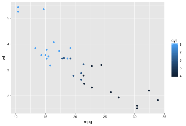
library(ggplot2)
# 选择mtcars数据集
ggplot(data = mtcars, mapping = aes(mpg, wt, color = cyl)) +
    geom_point()
2、映射(mapping)
映射使用aes()函数实现,是数据集中的数据关联到相应的图形属性过程中一种对应关系。
属性设置放在aes()里面,表示把数据根据某一属性分开处理;如果放在外面,则是统一处理
例
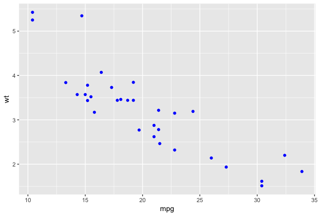
library(ggplot2)
# 离散分组着色数据类型要是factor
ggplot(data = mtcars, mapping = aes(mpg, wt, color = factor(am))) +
    geom_point(color = 'blue') # 统一设置颜色
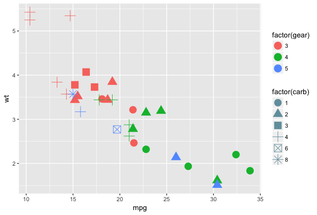
二级映射实现分组
library(ggplot2)
ggplot(mtcars, aes(x = mpg, y = wt, color = factor(gear))) +
    geom_point(aes(shape = factor(carb)))
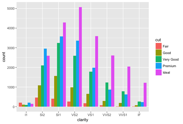
3、几何对象(geom) 与 统计变换(stats)
几何对象可以绘制不同类型的图,形式是gemo_xx
例
library(ggplot2)
ggplot(diamonds, aes(x = clarity, fill = cut)) +
    geom_bar(position = "dodge") # 并排排列
4、统计变换(stats)
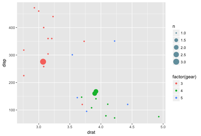
统计图片中的额外信息,进行一定的计算
例
library(ggplot2)
ggplot(mtcars, aes(x = drat, y = disp, color = factor(gear))) +
    stat_sum() # 计数,stat_unique则可以去重
5、标度(scale) 与 坐标(coords)
可以修改坐标轴和图例的参数,作用:
- 修改图例
- 修改图形属性
- 修改坐标轴
例:
library(ggplot2)
ggplot(data = mtcars, aes(wt, mpg, color = qsec, shape = factor(vs))) +
    geom_point(size = 3) +
    annotate('text', x = 4, y = 25, label = 'text') + # 文本注释
    labs(x = 'xx', y = 'yy') + # 添加标题、坐标名
    ggtitle('Title') +
    geom_vline(xintercept = 3) + # 添加竖线
    geom_hline(yintercept = 20) + # 添加水平线
    xlim(3, 4) + # 添加范围
    scale_x_continuous(breaks = c(3, 3.25, 3.5, 3.75, 4),
                       labels = c('a', 'b', 'c', 'd', 'e')) + # 修改坐标轴
    coord_flip() # 互换坐标轴

7、分面(facet)
即在一个页面上自动摆放多幅图形,是ggplot2非常方便的一个地方,先划分数据集再作图
例
library(ggplot2)
# 单变量分面
ggplot(data = mtcars, aes(wt, mpg)) +
    geom_point() +
    facet_grid(vs~.) # 根据vs分面

# 双变量分面
ggplot(data = mtcars, aes(wt, mpg)) +
    geom_point() +
    facet_grid(vs~am) # 根据vs和am分面

# 轴刻度不一致,不同纵(Y)坐标刻度
# scale = 'free'是同时释放x和y轴
ggplot(data = mtcars, aes(wt, mpg)) +
    geom_point() +
    facet_grid(vs ~., scales = "free_y") # 释放坐标轴

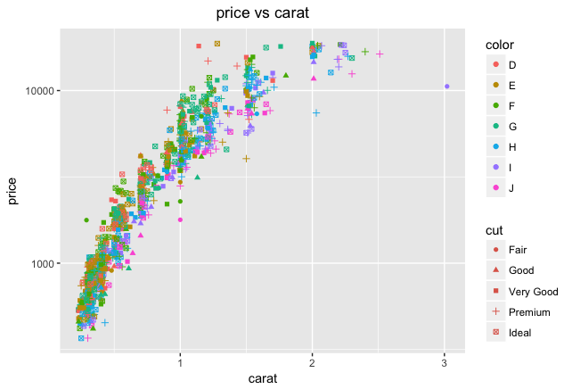
8、主题(theme)
主题不多论述,一班使用ggthemr包会比较省事
不使用ggthemr
library(ggplot2)
small = diamonds[sample(nrow(diamonds), 1000), ]
ggplot(small, aes(x = carat, y = price, shape = cut, colour = color)) +
    geom_point() +
    scale_y_log10() +
    labs(title = 'price vs carat') +
    theme(plot.title = element_text(hjust = 0.5)) # 标题居中
使用ggthemr
library(ggplot2)
library(ggthemr)
ggthemr('pale')
small = diamonds[sample(nrow(diamonds), 1000), ]
ggplot(small, aes(x = carat, y = price, shape = cut, colour = color)) +
    geom_point() +
    scale_y_log10() +
    labs(title = 'price vs carat') +
    theme(plot.title = element_text(hjust = 0.5)) # 标题居中
ggthemr_reset()
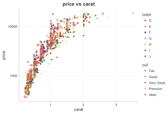
个人感觉配色更好看一些~

 浙公网安备 33010602011771号