
安卓Design包之NavigationView结合DrawerLayout,toolbar的使用,FloatingActionButton
注意:使用前需要添加Design依赖包,使用toolbar时需要隐藏标题头
FloatingActionButton
悬浮按钮:FloatingActionButton是重写ImageView的,所有FloatingActionButton拥有ImageView的一切属性。
- app:backgroundTint - 设置FAB的背景颜色。
- app:rippleColor - 设置FAB点击时的背景颜色。
- app:borderWidth - 该属性尤为重要,如果不设置0dp,那么在4.1的sdk上FAB会显示为正方形,而且在5.0以后的sdk没有阴影效果。所以设置为borderWidth="0dp"。
- app:elevation - 默认状态下FAB的阴影大小。
- app:pressedTranslationZ - 点击时候FAB的阴影大小。
- app:fabSize - 设置FAB的大小,该属性有两个值,分别为normal和mini,对应的FAB大小分别为56dp和40dp。
- src - 设置FAB的图标,Google建议符合Design设计的该图标大小为24dp。
- app:layout_anchor - 设置FAB的锚点,即以哪个控件为参照点设置位置。
- app:layout_anchorGravity - 设置FAB相对锚点的位置,值有 bottom、center、right、left、top等。
    <android.support.design.widget.FloatingActionButton
            android:layout_width="wrap_content"
            android:layout_height="wrap_content"
            android:layout_alignParentBottom = "true"
            android:layout_alignParentRight = "true"
            android:layout_margin="20dp"
            android:src="@mipmap/ic_launcher"/>
效果:
:
NavigationView
通过提供抽屉导航所需的框架让实现更简单,同时它还能够直接通过菜单资源文件直接生成导航元素。把NavigationView作为DrawerLayout的内容视图来使用。NavigationView处理好了和状态栏的关系,可以确保NavigationView在API21+设备上正确的和状态栏交互。
xml文件:
利用drawerLayout作为父布局,可以实现侧滑的功能


<?xml version="1.0" encoding="utf-8"?>
<android.support.v4.widget.DrawerLayout xmlns:android="http://schemas.android.com/apk/res/android"
    xmlns:tools="http://schemas.android.com/tools"
    xmlns:app="http://schemas.android.com/apk/res-auto"
    android:id="@+id/drawer_layout"
    android:layout_width="match_parent"
    android:layout_height="match_parent"
    android:paddingBottom="@dimen/activity_vertical_margin"
    tools:context="fanggao.qf.toolbar_drawerlayout_navigationview_floactionbar_snackbar.MainActivity">
<!--主界面-->
    <RelativeLayout
        android:layout_width="match_parent"
        android:layout_height="match_parent">
        <android.support.v7.widget.Toolbar
            android:id="@+id/toolbar"
            android:layout_width="match_parent"
            android:layout_height="wrap_content">
            <!--自定义布局-->

        </android.support.v7.widget.Toolbar>
        <!--悬浮的圆-->
        <android.support.design.widget.FloatingActionButton
            android:layout_width="wrap_content"
            android:layout_height="wrap_content"
            android:layout_alignParentBottom = "true"
            android:layout_alignParentRight = "true"
            android:layout_margin="20dp"
            android:src="@mipmap/ic_launcher"/>
    </RelativeLayout>
<!--左侧菜单   android:layout_gravity = "start" 在布局的左侧-->
<android.support.design.widget.NavigationView
    android:layout_width="250dp"
    android:layout_height="match_parent"
    android:layout_gravity = "start"
    app:headerLayout = "@layout/layout_header"
    app:menu="@menu/menu"/>

</android.support.v4.widget.DrawerLayout>
layout_header.xml
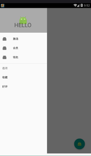
侧滑菜单中的标题头:
<?xml version="1.0" encoding="utf-8"?>
<RelativeLayout xmlns:android="http://schemas.android.com/apk/res/android"
    android:layout_width="match_parent"
    android:layout_height="match_parent"
    android:background="#aaaaaa">
    <ImageView
        android:id="@+id/img_icon"
        android:layout_width="wrap_content"
        android:layout_height="wrap_content"
        android:layout_centerInParent="true"
        android:src="@mipmap/ic_launcher"/>
    <TextView
        android:layout_width="wrap_content"
        android:layout_height="wrap_content"
        android:text="HELLO"
        android:layout_below="@id/img_icon"
        android:textSize="30sp"
        android:layout_margin="20dp"
        android:layout_centerHorizontal="true"/>
</RelativeLayout>
注意:
 <!--有group就会有分割线了
        android:checked="true" 在菜单项中图片就会显示为蓝色  false就会为灰色
        所以会导致图片全部为灰色,解决办法:
        方法1.在布局文件中添加app:itemIconTint="@color/blue"属性,表示设置图片的颜色全都为蓝色
        方法2.在java代码中:NavigationView navigationView = (NavigationView)findViewById(R.id.navigation_view);
             navigationView.setItemIconTintList(null);  -->
menu.xml菜单布局
<?xml version="1.0" encoding="utf-8"?>
<menu xmlns:android="http://schemas.android.com/apk/res/android">
    <!-- menu支持分组和子标题,但是子标题不支持icon-->
    <!--单选-->
    <group>
        <item
            android:title="激活"
            android:icon="@mipmap/ic_launcher">
        </item>
        <item
            android:title="会员"
            android:icon="@mipmap/ic_launcher">
        </item>
        <item
            android:title="钱包"
            android:icon="@mipmap/ic_launcher">
        </item>
    </group>
    <!--菜单-->
    <item
        android:title="选项"
        android:icon="@mipmap/ic_launcher">
        <menu>
            <item
            android:title="收藏"></item>
            <item
                android:title="好评"></item>
        </menu>

    </item>
</menu>
main:
public class MainActivity extends AppCompatActivity {

    private Toolbar toolbar;
    private DrawerLayout drawerLayout;

    @Override
    protected void onCreate(Bundle savedInstanceState) {
        super.onCreate(savedInstanceState);
        setContentView(R.layout.activity1_main);
        toolbar = (Toolbar) findViewById(R.id.toolbar);
        drawerLayout = (DrawerLayout) findViewById(R.id.drawer_layout);
        //设置主标题
        toolbar.setTitle("标题");
        //设置副标题
        toolbar.setSubtitle("标题的子类");
        //设置图标
        toolbar.setLogo(R.mipmap.ic_launcher);
        //设置Toolbar和DrawerLayout实现动画和联动
        this.setSupportActionBar(toolbar);

        //左侧菜单与toolbar联动
        // 给左上角图标的左边加上一个返回的图标
        getSupportActionBar().setDisplayHomeAsUpEnabled(true);
        getSupportActionBar().setHomeButtonEnabled(true); //设置返回键可用
        //ActionBarDrawerToggle可以监听抽屉开合事件,可以认为是DrawerListener的子类
        //声明mDrawerToggle对象,其中R.string.open和R.string.close简单可以用"open"和"close"替代
        ActionBarDrawerToggle actionBarDrawerToggle = new ActionBarDrawerToggle(MainActivity.this, drawerLayout,toolbar, R.string.open, R.string.close){
            @Override
            public void onDrawerOpened(View drawerView) {
                super.onDrawerOpened(drawerView);
                Log.i("tag", "onDrawerOpened: ");
            }

            @Override
            public void onDrawerClosed(View drawerView) {
                super.onDrawerClosed(drawerView);
                Log.i("tag", "onDrawerClosed: ");
            }
        };

        //使得图标和抽屉拉合保持同步
        actionBarDrawerToggle.syncState();
        //监听实现侧边栏的拉开和闭合,即抽屉drawer的闭合和打开
        drawerLayout.addDrawerListener(actionBarDrawerToggle);
    }
}
效果: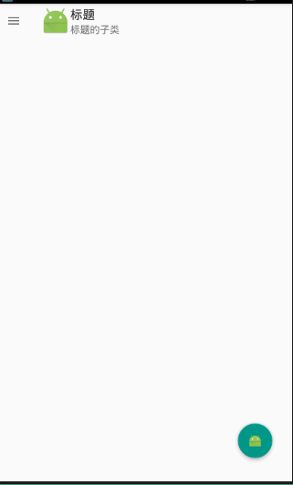

 浙公网安备 33010602011771号