水平垂直居中与三栏布局
1.水平垂直居中
<body>
    <div>
        <img src="images/headerLogo.gif" id="image">
    </div>
</body>
通过绝对定位position:absolute来实现
div{
    width: 100%;
    height: 600px;
    background-color: #efe5d0;

    position: relative;
}
#image{
    background-color: #954b4b;

    position: absolute;
    top: 50%;
    left: 50%;
    transform: translate(-50%,-50%);
}
要记得绝对定位元素的容纳块是position属性值不为static的最近的祖辈元素,因此首先要将<img>元素的父元素<div>设置为position:relative,使其成为绝对定位元素<img>的容纳块。这里要注意一个细节,仅仅是将偏移属性top和left设置为50%是不够的,因为图片本身是有宽度和高度的,造成下面这种效果:
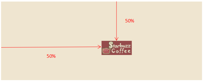
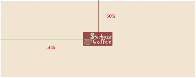
因此,利用变形属性transform对坐标轴进行偏移,实现水平垂直都居中。transform:translate(-50%,-50%),是以图像自身宽度和高度的50%作为坐标轴偏移量,相当于把图像的中心移到了top和left为50%的位置。
通过弹性盒布局display:flex来实现
div{
    width: 100%;
    height: 600px;
    background-color: #efe5d0;

    display: flex;
    justify-content: center;
    align-items: center;
}
#image{
    background-color: #954b4b;
}
只需要将弹性容器<div>的主轴和垂轴的对齐方式设置为center即可,其子元素作为弹性元素就会按照弹性容器的布局要求进行排布。
通过栅格布局display:grid来实现
div{
    width: 100%;
    height: 600px;
    background-color: #efe5d0;

    display: grid;
    grid-template-columns: 1fr;
    grid-template-rows: 1fr;
}
#image{
    background-color: #954b4b;

    justify-self: center;
    align-self: center;
}
整个栅格只有一行一列,这里使用justify-self和align-self我们对栅格元素来进行单独的布局,表示该栅格元素在所在栅格中水平垂直居中。
2.三栏布局
<body>
    <div id="left"></div>
    <div id="center"></div>
    <div id="right"></div>
</body>
通过弹性盒布局实现
div{
    width: 400px;
    height: 600px;
}
body{
    display: flex;
    justify-content: space-between;
    align-items: flex-start;
}
#left{
    background-color: #efe5d0;
}
#center{
    background-color: #954b4b;
    flex: 1;
    min-width: 100px;
}
#right{
    background-color: #675c47;
}
这里将每个<div>都初始化为宽400px、高600px的矩形。将父元素<body>设置为弹性容器,按照容器设定的布局方式对源文档中的<div>按文档顺序进行排布,中间的弹性元素<div>的弹性增长因子设置为1,其余两个默认为0,这样就可以实现中间栏自适应调整宽度,同时设定中间栏最小宽度为100px,防止浏览器窗口缩小导致中间栏消失。
缩小后: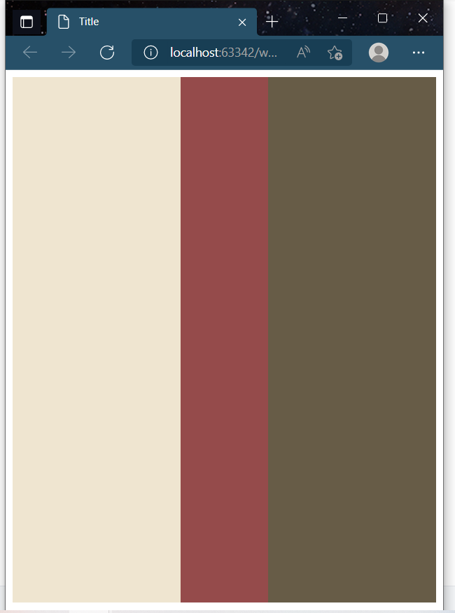
通过绝对定位实现
body{
    position: relative;
}
#left{
    width: 400px;
    height: 600px;
    background-color: #efe5d0;

    position: absolute;
    left: 0;
}
#center{
    height: 600px;
    background-color: #954b4b;

    position: absolute;
    left: 400px;
    right: 400px;
}
#right{
    width: 400px;
    height: 600px;
    background-color: #675c47;

    position: absolute;
    right: 0;
}
首先得现将父元素<body>的position属性设置为relative,才能使<body>成为它三个子元素<div>的容纳块。这里中间栏的宽度width由偏移属性left和right共同确定,使它刚好填满中间空白区域。
通过浮动来实现
div{
    width: 400px;
    height: 600px;
}
#left{
    background-color: #efe5d0;

    float: left;
}
#center{
    background-color: #954b4b;

    float: left;
    width: calc(100% - 800px);
}
#right{
    background-color: #675c47;

    float: right;
}
对于中间栏,需要使用计算式calc来重新计算其宽度,填满空白区域。使用浮动实现的三栏布局,在窗口缩得足够小的时候(<800px)会导致中间栏消失且右边栏换行,造成布局混乱。
通过栅格布局实现
div{
    height: 600px;
}
body{
    display: grid;
    grid-template-columns: 400px 1fr 400px;
    grid-template-rows: 1fr;
}
#left{
    background-color: #efe5d0;
}
#center{
    background-color: #954b4b;
}
#right{
    background-color: #675c47;
}
这里将栅格容器的中间列设为一份(fr)单元格,就可以自适应调整中间栏宽度,填满空白区域。

 浙公网安备 33010602011771号