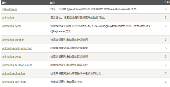
CSS属性
动画属性
-
概括
-
@keyframs:定义一个动画,@keyframe定义的动画名称用来被animation-name所使用。
-
使用@keyframes规则,你可以创建动画。创建动画是通过逐步改变从一个CSS样式设定到另一个。
在动画过程中,您可以更改CSS样式的设定多次。指定的变化时发生时使用%,或关键字"from"和"to",这是和0%到100%相同。
0%是开头动画,100%是当动画完成。
-
注意: 使用animation属性来控制动画的外观,还使用选择器绑定动画。.
-
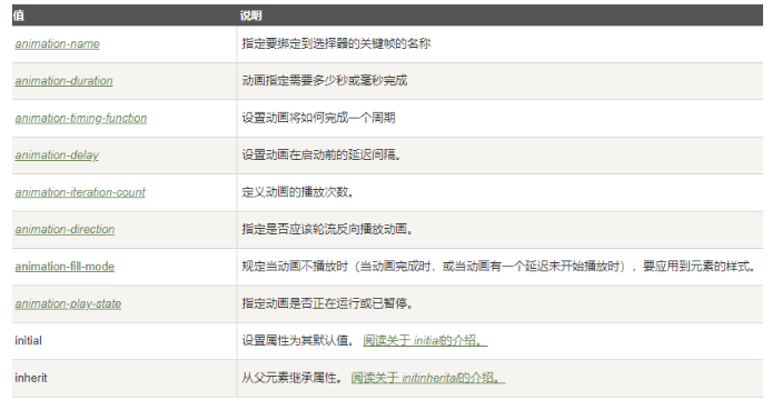
相关参数;
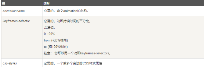
-
@keyframes animationname {keyframes-selector {css-styles;}} -
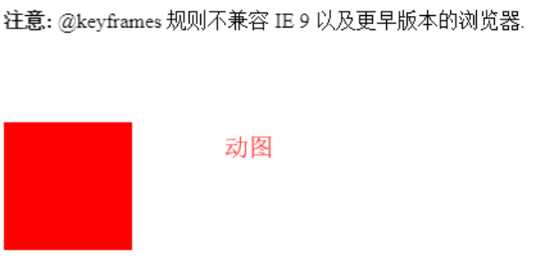
示例1:上下移动图像
<style>
div
{
	width:100px;
	height:100px;
	background:red;
	position:relative;
  animation:mymove 5s infinite; /* 这里的animation与keyframs绑定*/
	-webkit-animation:mymove 5s infinite; /* Safari and Chrome 谷歌支持这个*/
}

/* 将5s分成100份 */
@keyframes mymove
{
	0%   {top:0px;}
	25%  {top:200px;}
	75%  {top:50px}
	100% {top:100px;}
}

@-webkit-keyframes mymove /* Safari and Chrome */
{
	0%   {top:0px;}
	25%  {top:200px;}
	75%  {top:50px}
	100% {top:100px;}
}
</style>
</head>
<body>
<p><strong>注意:</strong> @keyframes 规则不兼容 IE 9 以及更早版本的浏览器.</p>
<div></div>
</body>
-
示例二:宽度拉伸
<style>
div
{
width:100px;
height:100px;
background:red;
position:relative;
animation:mymove 5s infinite;
-webkit-animation:mymove 5s infinite; /* Safari and Chrome */
}

@keyframes mymove
{
0%   {top:0px; background:red; width:100px;}
100% {top:200px; background:yellow; width:300px;}
}

@-webkit-keyframes mymove /* Safari and Chrome */
{
0%   {top:0px; background:red; width:100px;}
100% {top:200px; background:yellow; width:300px;}
}
</style>
</head>
<body>

<p><strong>注意:</strong> @keyframes 规则不兼容 IE 9 以及更早版本的浏览器.</p>
<div></div>
</body>
-

-
综合,循环式改变颜色和位置的左右移动
<style>
div {
  width:100px;
  height:100px;
  background:lightblue;
  position: relative;
  animation: mymove 2s infinite;
}
@keyframes mymove{
  0%  {top:0px;left:0px;background: red;width: 100px;}
  25% {top:0px;left:100px;background: blue;width:100px}
  50% {top:100px;left:100px;background: yellow;width: 100px;}
  75% {top:100px;left:0px;background: green;width: 100px;}
  100%{top:0px;background: red;width: 100px;}
}
</style>
</head>
<body>

<p><strong>注意:</strong> @keyframes 规则不兼容 IE 9 以及更早版本的浏览器.</p>
<div></div>
</body>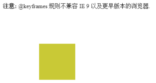
-
animation(动画属性):使用简写属性把animation绑定到一个div元素下
- 属性概要
-
语法
animation: name duration timing-function delay iteration-count direction fill-mode play-state;
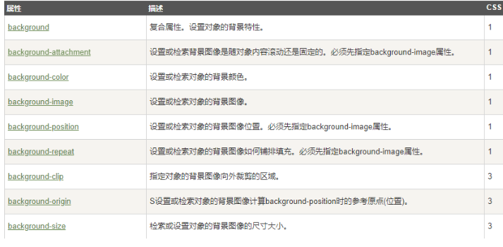
背景属性
-
!
-
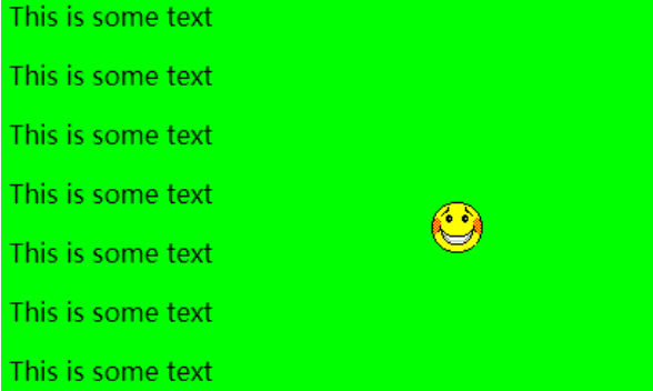
示例1、background 后面可以写所有你想写的参数,缺一两个不影响
<head>
<meta charset="utf-8">
<title>菜鸟教程(runoob.com)</title>
<style>
body
{
background: #00ff00 url('smiley.gif') no-repeat fixed center;
}
</style>
</head>

<body>
<p>This is some text</p>
<p>This is some text</p>
<p>This is some text</p>
<p>This is some text</p>
<p>This is some text</p>
<p>This is some text</p>
<p>This is some text</p>
<p>This is some text</p>
<p>This is some text</p>
<p>This is some text</p>
</body>
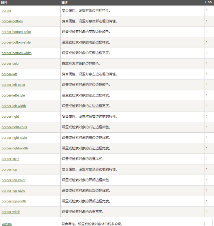
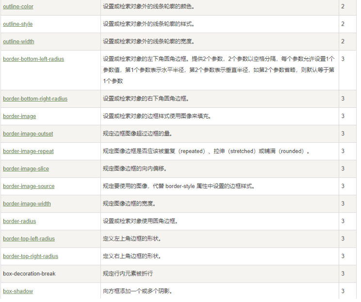
边框(border)和轮廓(outline)属性
-
-
-
需要说明的参数:
-
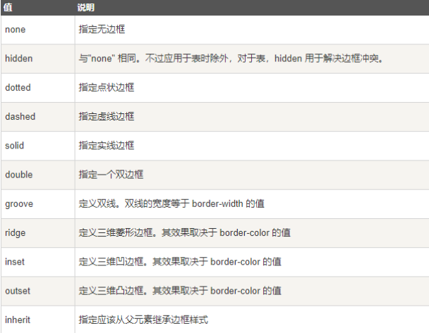
border-bottom-style和outline-style等相关的样式可以选参数:
-
-
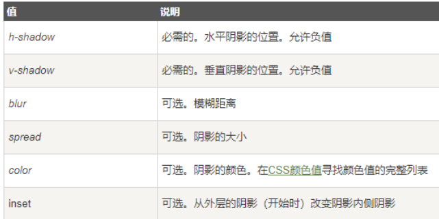
box-shadow 向边框添加一个或多个阴影
-
语法;
box-shadow: h-shadow v-shadow blur spread color inset;
<style>
body
{
	margin:30px;
	background-color:#E9E9E9;
}

div.polaroid
{
	width:294px;
	padding:10px 10px 20px 10px;
	border:1px solid #BFBFBF;
	background-color:white;
	/* Add box-shadow */
	box-shadow:10px 3px 3px #aaaaaa;
}

div.rotate_left
{
	float:left;
	-ms-transform:rotate(7deg); /* IE 9 */
	-webkit-transform:rotate(7deg); /* Safari and Chrome */
	transform:rotate(7deg);
}

div.rotate_right
{
	float:left;
	-ms-transform:rotate(-8deg); /* IE 9 */
	-webkit-transform:rotate(-8deg); /* Safari and Chrome */
	transform:rotate(-8deg);
}
</style>
</head>
<body>

<div class="polaroid rotate_left">
<img src="pulpitrock.jpg" alt="" width="284" height="213">
<p class="caption">The pulpit rock in Lysefjorden, Norway.</p>
</div>

<div class="polaroid rotate_right">
<img src="cinqueterre.jpg" alt="" width="284" height="213">
<p class="caption">Monterosso al Mare. One of the five villages in Cinque Terre.</p>
</div>
</body>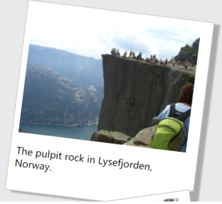
-
-
弹性盒子模型(flexible box)属性
-
-
flex-grow语法
flex-grow: number|initial|inherit;
#number	一个数字,规定项目将相对于其他灵活的项目进行扩展的量。默认值是 0。
<style> #main { width: 350px; height: 100px; border: 1px solid #c3c3c3; display: flex; } #main div:nth-of-type(1) {flex-grow: 1;} #main div:nth-of-type(2) {flex-grow: 3;} #main div:nth-of-type(3) {flex-grow: 1;} #main div:nth-of-type(4) {flex-grow: 1;} #main div:nth-of-type(5) {flex-grow: 1;} </style> </head> <body> <div id="main"> <div style="background-color:coral;"></div> <div style="background-color:lightblue;"></div> <div style="background-color:khaki;"></div> <div style="background-color:pink;"></div> <div style="background-color:lightgrey;"></div> </div> <p><b>注意:</b> Internet Explorer 10 及更早版本浏览器不支持 flex-grow 属性。</p> <p><b>注意:</b> Safari 6.1 及更新版本通过 -webkit-flex-grow 属性支持该属性。</p> </body>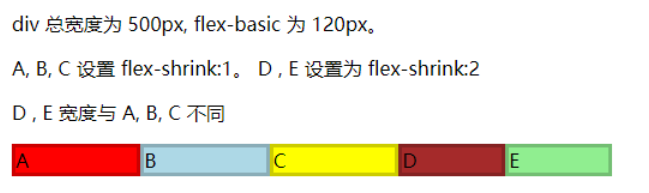
-
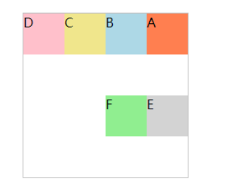
flex-shrink:默认值为1,如果没有显示定义该属性,将会自动按照默认值1在所有因子相加之后计算比率来进行空间收缩。
本例中A、B、C 显式定义了 flex-shrink 为 1,D、E 定义了 flex-shrink 为 2,所以计算出来总共将剩余空间分成了 7 份,其中 A、B、C 占 1 份,D、E 占 2 份,即1:1:1:2:2。
<style>
#content {
  display: flex;
  width: 500px;
}

#content div {
  flex-basis: 120px;
  border: 3px solid rgba(0,0,0,.2);
}

.box {
  flex-shrink: 1;
}

.box1 {
  flex-shrink: 2;
}
</style>
</head>
<body>

<p>div 总宽度为 500px, flex-basic 为 120px。</p>
<p>A, B, C 设置 flex-shrink:1。 D , E 设置为 flex-shrink:2</p>
<p>D , E 宽度与 A, B, C 不同</p>
<div id="content">
  <div class="box" style="background-color:red;">A</div>
  <div class="box" style="background-color:lightblue;">B</div>
  <div class="box" style="background-color:yellow;">C</div>
  <div class="box1" style="background-color:brown;">D</div>
  <div class="box1" style="background-color:lightgreen;">E</div>
</div>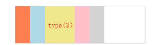
-
flex-basis 属性用于设置或检索弹性盒伸缩基准值。
<style>
#main {
    width: 350px;
    height: 100px;
    border: 1px solid #c3c3c3;
    display: -webkit-flex; /* Safari */
    display: flex;
}

#main div {
    -webkit-flex-grow: 0; /* Safari 6.1+ */
    -webkit-flex-shrink: 0; /* Safari 6.1+ */
    -webkit-flex-basis: 40px; /* Safari 6.1+ */
    flex-grow: 0;
    flex-shrink: 0;
    flex-basis: 40px;
}

#main div:nth-of-type(3) {
    -webkit-flex-basis: 80px; /* Safari 6.1+ */
    flex-basis: 80px;
}
</style>
</head>
<body>

<div id="main">
  <div style="background-color:coral;"></div>
  <div style="background-color:lightblue;"></div>
  <div style="background-color:khaki;"></div>
  <div style="background-color:pink;"></div>
  <div style="background-color:lightgrey;"></div>
</div>

<p><b>注意:</b> Internet Explorer 10 及更早版本浏览器不支持 flex-basis 属性。</p>
<p><b>注意:</b> Safari 6.1 及更新版本通过 -webkit-flex-basis 属性支持该属性。</p>

</body>
-
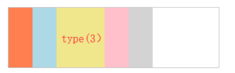
flex-flow 属性是 flex-direction 和 flex-wrap 属性的复合属性。flex-flow 属性用于设置或检索弹性盒模型对象的子元素排列方式。
flex-direction 属性规定灵活项目的方向。flex-wrap 属性规定灵活项目是否拆行或拆列。如果元素不是弹性盒对象的元素,则 flex-flow 属性不起作用。
-
语法:
flex-flow: flex-direction flex-wrap|initial|inherit;
代码示例
<style>
#main {
    width: 200px;
    height: 200px;
    border: 1px solid #c3c3c3;
    display: -webkit-flex; /* Safari */
    -webkit-flex-flow: row-reverse wrap; /* Safari 6.1+ */
    display: flex;
    flex-flow: row-reverse wrap;
}

#main div {
    width: 50px;
    height: 50px;
}
</style>
</head>
<body>

<div id="main">
  <div style="background-color:coral;">A</div>
  <div style="background-color:lightblue;">B</div>
  <div style="background-color:khaki;">C</div>
  <div style="background-color:pink;">D</div>
  <div style="background-color:lightgrey;">E</div>
  <div style="background-color:lightgreen;">F</div>
</div>

<p><b>注意:</b> Internet Explorer 10 及更早版本浏览器不支持 flex-flow 属性。</p>
<p><b>注意:</b> Safari 6.1 及更新版本通过 -webkit-flex-flow 属性支持该属性。</p>

</body>
transform属性
-
Transform属性应用于元素的2D或3D转换。这个属性允许你将元素旋转,缩放,移动,倾斜等。
-
语法;
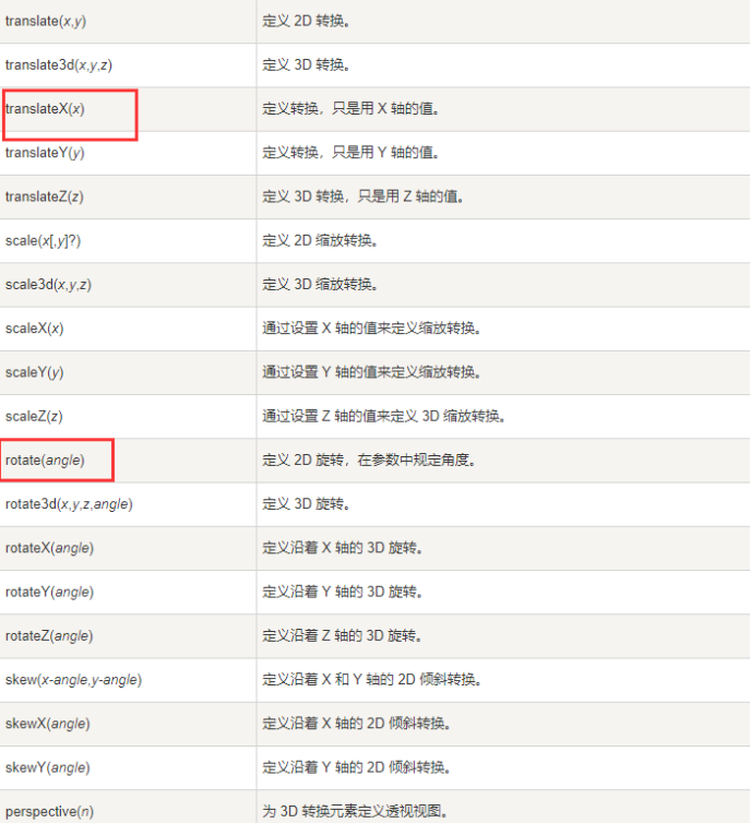
transform: none|transform-functions; -
-
旋转图片
<style>
body
{
	margin:30px;
	background-color:#E9E9E9;
}

div.polaroid
{
	width:294px;
	padding:10px 10px 20px 10px;
	border:1px solid #BFBFBF;
	background-color:white;
	/* Add box-shadow */
	box-shadow:2px 2px 3px #aaaaaa;
}

div.rotate_left
{
	float:left;
	-ms-transform:rotate(7deg); /* IE 9 */
	-webkit-transform:rotate(7deg); /* Safari and Chrome */
	transform:rotate(7deg);
}

div.rotate_right
{
	float:left;
	-ms-transform:rotate(-8deg); /* IE 9 */
	-webkit-transform:rotate(-8deg); /* Safari and Chrome */
	transform:rotate(-8deg);
}
</style>
</head>
<body>

<div class="polaroid rotate_left">
<img src="pulpitrock.jpg" alt="" width="284" height="213">
<p class="caption">The pulpit rock in Lysefjorden, Norway.</p>
</div>

<div class="polaroid rotate_right">
<img src="cinqueterre.jpg" alt="" width="284" height="213">
<p class="caption">Monterosso al Mare. One of the five villages in Cinque Terre.</p>
</div>

</body>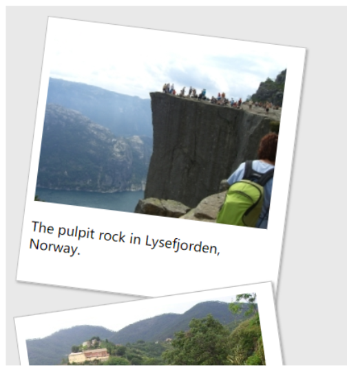
-
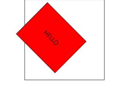
transform-Origin属性允许您更改转换元素的位置(改变原始位置)。2D转换元素可以改变元素的X和Y轴。 3D转换元素,还可以更改元素的Z轴。为了更好地理解Transform-Origin属性,请查看这个演示.注意: 使用此属性必须先使用 transform 属性。
<style>
#div1
{
	position: relative;
	height: 200px;
	width: 200px;
	margin: 100px;
	padding:10px;
	border: 1px solid black;
}

#div2
{
	padding:50px;
	position: absolute;
	border: 1px solid black;
	background-color: red;
	transform: rotate(45deg);
	transform-origin:20% 50%;

}
</style>
</head>

<body>

<div id="div1">
  <div id="div2">HELLO</div>
</div>
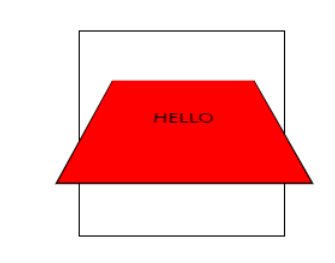
- perspective:多少像素的3D元素是从视图的perspective属性定义。这个属性允许你改变3D元素是怎样查看透视图。
定义时的perspective属性,它是一个元素的子元素,透视图,而不是元素本身。也就是控制3d效果的位置
<style>
#div1
{
	position: relative;
	height: 150px;
	width: 150px;
	margin: 50px;
	padding:10px;
	border: 1px solid black;

	-webkit-perspective:150; /* Safari and Chrome */
}

#div2
{
	padding:50px;
	position: absolute;
	border: 1px solid black;
	background-color: red;
	transform: rotateX(45deg);
	-webkit-transform: rotateX(45deg); /* Safari and Chrome */
}
</style>
</head>

<body>

<div id="div1">
  <div id="div2">HELLO</div>
</div>

</body>
-
来一个可以旋转折叠的图片
<style>
div {
  width:100px;
  height:100px;
  background:lightblue;
  position: relative;
  animation: mymove 2s infinite;
}
@keyframes mymove{
  0%  {top:0px;left:0px;background: red;width: 100px;transform: rotate(0deg) rotateX(0deg);}
  25% {top:0px;left:100px;background: blue;width:100px;transform: rotate(90deg) rotateX(45deg);}
  50% {top:100px;left:100px;background: yellow;width: 100px;transform: rotate(180deg) rotateX(90deg);}
  75% {top:100px;left:0px;background: green;width: 100px;transform: rotate(270deg) rotateX(135deg);}
  100%{top:0px;background: red;width: 100px;transform: rotate(360deg) rotateX(180deg)}
}
</style>
</head>
<body>

<p><strong>注意:</strong> @keyframes 规则不兼容 IE 9 以及更早版本的浏览器.</p>
<div></div>

</body>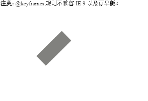

 浙公网安备 33010602011771号