如何解决div样式拉伸问题
现象描述:
当text组件的内容较多且显示多行的时候,相邻的div样式会显示异常,会从正常的圆形变为椭圆。
问题代码如下:
|
1
2
3
4
5
6
7
8
9
10
11
12
13
14
15
16
17
18
19
20
21
22
23
24
25
26
27
28
29
30
31
32
33
34
35
36
37
38
39
40
41
|
<template> <div class="container"> <div style="align-items: center;"> <div class="typscolor" style="blue; opacity: 0.26; margin-left: 16px;"></div> <text>{{text}}</text> <div class="typscolor" style="blue; opacity: 0.26; margin-left: 16px;"></div> <text>{{text}}</text> <div class="typscolor" style="blue; opacity: 0.26; margin-left: 16px;"></div> <text>{{text}}</text> </div> </div></template><style> .container { flex-direction: column; justify-content: center; height: 100%; } text { font-size: 24px; } .typscolor { border-radius: 50%; width: 30px; height: 30px; red; margin-right: 8px; }</style><script> module.exports = { data: { text:'text文本内容过多时左边的圆圈会被拉伸' }, onInit() { }, } </script> |
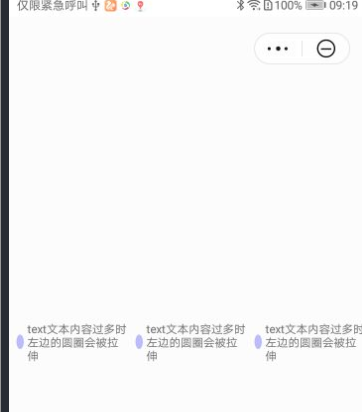
代码运行效果,如下图所示:
|
|
|
|
图1 异常 |
图2 正常 |

问题分析:
当text组件内容过多时,text组件宽度增加,相邻div宽度不够,flex布局宽度超出会自动压缩,从而导致div标签被拉伸了。
解决方法:
可以给div标签设置flex-shrink: 0属性,显示指定不压缩,即可解决该问题。
修改代码如下:
|
1
2
3
4
5
6
7
8
9
10
11
12
13
14
15
16
17
18
19
20
21
22
23
24
25
26
27
28
29
30
31
32
33
34
35
36
37
38
39
|
<template> <div class="container"> <div style="align-items: center;"> <div class="typscolor" style="blue; opacity: 0.26; margin-left: 16px;"></div> <text>{{text}}</text> <div class="typscolor" style="blue; opacity: 0.26; margin-left: 16px;"></div> <text>{{text}}</text> <div class="typscolor" style="blue; opacity: 0.26; margin-left: 16px;"></div> <text>{{text}}</text> </div> </div></template><style> .container { flex-direction: column; justify-content: center; height: 100%; } text { font-size: 24px; } .typscolor { border-radius: 50%; width: 30px; height: 30px; red; margin-right: 8px; flex-shrink: 0; /*加上该属性即可解决拉伸问题*/ }</style><script> module.exports = { data: { text:'text文本内容过多时左边的圆圈会被拉伸' }, onInit() { }, } </script> |
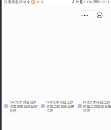
修改后代码运行效果如下图所示:
欲了解更多详情,请参见:
快应用通用样式介绍:
原文链接:https://developer.huawei.com/...
原作者:Mayism

 浙公网安备 33010602011771号