Sass入门——基本特性-基础
本文来自慕课网大漠
声明变量
三个部分:1、声明变量的符号"$"2、变量名称3、赋予变量的值
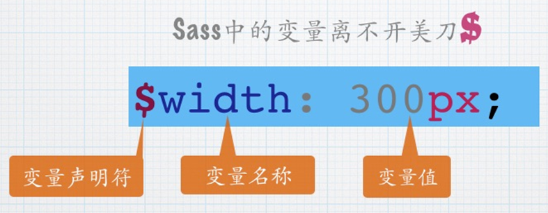
$brand-primary : darken(#428bca, 6.5%) !default; // #337ab7
$btn-primary-color : #fff !default;
$btn-primary-bg : $brand-primary !default;
$btn-primary-border : darken($btn-primary-bg, 5%) !default;
在后面加上 !default表示默认变量
覆盖默认值:在默认变量之前重新声明变量即可
$baseLineHeight: 2;
$baseLineHeight: 1.5 !default;
body{
    line-height: $baseLineHeight;
}
编译后的CSS:
body{
    line-height:2;
}
调用变量:
"$变量名"放在你想调用的地方就行了。
局部变量和全部变量
没什么难理解的,看一下代码就行了
$color: orange !default;//定义全局变量(在选择器、函数、混合宏...的外面定义的变量为全局变量)
.block {
  color: $color;//调用全局变量
}
em {
  $color: red;//定义局部变量
  a {
    color: $color;//调用局部变量
  }
}
span {
  color: $color;//调用全局变量
}
全局变量的影子:简单说就是局部变量的名字和全局变量的名字一样。
什么时候声明变量?
1、该值至少重复出现了两次;
2、该值至少可能会被更新一次;
3、该值所有的变现都与变量有关(非巧合)
嵌套
选择器嵌套
有这样一段结构
<header>
<nav>
    <a href=“##”>Home</a>
    <a href=“##”>About</a>
    <a href=“##”>Blog</a>
</nav>
<header>
想选中header中的a标签,CSS:
nav a {
  color:red;
}
header nav a {
  color:green;
}
Sass:
nav{
  a{
    color: red;
    header & {
      color: green;
    }
  }
}
属性嵌套
CSS有些属性只是后缀不一样,前缀一样,比如margin-top/margin-bottom
如果CSS是这样:
.box {
    border-top: 1px solid red;
    border-bottom: 1px solid green;
}
那么Sass可以这样写:
.box{
  border: {
    top: 1px solid red;
    bottom: 1px solid green;
  }
}
伪类嵌套
和属性嵌套差不多,加上一个&符号就可以了
.clearfix{
&:before,
&:after {
    content:"";
    display: table;
  }
&:after {
    clear:both;
    overflow: hidden;
  }
}
避免选择器嵌套:俩原因,读不懂,不会写。
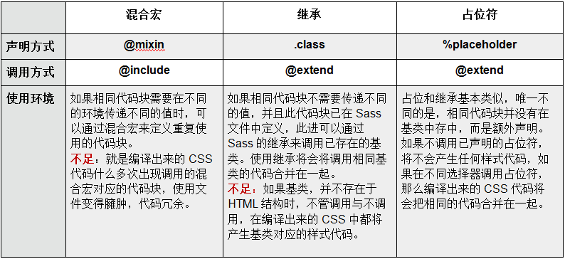
混合宏
需要重复大量的样式时,混合宏很有用
声明混合宏
不带参数混合宏
使用"@mixin"来声明
@mixin border-radius{
    -webkit-border-radius: 5px;
    border-radius: 5px;
}
带参数混合宏
@mixin border-radius($radius:5px){
    -webkit-border-radius: $radius;
    border-radius: $radius;
}
复杂的混合宏
可以在大括号里写上带有逻辑关系的语句
@mixin box-shadow($shadow...){
  @if length($shadow) >= 1 {
    @include prefixer(box-shadow, $shadow);
  } @else{
    $shaow: 0 0 4px rgba(0,0,0,0.3);
    @include prefixer(box-shadow, $shadow);
  }
}
box-shadow带有多个参数,可以用"..."来代替。当$shadow的参数数值量大于或等于1时,表示有多个阴影值,反之调用默认的参数值0 0 4px rgba(0,0,0,0.3)。
调用混合宏
匹配一个关键词"@include"来调用
比如调用上面的混合宏border-radius:
button {
    @include border-radius;
}
混合宏的参数
传一个不带值的参数
![]()
@mixin border-radius($radius){
  -webkit-border-radius: $radius;
  border-radius: $radius;
}
调用时给混合宏传一个参数值:
.box{
  @include border-radius(3px);
}
传一个带值的参数
@mixin border-radius($radius:3px){
  -webkit-border-radius: $radius;
  border-radius: $radius;
}
调用时可以直接调用混合宏"border-radius"
.btn{
  @include border-radius;
}
当然也可以在调用时再给混合宏的参数传值:
.box{
  @include border-radius(50%);
}
传多个参数
@mixin center($width,$height){
  width: $width;
  height: $height;
  position: absolute;
  top: 50%;
  left: 50%;
  margin-top: -($height) / 2;
  margin-left: -($width) / 2;
}
一个特别的参数"...",当混合宏传入的参数过多时,可以用这个参数来代替。
@mixin box-shadow($shadow...){
  @if length($shadows) >= 1 {
    -webkit-box-shadow: $shadows;
    box-shadow: $shadows;
  } @else {
    $shadows: 0 0 2px rgba(#000,.25);
    -webkit-box-shadow: $shadow;
    box-shadow: $shadow;
  }
}
混合宏的不足
生成冗余的代码块
@mixin border-radius{
  -webkit-border-radius: 3px;
  border-radius: 3px;
}
.box {
  @include border-radius;
  margin-bottom: 5px;
}
.btn {
  @include border-radius;
}
生成的CSS
.box {
  -webkit-border-radius: 3px;
  border-radius: 3px;
  margin-bottom: 5px;
}
.btn {
  -webkit-border-radius: 3px;
  border-radius: 3px;
}
扩展/继承
加一个"@extend"就可以了
.btn {
  border: 1px solid #ccc;
  padding: 6px 10px;
  font-size: 14px;
}
.btn-primary {
  background-color: #f36;
  color: #fff;
  @extend .btn;
}
.btn-second {
  background-color: orange;
  color: #fff;
  @extend .btn;
}
编译后的CSS
.btn, .btn-primary, .btn-second {
  border: 1px solid #ccc;
  padding: 6px 10px;
  font-size: 14px;
}
.btn-primary {
  background-color: #f36;
  color: #fff;
}
.btn-second {
  background-clor: orange;
  color: #fff;
}
占位符 %placeholder
%声明的代码如果不被@extend调用,不会产生任何的代码。
%mt5 {
  margin-top: 5px;
}
%pt5{
  padding-top: 5px;
}
.btn {
  @extend %mt5;
  @extend %pt5;
}
.block {
  @extend %mt5;
  span {
    @extend %pt5;
  }
}
编译后的CSS:
.btn, .block {
  margin-top: 5px;
}
.btn, .block span {
  padding-top: 5px;
}
通过@extend调用的占位符,编译出的代码会将相同的代码合并在一起。
混合宏 || 继承 || 占位符?
插值
$properties: (margin, padding);
@mixin set-value($side, $value) {
@each $prop in $properties {
#{$prop}-#{$side}: $value;
}
}
.login-box {
@include set-value(top, 14px);
}
编译成CSS:
.login-box {
    margin-top: 14px;
    padding-top: 14px;
}
再来看一个例子(构建一个选择器)
@mixin generate-sizes($class, $small, $medium, $big) {
    .#{$class}-small { font-size: $small; }
    .#{$class}-medium { font-size: $medium; }
    .#{$class}-big { font-size: $big; }
}
@include generate-sizes("header-text", 12px, 20px, 40px);
编译成CSS:
.header-text-small { font-size: 12px; }
.header-text-medium { font-size: 20px; }
.header-text-big { font-size: 40px; }

 浙公网安备 33010602011771号