FLEX布局
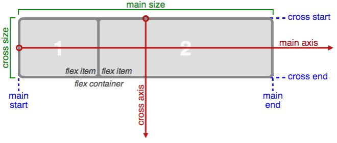
main axis – it is not necessarily horizontal
main size – The flex item’s main size property is either the ‘width’ or ‘height’ property, whichever is in the main dimension.
PROPERTIES FOR THE PARENT
DISPLAY
CSS columns have no effect on a flex container.FLEX-DIRECTION
.container {flex-direction: row | row-reverse | column | column-reverse;}FLEX-WRAP
nowrap(default): single-linewrap: multi-lineFLEX-FLOW
JUSTIFY-CONTENT
space-around: items are evenly distributed in the line with equal space around them. Note that visually the spaces aren’t equal, since all the items have equal space on both sides.The first item will have one unit of space against the container edge, but two units of space between the next item because that next item has its own spacing that applies.ALIGN-ITEMS
ALIGN-CONTENT
PROPERTIES FOR THE CHILDREN
ORDER
FLEX-GROW
If all items haveflex-growset to 1, the remaining space in the container will be distributed equally to all children. If one of the children a value of 2, the remaining space would take up twice as much space as the others (or it will try to, at least).FLEX-SHRINK
FLEX-BASIS
Theautokeyword means “look at my width or height property” (which was temporarily done by themain-sizekeyword until deprecated). Thecontentkeyword means “size it based on the item’s content”Not well supported yet.FLEX
It is recommended that you use this shorthand property.
ALIGN-SELF
This allows the default alignment (or the one specified byalign-items) to be overridden for individual flex items.Note thatfloat,clearandvertical-alignhave no effect on a flex item.

 浙公网安备 33010602011771号