HTML+CSS实现大盒子在小盒子的展示范围内进行滚动展示
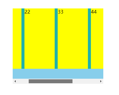
1.效果展示:
![]()
![]()
2.主要代码:样式: overflow:auto;
3.如果想要消除对应的滚动条:
.out::-webkit-scrollbar{
display: none;
}
4.创建对应的盒子(div)配置对应的样式:
源代码:
  <!DOCTYPE html>
  <html>
  <head>
  <meta charset="UTF-8">
  <title>rowspeed</title>

  <style type="text/css">
  *{
    padding: 0;
    margin: 0;
  }
  .out{
    position: absolute;
    left: 200px;
    top: 100px;
    width: 300px;
    height:250px;
    background: skyblue;
    overflow: auto;  /*实现代码所在位置*/
  }
    .conten{
    position: absolute;
    display: flex;
    justify-content: space-around;
    width: 550px;
    height: 200px;
    background: lightseagreen;
  }
  .conten>div{
    width: 100px;
    height: 100%;
    background: yellow;
  }

  /*消除滚动条,消除的时候PC电脑端可以通过按下鼠标的滚轮进行左右滑动,或者笔记本电脑双指同时拖动*/
  /*out::-webkit-scrollbar{
    display: none;

  }*/
  </style>
  </head>
  <body>
    <div class="out">
      <div class="conten">
        <div>11</div>
        <div>22</div>
        <div>33</div>
        <div>44</div>
        <div>55</div>
      </div>
    </div>
  </body>
  </script>
  </html>


 浙公网安备 33010602011771号