css秘密花园一
css秘密花园
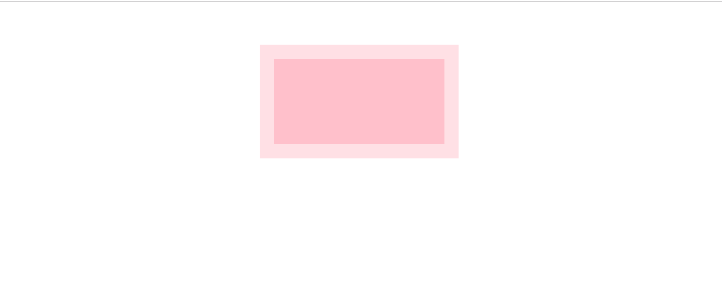
1.透明边框
<style>
    div{
      width: 120px;
      height: 60px;
      margin: 30px auto;
      background: pink;
      border: 10px solid hsla(0, 0%, 100%, .5)
    }
  </style>

<body>
  <main>
    <div></div>
  </main>
</body>
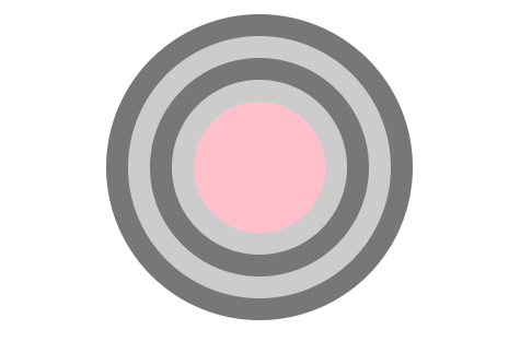
2.css多重边框
<style>
    div{
      width: 60px;
      height: 60px;
      margin: 50px auto;
      background: pink;
      border-radius: 50%;
      box-shadow: 0 0 0 10px #ccc,0 0 0 20px #777,
                  0 0 0 30px #ccc,0 0 0 40px #777;
    }
  </style>

<body>
  <main>
    <div></div>
  </main>
</body>
<style>
    div{
      width: 120px;
      height: 60px;
      margin: 50px auto;
      background: pink;
      border: 10px solid #ccc;
      outline: 10px solid #ccc;
      outline-offset: -30px;
    }
  </style>

<body>
  <main>
    <div></div>
  </main>
</body

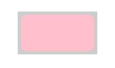
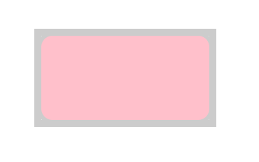
3.css内圆角
<style>
    div{
      width: 120px;
      height: 60px;
      margin: 50px auto;
      background: pink;
      border: 5px solid #cccccc;
      border-radius: 15px;
      outline: 5px solid #ccc;
      outline-offset: -5px;
    }
  </style>
<body>
  <main>
    <div></div>
  </main>
</body>
<style>
    div{
      width: 120px;
      height: 60px;
      margin: 50px auto;
      background: pink;
      border-radius: 8px;
      outline: 5px solid #ccc;
      box-shadow: 0 0 0 3px #ccc;
    }
  </style>
<body>
  <main>
    <div></div>
  </main>
</body>
4.滚动的进度条
<style>
    main{
      width: 800px;
      height: 60px;
      margin: 50px auto;
    }
    .progress-bar{
      width: 100%;
      height: 12px;
      border-radius: 6px;
      overflow: hidden;
      position: relative;
    }
    .progress-enter{
      height: inherit;
      background:pink;
      opacity: .5;
    }
    .progress-bg{
      width: 60%;
      height: inherit;
      border-radius: 6px;
      background: repeating-linear-gradient(-45deg,#d9cfbb 25%,#C3B393 0, #C3B393 50%,
                                          #D9CFBB 0, #D9CFBB 75%, #C3B393 0);
                                          /* 背景斑马条纹 */
      background-size: 16px 16px;
      animation: panoramic 20s linear infinite;
      /* animation 参数依次是 动画名称,一个动画周期持续事件 ,infinite代表循环播放 linear直线*/
    }
    @keyframes panoramic {
      to{
        background-position: 200% 0;
      }
    }
  </style>
<body>
  <main>
    <div class="progress-bar">
      <div class="progress-enter">
        <div class="progress-bg"></div>
      </div>
    </div>
  </main>
</body>

会动的

5.一像素横线 主要是手机端问题,有时候1px不是1px
使用box-show 配合transform: scale(.5) translateZ(0)
<style>
    main{
      width: 800px;
      height: 60px;
      margin: 50px auto;
      display: flex;
    }
    span{
      width: 100%;
      position: relative;
    }
    span::after{
      content: '';
      width: 100%;
      position: absolute;
      box-shadow: 0 0 0 1px #b4a078;
      transform-origin: 0 bottom;
      transform: scale(.5) translateZ(0);
    }
    @media (min-resolution: 2dppx){
      span::after{
        box-shadow: 0 0 0 .5px #b4a078;
      }
    }
    @media (min-resolution: 3dppx){
      span::after{
        box-shadow: 0 0 0 .3333px #b4a078;
      }
    }
  </style>

<body>
  <main>
    <span>

    </span>
  </main>
</body>
参考地址 https://lhammer.cn/You-need-to-know-css/#/translucent-borders

 浙公网安备 33010602011771号