echarts折线图柱状图的坐标轴的颜色及样式的设置
基本用法请查看echarts官网。
一、图例legend的设置。
1.字体和颜色的设置
textStyle:{
                fontSize:15,
                color:'#fff'
            }
2.样式的设置


legend: {
           data:systemName,
           itemWidth:40,
           itemHeight:20,
           textStyle:{
               fontSize:15,
               color:'#fff'
           }
       }
可以根据需求自己设置。
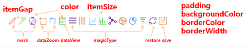
二、工具箱toolbox的设置
三、tooltip悬浮提示框
{
    trigger: 'axis',
   axisPointer: { // 坐标轴指示器,坐标轴触发有效
   type: 'line', // 默认为直线,可选为:'line' | 'shadow'
   lineStyle: {
     color: 'rgb(248,175,18)' // 线的颜色
   }
  },
   textStyle:{
      color:'#fff'
   },
   formatter: function (params) {  // 自定义显示
       var value = params.name + ': ' + params.value;
       return value
    }
}
三、x轴坐标xAxis的字体颜色大小,坐标线颜色,以及网格线的设置
xAxis : [
            {
                type: 'category',
          name: '分钟',
         nameGap: 4, // 坐标轴名称与轴线之间的距离
                boundaryGap: false,
                data: time,
                splitLine:{show: false},//去除网格线
                splitArea : {show : true},//保留网格区域
                axisTick: {
                axisTick: {
                    show: false, //隐藏刻度线
                 },
                axisLine: {
                    lineStyle: {
                        type: 'solid',
                        color: '#fff',//坐标线的颜色
                        width:'2'//坐标线的宽度
                    }
                },
                axisLabel: {
                    textStyle: {
              show:true,//不显示坐标轴的数字
                        color: '#fff',//坐标值得具体的颜色
               formatter:function(value){
               if (value < 0) { //横坐标的负半轴的  "坐标轴" 上显示是正数
                return -value;
              }else {
                return value;
             }
                    }
                }
            }
        ]
四、yAsix的设置相同
yAxis : [
           {
               type : 'value',
               splitLine:{show: false},//去除网格线
               splitArea : {show : true},//保留网格区域
               axisLine: {
                   lineStyle: {
                       type: 'solid',
                       color:'#fff',
                       width:'2'
                   }
               },
               axisLabel: {
                   textStyle: {
                       color: '#fff'
                   }
               }
           }
       ]
五、series的设置
series: [
            {
                name: '支出',
                type: 'bar',
                stack: '总量',
                label: {
                    normal: {
                        show: true,
                        /*
                        *处理横坐标负半轴这边的  "柱状"  显示的数
                        *后台传过来是负数,显示时是正数
                          */
                        formatter: function (value) {
                            if(value.data < 0){
                                return -value.data;
                            }
                        },
                    }
                },
                data: [-120, -132, -101, -134, -190, -230, -210]
            },
            {
                name: '收入',
                type: 'bar',
                stack: '总量',
                label: {
                    show: true
                },
                data: [200, 170, 240, 244, 200, 220, 210]
            }
        ]
原文链接:https://www.cnblogs.com/my-freedom/p/6699271.html

 浙公网安备 33010602011771号