数据分析 Matplotlib 之线形图
Matplotlib
我们学习完Python中用于数据处理的Numpy和Pandas之后, 我们需要再学习一些关于数据可视化的库--matplotlib.
在数据分析工作中, 人们往往对数据可视化这一步不够重视, 实际上它非常重要, 因为错误或不充分的数据表示方法可能会毁掉原本出色的数据分析工作.我们下面将会学习matplotlib库各方面的知识
4.1 概述
matplotlib库不是一个单独的应用,而是Python语言的一个库. 专门用于开发2D图表. 它具有以下优点:
matplotlib库不是一个单独的应用,而是Python语言的一个库. 专门用于开发2D图表. 它具有以下优点:
- 使用起来极其简单.
- 以渐进、交互式方式实现数据可视化.
- 对图像元素控制能力更强.
- 可输出PNG、PDF等多种格式.
Ubuntu和Mac上直接通过命令安装:
pip install matplotlib
线性图和案例
from pandas import DataFrame,Series
import pandas as pd
import numpy as np
import matplotlib.pyplot as plt

x = np.arange(1, 11)
y = np.random.randint(1, 10, 10)

# 调用绘制线性图函数plot()
plt.plot(x, y)
# 调用show方法显式
plt.show()

线条和标记节点样式: 标记字符:标记线条中的点
- 线条颜色,color='g'
- 线条风格,linestyle='--'
- 线条粗细,linewidth=5.0
- 标记风格,marker='o'
- 标记颜色,markerfacecolor='b'
- 标记尺寸,markersize=20
- 透明度,alpha=0.5
- 线条和标记节点格式字符 如果不设置颜色,系统默认会取一个不同颜色来区别线条.
| 颜色字符(color) | 风格(linestyle) | 标记字符(mark) |
|---|---|---|
| r 红色 | - 实线 | o实心圈标记 |
| g 绿色 | -- 虚线,破折线 | . 点标记 |
| b 蓝色 | -. 点划线 | , 像素标记,极小的点 |
| w 白色 | : 点虚线,虚线 | v 倒三角标记 |
| c 青色 | '' 留空或空格,无线条 | ^ 上三角标记 |
| m 洋红 | > 右三角标记 | |
| y 黄色 | < 左三角标记 | |
| k 黑色 | * 星形标记 | |
| #00ff00 16进制 | + 十字标记 |
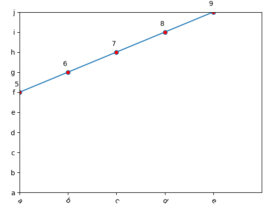
设置 x, y 值从什么时候开始到什么值结束,自定义x和y显示的值
from pandas import DataFrame,Series
import pandas as pd
import numpy as np
import matplotlib.pyplot as plt


plt.plot(np.arange(5),
         np.arange(5,10),
         marker='o',
         markersize=6,
         markerfacecolor='r',
         # linestyle='-.',
         # linewidth=5,
         # alpha=0.8
        )
# 设置 x, y 值从什么时候开始到什么值结束
plt.xlim(0, 5)
plt.ylim(0, 9)

plt.xticks([0, 1, 2, 3, 4], ['a', 'b', 'c', 'd', 'e'], rotation=-40)
plt.yticks([0, 1, 2, 3, 4, 5, 6, 7, 8, 9], list('abcdefghij'))

plt.show()

通过 plt.text 函数增加文本信息(根据坐标来设置文本位置)
from pandas import DataFrame,Series
import pandas as pd
import numpy as np
import matplotlib.pyplot as plt

x = np.arange(5)
y = np.arange(5,10)
plt.plot(x,
         y,
         marker='o',
         markersize=6,
         markerfacecolor='r',
         # linestyle='-.',
         # linewidth=5,
         # alpha=0.8
        )
# 设置 x, y 值从什么时候开始到什么值结束
plt.xlim(0, 5)
plt.ylim(0, 9)

plt.xticks([0, 1, 2, 3, 4], ['a', 'b', 'c', 'd', 'e'], rotation=-40)
plt.yticks([0, 1, 2, 3, 4, 5, 6, 7, 8, 9], list('abcdefghij'))

for a, b in zip(x, y):
    plt.text(a-0.1, b+0.3, str(b))

plt.show()
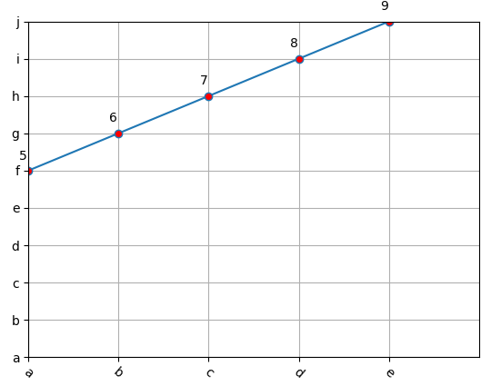
增加网格 通过设置 plt.grid(True)
from pandas import DataFrame,Series
import pandas as pd
import numpy as np
import matplotlib.pyplot as plt

x = np.arange(5)
y = np.arange(5,10)
plt.plot(x,
         y,
         marker='o',
         markersize=6,
         markerfacecolor='r',
         # linestyle='-.',
         # linewidth=5,
         # alpha=0.8
        )
# 设置 x, y 值从什么时候开始到什么值结束
plt.xlim(0, 5)
plt.ylim(0, 9)

plt.xticks([0, 1, 2, 3, 4], ['a', 'b', 'c', 'd', 'e'], rotation=-40)
plt.yticks([0, 1, 2, 3, 4, 5, 6, 7, 8, 9], list('abcdefghij'))

for a, b in zip(x, y):
    plt.text(a-0.1, b+0.3, str(b))
# 增加网格
plt.grid(True)
plt.show()
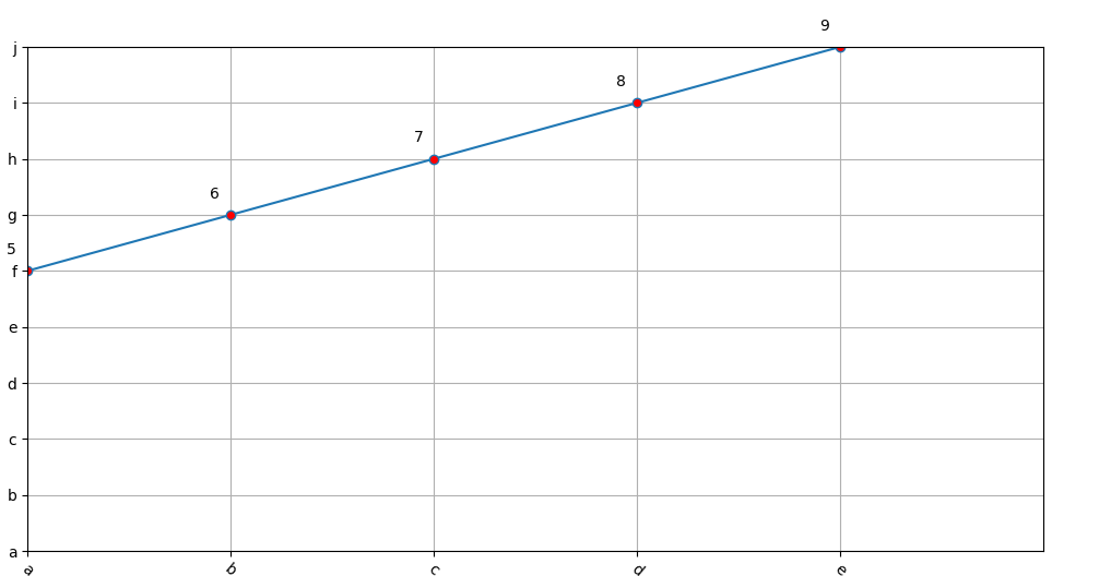
设置图形显示的尺寸 plt.figure(figsize=(12, 6))


from pandas import DataFrame,Series
import pandas as pd
import numpy as np
import matplotlib.pyplot as plt

x = np.arange(5)
y = np.arange(5,10)
plt.figure(figsize=(12, 6))
plt.plot(x,
         y,
         marker='o',
         markersize=6,
         markerfacecolor='r',
         # linestyle='-.',
         # linewidth=5,
         # alpha=0.8
        )
# 设置 x, y 值从什么时候开始到什么值结束
plt.xlim(0, 5)
plt.ylim(0, 9)

plt.xticks([0, 1, 2, 3, 4], ['a', 'b', 'c', 'd', 'e'], rotation=-40)
plt.yticks([0, 1, 2, 3, 4, 5, 6, 7, 8, 9], list('abcdefghij'))

for a, b in zip(x, y):
    plt.text(a-0.1, b+0.3, str(b))
# 增加网格
plt.grid(True)
plt.show()
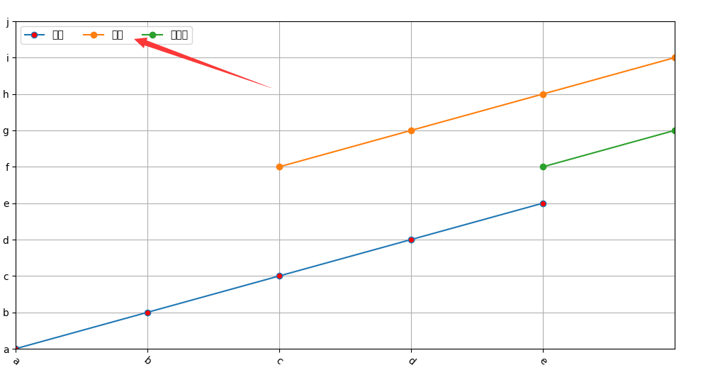
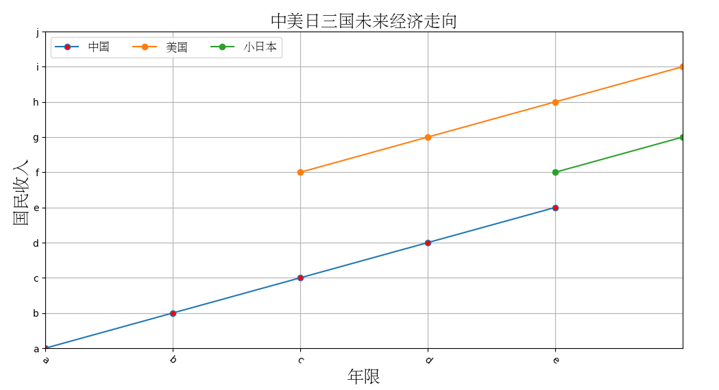
增加图例 plt.legend
from pandas import DataFrame,Series
import pandas as pd
import numpy as np
import matplotlib.pyplot as plt

x = np.arange(5)
y = np.arange(5)

# 设置图片大小
plt.figure(figsize=(12, 6))

line1, = plt.plot(x,
         y,
         marker='o',
         markersize=6,
         markerfacecolor='r',
         # linestyle='-.',
         # linewidth=5,
         # alpha=0.8
        )

line2, = plt.plot([2, 3, 4, 5, 6], [5, 6, 7, 8, 9], marker='o')
line3, = plt.plot([4, 5, 6, 7], [5, 6, 7, 8], marker='o')

plt.xlim(0, 5)
plt.ylim(0, 9)

plt.xticks([0, 1, 2, 3, 4], ['a', 'b', 'c', 'd', 'e'], rotation=-40)
plt.yticks([0, 1, 2, 3, 4, 5, 6, 7, 8, 9], list('abcdefghij'))

# 增加图例
plt.legend([line1, line2, line3], ['中国', '美国', '小日本'], loc=2, ncol=3)

# 增加网格
plt.grid(True)
plt.show()
显示标题和引入字体,显示 lable
from pandas import DataFrame,Series
import pandas as pd
import numpy as np
import matplotlib.pyplot as plt
from matplotlib.font_manager import FontProperties

x = np.arange(5)
y = np.arange(5)

# 设置图片大小
plt.figure(figsize=(12, 6))

line1, = plt.plot(x,
         y,
         marker='o',
         markersize=6,
         markerfacecolor='r',
         # linestyle='-.',
         # linewidth=5,
         # alpha=0.8
        )

line2, = plt.plot([2, 3, 4, 5, 6], [5, 6, 7, 8, 9], marker='o')
line3, = plt.plot([4, 5, 6, 7], [5, 6, 7, 8], marker='o')

# 加载字体
font = FontProperties(fname='C:\\Windows\\Fonts\\STSONG.TTF', size=18)
font2 = FontProperties(fname='C:\\Windows\\Fonts\\STSONG.TTF', size=12)

plt.xlim(0, 5)
plt.ylim(0, 9)

# rotation 斜体显示
plt.xticks([0, 1, 2, 3, 4], ['a', 'b', 'c', 'd', 'e'], rotation=-40)
plt.yticks([0, 1, 2, 3, 4, 5, 6, 7, 8, 9], list('abcdefghij'))

# 增加图例
plt.legend([line1, line2, line3], ['中国', '美国', '小日本'], loc=2, ncol=3, prop=font2)

# 显示标题
plt.title('中美日三国未来经济走向', fontproperties=font)
plt.xlabel('年限', fontproperties=font)
plt.ylabel('国民收入', fontproperties=font)


# 增加网格
plt.grid(True)
plt.show()
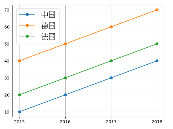
将DataFrame绘制线形图
from pandas import DataFrame,Series
import pandas as pd
import numpy as np
import matplotlib.pyplot as plt
from matplotlib.font_manager import FontProperties
# 加载字体
font = FontProperties(fname='C:\\Windows\\Fonts\\STSONG.TTF', size=18)

data_frame1 = pd.DataFrame({
    '中国': {2015: 10, 2016: 20, 2017: 30, 2018: 40},
    '法国': {2015: 20, 2016: 30, 2017: 40, 2018: 50},
    '德国': {2015: 40, 2016: 50, 2017: 60, 2018: 70},
})

plt.plot(data_frame1, marker='o')

# 设置图例
plt.legend(data_frame1, prop=font)
plt.grid(True)

plt.xticks([x for x in range(2015, 2019)], [x for x in range(2015, 2019)])
plt.show()
# 增加网格
plt.grid(True)
plt.show()
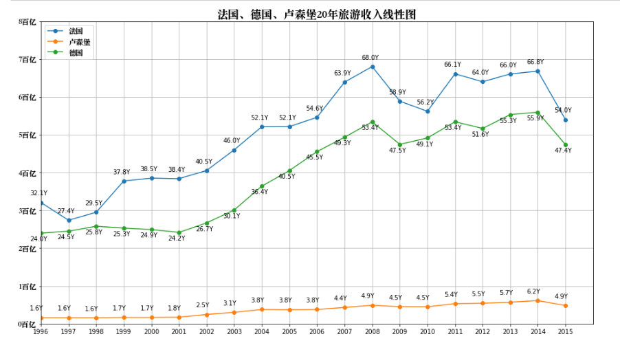
线形图案例
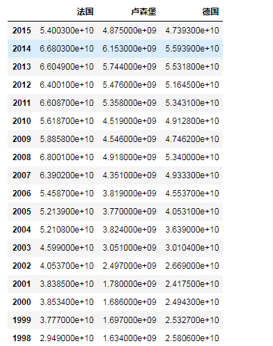
数据来源: http://data.stats.gov.cn/easyquery.htm?cn=G0104 数据共20行51列. 欧洲51国家从1997年-2015年旅游收入数据.
完成任务:
- 输出德国、卢森堡、法国20年旅游收入线性图.
- 计算欧洲20年旅游收入总和,并绘制线性图.
import numpy as np
import matplotlib.pyplot as plt
import pandas as pd
from pandas import Series, DataFrame
from matplotlib.font_manager import FontProperties

# 加载数据
data = pd.read_csv('欧洲国家20年旅游收入数据-utf8.csv', skiprows=3, skipfooter=2, engine='python')
# 删除数据为NaN的列
data.dropna(axis=1, how='all', inplace=True)
# 替换NaN值
data.fillna(0, inplace=True)
data

data.index = [x for x in range(1996, 2016)][::-1]
data
# 设置图大小
plt.figure(figsize=(16, 9))
# 绘制线性图
plt.plot(data, marker='o')
# 增加网格
plt.grid(True)
# 增加标题
# 加载字体
font = FontProperties(fname='/Library/Fonts/Songti.ttc', size=18)
font2 = FontProperties(fname='/Library/Fonts/Songti.ttc', size=12)
plt.title('法国、德国、卢森堡20年旅游收入线性图', fontproperties=font)

plt.xlim(1996, 2016)
plt.ylim(0, 8*10**10)
plt.xticks([x for x in range(1996, 2016)], [x for x in range(1996, 2016)])
plt.yticks([x*10**10 for x in range(9)], [str(x)+'百亿' for x in range(9)], fontproperties=font2)

# 增加图例
plt.legend(data, prop=font2, loc=2)
# 显示数字
for a,b in zip(data.index, data.values):
    plt.text(a-0.4, b[0]+2*10**9, '%1.1fY' % (b[0]/(10**9)))
    plt.text(a-0.4, b[1]+2*10**9, '%1.1fY' % (b[1]/(10**9)))
    plt.text(a-0.4, b[2]-2*10**9, '%1.1fY' % (b[2]/(10**9)))

plt.show()

 浙公网安备 33010602011771号