
关于font-size
看到一篇文章想法不错,记录下来。原文地址https://css-tricks.com/rems-ems/
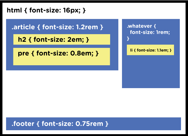
rem(root em),也是相对长度单位,与em不同的是以根元素的font-size为基准,因此避免了em的层叠效果带来的麻烦。于是很多人开始使用rem布局。
html { font-size: 16px }
.a { font-size: 1rem }
.b { font-size: 2rem }
.c { font-size: 3rem }
理想中,只需调整html里的font-size值就可以搞定页面的缩放。事实上效果并不理想,有的部分会过于巨大,而有的字迹会小到难以辨认。
于是产生了这个想法:px at the Root, rem for Components, em for actual elements.
改成html{ font-size: 100% } 会好一点

 浙公网安备 33010602011771号