【动画进阶】单标签下多色块随机文字随机颜色动画
我的小册 《CSS 技术揭秘与实战通关》上线了,想了解更多有趣、进阶、系统化的 CSS 内容,可以猛击 - LINK。
在 CSS 还原拉斯维加斯球数字动画 - 掘金 一文中,我们利用纯 CSS,实现了一个非常 Amazing 的动画效果:
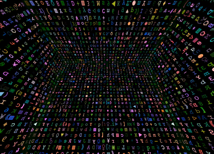
其中一个核心点就是,我们利用了如下的代码,在一个 DIV 平面内,实现了单个平面下的随机文字随机颜色效果。
效果如下:
其中的 HTML 代码大致如下:
<div class="g-container">
  <div></div>
  // ... 一个 32 个子 div
  <div></div>
</div>
这里为了实现上述效果,其实是用了 32 列,每列是一个 DIV。
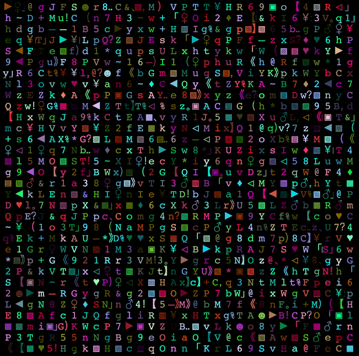
emmm,对于追求极致的我们,32 个 DIV 确实不太优雅了。那么,CSS 有没有什么方式,能够单个标签实现多列多格子,每个格子颜色不一致呢?像是这样:

答案当然是可以。本文,我们就将一起来探寻,使用 CSS 如何实现单标签下多色块,及单标签下随机文字随机颜色动画效果。
多重背景的威力
思考一下,单个 DIV,我们如何能够实现下述效果呢,譬如一个 DIV 内,有 36 种不同的颜色:

这里的核心,其实就是需要借助多重背景。
正常而言,我们的 DIV 只能有一个 background,设置一种颜色,像是这样:
<div></div>
div {
    width: 300px;
    height: 300px;
    background: #000;
}
效果如下:
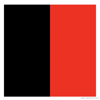
但是,合理利用渐变语法的规则,利用多重渐变,我们就可以实现多重背景,我们改造一些上述代码:
div {
    position: relative;
    margin: auto;
    width: 300px;
    height: 300px;
    background-image:
        linear-gradient(90deg, #000, #000),
        linear-gradient(90deg, #f00, #f00);
    background-size: 50% 100%, 50% 100%;
    background-position: 0 0, 150px 0;
    background-repeat: no-repeat;
}
利用多重背景的能力,我们就得到了黑色和红色两个色块:
我们还可以继续拆分,1 拆 4:
div {
    position: relative;
    margin: auto;
    width: 300px;
    height: 300px;
    background-image:
        linear-gradient(90deg, #000, #000),
        linear-gradient(90deg, #0f0, #0f0),
        linear-gradient(90deg, #00f, #00f),
        linear-gradient(90deg, #f00, #f00);
    background-size: 50% 50%, 50% 50%, 50% 50%, 50% 50%;
    background-position: 0 0, 150px 0, 0 150px, 150px 150px;
    background-repeat: no-repeat;
}
效果如下:

它其实是这么个意思,看下面这张图就能很好的理解:
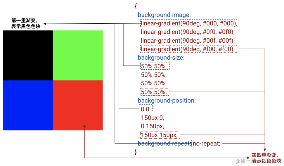
这里我们只标识出了黑色色块和红色色块,另外两个色块的原理也是一样的。
理解了这一点之后,我们要实现如下这个图形就非常轻松了:
当然,这里有个问题,我们手动去写那么多重渐变的代码,工作量是非常之大的,因此,我们可以尝试封装一个 SCSS 函数或者 mixin 帮助我们减轻代码量。
@use "sass:string";


@function randomNum($max, $min: 0, $u: 1) {
    @return ($min + random($max)) * $u;
}

@mixin randomLinear($rows: 6, $cols: 8) {
  $bg: null;
  $pos: null;

  $px: 100% / ($cols - 1);
  $py: 100% / ($rows - 1);

  @for $i from 0 through $rows - 1 {
    @for $j from 0 through $cols - 1 {
      @if ($bg) {
        $bg: $bg + string.unquote(",");
        $pos: $pos + string.unquote(",");
      }
      $color: randomColor();
      $bg: $bg + linear-gradient(to right, $color, $color);
      $pos: $pos + string.unquote("#{$j * $px} #{$i * $py}");
    }
  }
  background: {
    image: $bg;
    size: (100% / $cols) (100% / $rows);
    repeat: no-repeat;
    position: $pos;
  }
}

@function randomColor() {
    @return rgb(randomNum(205, 50), randomNum(255), randomNum(255));
}

div {
    @include randomLinear(6, 6);
}
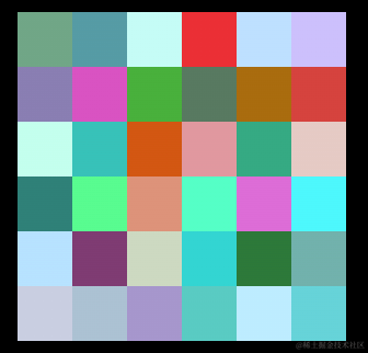
这里,我们借助 SCSS 封装了一个 randomLinear 的 mixin,它接收两个参数,分别表示行数和列数,基于上面的 background 拆分,实现了多重渐变,如此一来,我们就能在单个 DIV 下得到这样一个随机的多色块格子图:

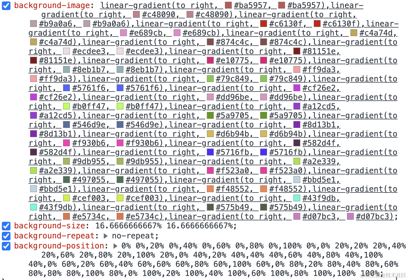
审查元素,SCSS 编译后的 CSS 代码其实就是这样的:
好,在此基础上要实现颜色的随机变化也非常简单,我们只需要配合 filter: hue-rotate() 变换即可。
代码如下:
div {
    @include randomLinear(6, 6);
    animation: colorChange 1s infinite steps(10);
}

@keyframes colorChange {
    100% {
        filter: hue-rotate(360deg);
    }
}
这里巧妙的利用了 steps(10),让整个图形在 1s 内进行 10 次 hue-rotate() 变化。
这里的核心点有两个:
- 利用
filter: hue-rotate(360deg)滤镜,能够实现颜色的切换 - 利用
steps(10)实现了逐帧动画而不是连续的补间动画
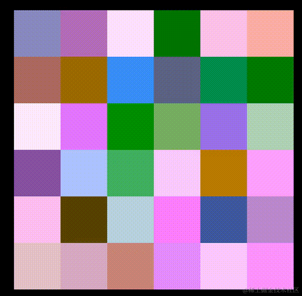
如此一来,我们就能得到如下效果,实现了单个标签内多个不同色块,并且可以实现动画变换:
结合 background-clip: text 实现文字效果
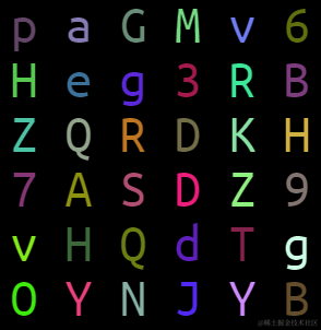
接下来,我们需要实现单个标签下的随机文字、随机颜色的动画效果。也就是下图右边的效果:
有了上面的铺垫,其实整个效果就剩下两步:
- 利用
background-clip: text实现从色块到文字的裁剪变化 - 借助 SCSS 函数及 CSS 变量,实现随机文字的变化
首先,与 CSS 还原拉斯维加斯球数字动画 - 掘金 一文中一样,借助 SCSS 函数,编写一个随机字符的函数,通过元素的伪元素 content 进行设置,并且,我们把背景色,也设置给元素的伪元素:
$str: 'QWERTYUIOPASDFGHJKLZXCVBNMabcdefghigklmnopqrstuvwxyz123456789';
$length: str-length($str);

@function randomChar() {
    $r: random($length);
    @return str-slice($str, $r, $r);
}

@function randomChars($number) {
    $value: '';

    @if $number > 0 {
        @for $i from 1 through $number {
            $value: $value + randomChar();
        }
    }
    @return $value;
}

div  {
    width: 300px;
    height: 300px;
    font-size: 50px;
    line-height: 50px;
    letter-spacing: 25px;
    word-wrap: break-word;
    font-family: monospace;

    &::before {
        content: randomChars(36);
        position: absolute;
        inset: 0;
        @include randomLinear(6, 6);
        color: transparent;
    }
}
这里,有几个细节点再简单讲解一下:
- 为了让每个字符对齐,我们使用了
font-family: monospace等宽字符,并且利用font-size和letter-spacing确保一行只能放下 6 个字符 - 利用
randomCharsSCSS 函数,随机从我们定义的$strSCSS 字符串变量中取 36 个随机字符 @include randomLinear(6, 6)就是上面铺垫的随机渐变背景
如此一来,我们就能得到这么一个效果:
此时,我们只需要再给元素的伪元素设置一个 background-clip: text 配合文字颜色 transparent,即可得到色块裁剪到只剩下文字部分的效果:
div  {
    // ...

    &::before {
        //...
        color: transparent;
        background-clip: text;
    }
}
效果如下:
好,那如何再让整个文字随机变换起来呢?我们只需提前生成多个不同的随机文字 content,然后进行动画切换即可,像是这样:
div  {
    // ...

    &::before {
        content: randomChars(36);
        --content1: "#{randomChars(36)}";
        --content2: "#{randomChars(36)}";
         --content3: "#{randomChars(36)}";
        --content4: "#{randomChars(36)}";
        --content5: "#{randomChars(36)}";
        --content6: "#{randomChars(36)}";
        --content7: "#{randomChars(36)}";
        --content8: "#{randomChars(36)}";
        --content9: "#{randomChars(36)}";
        color: transparent;
        background-clip: text;
        animation: contentChange 1.5s infinite linear;
    }
}
@keyframes contentChange {
    10% {
        content: var(--content1);
    }
    20% {
        content: var(--content2);
    }
    30% {
        content: var(--content3);
    }
    40% {
        content: var(--content4);
    }
    50% {
        content: var(--content5);
    }
    60% {
        content: var(--content6);
    }
    70% {
        content: var(--content7);
    }
    80% {
        content: var(--content8);
    }
    90% {
        content: var(--content9);
    }
}
这样,文字也能随机动起来了(当然,此处其实是伪随机):
最后,把上面的 hue-rotate 动画重新打开,就能让文字颜色也随机变换!
至此,完整的代码如下:
<div></div>
@use "sass:string";
@import url('https://fonts.googleapis.com/css2?family=Righteous&family=Ubuntu+Mono&display=swap');

$str: 'QWERTYUIOPASDFGHJKLZXCVBNMabcdefghigklmnopqrstuvwxyz123456789';
$length: str-length($str);

@function randomNum($max, $min: 0, $u: 1) {
    @return ($min + random($max)) * $u;
}

@mixin randomLinear($rows: 6, $cols: 8) {
  $bg: null;
  $pos: null;

  $px: 100% / ($cols - 1);
  $py: 100% / ($rows - 1);

  @for $i from 0 through $rows - 1 {
    @for $j from 0 through $cols - 1 {
      @if ($bg) {
        $bg: $bg + string.unquote(",");
        $pos: $pos + string.unquote(",");
      }
      $color: randomColor();
      $bg: $bg + linear-gradient(to right, $color, $color);
      $pos: $pos + string.unquote("#{$j * $px} #{$i * $py}");
    }
  }
  background: {
    image: $bg;
    size: (100% / $cols) (100% / $rows);
    repeat: no-repeat;
    position: $pos;
  }
}

@function randomColor() {
    @return rgb(randomNum(205, 50), randomNum(255), randomNum(255));
}

@function randomChar() {
    $r: random($length);
    @return str-slice($str, $r, $r);
}

@function randomChars($number) {
    $value: '';

    @if $number > 0 {
        @for $i from 1 through $number {
            $value: $value + randomChar();
        }
    }
    @return $value;
}

div {
    width: 300px;
    height: 300px;
    color: #fff;
    font-size: 50px;
    line-height: 50px;
    letter-spacing: 25px;
    word-wrap: break-word;
    animation: colorChange 1.5s infinite steps(10);

    &::before {
        --content1: "#{randomChars(36)}";
        --content2: "#{randomChars(36)}";
        --content3: "#{randomChars(36)}";
        --content4: "#{randomChars(36)}";
        --content5: "#{randomChars(36)}";
        --content6: "#{randomChars(36)}";
        --content7: "#{randomChars(36)}";
        --content8: "#{randomChars(36)}";
        --content9: "#{randomChars(36)}";
        content: randomChars(36);
        position: absolute;
        inset: 0;
        color: transparent;
        background-clip: text;
        animation: contentChange 1.5s infinite linear;
    }
}

@keyframes colorChange {
    100% {
        filter: hue-rotate(340deg);
    }
}
@keyframes contentChange {
    10% {
        content: var(--content1);
    }
    20% {
        content: var(--content2);
    }
    30% {
        content: var(--content3);
    }
    40% {
        content: var(--content4);
    }
    50% {
        content: var(--content5);
    }
    60% {
        content: var(--content6);
    }
    70% {
        content: var(--content7);
    }
    80% {
        content: var(--content8);
    }
    90% {
        content: var(--content9);
    }
}
效果如下:
完整的代码,你可以戳这里:CodePen Demo -- Single Div Random Text And Random Color
多色块的其他解决方案?
我们继续扩展延伸一下,本效果的核心还是如何在一个 DIV 下实现多种不同的颜色。
那么,除了上述的技巧,还有其他方式能够在一个 DIV 下实现多种不同颜色吗?
这里,我们还可以利用内联元素的 background 展示特性来实现。
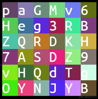
什么意思呢?其实 background 的展示,在 块级元素状态 和 内联元素状态 下的展示规则是不一样的。
表现为 display: inline 内联元素的 background 展现形式与 display: block 块级元素(或者 inline-block、flex、grid)不一致。
简单看个例子:
<p>Lorem .....</p><a>Lorem .....</a>
这里需要注意,<p> 元素是块级元素,而 <a> 是内联元素。
我们给它们统一添加上一个从绿色到蓝色的渐变背景色:
p, a {
  background: linear-gradient(90deg, blue, green);
}
看看效果:
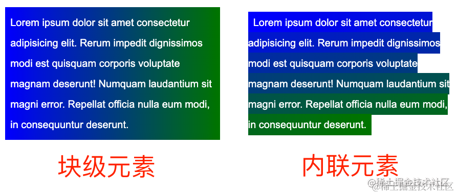
什么意思呢?区别很明显:
- 块级元素的背景整体是一个渐变整体
- 内联元素的背景效果是以行为单位进行串连的,每一行都是会有不一样的效果,每行连起来整体组成一个完整的背景效果
基于这一点,我们同样可以实现单个 DIV 下的多重背景。
举个例子:
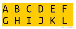
<div class="g-container">
    <span>ABCDEFGHIJKL</span>
</div>
div {
    width: 300px;
}
span{
    color: #000;
    font-size: 50px;
    line-height: 50px;
    letter-spacing: 25px;
    word-wrap: break-word;
    background: #fc0;
}
此时,我们只设置了一个背景 background: #fc0,效果如下:
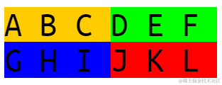
基于上面说的技巧,我们改造一下 background: #fc0,拆分成多段渐变背景:
span{
    //...
    background: linear-gradient(
        90deg,
        #fc0 0 25%,
        #0f0 0 50%,
        #00f 0 75%,
        #f00 0 100%
    );
}
这里,我们每隔 25%,设置了一段不同的颜色,如此一来,整个背景色就变成了 4 块:
基于这个技巧,我们同样可以封装一个 SCSS 函数,用于在单个 DIV 下生成多段色块。代码如下:
@use "sass:string";
@import url('https://fonts.googleapis.com/css2?family=Righteous&family=Ubuntu+Mono&display=swap');

$str: 'QWERTYUIOPASDFGHJKLZXCVBNMabcdefghigklmnopqrstuvwxyz123456789';
$length: str-length($str);


@function randomNum($max, $min: 0, $u: 1) {
    @return ($min + random($max)) * $u;
}
@function randomColor() {
    @return rgb(randomNum(205, 50), randomNum(255), randomNum(255));
}
@function randomLinear($count) {
    $value: '';

    @for $i from 0 through ($count - 1) {
        $j: $i - 1;
        $value: $value + randomColor() + string.unquote(" #{$j * 50}px #{$i * 50}px,");
    }

    @return linear-gradient(90deg, string.unquote(#{$value}) randomColor() 0 100%);
}

span {
    background: randomLinear(36, 50);
}
上面的代码,我们实现了一个 randomLinear($count, $width) 的 SCSS 函数,其中:
$count表示需要的色块个数$width表示每个色块的宽度
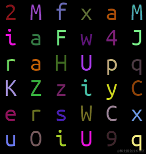
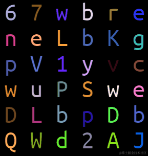
如此一来,在一个 300px x 300px 的内联元素内,我们同样可以实现多个不同的随机颜色。利用这个技巧,一样可以实现单个平面下的随机文字随机颜色效果:
剩余的技巧都是相同的,这里就不再赘述,此技巧的完整代码,你可以戳这里:CodePen Demo -- Single Div Random Text And Random Color
最后
本文到此结束,希望对你有帮助 😃
更多精彩 CSS 技术文章汇总在我的 Github -- iCSS ,持续更新,欢迎点个 star 订阅收藏。
如果还有什么疑问或者建议,可以多多交流,原创文章,文笔有限,才疏学浅,文中若有不正之处,万望告知。

 浙公网安备 33010602011771号