用CSS画英文字母
起因是在网上看到了有人用纯css画出了英文字母,感觉不难,了解过css3的话都会感觉思路比较直观
主要用到的css知识点:绝对定位,圆角属性以及元素的宽高均为零时边框的挤压性质
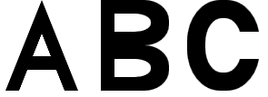
效果图
源代码
<!DOCTYPE html>
<html>
<head>
    <title>CSS-Letter</title>
    <meta charset="utf-8"/>
    <style type="text/css">
        *{
            margin:0px;
            padding:0px;
        }
        .letter{
            position:relative;
            width:80px;
            height:100px;
            float:left;
            margin-left:20px;
        }
        .A-widget-one{
            width:0px;
            height:0px;
            border-bottom:100px solid #000;
            border-left:40px solid transparent;
            border-right:40px solid transparent;
            position:absolute;
            left:0px;
            top:0px;
        }
        .A-widget-two{
            width:0px;
            height:0px;
            border-bottom:63px solid #FFF;
            border-left:25px solid transparent;
            border-right:25px solid transparent;
            position:absolute;
            left:15px;
            bottom:0px;
        }
        .A-widget-three{
            width:32px;
            height:15px;
            background-color:#000;
            position:absolute;
            left:24px;
            top:62px;
        }
        .B-widget-one{
            width:15px;
            height:100px;
            background-color:#000;
            position:absolute;
            left:5px;
            top:0px;
        }
        .B-widget-two,.B-widget-three{
            width:60px;
            height:50px;
            background-color:#000;
            border-top-right-radius:45%;
            border-bottom-right-radius:45%;
            position:absolute;
            left:20px;
            top:0px;
        }
        .B-widget-three{
            top:50px;
        }
        .B-widget-four,.B-widget-five{
            width:40px;
            height:20px;
            background-color:#FFF;
            border-top-right-radius:45%;
            border-bottom-right-radius:45%;
            position:absolute;
            left:20px;
            top:15px;
        }
        .B-widget-five{
            top:65px;
        }
        .C-widget-one{
            width:80px;
            height:100px;
            background-color:#000;
            border-radius:45%;
        }
        .C-widget-two{
            width:40px;
            height:60px;
            background-color:#FFF;
            border-radius:45%;
            position:absolute;
            left:20px;
            top:20px;
        }
        .C-widget-three{
            width:22px;
            height:30px;
            background-color:#FFF;
            position:absolute;
            right:0px;
            top:35px;
        }
    </style>
</head>
<body>
    <div class="letter">
        <div class="A-widget-one"></div>
        <div class="A-widget-two"></div>
        <div class="A-widget-three"></div>
    </div>
    <div class="letter">
        <div class="B-widget-one"></div>
        <div class="B-widget-two"></div>
        <div class="B-widget-three"></div>
        <div class="B-widget-four"></div>
        <div class="B-widget-five"></div>
    </div>
    <div class="letter">
        <div class="C-widget-one"></div>
        <div class="C-widget-two"></div>
        <div class="C-widget-three"></div>
    </div>
</body>
</html>
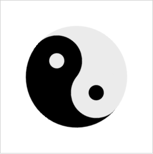
利用css的圆角属性和绝对定位可以做很多有意思的东西,例如下面就是一个用css画出来的太极图
代码
<!DOCTYPE html>
<html>
  <head>
    <title>css-taichi</title>
    <meta charset="utf-8"/>
    <style type="text/css">
      *{
        margin:0;
        padding:0;
      }
      .wrapper{
        width:300px;
        height:300px;
        margin:20px auto;
        border:1px solid #CDCDCD;
        position:relative;
      }
      .wrapper-circle{
        width:200px;
        height:200px;
        border-radius:50%;
        position:absolute;
        left:50px;
        top:50px;
        animation-name:rotary-taichi;
        animation-duration:3s;
        animation-iteration-count:infinite;
        animation-direction:alterlate;
      }
      .circle{
        width:100px;
        height:200px;
        position:absolute;
      }
      .left-circle{
        left:0;
        top:0;
        border-radius:200px 0 0 200px;
        background-color:#EBEBEB;
      }
      .right-circle{
        right:0;
        top:0;
        border-radius:0 200px 200px 0;
        background-color:#000;
      }
      .minor-circle{
        width:100px;
        height:100px;
        border-radius:50%;
        position:absolute;
        z-index:10;
      }
      .top-circle{
        right:-50px;
        top:0;
        background-color:#EBEBEB;
      }
      .bottom-circle{
        right:-50px;
        bottom:0;
        background-color:#000;
      }
      .tiny-circle{
        width:30px;
        height:30px;
        border-radius:50%;
        position:absolute;
        left:35px;
        top:35px;
        z-index:20;
      }
      .top-circle .tiny-circle{
        background-color:#000;
      }
      .bottom-circle .tiny-circle{
        background-color:#EBEBEB;
      }
      @keyframes rotary-taichi{
        transform-origin:50% 50%;
        from {transform:rotate(0deg);}
        to {transform:rotate(360deg);}
      }
    </style>
  </head>
<body>
  <div class="wrapper">
    <div class="wrapper-circle">
        <div class="left-circle circle">
          <div class="top-circle minor-circle">
            <div class="tiny-circle"></div>
          </div>
          <div class="bottom-circle minor-circle">
            <div class="tiny-circle"></div>
          </div>
        </div>
        <div class="right-circle circle">
        </div>
    </div>
  </div>
</body>
</html>

 浙公网安备 33010602011771号