Ant-Design-Vue中关于Table组件的使用
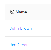
1. 如何自定义表格列头:
<a-table
        :columns="columns"
        :dataSource="dataSource">
        <span slot="customTitle"><a-icon type="smile-o"/>Name</span>
</a-table>
const columns = [
    {
      dataIndex: 'name',    // 自定义列表头,则不能设置title属性
      align: 'left',
      slots: { title: 'customTitle'}  // 在这里定义一个slots属性,并设置一个title属性
    }
]
页面将会渲染为如下:
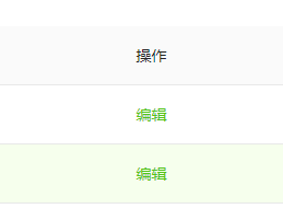
2.如何设置自定义单行样式
<a-table
        :columns="columns"
        :dataSource="dataSource">
        <span slot="action" slot-scope="record, index"> // 这里传入的值分别是:record:当前行的原始数据,index:当前行的索引
          <a @click="handleEdit(record.key)">编辑</a>
        </span>
</a-table>
const columns = [
    {
      title: '菜单名称'
      dataIndex: 'name',  // dataIndex的值对应的是,列数据在数据项中对应的 key
      key: 'name',     // 如果dataIndex属性值唯一,则可以不设置key属性
      align: 'left',
    },
    {
      title: '操作',
    key: 'action'
      dataIndex: 'action',
      width: '30%',
      scopedSlots: { customRender: 'action' },    //这一行自定义渲染这一列
      align: 'center'
    }
 ]
页面展示如下:
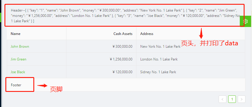
3.如何设置表头,页脚和边框线?
<template>
  <a-table :columns="columns" :dataSource="data" bordered>  // 这里添加bordered属性,就可以添加上边框线
    <template slot="name" slot-scope="text">
      <a href="javascript:;">{{text}}</a>
    </template>
    <template slot="title" slot-scope="currentPageData">  // slot="title"就可以设置页头了,'title'改为其他值则没有页头
      Header--{{currentPageData}}    // 这里打印一下currentData,看下是啥值
    </template>
    <template slot="footer"> Footer </template>  // 跟上同理
 </a-table>
</template>
const columns = [  // columns中并没有定义页头和页脚的相关代码
    {
      title: 'Name',
      dataIndex: 'name',
      scopedSlots: { customRender: 'name' },
    },
    {
      title: 'Cash Assets',
      className: 'column-money',
      dataIndex: 'money',
    },
    {
      title: 'Address',
      dataIndex: 'address',
    },
  ];
页面显示就结果如下:
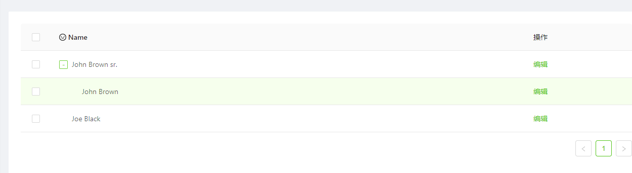
4.表格如何树形展示数据:
<a-table
    :columns="columns"
    :dataSource="dataSource"
    childrenColumnName="qq"  // 这里可以选择子节点的属性名,一般都为'children',这里我设置为'qq',试下效果
    :rowSelection="rowSelection">  // rowSelection是列表可选择的时候的配置项,后面介绍,带有此选项表格前就会出现可选择的checkbox
    <span slot="customTitle"><a-icon type="smile-o" /> Name</span>
    <span slot="action" slot-scope="text, record, index">
       <a @click="handleEdit(record.key)">编辑</a>
    </span>
</a-table>
const columns = [
    {
      dataIndex: 'name',
      key: 'name',
      align: 'left',
      slots: { title: 'customTitle'}
    },
    {
      title: '操作',
      dataIndex: 'action',
      width: '30%',
      scopedSlots: { customRender: 'action' },
      align: 'center'
    }
  ]
  const dataSource = [
    {
      key: 1,
      name: 'John Brown sr.',
      age: 60,
      address: 'New York No. 1 Lake Park',
      qq: [            //这里我把子节点的key,改为qq了
        {
          key: 11,
          name: 'John Brown',
          age: 42,
          address: 'New York No. 2 Lake Park'
        }
      ]
    },
    {
      key: 2,
      name: 'Joe Black',
      age: 32,
      address: 'Sidney No. 1 Lake Park'
    }
  ]
页面显示效果如下:(显示正确)
5.自定义筛选菜单:(下面的代码都太多了,有必要在点开看吧,有详细的注释)


<template>
  <a-table :dataSource="data" :columns="columns">
    <!--下面这整个div都是设置每一列搜索的样式图标-->
    <div
      slot="filterDropdown"
      slot-scope="{ setSelectedKeys, selectedKeys, confirm, clearFilters, column }"
      style="padding: 8px"
    >
      <!-- 这里的slot是filter的插槽,column是当前列的配置,slot-scope直接照抄即可 -->
      <a-input
        v-ant-ref="c => searchInput = c"
        :placeholder="`Search ${column.dataIndex}`"
        :value="selectedKeys[0]"
        @change="e => setSelectedKeys(e.target.value ? [e.target.value] : [])"
        @pressEnter="() => handleSearch(selectedKeys, confirm)"
        style="width: 188px; margin-bottom: 8px; display: block;"
      />
      <!-- v-ant-ref是固定写法,将表单输入的值传递给searchInput,selectedKeys是数组,value每次绑定的都是他的第一个值 -->
      <!--@change和@pressEnter是Input组件的自带方法,请查看Input组件内容-->
      <!--@change方法是实时改变要查询的selectedKeys的值,@pressEnter是按下enter直接查询的方法-->
      <a-button
        type="primary"
        @click="() => handleSearch(selectedKeys, confirm)"
        icon="search"
        size="small"
        style="width: 90px; margin-right: 8px"
      >Search
      </a-button>
      <a-button @click="() => handleReset(clearFilters)" size="small" style="width: 90px"
      >Reset
      </a-button>
    </div>
<!--这里专门配置搜索按钮的样式,可以修改type的值为你想要的图标,也可以修改style,改变搜索前和搜索后的图标样式-->
    <a-icon
      slot="filterIcon"
      slot-scope="filtered"
      type="search"
      :style="{ color: filtered ? 'red' : undefined }"
    />
    <!--修改匹配到的数据样式-->
    <template slot="customRender" slot-scope="text">
      <span v-if="searchText">
        <template
          v-for="(fragment, i) in text.toString().split(new RegExp(`(?<=${searchText})|(?=${searchText})`, 'i'))"
        >
          <mark
            v-if="fragment.toLowerCase() === searchText.toLowerCase()"
            :key="i"
            class="highlight"
          >{{fragment}}</mark>
          <template v-else>{{fragment}}</template>
        </template>
      </span>
      <template v-else>{{text}}</template>
    </template>
  </a-table>
</template>

<script>
  const data = []

  export default {
    data () {
      return {
        data,
        searchText: '',
        searchInput: null,
        columns: [
          {
            title: 'Name',
            dataIndex: 'name',
            key: 'name',
            // 这里的三个插槽,分别是搜索按钮插槽,定义搜索按钮样式插槽,和搜索之后的数据插槽
            scopedSlots: {
              filterDropdown: 'filterDropdown',
              filterIcon: 'filterIcon',
              customRender: 'customRender'
            },
            //这里才是确定筛选的运行函数
            onFilter: (value, record) => record.name.toString().toLowerCase().includes(value.toLowerCase()),
            //自定义筛选菜单可见变化时调用
            onFilterDropdownVisibleChange: visible => {
              if (visible) {
                setTimeout(() => {
                  this.searchInput.focus()
                }, 0)
              }
            }
          },{......}//省略了部分配置
     ]
      }
    },
    methods: {
      handleSearch (selectedKeys, confirm) {
        confirm();  // confirm会关闭搜索框
        console.log(selectedKeys) // 会打印出你在搜索框中输入的值
        this.searchText = selectedKeys[0]
      },

      handleReset (clearFilters) {
        clearFilters();  // => 这里面也有调用confirm方法关闭对话框
        this.searchText = ''
      }
    }
  }
</script>
6.如何自定义可以编辑单行的表格?
<template>
  <a-table :columns="columns" :dataSource="data" bordered>
    <!--用v-for遍历模板,直接渲染三个插槽-->
    <template
      v-for="col in ['name', 'age', 'address']"
      :slot="col"
      slot-scope="text, record, index"
    >
      <div :key="col">
        <!--如果record.editable为true,则展示input框,可以修改数据,为false则直接展示数据-->
        <a-input
          v-if="record.editable"
          style="margin: -5px 0"
          :value="text"
          @change="e => handleChange(e.target.value, record.key, col)"
        />
        <template v-else>{{text}}</template>
      </div>
    </template>
    <!--操作栏插槽-->
    <template slot="operation" slot-scope="text, record, index">
      <div class="editable-row-operations">
        <!--如果当前行的editable为true说明正在操作中,显示save和cancel按钮,否则显示edit按钮-->
        <span v-if="record.editable">
          <a @click="() => save(record.key)">Save</a>
          <a-popconfirm title="Sure to cancel?" @confirm="() => cancel(record.key)">
            <a>Cancel</a>
          </a-popconfirm>
        </span>
        <span v-else>
          <a @click="() => edit(record.key)">Edit</a>
        </span>
      </div>
    </template>
  </a-table>
</template>
<script>
  const columns = [
    {title: 'name',dataIndex: 'name',width: '25%',scopedSlots: { customRender: 'name' }},
    {title: 'age',dataIndex: 'age',width: '15%',scopedSlots: { customRender: 'age' }},
    {title: 'address',dataIndex: 'address',width: '40%',scopedSlots: { customRender: 'address' }},
    {title: 'operation',dataIndex: 'operation',scopedSlots: { customRender: 'operation' }}
  ];

  const data = [];
  for (let i = 0; i < 100; i++) {
    data.push({
      key: i.toString(),
      name: `Edrward ${i}`,
      age: 32,
      address: `London Park no. ${i}`,
    });
  }
  export default {
    data() {
      this.cacheData = data.map(item => ({ ...item })); //缓存所有数据
      return {
        data,
        columns,
      };
    },
    methods: {
      /**
       * input的change的回调方法
       * @param value input框中你输入的值
       * @param key   当前行对应的key值
       * @param column  当前列的dataIndex对应的名称,有['name','age','address']
       */
      handleChange(value, key, column) {
        const newData = [...this.data];
        const target = newData.filter(item => key === item.key)[0];
        console.log(column);
        if (target) {
          target[column] = value;
          this.data = newData;
        }
      },
      /**
       * 点击操作栏中修改的回调方法
       * @param key 当前行对应的key值
       */
      edit(key) {
        const newData = [...this.data];// 直接获取了所有数据
        const target = newData.filter(item => key === item.key)[0];   // 在筛选出key值相同的那一条数据
        if (target) { // 如果数据存在,则给这条数据新增一个属性为editable属性为true => 代表为正在更改中
          target.editable = true;
          this.data = newData;
        }
      },
      /**
       * 修改完成之后点击保存的回调方法
       * @param key 当前行对应的key值
       */
      save(key) {
        const newData = [...this.data];
        const newCacheData = [...this.cacheData];
        const target = newData.filter(item => key === item.key)[0];
        const targetCache = newCacheData.filter(item => key === item.key)[0];
        if (target && targetCache) {
          delete target.editable; // 删除editable属性
          this.data = newData;
          Object.assign(
            targetCache,
            target
          );
          this.cacheData = newCacheData;
        }
      },
      /**
       * 点击取消编辑的回调方法
       * @param key 当前行对应的key值
       */
      cancel(key) {
        const newData = [...this.data];
        const target = newData.filter(item => key === item.key)[0];
        if (target) { // 将缓存的值重新复制给原先的数据,并删除editable属性
          Object.assign(target, this.cacheData.filter(item => key === item.key)[0]);
          delete target.editable;
          this.data = newData;
        }
      },
    },
  };
</script>
<style scoped>
  .editable-row-operations a {
    margin-right: 8px;
  }
</style>
7.如何定义可展开的table?
<template>
  <a-table :columns="columns" :dataSource="data">
    <a slot="action" slot-scope="text" href="javascript:;">Delete</a>
<!--    <p slot="expandedRowRender" slot-scope="record" style="margin: 0">{{record.description}}</p>-->
    <p slot="expandedRowRender" slot-scope="record,index" style="margin: 0">{{index}}</p>
    <p slot="expandedRowRender" slot-scope="record, index, indent, expanded">{{record}}--{{index}}--{{indent}}--{{expanded}}</p>
    <!--slot="expandedRowRender" 为Table的官方api,可传入的值如上所示,只可展开一行,如果像上面这样写了三行,则只展示最下面一行 -->
  </a-table>
</template>
<script>
  const columns = [
    { title: 'Name', dataIndex: 'name', key: 'name' },
    { title: 'Age', dataIndex: 'age', key: 'age' },
    { title: 'Address', dataIndex: 'address', key: 'address' },
    { title: 'Action', dataIndex: '', key: 'x', scopedSlots: { customRender: 'action' } },
  ];

  const data = [
    {
      key: 1,
      name: 'John Brown',
      age: 32,
      address: 'New York No. 1 Lake Park',
      description: 'My name is John Brown, I am 32 years old, living in New York No. 1 Lake Park.',
    }
  ];

  export default {
    data() {
      return {data,columns,};
    },
  };
</script>
8.最后来一个带分页的表格
<template>
  <a-table :rowSelection="rowSelection" :columns="columns" :dataSource="data" :pagination="ipagination"/>
</template>
  const columns = [
    {itle: 'Name',dataIndex: 'name'},
    {title: 'Age',dataIndex: 'age'},
    {title: 'Address',dataIndex: 'address'}
  ]

  const data = []
  for (let i = 0; i < 46; i++) {
    data.push({
      key: i,
      name: `Edward King ${i}`,
      age: 32,
      address: `London, Park Lane no. ${i}`
    })
  }

  export default {
    data () {
      return {
        data,
        columns
        ipagination: {
          current: 1,
          pageSize: 10,
          total: data.length,
          showSizeChanger: true,
          showQuickJumper: true,
          pageSizeOptions: ['10','20','30'],  //这里注意只能是字符串,不能是数字
          showTotal: (total, range) => `显示${range[0]}-${range[1]}条,共有 ${total}条`
        }
      }
    }
  }
9.建议看官方组件案列中的,自定义选择项案例,看完弄懂,表格的基本使用没有问题了。大家使用的时候遇到了什么问题可以来沟通一下啊。。。

 浙公网安备 33010602011771号