动手学深度学习----循环神经网络(详细讲解模型评价指标从对数似然到困惑度+时间序列)

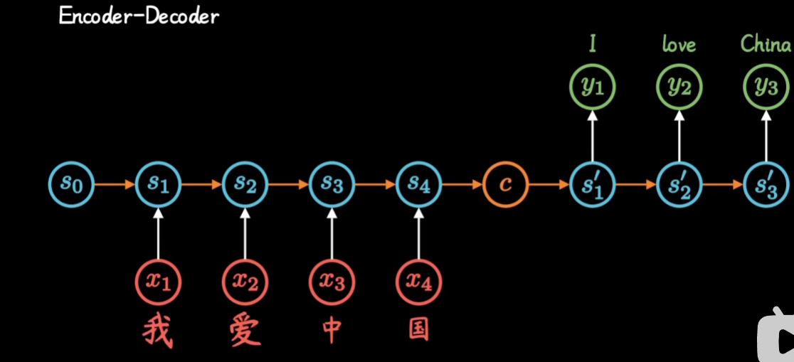
RNN
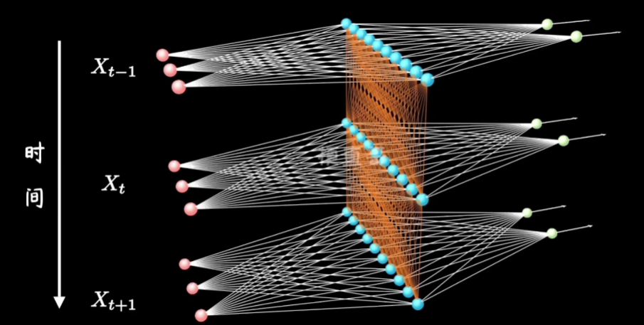
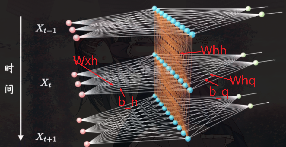
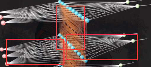
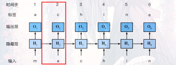
这里就是在多层感知机(MLP)上加了时间,我们以前的隐藏层如今还需要接受上一层隐藏层的计算
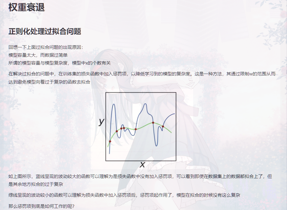
形象点就是如图:
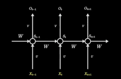
然后训练时给人的感觉就是:
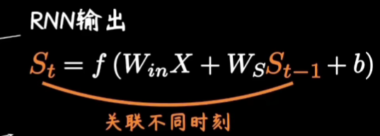
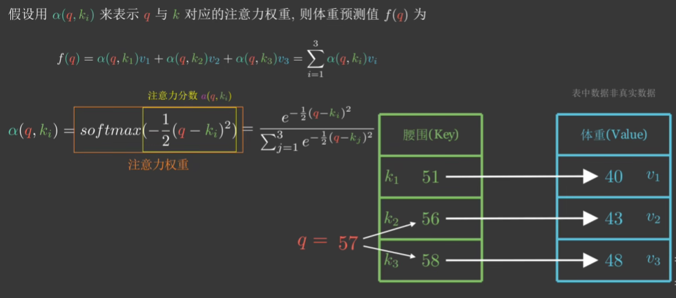
RNN模型的评价标准----困惑度
困惑度定义如下:
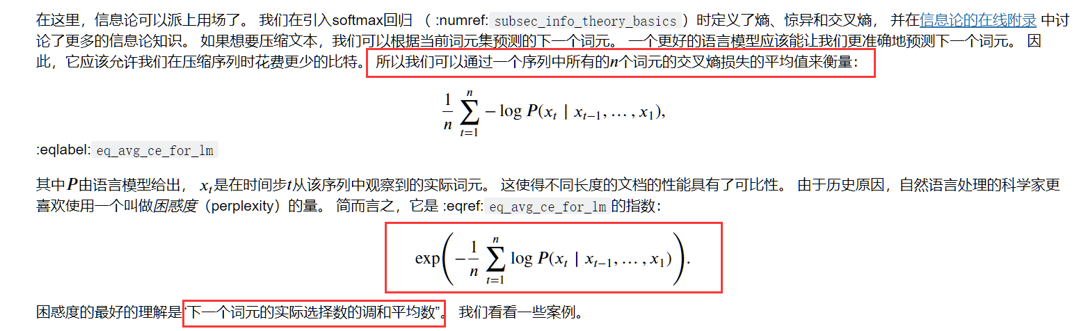
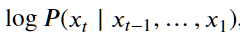
注意他这里说明的:我们并肩一个语言模型的好坏,可以通过一个序列中所有的 𝑛 个词元的交叉熵损失的平均值来衡量
在实际计算中,他是这么计算的:
 for X, Y in train_iter:
        if state is None or use_random_iter:
            # 在第一次迭代或使用随机抽样时初始化state
            state = net.begin_state(batch_size=X.shape[0], device=device)
        else:
            if isinstance(net, nn.Module) and not isinstance(state, tuple):
                # state对于nn.GRU是个张量
                state.detach_()
            else:
                # state对于nn.LSTM或对于我们从零开始实现的模型是个张量
                for s in state:
                    s.detach_()
        # .reshape表示变成一维
        y = Y.T.reshape(-1)
        X, y = X.to(device), y.to(device)
        y_hat, state = net(X, state)

        l = loss(y_hat, y.long()).mean()

        if isinstance(updater, torch.optim.Optimizer):
            updater.zero_grad()
            l.backward()
            grad_clipping(net, 1)
            updater.step()
        else:
            l.backward()
            grad_clipping(net, 1)
            # 因为已经调用了mean函数
            updater(batch_size=1)
        metric.add(l * y.numel(), y.numel())
    return math.exp(metric[0] / metric[1]), metric[1] / timer.stop()
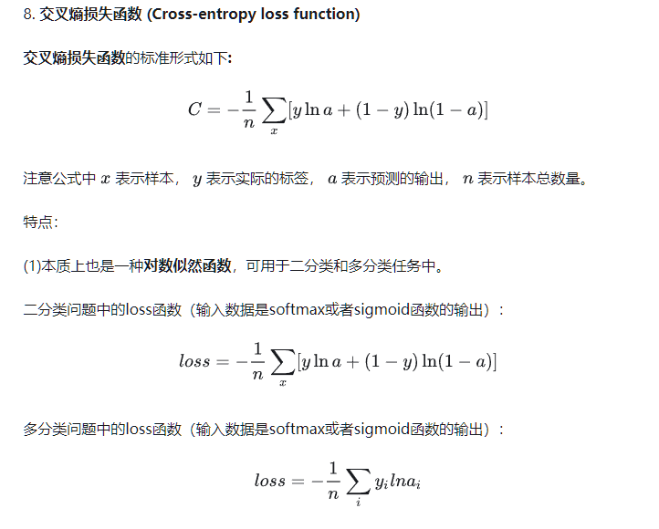
上述他通过每一次的训练将损失值l 乘以 y的元素个数y.numel()
然后每一次将l*y.numel()的结果累加
最后 math.exp(metric[0] / metric[1]) 就是算出的困惑度
感觉和困惑度的定义差了很大,为何可以这么计算?
-
我们先来回忆下上述代码的损失值l(交叉熵损失函数计算得来)是如何计算的!
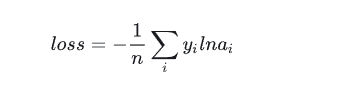
我个人对这个如loss=-(1/n)∑ yi Iog(ai)的理解是 通过softmax函数得到的ai相当于概率,log(ai)就是将这一概率转换为衡量概率大小的值,概率越大log(ai)越大(需要注意的是log(ai)永远是负的)
然后 yi就是真实的标签,一般我们会将yi进行独热编码,即如 可能预测出的单词为 a b c d 这四种,yi是b,则将yi 进行独热编码后为[0 1 0 0] 变成这样计算机好处理的矩阵形式
然后假设ai为 [0.1 0.5 0.3 0.1] 那么yilog(ai) 就为 log(0.5) ,即只有预测对的位置会提供数值,其余位为0
当ai预测对的位置概率越大,则说明预测对了,提供的log(ai)也越小,则loss也越小
即loss越小越好
-
交叉熵函数与最大似然函数?


首先要了解一下什么是似然函数和最大似然函数了
详细博客(个人认为这篇博客全程高能,要详细看看)


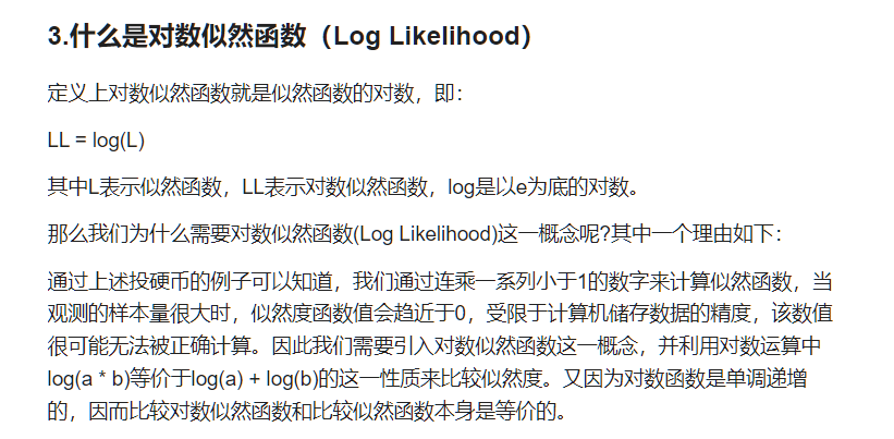

上面的似然函数如何运用到求我们的损失函数上?
对数似然函数!
-
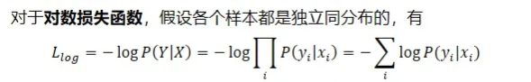
好!回到为何能用loss * y.numel() 求 困惑度上来
我们知道loss的计算方法是
那么loss*y.numel()=∑yi logai(Inai就是logai)
在n=1的情况下(即在只训练一轮的情况下),根据我们上面讲的其就是log(aij)(aij是预测第j个是对的概率)
其实计算困惑度中的
就是log(aij)
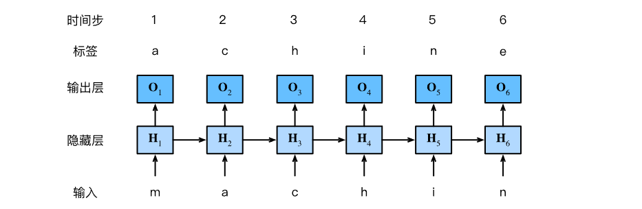
RNN的实现
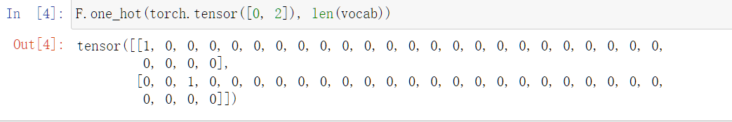
- 独热编码
from torch.nn import functional as F
print(torch.tensor([0,2]))
#(这里len(vocab)表示可能预测出单词的总个数)
F.one_hot(torch.tensor([0, 2]), len(vocab))
运用如下:
class RNNModelScratch: #@save
    """从零开始实现的循环神经网络模型"""
    def __init__(self, vocab_size, num_hiddens, device,
                 get_params, init_state, forward_fn):
        self.vocab_size, self.num_hiddens = vocab_size, num_hiddens
        self.params = get_params(vocab_size, num_hiddens, device)
        self.init_state, self.forward_fn = init_state, forward_fn

    def __call__(self, X, state):
        X = F.one_hot(X.T, self.vocab_size).type(torch.float32)
        return self.forward_fn(X, state, self.params)

    def begin_state(self, batch_size, device):
        return self.init_state(batch_size, self.num_hiddens, device)
在 def call(self, X, state):中,输入的X原来假设是32x35的(即一次训练有32个数据,每一个数据(句子)有35个词),通过F.one_hot后(需要注意在F.one_hot中是X.T)会变成(self.vocab_size假设为28)35x32x28,即获得形状为 (时间步数,批量大小,词表大小)的X
- 参数初始化
# 这里batch_size表示一次训练有多少数据,num_steps表示时间长度(即句子中单词的个数)
batch_size, num_steps = 32, 35
# 得到训练数据迭代器train_iter和 单词与数字相互转换的类vocab
train_iter, vocab = d2l.load_data_time_machine(batch_size, num_steps)
def get_params(vocab_size, num_hiddens, device):

	# 输入大小和输出大小都是等于可能预测出的单词总个数
    num_inputs = num_outputs = vocab_size

    def normal(shape):
        return torch.randn(size=shape, device=device) * 0.01

    # 隐藏层参数
    W_xh = normal((num_inputs, num_hiddens))
    W_hh = normal((num_hiddens, num_hiddens))
    b_h = torch.zeros(num_hiddens, device=device)
    # 输出层参数
    W_hq = normal((num_hiddens, num_outputs))
    b_q = torch.zeros(num_outputs, device=device)
    # 附加梯度
    params = [W_xh, W_hh, b_h, W_hq, b_q]
    for param in params:
        param.requires_grad_(True)
    return params
- 进行某一时间进行一次计算时的内容
def rnn(inputs, state, params):
    # inputs的形状:(时间步数量,批量大小,词表大小)
    W_xh, W_hh, b_h, W_hq, b_q = params
    H, = state
    outputs = []
    # X的形状:(批量大小,词表大小)
    for X in inputs:
        H = torch.tanh(torch.mm(X, W_xh) + torch.mm(H, W_hh) + b_h)
        Y = torch.mm(H, W_hq) + b_q
        outputs.append(Y)
    return torch.cat(outputs, dim=0), (H,)
即如下三部分:
得到的结果就是:
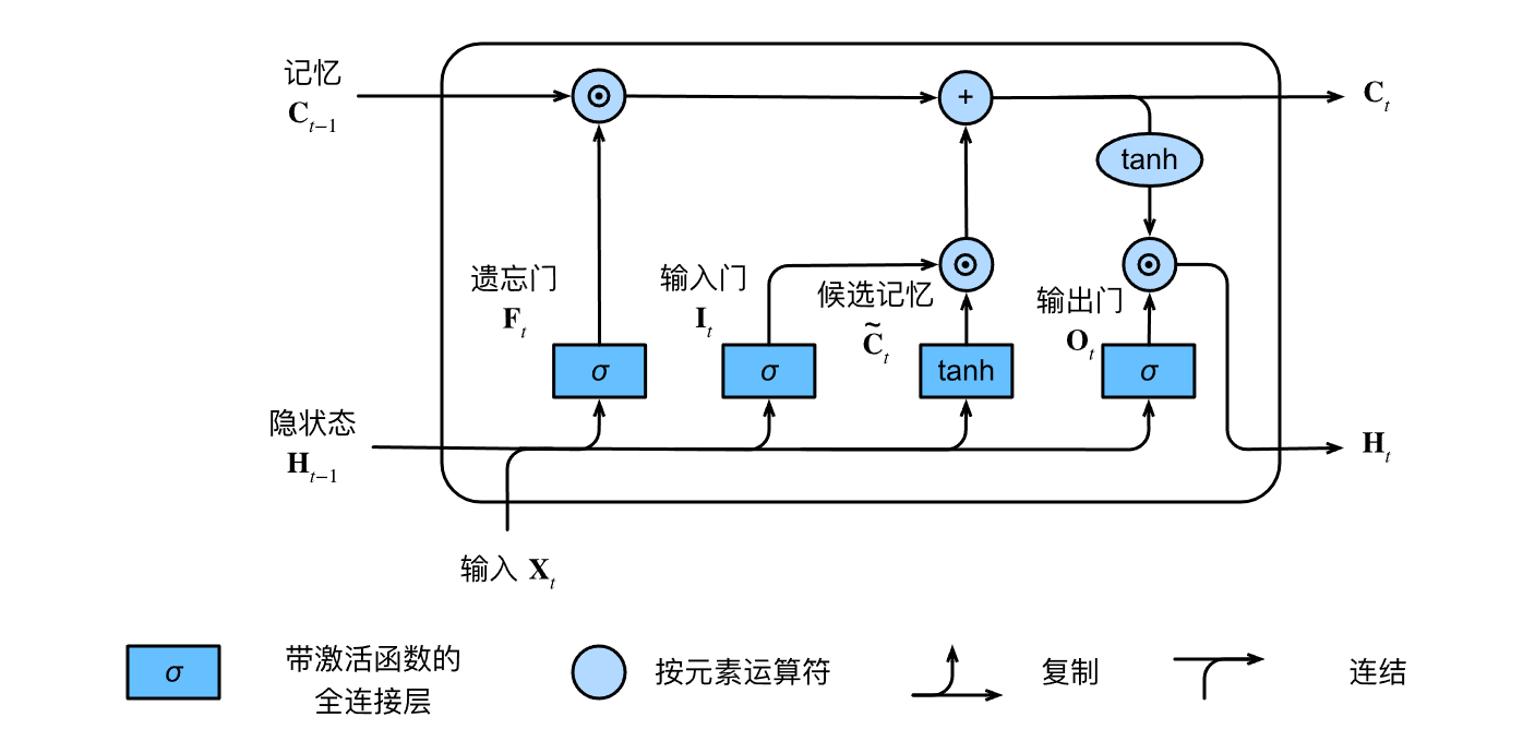
长短期记忆网络(LSTM)
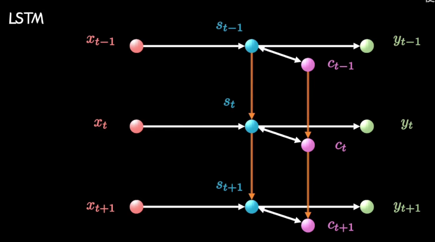
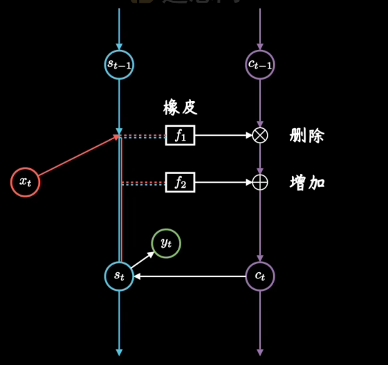
其中我们可以将C看作是一个记事本,Ct-1是昨天记录的东西,到今天我们可以对记事本上的东西进行删除和增加内容
-
遗忘门通过“昨天”的隐状态(Ht-1)和"今天"的内容(Xt),以及W和b参数,控制对“昨天”记录的“删除”。
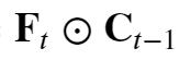
其会参与到“今天”记事本Ct的内容中来(遗忘门 𝐅𝑡 控制保留多少过去的 记忆元 𝐂𝑡−1)
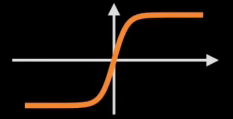
注意这个激活函数:Sigmoid——压缩函数,Sigmoid函数被用作神经网络中的激活函数。这个单元的输出保证总是介于0和1之间。

如上是Ct的一部分
-
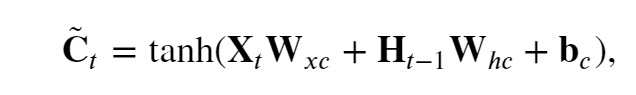
候选记忆~Ct是"大脑(Ht-1)"根据“今天”的输入Xt,以及参数W和b,决定对“今天”内容的整理,
tanh函数函数的值范围为 (−1,1).
-
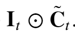
输入门控制对“昨天”记录的“增加”,其也会参与到“今天”记事本Ct的内容来( 输入门 𝐈𝑡 控制采用多少来自 ~𝐂̃𝑡的新数据)
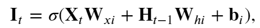
如上是Ct中的一部分
-
“今天“的记事本Ct

如果遗忘门始终为 1且输入门始终为 0, 则过去的记忆元 𝐂𝑡−1 将随时间被保存并传递到当前时间步。 引入这种设计是为了缓解梯度消失问题, 并更好地捕获序列中的长距离依赖关系。
-
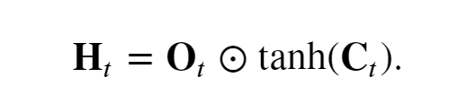
输出门Ot 控制“今天”"大脑"Ht 要保留的内容

-
“今天“大脑的状态Ht
API实现
num_inputs = vocab_size
lstm_layer = nn.LSTM(num_inputs, num_hiddens)
model = d2l.RNNModel(lstm_layer, len(vocab))
model = model.to(device)
d2l.train_ch8(model, train_iter, vocab, lr, num_epochs, device)
长短期记忆网络可以缓解梯度消失和梯度爆炸。
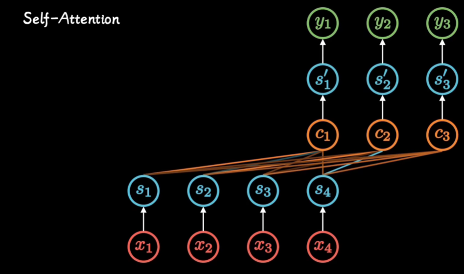
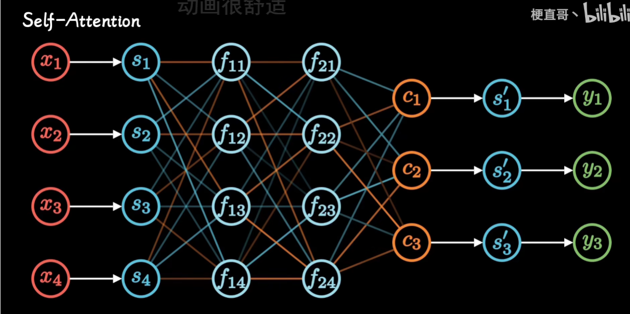
Attention 注意力机制
推荐教程
-
注意力机制的本质|Self-Attention|Transformer|QKV矩阵
-
通过讲解seq2seq模型 使用Attention 进行改进来讲解Attention
Transformer
Kaggle竞赛 Spooky Author Identification
很好的博客,完整地对自然语言数据处理的步骤和方式进行讲解,并教授了词云图和LDA技术
我在我的Jupyter notebook中对其代码有较详细的讲解
日后问题
问题一:如何可视化LDA的结果?
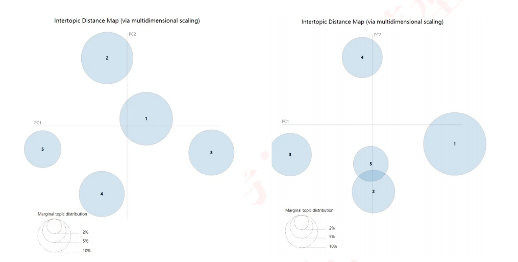
想要得到如上图展示的结果,每一个圆圈代表一个主题,可以查看各个主题之间的关系和距离
他这里用到了pyLDAvis这个库
关于这个库:参考博客
我们在分词阶段可能会遇到报错
"Expected string or bytes-like object"
这个原因的解决方法是:
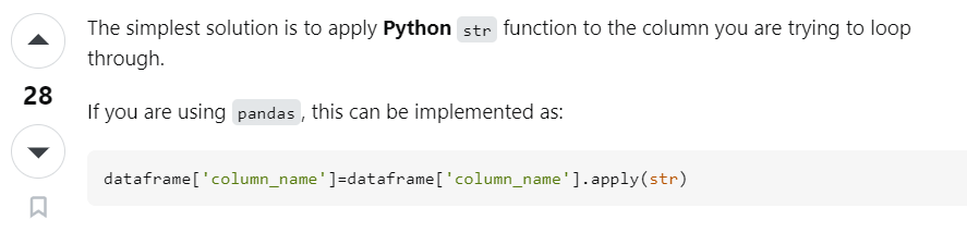
所以以后得要小心点了,这个问题当时处理的时候2个小时就没了
完整代码如下:
info_data['Notes']=info_data['Notes'].apply(str)
info_data['Lab Comments']=info_data['Lab Comments'].apply(str)
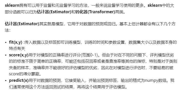
from sklearn.decomposition import NMF, LatentDirichletAllocation
lda = LatentDirichletAllocation(n_components=5, max_iter=5,
learning_method = 'online',
learning_offset = 50.,
random_state = 0)
lda.fit(vNotes)
def print_top_words(model, feature_names, n_top_words):
for index, topic in enumerate(model.components_):
message = "\nTopic #{}:".format(index)
# topic.argsort 是对这个主题下的单词按照权重从小到大排序,于是
# 我们从默认的-1 开始(即最后一个单词),到第-40个单词为止,取出单词
message += " ".join([feature_names[i]
for i in topic.argsort()[:-n_top_words - 1 :-1]])
print(message)
print("="*70)
n_top_words = 10
print("\nTopics in LDA model: ")
tf_feature_names = tf_vectorizer.get_feature_names()
print_top_words(lda, tf_feature_names, n_top_words)
# pip install pyLDAvis
import pyLDAvis
import pyLDAvis.sklearn
pyLDAvis.enable_notebook(local=True)
vNotes_data = pyLDAvis.sklearn.prepare(lda, vNotes, tf_vectorizer)
pyLDAvis.display(vNotes_data) #在notebook的output cell中显示
first_topic = lda.components_[0]
first_topic_words = [tf_feature_names[i] for i in first_topic.argsort()[:-100 - 1 :-1]]
print(first_topic_words)
# 云图
from wordcloud import WordCloud, STOPWORDS
from matplotlib import pyplot as plt
from scipy.misc import imread
%matplotlib inline
plt.figure(figsize=(16,13))
img1=imread("./image-background.jpg")
img2=imread("./images.jpg")
hcmask = img2
# 难道单词数一样就根据单词前后来分大小权重?
firstcloud = WordCloud(
stopwords=STOPWORDS,
background_color='white',
mask=hcmask,
width=2500,
height=1800
).generate(" ".join(first_topic_words))
plt.imshow(firstcloud)
plt.axis('off')
plt.show()
kaggle竞赛 Natural Language Processing with Disaster Tweets
NLP Getting Started Tutorial
这篇博客讲的很简单,就是求了个单词的vector矩阵后,直接调用sklearn中的岭回归模型,进行预测
上述博客用岭回归的理由是:Our vectors are really big, so we want to push our model's weights toward 0 without completely discounting different words - ridge regression is a good way to do this.
岭回归就是在最小二乘那里加了个惩罚项,在防止过拟合时很好用
这篇博客还提到了其他一些模型技术:

KerasNLP starter notebook Disaster Tweets
这篇博客直接用了DistilBERT这个模型,没有什么数据分析部分
NLP with Disaster Tweets - EDA, Cleaning and BERT
这篇博客手把手带着进行数据分析和模型使用
首先从缺失值入手,简单地将缺失的地方填补为no_data
我们进行数据分析是为了更好地将数据转换为我们机器模型能够读入计算的数据,同时筛选出特征更好地让模型能够够学习
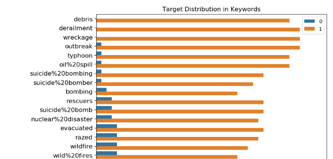
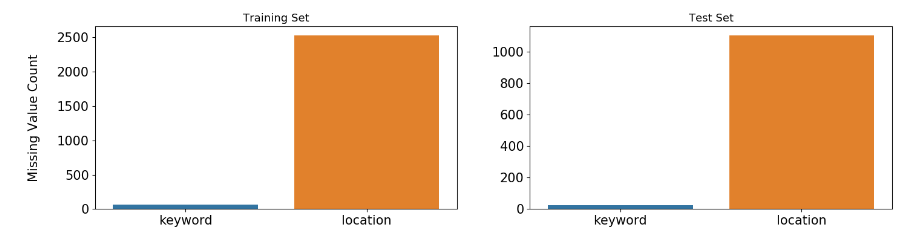
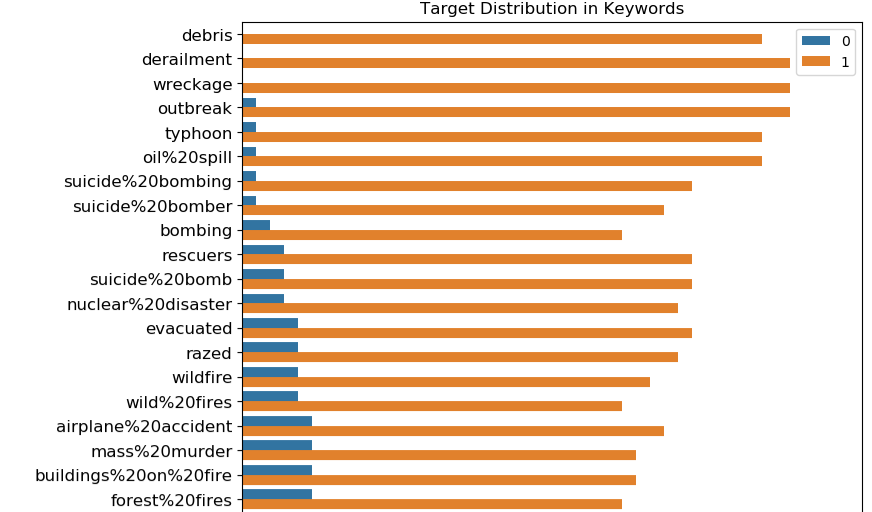
这里首先看下特征keyword和location的基本属性:元素个数,与是否为真正的灾害的关系
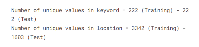
然后他就得出结论:
Locations are not automatically generated, they are user inputs. That's why location is very dirty and there are too many unique values in it. It shouldn't be used as a feature.
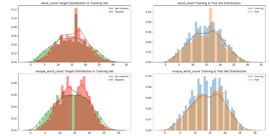
然后他进行元数据特征
所谓元数据特征是数据本身的属性,如文本数据就有文本长度,单词个数等
他这里写出来了如下元数据:
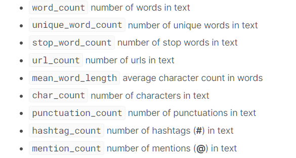
并计算出这些数据后,分别画出了在是真正灾害和非灾害时,这些元数据特征的分布图
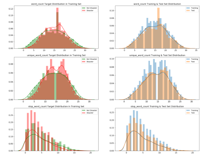
On the other hand, word_count, unique_word_count, stop_word_count, mean_word_length, char_count, punctuation_count have very different distributions for disaster and non-disaster tweets. Those features might be useful in models.
学到了
Embeddings
如下两篇博客


还有就是这些GloVe-300d-840B,FastText-Crawl-300d-2M,GoogleNews-vectors-negative300都是要预先下载下来的,一个起码几个G
画图
在这篇博客NLP with Disaster Tweets - EDA, Cleaning and BERT中
import numpy as np
import pandas as pd
pd.set_option('display.max_rows', 500)
pd.set_option('display.max_columns', 500)
pd.set_option('display.width', 1000)

import matplotlib.pyplot as plt
import seaborn as sns
-
sns.barplot
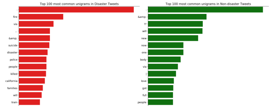
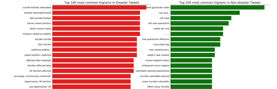
这里还涉及到了一些分词的代码,将句子分成一元,二元,三元词
-
sns.countplot
-
sns.distplot
问题集合
关于Embeddings
在博客NLP with Disaster Tweets - EDA, Cleaning and BERT
他在下面写了:
When you have pre-trained embeddings, doing standard preprocessing steps might not be a good idea because some of the valuable information can be lost. It is better to get vocabulary as close to embeddings as possible. In order to do that, train vocab and test vocab are created by counting the words in tweets.
Text cleaning is based on the embeddings below:
- GloVe-300d-840B
- FastText-Crawl-300d-2M
然后他下面的模型用的是:
This model uses the implementation of BERT from the TensorFlow Models repository on GitHub at tensorflow/models/official/nlp/bert. It uses L=12 hidden layers (Transformer blocks), a hidden size of H=768, and A=12 attention heads.
This model has been pre-trained for English on the Wikipedia and BooksCorpus. Inputs have been "uncased", meaning that the text has been lower-cased before tokenization into word pieces, and any accent markers have been stripped. In order to download this model, Internet must be activated on the kernel.
然后我们想问的是:
在另外一篇博客:How to: Preprocessing when using embeddings
他用的是:
I will focus in this notebook, how to achieve that. For an example I take the GoogleNews pretrained embeddings, there is no deeper reason for this choice.
那么对于这个比赛我也可以用GoogleNews吗?BERT model has been pre-trained for English on the Wikipedia and BooksCorpus.与使用GloVe-300d-840B 和 FastText-Crawl-300d-2M有什么关系吗?
Kaggle Store Sales - Time Series Forecasting
推荐的博客:
Everything you can do with a time series
这篇博客完整地将关于时间序列处理的知识讲了一边,其中涉及到了许多库,和画图技巧。但是模型没有涉及到机器学习的。
但是在他写的另一个博客上:
Intro to Recurrent Neural Networks LSTM | GRU
倒是有讲,但是是5年前写的,太老了
TimeSeries Analysis 📈A Complete Guide 📚
这篇博客是使用上述博客的方法的,使用顺序排版较好,一般处理数据的过程就按照他这么写了
同时他还讲到了许多模型(包括LSTM等)
学习记录
Everything you can do with a time series
导入数据
google = pd.read_csv('../input/stock-time-series-20050101-to-20171231/GOOGL_2006-01-01_to_2018-01-01.csv', index_col='Date', parse_dates=['Date'])
google.head()
这段代码是使用 Pandas(一种 Python 中用于数据处理的库)来读取一个 CSV 文件。让我解释一下 index_col='Date' 和 parse_dates=['Date'] 的作用:
-
index_col='Date':这个参数指定了将哪一列作为数据框的索引(行标签)。在这个例子中,'Date'列会被作为索引,意味着每行数据将以日期作为索引值,而不是默认的整数索引。 -
parse_dates=['Date']:这个参数告诉 Pandas 尝试解析指定的列(这里是'Date'列)为日期时间格式,以便在数据框中正确地表示日期和时间。这样做后,'Date'列的值将以日期时间格式存储,而不是简单的文本字符串。
综合起来,这两个参数的作用是将 CSV 文件中的 'Date' 列作为数据框的索引,并将该列的值解析为日期时间格式,以便更方便地处理时间序列数据。
Prepare data
处理缺失值
humidity = humidity.iloc[1:]
humidity = humidity.fillna(method='ffill')
humidity.head()
这行代码使用了 Pandas 中的 fillna() 方法来处理缺失值。具体来说,fillna(method='ffill') 中的参数 method='ffill' 指定了使用前向填充(forward fill)的方法来填补缺失值。
ffill 是 "forward fill" 的缩写,意味着用缺失值前面的最近一个非缺失值来填充该缺失值。换句话说,如果某一行的数值为空(NaN),那么该行将被用它上面最近一个非空数值所填充。这种方法适用于时间序列数据或者有序数据,可以用前面已知的值来填补缺失值,保持数据的连续性。
pressure = pressure.iloc[1:]
pressure = pressure.fillna(method='ffill') pressure = pressure.fillna(method='bfill')
这两行代码都使用了 Pandas 的 fillna() 方法来处理缺失值,但使用了不同的填充方法:
-
pressure = pressure.fillna(method='bfill')使用了'bfill',意味着使用后向填充(backward fill)。这种方法会用缺失值后面的最近一个非缺失值来填充该缺失值。换句话说,如果某一行的数值为空(NaN),那么该行将被用它后面最近一个非空数值所填充。 -
pressure = pressure.fillna(method='ffill')使用了'ffill',表示使用前向填充(forward fill)。这种方法会用缺失值前面的最近一个非缺失值来填充该缺失值。如果某一行的数值为空(NaN),那么该行将被用它上面最近一个非空数值所填充。
这两种填充方法分别根据缺失值前后最近的非空数值来填充缺失值,以保持数据的连续性。选择使用哪种方法取决于数据的特点和处理缺失值的需求。
可视化数据
humidity["Kansas City"].asfreq('M').plot() # asfreq method is used to convert a time series to a specified frequency. Here it is monthly frequency.
我是万万没想到pandas中的Series能够直接画图
这里是取了Kansas City这个列画出图来
这段代码使用了 Pandas 的时间序列数据来操作湿度数据中的 "Kansas City" 列,并对其进行频率转换,然后绘制了图表。
humidity["Kansas City"] 选择了数据中 "Kansas City" 列的湿度值。接着,.asfreq('M') 将数据的时间频率转换为每月('M'),这意味着数据将以月为单位进行重新采样,可能进行了聚合操作(例如取每个月的平均值或者最后一天的值)。
最后,.plot() 命令用于绘制转换后的数据,显示出 "Kansas City" 列的湿度随时间变化的情况,以月为单位的变化趋势。
需要注意的是在这之前设置了DataFrame的索引为时间且将其数据类型改为时间类型
google['2008':'2010'].plot(subplots=True, figsize=(10,12))
plt.title('Google stock attributes from 2008 to 2010')
plt.savefig('stocks.png')
plt.show()
我也万万没想到当设置了DataFrame的索引为时间,且将其数据类型改为时间类型后
可以直接使用'2008':'2010'
timestamps and periods
在 Pandas 中,时间戳(timestamps)和时间段(periods)是用来表示与时间相关的信息的基本数据类型:
-
时间戳:
- 时间戳表示时间中的特定时刻,精确到纳秒级别。它们用于记录时间点,比如2023年7月4日上午8:30。在 Pandas 中,
Timestamp是表示单个时间戳的数据类型。 - 它们非常有用于各种基于时间的操作,比如时间序列分析、时间序列数据索引和进行涉及特定日期和时间的计算。时间戳使得在 Pandas 的 DataFrame 或 Series 中轻松处理和操作与时间相关的数据成为可能。
- 时间戳表示时间中的特定时刻,精确到纳秒级别。它们用于记录时间点,比如2023年7月4日上午8:30。在 Pandas 中,
-
时间段:
- 时间段表示一段时间间隔,比如一天、一个月或一年。它们表示一段固定频率的时间。例如,一个时间段可以表示2023年7月的整个月份。
Period是 Pandas 用来表示这些时间间隔的数据类型。时间段在处理固定频率的时间段,比如财务季度、月份或天数时非常有用。
时间戳和时间段在时间序列分析、处理基于时间的数据以及在 Pandas 中进行各种与时间相关的操作中至关重要。它们使得能够轻松地索引、切片和操作时间序列数据,从而能够有效地进行时间上的计算和分析。
# Creating a Timestamp
timestamp = pd.Timestamp(2017, 1, 1, 12)
timestamp
# Converting timestamp to period
new_period = timestamp.to_period(freq='H')
new_period

Period('2017-01-01 12:00', 'H')

# Creating a period
period = pd.Period('2017-01-01')
period

Period('2017-01-01', 'D')


# Converting period to timestamp
new_timestamp = period.to_timestamp(freq='H', how='start')
new_timestamp

Timestamp('2017-01-01 00:00:00')
这段代码使用了 Pandas 中的 pd.Period() 函数创建了一个时间段(Period)。pd.Period('2017-01-01') 创建了一个以日('D')为频率的时间段,起始于 2017 年 1 月 1 日。
结果 Period('2017-01-01', 'D') 表示一个频率为天('D')的时间段,起始于 2017 年 1 月 1 日。这个时间段代表了从 2017 年 1 月 1 日开始的一个完整的天。
date_range 生成一段时间序列
# Creating a datetimeindex with daily frequency
dr1 = pd.date_range(start='1/1/18', end='1/9/18')
dr1
# Creating a datetimeindex with monthly frequency
dr2 = pd.date_range(start='1/1/18', end='1/1/19', freq='M')
dr2
# Creating a datetimeindex without specifying start date and using periods
dr3 = pd.date_range(end='1/4/2014', periods=8)
dr3
# Creating a datetimeindex specifying start date , end date and periods
dr4 = pd.date_range(start='2013-04-24', end='2014-11-27', periods=3)
dr4
to_date 将非时间日期数据转换为时间日期数据
df = pd.DataFrame({'year': [2015, 2016], 'month': [2, 3], 'day': [4, 5]})
df

df = pd.to_datetime(df)
df

df = pd.to_datetime('01-01-2017')
df
时间序列平移
This is useful when comparing the time series with a past of itself
humidity["Vancouver"].asfreq('M').plot(legend=True)
shifted = humidity["Vancouver"].asfreq('M').shift(10).plot(legend=True)
shifted.legend(['Vancouver','Vancouver_lagged'])
plt.show()
Resampling 重新采样
分为高频到低频:如日数据到月数据
低频到高频:如月数据到日数据
Upsampling - Time series is resampled from low frequency to high frequency(Monthly to daily frequency). It involves filling or interpolating missing data
Downsampling - Time series is resampled from high frequency to low frequency(Weekly to monthly frequency). It involves aggregation of existing data.
简单点说,原来的数据为:
经过Downsampling后
# We downsample from hourly to 3 day frequency aggregated using mean
pressure = pressure.resample('3D').mean()
pressure.head()
也就是取平均得到的这个
Statistics
变换率,即当前时间的值/前一时间的值
google['Change'] = google.High.div(google.High.shift())
google['Change'].plot(figsize=(20,8))
变换率值(即在变化率的基础上-1再*100)
google['Return'] = google.Change.sub(1).mul(100)
google['Return'].plot(figsize=(20,8))
绝对值变化
google.High.diff().plot(figsize=(20,6))
.diff() 是 Pandas 中用于计算一阶差分(即当前元素与前一个元素之间的差)的方法。在这段代码中,google.High.diff() 计算了 Google 股价中每个时间点与其前一个时间点的高点(High)之间的差值。
这种操作可以帮助观察相邻时间点之间的变化情况。绘制 .diff() 后的数据的折线图,可以显示出每个时间点股价变动的情况。如果股价有较大的波动,差分操作可以帮助观察这些波动的幅度。
比较两个不同的时间序列
We will compare 2 time series by normalizing them
这个所谓的normalizing 就是
This is achieved by dividing each time series element of all time series by the first element. This way both series start at the same point and can be easily compared.
normalized_google = google.High.div(google.High.iloc[0]).mul(100)
normalized_microsoft = microsoft.High.div(microsoft.High.iloc[0]).mul(100)
normalized_google.plot()
normalized_microsoft.plot()
plt.legend(['Google','Microsoft'])
plt.show()
.div()中的内容为要除的内容
原来为:
滑动窗口和扩展窗口
窗口函数在数据分析中用于在指定的窗口或数据子集上执行计算。它们帮助识别数据集中的子周期,并基于这些子集计算指标或统计量。
-
滚动窗口:
- 滚动窗口涉及对一个固定大小的窗口进行计算,这个窗口会滑动或移动穿过数据。这意味着对于数据集中的每个点,窗口包含一定数量的先前数据点。
- 例如,在金融分析中,股票价格的 30 天滚动平均值就是在每个数据点处计算前 30 天股价的平均值。
- 窗口的大小保持不变,但在数据集中滑动,使你能够观察时间内的趋势或变化,而不需要一次考虑整个数据集。
-
扩展窗口:
- 扩展窗口包含截至当前数据点的所有先前值。与固定大小的滚动窗口不同,扩展窗口随着时间的推移逐渐增长,并包含从一开始到当前点的所有可用数据。
- 例如,在金融中,一个扩展窗口的计算可能涉及计算股票收益的累积和,包含了截至每个点的所有历史收益。
- 扩展窗口对于分析累积指标或观察随着更多数据变得可用而出现的趋势非常有用。
滚动窗口和扩展窗口都对于时间序列分析、金融计算和统计分析非常有价值。它们可以提供关于数据中趋势、变化和模式的见解,无论是专注于固定大小的子集(滚动窗口)还是考虑累积整个数据集(扩展窗口)。
# Rolling window functions
rolling_google = google.High.rolling('90D').mean()
google.High.plot()
rolling_google.plot()
plt.legend(['High','Rolling Mean'])
# Plotting a rolling mean of 90 day window with original High attribute of google stocks
plt.show()
这里滑动窗口大小为90天
# Expanding window functions
microsoft_mean = microsoft.High.expanding().mean()
microsoft_std = microsoft.High.expanding().std()
microsoft.High.plot()
microsoft_mean.plot()
microsoft_std.plot()
plt.legend(['High','Expanding Mean','Expanding Standard Deviation'])
plt.show()
std()是计算标准差的
extend应该可以反应出哪些时间开始导致趋势变换
自相关和偏自相关
自相关(Autocorrelation)函数是衡量时间序列数据在不同滞后(lags)下与自身相关性的函数。
换句话说,自相关函数(ACF)用于分析一个时间序列与其自身在不同时间滞后下的相关程度。它通过计算时间序列在不同滞后(时间间隔)下的相关系数来评估数据点与先前数据点之间的关系。如果时间序列在特定滞后下具有显著的自相关性,这意味着在该滞后时间下存在一定程度的重复模式或周期性。ACF 的计算结果可以揭示时间序列数据的重复性、周期性或趋势。
例如,假设我们有一组每日销售数据,我们可以使用自相关函数来检查这些数据是否在某个特定的时间滞后下存在相关性。如果在7天(一周)的滞后下存在高度正相关的情况,这可能暗示了每周销售数据之间的某种重复模式,比如周一到周日的销售额之间可能存在某种相关性。通过分析不同滞后下的自相关函数,可以揭示出时间序列数据的周期性或趋势特征。
from statsmodels.graphics.tsaplots import plot_acf, plot_pacf

# Autocorrelation of humidity of San Diego
plot_acf(humidity["San Diego"],lags=25,title="San Diego")
plt.show()
在统计学中,当我们计算相关性时,可能会对结果的显著性感兴趣。置信区间提供了对相关性测量值的显著性进行评估的方法。它告诉我们,根据样本数据,我们可以对真实的相关性值有多大的信心。
如果自相关函数值落在置信区间内,通常认为该值不具有统计学上的显著性,即在这个置信水平下(通常是95%或99%置信水平),这个相关性值可能是由于随机性而非真实的关联性造成的。反之,如果自相关函数值超出了置信区间,就有可能表示存在显著的相关性。
使用相关性置信区间可以帮助我们确定自相关函数值是否足够大,以至于我们可以相当自信地说这种相关性不是由随机变化所导致的。这有助于更准确地解释时间序列数据中的相关性和模式。
自相关函数(ACF)和偏自相关函数(PACF)都是用于衡量时间序列数据中不同滞后下数据之间相关性的工具,但它们在计算和解释上有一些区别:
-
自相关函数(ACF):
- ACF 衡量的是时间序列数据与其滞后值之间的直接相关性。
- ACF 显示了时间序列数据在不同滞后(lags)下的相关性程度。每个滞后期的自相关系数表示了当前值与滞后期之间的相关性。
- ACF 不考虑其他滞后期的影响,它展示了数据本身的总体相关性结构。
-
偏自相关函数(PACF):
- PACF 衡量的是时间序列数据与其滞后值之间的偏相关性,也就是在控制其他滞后项不变的情况下,特定滞后项对当前值的影响。
- PACF 显示了每个滞后期对当前值的独立影响,排除了其他滞后项的影响。
- 与 ACF 不同,PACF 突出了每个滞后期自身对当前值的贡献,帮助识别出时间序列中哪些滞后期是真正对当前值有影响的。
总体来说,ACF 显示的是数据与各个滞后期的整体相关性,而 PACF 则更专注于确定每个滞后期对当前值的独立影响。两者结合使用有助于更全面地了解时间序列数据中滞后项之间的关系。
# Partial Autocorrelation of humidity of San Diego
plot_pacf(humidity["San Diego"],lags=25)
plt.show()
偏自相关函数(PACF)中某个滞后期的值很大可能意味着在控制其他滞后项不变的情况下,这个特定滞后项对当前值有较强的独立影响。
时间序列分解和随机步
These are the components of a time series
- Trend - Consistent upwards or downwards slope of a time series
- Seasonality - Clear periodic pattern of a time series(like sine funtion)
- Noise - Outliers or missing values
from pylab import rcParams
import statsmodels.api as sm
# Now, for decomposition...
rcParams['figure.figsize'] = 11, 9
decomposed_google_volume = sm.tsa.seasonal_decompose(google["High"],freq=360) # The frequncy is annual
figure = decomposed_google_volume.plot()
plt.show()
这段代码使用了 StatsModels 库中时间序列分析模块(tsa)中的 seasonal_decompose 函数,对 Google 股票的 "High" 列进行了季节性分解。
具体来说,代码中的操作如下:
sm.tsa.seasonal_decompose(google["High"], freq=360):这行代码将对指定的时间序列数据google["High"]进行季节性分解。参数freq=360表示设定分解的周期为 360,这里将数据假定为有年度季节性,周期为一年的交易日数量。- 季节性分解的目的是将时间序列数据拆分为三个部分:趋势(Trend)、季节性(Seasonal)、残差(Residuals)。
- 趋势部分描述了数据长期趋势或变化。
- 季节性部分显示了数据中与周期性模式相关的变化。
- 残差部分则代表了无法被趋势和季节性解释的随机变动或噪声。
这样的分解有助于更好地理解时间序列数据,将其拆解成不同的组成部分,进而分析趋势、季节性、以及剩余的随机性。
- There is clearly an upward trend in the above plot.
- You can also see the uniform seasonal change.
- Non-uniform noise that represent outliers and missing values
在季节性分解的结果中,残差(Residuals)代表了时间序列数据中无法被趋势和季节性解释的部分,即剩余部分。这部分包含了除了趋势和季节性之外的所有随机性和不规则性。
绘制残差图表有助于分析未被模型捕获的数据特征,比如是否存在一些未被发现的模式或变化。通常情况下,如果残差显示出随机性、平稳性以及没有明显的趋势或周期性,那么这可能意味着模型已经比较好地拟合了原始数据的趋势和季节性。
所以,如果你绘制了季节性分解的残差图表,你会看到一个展示了剩余部分的时间序列,其中包含了未被模型解释的数据特征。
计算方法:
-
去除趋势:
- 从原始数据中去除趋势部分,得到去趋势化后的数据。这个步骤可以通过原始数据减去移动平均或滤波后的数据来实现,留下了趋势被移除后的数据部分。
-
计算季节性:
- 使用统计方法(例如季节性分解中的周期性参数),对去趋势化后的数据进行处理,以提取数据中的季节性模式。这个步骤能够捕捉数据在特定周期内的重复性特征。
-
计算残差:
- 残差是通过将原始数据分解为趋势和季节性后,剩余的部分。它代表了无法被趋势和季节性所解释的数据特征,通常被认为是数据中的随机波动或噪声。
白噪声
White noise has...
- Constant mean 恒定均值
- Constant variance 恒定方差
- Zero auto-correlation at all lags
随机步(Random Walk)
known as a stochastic or random process, that describes a path that consists of a succession of random steps on some mathematical space such as the integers.
这里作者举例通过假设检验,来判断变化情况是否符合Random Walk 。使用的是Augmented Dickey-Fuller test
如果计算出来p-value<0.05,则说明数据并不支持遵循随机漫步模型。也就是说,根据这个检验,不能认为数据变动是完全随机的,它可能遵循某种不同于随机漫步的模式或规律。
import plotly.figure_factory as ff
fig = ff.create_distplot([random_walk],['Random Walk'],bin_size=0.001)
iplot(fig, filename='Basic Distplot')
平稳性
原来ADF test的作用还可以是检验是否为non-stationarity,如果其不符合random walk则说明其有规律,就是stationarity
非平稳时间序列太过杂乱无章,有的甚至完全无规律可循,而平稳时间序列本身存在某种分布规律,前后具有一定自相关性且能够延续下去,进而可以利用这些信息帮助预测未来
Stationarity is important as non-stationary series that depend on time have too many parameters to account for when modelling the time series. diff() method can easily convert a non-stationary series to a stationary series.
# The original non-stationary plot
decomposed_google_volume.trend.plot()

# The new stationary plot
decomposed_google_volume.trend.diff().plot()
大多数时间序列都是非平稳的,一般可以通过差分、取对数等方法转化成平稳时间序列,若不成就不能使用平稳时间序列分析方法了。
模型
from statsmodels.tsa.arima_process import ArmaProcess
from statsmodels.tsa.arima_model import ARIMA
from statsmodels.tsa.arima_model import ARMA
AR
The autoregressive model specifies that the output variable depends linearly on its own previous values and on a stochastic term (an imperfectly predictable term); thus the model is in the form of a stochastic difference equation.
MA
The moving-average (MA) model is a common approach for modeling univariate time series. The moving-average model specifies that the output variable depends linearly on the current and various past values of a stochastic (imperfectly predictable) term.(随机(不完全可预测)项。即噪声,残差)
ARMA
Autoregressive–moving-average (ARMA) models provide a parsimonious description of a (weakly) stationary stochastic process in terms of two polynomials, one for the autoregression and the second for the moving average. It's the fusion of AR and MA models.
更详细的内容在"D:\AI\WorkSpace\Time series\Everything you can do with a time series.md"
关于这个赛题的博客:
Store Sales - Time Series Forecasting
这位老哥写了关于他的想法和EDA
但是我看不懂,他推荐了kaggle上的这门课:Time Series
结合这门课再去理解他的博客会更好点
这个课:Time Series才是真正将清楚了我数据探索和模型的关系!
我们做数据探索一切都是为了建模挑选特征,如何让模型更好地学习到特征!
对于时间序列来说:模型可以分别从 时间,以往特征对当前的影响 两个角度来拟合时间序列
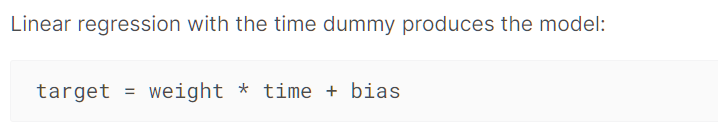
There are two kinds of features unique to time series: time-step features and lag features.
我们一般会去探究时间序列的 Trend,Seasonality,lags
Trend 和 Seasonality 在模型中提供的feature是time
lags 在模型中提供的是lag
Trend
Trend 是一种趋势,是一种忽视了短期波动的变化
其可以通过rolling 和 expanding来得到(上面我们提到过的,滑动窗口和扩展步)
同时需要注意的是为了使其不受到短期波动的影响,我们都是使用 比一段周期更长的时间 作为窗口
如何使用在模型中这个博客也提到了,但是暂时我还没时间动手实际
个人感觉是拟合出这个趋势曲线,在加上下面的seasonality和lag的变化就是 Time series
Seasonality
Seasonality 是一种随着时间的周期性,即随着时间变化,体现出来的一种规律
Seasonal changes generally follow the clock and calendar -- repetitions over a day, a week, or a year are common.
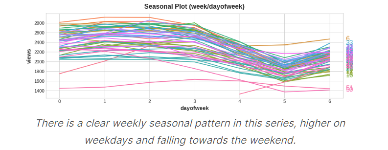
一年中不同week 在0~6天的趋势变化图
可以看到基本上都是在一周开始增长,在一周结束时下降
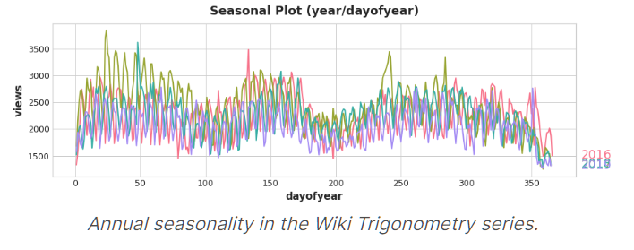
不同年份 每一天变化图
对应week/dayofweek 我们可以通过线性模型拟合出变化
但是对应year/dayofyear 我们要通过Fourier features(傅里叶特征)来拟合
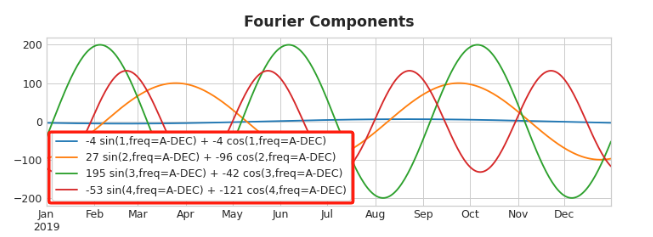
Choosing Fourier features with the Periodogram
How many Fourier pairs should we actually include in our feature set?
We can answer this question with the periodogram
The periodogram tells you the strength of the frequencies in a time series.
Specifically, the value on the y-axis of the graph is (a ** 2 + b ** 2) / 2, where a and b are the coefficients of the sine and cosine at that frequency (as in the Fourier Components plot above).
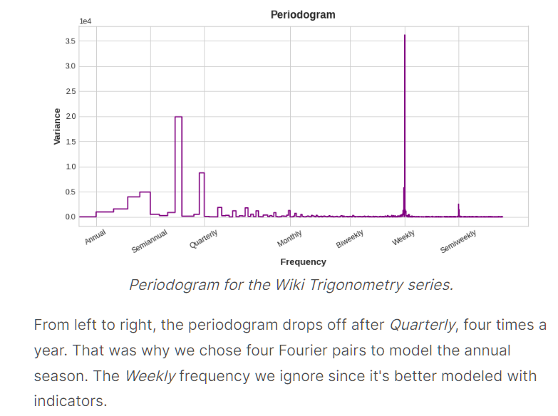
选的准则是什么时候开始下降就选哪个
我们这里可以看到是Quarterly开始下降,其是1/4年,即一年4次,所以chose four Fourier pairs
week那里就不用看了,因为week不适合用Fourier features
The weekly season we'll model with indicators and the annual season with Fourier features.
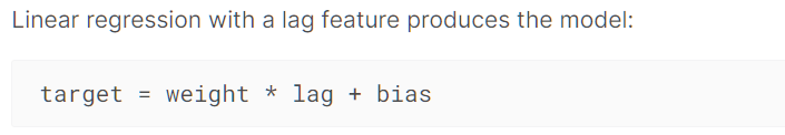
Lag
lag就是一种滞后,这种滞后可能会影响当前的值
同时滞后可能会有循环,其与seasonality的区别是lag是不受到固定时间的限制
如:
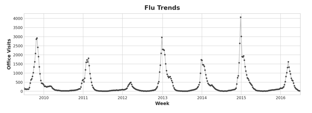
Our Flu Trends data shows irregular cycles instead of a regular seasonality: the peak tends to occur around the new year, but sometimes earlier or later, sometimes larger or smaller.
Modeling these cycles with lag features will allow our forecaster to react dynamically to changing conditions instead of being constrained to exact dates and times as with seasonal features.
更多的图:
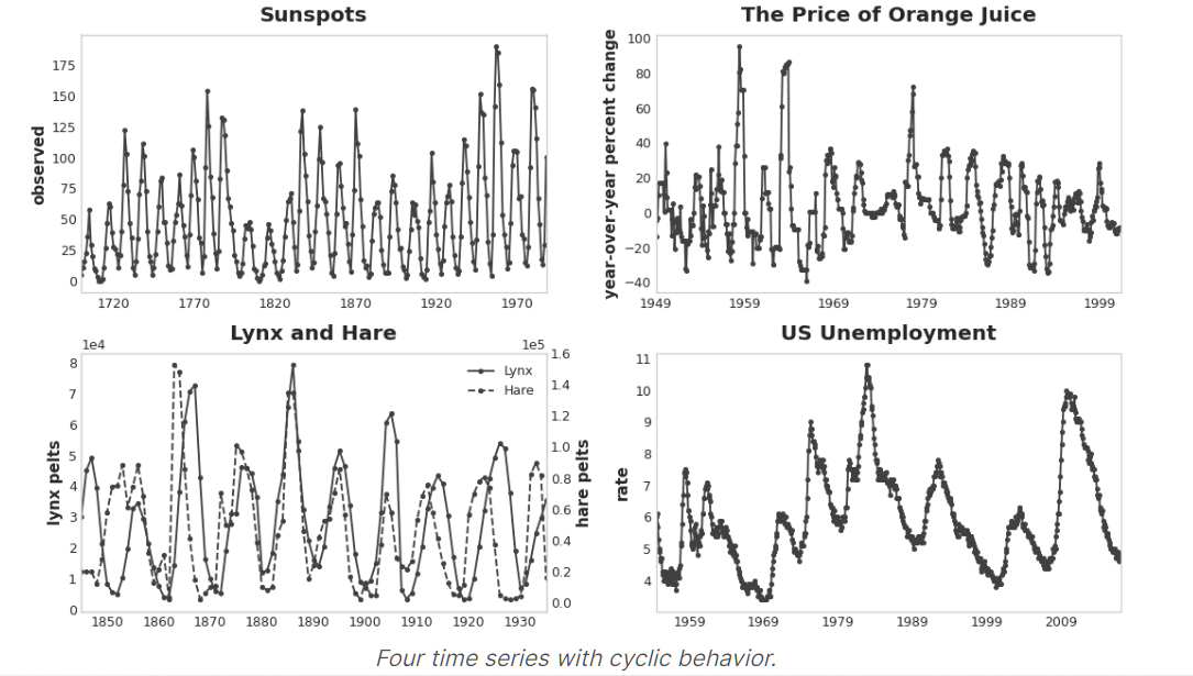
可以看到他们的循环都不是那么有规律,但是确实有一种循环的感觉
lag 可以作为特征
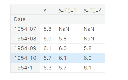
By lagging a time series, we can make its past values appear contemporaneous with the values we are trying to predict (in the same row, in other words).
This makes lagged series useful as features for modeling serial dependence.
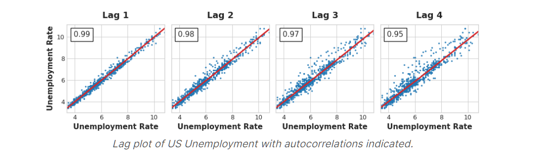
The most commonly used measure of serial dependence is known as autocorrelation, which is simply the correlation a time series has with one of its lags.
注意:在选择lag作为特征之前要先确定其与我们的当前时间序列是线性相关的!(或者将其变成线性相关)
选择lag
这个我们在上面讲过:自相关和偏自相关
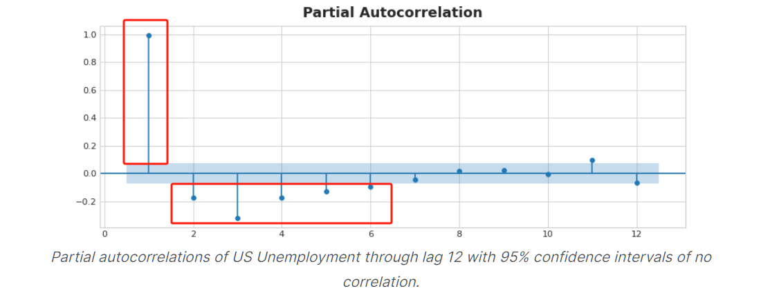
In the figure below, lag 1 through lag 6 fall outside the intervals of "no correlation" (in blue), so we might choose lags 1 through lag 6 as features for US Unemployment. (Lag 11 is likely a false positive.)

 浙公网安备 33010602011771号