html5+基于rem的布局实例
前端页面开发流程
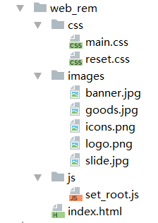
1、创建页面项目目录
2、使用Photoshop对效果图切图,切出网页制作中需要的小图片
3、将装饰类图像合并,制作成雪碧图
4、结合Photoshop和代码编辑器,参照效果图,进行html和css代码书写,制作页面
基于rem的布局
首先了解em单位,em单位是参照元素自身的文字大小来设置尺寸,rem指的是参照根节点的文字大小,根节点指的是html标签,设置html标签的文字大小,其他的元素相关尺寸设置用rem,这样,所有元素都有了统一的参照标准,改变html文字的大小,就会改变所有元素用rem设置的尺寸大小。
cssrem安装
cssrem插件可以动态地将px尺寸换算成rem尺寸
下载本项目,比如:git clone https://github.com/flashlizi/cssrem 进入packages目录:Sublime Text -> Preferences -> Browse Packages... 复制下载的cssrem目录到刚才的packges目录里。 重启Sublime Text。
配置参数 参数配置文件:Sublime Text -> Preferences -> Package Settings -> cssrem px_to_rem - px转rem的单位比例,默认为40。 max_rem_fraction_length - px转rem的小数部分的最大长度。默认为6。 available_file_types - 启用此插件的文件类型。默认为:[".css", ".less", ".sass"]。


1 (function(){
2     var calc = function(){
3         var docElement = document.documentElement;
4         var clientWidthValue = docElement.clientWidth > 750 ? 750 : docElement.clientWidth;
5         docElement.style.fontSize = 20*(clientWidthValue/375) + 'px';
6     }
7     calc();
8     window.addEventListener('resize',calc);
9 })();
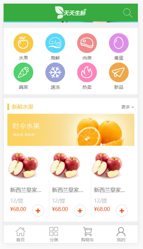
1 <!doctype html> 2 <html lang="en"> 3 <head> 4 <meta charset="UTF-8"> 5 <meta name="viewport" 6 content="width=device-width, user-scalable=no, initial-scale=1.0, maximum-scale=1.0, minimum-scale=1.0"> 7 <meta http-equiv="X-UA-Compatible" content="ie=edge"> 8 <title>天天生鲜-首页-手机版</title> 9 10 <link rel="stylesheet" type="text/css" href="css/reset.css" > 11 <link rel="stylesheet" type="text/css" href="css/main.css"> 12 13 <script type="text/javascript" src="js/set_root.js"></script> <!--引入js文件,该文件设置整体布局的大小变化--> 14 </head> 15 <body> 16 17 <div class="main_wrap"> 18 <div class="header clearfix"> 19 <a href="" class="logo"><img src="images/logo.png" alt="log"></a> 20 <a href="" class="search"></a> 21 </div> 22 23 24 <div class="center_wrap"> 25 <div class="slide"><img src="images/slide.jpg" alt="幻灯片"></div> 26 27 <div class="menu_con clearfix"> 28 <ul class="menu"> 29 <li> 30 <a href=""></a> 31 <h2>水果</h2> 32 </li> 33 <li> 34 <a href=""></a> 35 <h2>海鲜</h2> 36 </li> 37 <li> 38 <a href=""></a> 39 <h2>肉类</h2> 40 </li> 41 <li> 42 <a href=""></a> 43 <h2>禽蛋</h2> 44 </li> 45 <li> 46 <a href=""></a> 47 <h2>蔬菜</h2> 48 </li> 49 <li> 50 <a href=""></a> 51 <h2>速冻</h2> 52 </li> 53 <li> 54 <a href=""></a> 55 <h2>热卖</h2> 56 </li> 57 <li> 58 <a href=""></a> 59 <h2>新品</h2> 60 </li> 61 </ul> 62 </div> 63 64 <div class="common_model clearfix"> 65 <div class="common_title"> 66 <h3 class="fl">新鲜水果</h3> 67 <a href="#" class="fr">更多 ></a> 68 </div> 69 70 <div class="banner"><img src="images/banner.jpg" alt="banner"></div> 71 72 <ul class="goods_list"> 73 <li> 74 <a href="#" class="goods_pic"><img src="images/goods.jpg" alt=""></a> 75 <h3 class="goods_name">新西兰皇家大红富士</h3> 76 <p class="goods_unit">12/提</p> 77 <p class="goods_price">¥68.00</p> 78 <a href="#" class="add_chart"></a> 79 </li> 80 <li> 81 <a href="#" class="goods_pic"><img src="images/goods.jpg" alt=""></a> 82 <h3 class="goods_name">新西兰皇家大红富士</h3> 83 <p class="goods_unit">12/提</p> 84 <p class="goods_price">¥68.00</p> 85 <a href="#" class="add_chart"></a> 86 </li> 87 <li> 88 <a href="#" class="goods_pic"><img src="images/goods.jpg" alt=""></a> 89 <h3 class="goods_name">新西兰皇家大红富士</h3> 90 <p class="goods_unit">12/提</p> 91 <p class="goods_price">¥68.00</p> 92 <a href="#" class="add_chart"></a> 93 </li> 94 </ul> 95 </div> 96 </div> 97 98 99 <div class="footer"> 100 <ul> 101 <li> 102 <a href=""></a> 103 <h2>首页</h2> 104 </li> 105 <li> 106 <a href=""></a> 107 <h2>分类</h2> 108 </li> 109 <li> 110 <a href=""></a> 111 <h2>购物车</h2> 112 </li> 113 <li> 114 <a href=""></a> 115 <h2>我的</h2> 116 </li> 117 </ul> 118 </div> 119 120 </div> 121 122 </body> 123 </html>
 1 /* 将标签默认的间距设置为0 */
 2 body,p,h1,h2,h3,h4,h5,h6,ul,dl,dd,input,form,select{
 3     margin:0;
 4     padding:0;
 5 }
 6
 7 /* 让h标签继承body内设置的字体大小 */
 8 h1,h2,h3,h4,h5,h6{
 9     font-size:100%;
10 }
11
12 /* 去掉默认的项目图标 */
13 ul{
14     list-style:none;
15 }
16
17 a{
18     text-decoration:none;
19 }
20
21 em{
22     font-style:normal;
23 }
24
25 /* 去掉IE下,图片做链接时产生的边框 */
26 img{
27     border:none;
28 }
29
30 /* 清除margin-top塌陷和清除浮动 */
31 .clearfix:before,.clearfix:after{
32     content:"";
33     display:table;
34 }
35 .clearfix:after{
36     clear:both;
37 }
38 .clearfix{
39     zoom:1;
40 }
41
42 /* 浮动 */
43 .fl{
44     float:left;
45 }
46
47 .fr{
48     float:right;
49 }
  1 /* em布局,各尺寸=px/20 */
  2
  3 .main_wrap{
  4     position:absolute;  /*为了避免在微信出问题,所以才用了绝对定位而不是固定定位*/
  5     top:0;
  6     right:0;
  7     bottom:0;
  8     left:0;
  9 }
 10
 11 .header{
 12     height:2.5rem;
 13     background-color:#37ab40;
 14     position:relative;
 15 }
 16
 17 .header .logo{
 18     display:block;   /*为了宽和高生效,将a标签转为块元素*/
 19     width:4.45rem;
 20     height:1.8rem;
 21     margin:0.35rem auto 0;
 22 }
 23
 24 .header .logo img{
 25     width:100%;  /*继承logo的宽度,高度自动也压缩了*/
 26 }
 27
 28 .header .search{
 29     position:absolute;
 30     width:1.35rem;  /*必须设置宽高,不然背景图撑不开宽高*/
 31     height:1.35rem;
 32     right:0.75rem;
 33     top:0.625rem;
 34     background:url(../images/icons.png) left top no-repeat;
 35     background-size:3rem 42rem;  /*将雪碧图压缩*/
 36 }
 37
 38
 39 /* ---------------------------------------------*/
 40 .center_wrap{
 41     position:absolute;
 42     top:2.5rem;
 43     bottom:2.5rem;
 44     left:0;
 45     right:0;
 46     background-color:#efefef;
 47
 48     overflow-x:hidden;
 49     overflow-y:auto;     /* 下拉滚动条,overflow-y必须加在父容器上。且必须指定子元素div的高度才能生效,<div class="center_wrap"><div style="height:1500px;width:200px;>fff</div></div>*/
 50 }
 51
 52
 53 /* -----------*/
 54 .center_wrap .slide img{
 55     width:100%;   /* slide和img都继承了center_wrap的宽度 */
 56 }
 57
 58 /* -----------*/
 59 .menu_con{
 60     height:9.25rem;
 61     background-color:#fff;
 62     margin-top:0.5rem;
 63     overflow:hidden;
 64 }
 65
 66 .menu{
 67     width:19rem;
 68     height:8.1rem;
 69     margin:0.7rem 0 0 1.375rem;
 70     /*background-color:gold;*/
 71 }
 72
 73 .menu li{
 74     width:2.81rem;
 75     height:4.1rem;
 76     float:left;
 77     margin-right:1.625rem;
 78     /*background-color:blue;*/
 79 }
 80
 81 .menu li a{
 82     display:block;   /*为了宽和高生效,将a标签转为块元素*/
 83     width:2.8rem;
 84     height:2.8rem;
 85     background:url(../images/icons.png) left -3rem no-repeat;
 86     background-size:3rem 42rem;   /*将雪碧图压缩*/
 87 }
 88
 89 .menu li h2{
 90     font:13px/1.3rem '微软雅黑';   /*  注意:字体不要设置em,设置em文字随页面变动可能会变小,无意义*/
 91     color:#666;
 92     text-align:center;
 93 }
 94
 95 .menu li:nth-child(2) a{
 96     background-position:left -6rem;
 97 }
 98 .menu li:nth-child(3) a{
 99     background-position:left -9rem;
100 }
101 .menu li:nth-child(4) a{
102     background-position:left -12rem;
103 }
104 .menu li:nth-child(5) a{
105     background-position:left -15rem;
106 }
107 .menu li:nth-child(6) a{
108     background-position:left -18rem;
109 }
110 .menu li:nth-child(7) a{
111     background-position:left -21rem;
112 }
113 .menu li:nth-child(8) a{
114     background-position:left -24rem;
115 }
116
117 /* -----------*/
118 .common_model{
119     background-color:#fff;
120     margin:0.5rem 0;
121 }
122
123 .common_title{
124     width:17.75rem;
125     height:0.9rem;
126     margin:0.8rem auto 0;
127 }
128
129 .common_title h3{
130     font:15px/0.9rem '微软雅黑';
131     color:#fbc83d;
132     border-left:0.25rem solid #fbc83d;
133     text-indent:0.4rem;
134 }
135
136 .common_title a{
137     font:12px/0.9rem '微软雅黑';
138     color:#7f7f7f;
139 }
140
141 .banner{
142     width:17.75rem;
143     height:4.5rem;
144     margin:0.5rem auto 0;
145 }
146
147 .banner img{
148     width:100%;
149 }
150
151 .goods_list{
152     width:17.75rem;
153     height:9.35rem;
154     margin:0.5rem auto 0.7rem;
155 }
156
157 .goods_list li{
158     float:left;
159     width:5.8rem;
160     height:9.35rem;
161     border-right:1px solid #e7e7e7;
162
163     position:relative;
164 }
165
166 .goods_list li:last-child{   /* 将最后一个li的右边线设置为0,即隐藏看不见*/
167     border-right:0px;
168 }
169
170 .goods_list li .goods_pic{
171     display:block;
172     width:4.5rem;
173     height:4.5rem;
174     margin:0.5rem auto;
175 }
176
177 .goods_list li .goods_pic img{
178     width:100%;
179 }
180
181 .goods_list li .goods_name{
182     width:5.0rem;
183     font:15px/15px '微软雅黑';
184     color:#666;
185     margin:0.75rem auto 0;
186
187     /* 这三行代码同时使用,是为了将文字只展示一行,多余的文字用...展示*/
188     overflow:hidden;
189     white-space:nowrap;  /* 文字只能一行展示*/
190     text-overflow:ellipsis;  /* 多余的文字用...展示*/
191 }
192
193 .goods_list li .goods_unit{
194     width:5.0rem;
195     font:12px/12px '微软雅黑';
196     color:#bbb;
197     margin:0.8rem auto 0;
198 }
199
200 .goods_list li .goods_price{
201     width:5.0rem;
202     font:12px/12px '微软雅黑';
203     color:#ff4400;
204     margin:0.5rem auto 0;
205 }
206
207 .goods_list li .add_chart{
208     position:absolute;  /* 绝对定位将a变为了行内块元素了,所以不需要display:block,直接就可以设置宽和高了*/
209     right:0.675rem;
210     bottom:0;
211     width:1.7rem;
212     height:1.7rem;
213     background:url(../images/icons.png) left -27rem no-repeat;
214     background-size:3rem 42rem;
215 }
216
217 @media (min-width:375px){   /* 当页面宽度大于375px时的字体大小 */
218     .goods_list li .goods_unit{
219         font:14px/14px '微软雅黑';
220     }
221
222     .goods_list li .goods_price{
223         font:14px/14px '微软雅黑';
224     }
225 }
226
227
228 /* ---------------------------------------------*/
229 .footer{
230     position:absolute;
231     left:0;
232     bottom:0;
233     background-color:#fff;
234     width:100%;         /* 绝对定位将.footer转换成了内联块元素,内联块元素如果没有设置宽高,宽高由内容决定, 所以这里继承了父元素的宽度*/
235     height:2.5rem;
236 }
237
238 .footer ul{
239     height:2.5rem;
240 }
241
242 .footer li{
243     width:25%;
244     height:2.5rem;
245     float:left;
246 }
247
248 .footer li a{
249     display:block;
250     width:1.375rem;
251     height:1.3rem;
252     margin:0.25rem auto 0;
253     background:url(../images/icons.png) left -30rem no-repeat;
254     background-size:3rem 42rem;
255 }
256
257 .footer li:nth-child(2) a{
258     background-position:left -33rem;
259 }
260 .footer li:nth-child(3) a{
261     background-position:left -36rem;
262 }
263 .footer li:nth-child(4) a{
264     background-position:left -39rem;
265 }
266
267 .footer li h2{
268     font:12px/12px '微软雅黑';
269     color:#949392;
270     text-align:center;
271     margin-top:0.2rem;
272 }
posted on 2019-12-07 10:21 cherry_ning 阅读(419) 评论(0) 收藏 举报


 浙公网安备 33010602011771号