
css3--圆角、阴影、透明度
CSS3圆角、阴影、rgba
CSS3圆角
设置某一个角的圆角,比如设置左上角的圆角:
border-top-left-radius:30px 60px;
同时分别设置四个角: border-radius:30px 60px 120px 150px;
设置四个圆角相同:
border-radius:50%;
CSS3阴影
box-shadow:h-shadow v-shadow blur spread color inset;
分别设置阴影:水平偏移 垂直偏移 羽化大小 扩展大小 颜色 是否内阴影
<style type="text/css">
    .box{
        width:200px;
        height:50px;
        background-color:gold;
        /* box-shadow:10px 10px 5px 2px pink inset; */
        box-shadow:10px 10px 5px 2px pink;
    }
</style>
......
<div class="box"></div>

<!-- 给盒子加上了粉红色的阴影 -->
rgba(新的颜色值表示法)
1、盒子透明度表示法:opacity:0.1;filter:alpha(opacity=10)(兼容IE);
2、rgba(0,0,0,0.1) 前三个数值表示颜色,第四个数值表示颜色的透明度
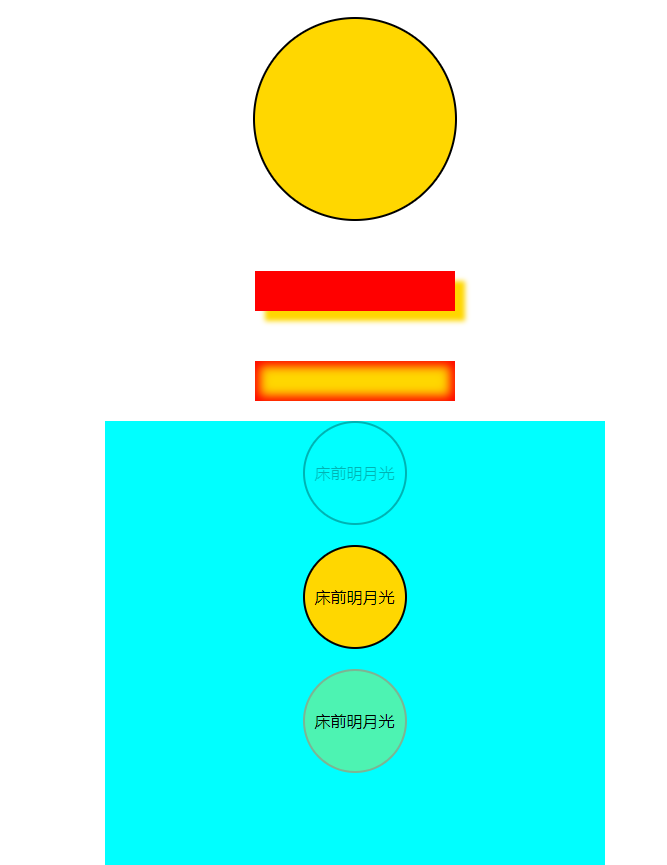
  1 <!doctype html>
  2 <html lang="en">
  3 <head>
  4     <meta charset="UTF-8">
  5     <meta name="viewport"
  6           content="width=device-width, user-scalable=no, initial-scale=1.0, maximum-scale=1.0, minimum-scale=1.0">
  7     <meta http-equiv="X-UA-Compatible" content="ie=edge">
  8     <title>css3 圆角、阴影、透明度</title>
  9
 10     <style type="text/css">
 11         /* 圆角 */
 12         .box{
 13             width:200px;
 14             height:200px;
 15             border:2px solid #000;
 16             margin:20px auto 0;
 17             background-color:gold;
 18
 19             border-top-left-radius:100px 50px;  /* 设置左上角的圆角 */
 20             border-top-right-radius:100px;
 21             border-radius:50px;  /* 设置四个圆角相同 */
 22             border-radius:50%;
 23         }
 24
 25         /* 阴影 */
 26         .shadow1{
 27            width:200px;
 28            height:40px;
 29            margin:50px auto 0;
 30            background-color:red;
 31
 32            box-shadow:10px 10px 5px 0px gold;  /* 分别设置阴影:水平偏移 垂直偏移 羽化大小 扩展大小 颜色 是否内阴影 */
 33         }
 34
 35         .shadow2{
 36            width:200px;
 37            height:40px;
 38            margin:50px auto 0;
 39            background-color:gold;
 40
 41            box-shadow:0px 0px 10px 5px red inset;   /* 内阴影 */
 42         }
 43
 44         /* 盒子透明度表示法 */
 45         .main-box{
 46             width:500px;
 47             height:500px;
 48             background-color:cyan;
 49             margin:20px auto 0;
 50         }
 51
 52         .box1{
 53             width:100px;
 54             height:100px;
 55             border:2px solid #000;
 56             margin:20px auto 0;
 57             border-radius:50%;
 58             text-align:center;  /* 文字横向居中*/
 59             line-height:100px;  /* 文字纵向居中*/
 60             background:url(../images/location_bg.jpg);
 61
 62             opacity:0.3;      /* 盒子透明度表示法,且文字透明度一起变*/
 63             filter:alpha(opacity=30);  /* 兼容IE */
 64
 65         }
 66
 67         /* 设置各自色块的透明度 */
 68         .box2{
 69             width:100px;
 70             height:100px;
 71             border:2px solid #000;
 72             margin:20px auto 0;
 73             border-radius:50%;
 74             text-align:center;  /* 文字横向居中*/
 75             line-height:100px;  /* 文字纵向居中*/
 76
 77             background-color:rgba(255,215,0);
 78         }
 79
 80         .box3{
 81             width:100px;
 82             height:100px;
 83             border:2px solid #000;
 84             margin:20px auto 0;
 85             border-radius:50%;
 86             text-align:center;  /* 文字横向居中*/
 87             line-height:100px;  /* 文字纵向居中*/
 88
 89             background-color:rgba(255,215,0,0.3);   /* 前三个数值表示颜色,第四个数值表示颜色的透明度 */
 90             border:2px solid rgba(233,41,75,0.3);
 91         }
 92
 93
 94     </style>
 95 </head>
 96 <body>
 97
 98 <div class="box"></div>
 99
100 <div class="shadow1"></div>
101 <div class="shadow2"></div>
102
103 <div class="main-box">
104     <div class="box1">床前明月光</div>
105     <div class="box2">床前明月光</div>
106     <div class="box3">床前明月光</div>
107 </div>
108
109 </body>
110 </html>
posted on 2019-11-25 19:51 cherry_ning 阅读(268) 评论(0) 收藏 举报


 浙公网安备 33010602011771号