
09-前端网页基础-h5与css3新特性-2
h5与css3新特性
output标签
- <output name="名称" for="element_id">默认内容</output>
- for:定义输出域相关一个或多个元素,以空格隔开;
- form:定义输入字段所属的一个或多个表单,以空格隔开;
- name:定义对象的唯一名称(表单提交时使用)
- 代码演示
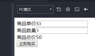
<!DOCTYPE html>
<html>
    <head>
        <meta charset="utf-8">
        <title></title>
    </head>
    <body>
        <div>
            商品单价<input type="number" id="price" value="50" oninput="total.value=parseInt(price.value)*parseInt(amount.value)"><br>
            商品数量<input type="number" id="amount" value="1" oninput="total.value=parseInt(price.value)*parseInt(amount.value)"><br>
            商品总价<ouput id="total" for="price amount" form="cart">50</output><br>
            <input type="button" name="" id="" value="立即购买" onclick="alert('总价:'+document.getElementById('total').innerText)"/>
        </div>
    </body>
</html>
progress进度条标签
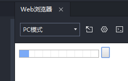
- <progress value="22" max="100"></progress>,结合JavaScript显示 一个进度条
- 代码演示
<!DOCTYPE html>
<html>
    <head>
        <meta charset="utf-8">
        <title></title>
    </head>
    <body>
        <progress max="100" value="10" id="progress"></progress>
        <input type="button" name="" value="" onclick="start_download()"/>
        <script type="text/javascript">
            progress = document.getElementById('progress')
            value = 0
            step = 0.2
            function start_download(){
                setInterval(download,50)
            }
            function download(){
                value += step
                progress.value = value
            }
        </script>
    </body>
</html>
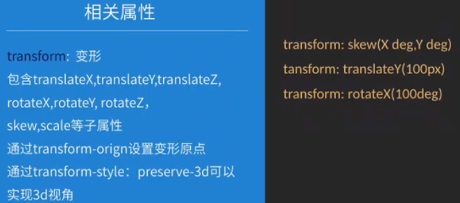
变型属性
- 代码演示
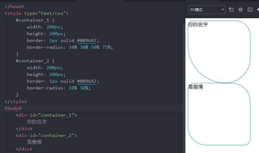
<!DOCTYPE html> <html> <head> <meta charset="utf-8"> <title></title> </head> <style type="text/css"> #container_1 { width: 200px; height: 200px; border: 1px solid #0096A7; border-radius: 10% 30% 50% 75%; } #container_2 { width: 200px; height: 200px; border: 1px solid #0096A7; border-radius: 10% 30%; } </style> <body> <div id="container_1"> 你的名字 </div> <div id="container_2"> 是爱情 </div> </body> </html>
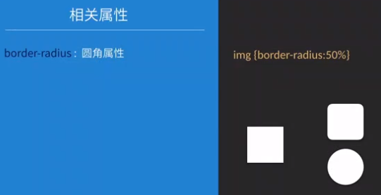
#border-radius: 10% 30% 50% 70%;分别表示左上10%右上30%、右下50%左下70%
#border-radius: 10% 30%;分别表示左上右下10%,右上左下30%
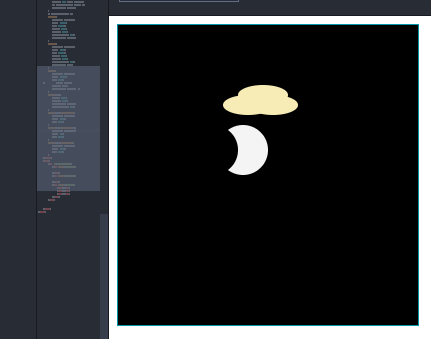
<!DOCTYPE html>
<html>
    <head>
        <meta charset="utf-8">
        <title></title>
    </head>
    <style type="text/css">
        #container {
            position: relative;
            width: 300px;
            height: 300px;
            border: 1px solid #0096A7;
            /* border-radius: 100px; */
            background: #000000;
        }
        /* 拥有月色与云彩的夜晚 */
        .moon_1{
            position: absolute;
            left: 100px;
            top: 100px;
            width: 50px;
            height: 50px;
            border-radius: 50%;
            background: #F4F4F4;
        }
        .moon_2{
            position: absolute;
            left: 70px;
            top: 100px;
            width: 50px;
            height: 50px;
            border-radius: 50%;
            background: #000;
        }
        .cloud{
            position: absolute;
            left: 100px;
            top: 50px;
    /*         width: 100px;
            height: 30px;
            background: #00FF00; */
        }
        .cloud>div{
            width: 50px;
            height: 20px;
            background: #F7ECB5;
            border-radius: 50%;
        }
        .cloud>div:first-child{
            position: absolute;
            left: 20px;
            top: 10px;
        }
        .cloud>div:nth-child(2){
            position: absolute;
            left: 5px;
            top: 20px;
        }
        .cloud>div:last-child{
            position: absolute;
            left: 30px;
            top: 20px;
        }
    </style>
    <body>
        <div id="container">
            <div class="moon_1">

            </div>
            <div class="moon_2">

            </div>
            <div class="cloud">
                <div></div>
                <div></div>
                <div></div>
            </div>
        </div>


    </body>
</html>
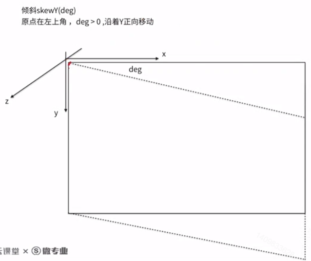
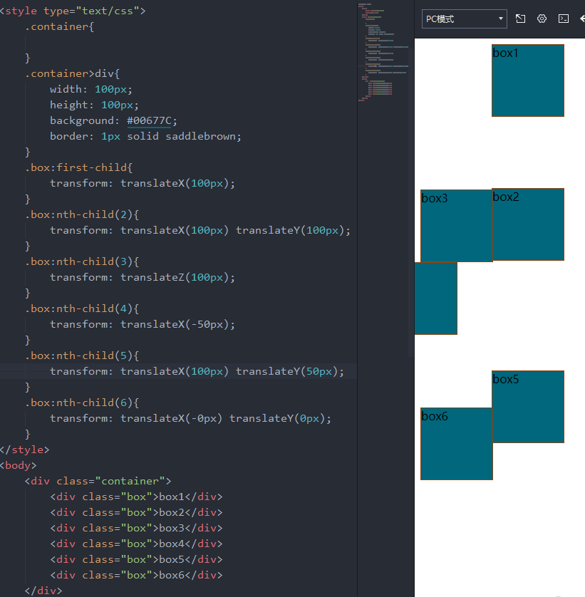
元素变形—移动、倾斜、旋转
元素变形——移动
<!DOCTYPE html>
<html>
    <head>
        <meta charset="utf-8">
        <title></title>
    </head>
    <style type="text/css">
        .container{

        }
        .container>div{
            width: 100px;
            height: 100px;
            background: #00677C;
            border: 1px solid saddlebrown;
        }
        .box:first-child{
            transform: translateX(100px);
        }
        .box:nth-child(2){
            transform: translateX(100px) translateY(100px);
        }
        .box:nth-child(3){
            transform: translateZ(100px);
        }
        .box:nth-child(4){
            transform: translateX(-50px);
        }
        .box:nth-child(5){
            transform: translateX(100px) translateY(50px);
        }
        .box:nth-child(6){
            transform: translateX(-0px) translateY(0px);
        }
    </style>
    <body>
        <div class="container">
            <div class="box">box1</div>
            <div class="box">box2</div>
            <div class="box">box3</div>
            <div class="box">box4</div>
            <div class="box">box5</div>
            <div class="box">box6</div>
        </div>
    </body>
</html>
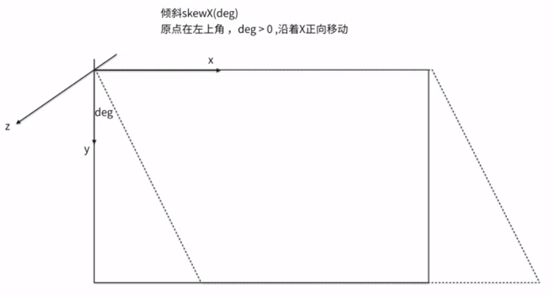
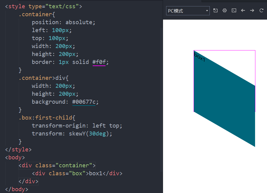
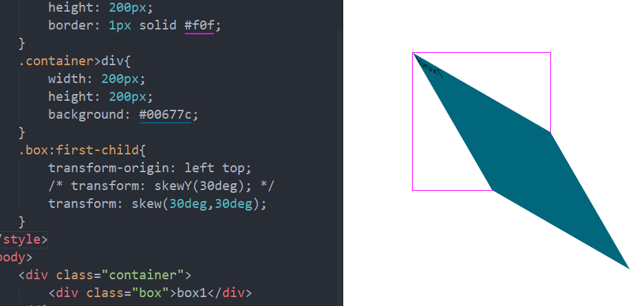
元素变形——倾斜
<!DOCTYPE html>
<html>
    <head>
        <meta charset="utf-8">
        <title></title>
    </head>
    <style type="text/css">
        .container{
            position: absolute;
            left: 100px;
            top: 100px;
            width: 200px;
            height: 200px;
            border: 1px solid #f0f;
        }
        .container>div{
            width: 200px;
            height: 200px;
            background: #00677c;
        }
        .box:first-child{
            transform-origin: left top;
            transform: skewY(30deg);
       /* transform:skew(30deg,30deg); */
        }
    </style>
    <body>
        <div class="container">
            <div class="box">box1</div>
        </div>
    </body>
</html>
元素变形—旋转
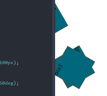
<!DOCTYPE html>
<html>
    <head>
        <meta charset="utf-8">
        <title></title>
    </head>
    <style type="text/css">
        .container{
            position: absolute;
            width: 100px;
            height: 100px;
        }
        .container>div{
            width: 100px;
            height: 100px;
            background: #00677C;
            border: 1px solid saddlebrown;
        }
        .box:first-child{
            transform: rotateZ(60deg) translateY(100px);
        }
        .box:nth-child(2){
            transform: translateY(100px) rotateZ(60deg);
        }
        .box:nth-child(3){
            transform: rotate(-60deg);
        }
    </style>
    <body>
        <div class="container">
            <div class="box">box1</div>
            <div class="box">box2</div>
            <div class="box">box3</div>
        </div>
    </body>
</html>
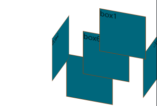
<!DOCTYPE html>
<html>
    <head>
        <meta charset="utf-8">
        <title></title>
    </head>
    <style type="text/css">
        .container{
            position: absolute;
            left: 200px;
            top: 100px;
            transform-style: preserve-3d;
            transform: rotateX(30deg) rotateY(20deg);
        }
        .container>div{
            position: absolute;
            left: 0;
            top: 0;
            width: 100px;
            height: 100px;
            background: #00677C;
            border: 1px solid saddlebrown;
        }
        .box:nth-child(1){
            transform: translateZ(100px);
        }
        .box:nth-child(2){
            transform: rotateY(180deg) translateZ(100px);
        }
        .box:nth-child(3){
            transform: rotateY(90deg) translateZ(100px);
        }
        .box:nth-child(4){
            transform: rotateY(-90deg) translateZ(100px);
        }
        .box:nth-child(5){
            transform: rotateY(90deg) translateZ(100px);
        }
        .box:nth-child(6){
            transform: rotateX(-90deg) translateZ(100px);
        }
    </style>
    <body>
        <div class="container">
            <div class="box">box1</div>
            <div class="box">box2</div>
            <div class="box">box3</div>
            <div class="box">box4</div>
            <div class="box">box5</div>
            <div class="box">box6</div>
        </div>
    </body>
</html>
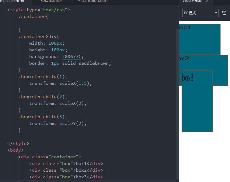
元素变形—缩放
<!DOCTYPE html>
<html>
    <head>
        <meta charset="utf-8">
        <title></title>
    </head>
    <style type="text/css">
        .container{

        }
        .container>div{
            width: 100px;
            height: 100px;
            background: #00677C;
            border: 1px solid saddlebrown;
        }
        .box:nth-child(1){
            transform: scaleX(1.5);
        }
        .box:nth-child(2){
            transform: scaleX(2);
        }
        .box:nth-child(3){
            transform: scaleY(2);
        }

    </style>
    <body>
        <div class="container">
            <div class="box">box1</div>
            <div class="box">box2</div>
            <div class="box">box3</div>
        </div>
    </body>
</html>
动画属性
transition
- 参考资料:https://developer.mozilla.org/zh-CN/docs/Web/CSS/CSS_Transitions/Using_CSS_transitions
| transition-property | 指定transition属性的name,transition效果 |
| transition-duration | 设定出现transition效果的时长 |
| transition-timing-function | 指定transition效果的转速曲线 |
| transition-delay | 定义transition效果延时多少秒才开始的 |
animation
- 参考资料:https://www.runoob.com/cssref/css3-pr-animation.html
| 值 | 说明 |
|---|---|
| animation-name | 指定动画的名称 |
| animation-duration | 设定动画持续时间 |
| animation-timing-function | 设置动画速度效果的速度曲线 |
| animation-delay | 设置动画在启动前的延迟时间。 |
| animation-iteration-count | 定义动画的播放次数。 |
| animation-direction | 指定是否应该轮流反向播放动画。 |
| animation-fill-mode | 规定当动画不播放时(当动画完成时,或当动画有一个延迟未开始播放时),要应用到元素的样式。 |
| animation-play-state | 指定动画是否正在运行或已暂停。 |
| initial | 设置属性为其默认值。 阅读关于 initial的介绍。 |
| inherit | 从父元素继承属性。 阅读关于 initinherital的介绍。 |
| infinite | 循环播放动画 |
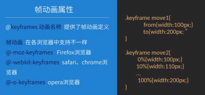
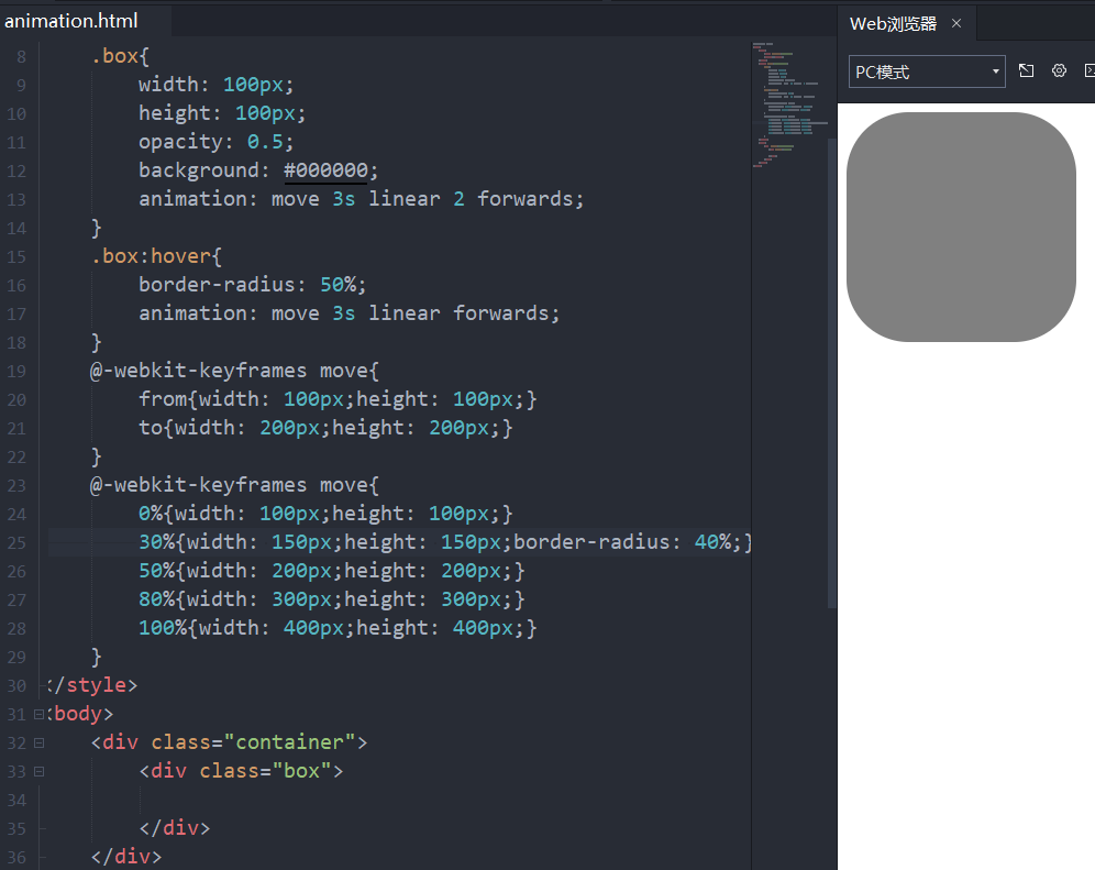
<!DOCTYPE html>
<html>
    <head>
        <meta charset="utf-8">
        <title></title>
    </head>
    <style type="text/css">
        .box{
            width: 100px;
            height: 100px;
            opacity: 0.5;
            background: #000000;
            animation: move 3s linear 2 forwards;
        }
        .box:hover{
            border-radius: 50%;
            animation: move 3s linear forwards;
        }
        @-webkit-keyframes move{
            from{width: 100px;height: 100px;}
            to{width: 200px;height: 200px;}
        }
        @-webkit-keyframes move{
            0%{width: 100px;height: 100px;}
            30%{width: 150px;height: 150px;border-radius: 40%;}
            50%{width: 200px;height: 200px;}
            80%{width: 300px;height: 300px;}
            100%{width: 400px;height: 400px;}
        }
    </style>
    <body>
        <div class="container">
            <div class="box">

            </div>
        </div>
    </body>
</html>

 浙公网安备 33010602011771号