
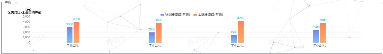
3.柱状图
1. 多个柱状图
<template>
  <div>
    <div ref="chart1" class="chart"></div>
  </div>
</template>
<script>
import * as echarts from "echarts";
export default {
  data() {
    return {
      chartOption: {
        // backgroundColor: 'rgba(0,0,0,0.6)',
        grid: {
          top: "25%",
          left: "5%",
          right: "5%",
          bottom: "8%",
          containLabel: true
        },
        title: {
          text: "区内对比-工业亩均产值",
          left: "10",
          top: "20",
          // padding: [10, 0, 0, 50],
          textStyle: {
            color: "#000",
            fontFamily: "Alibaba PuHuiTi",
            fontSize: 14,
            fontWeight: 600
            // padding: [0, 0, 0, 35]
          }
        },
        legend: {
          data: ["计划投资额(万元)", "实际投资额(万元)"],
          left: "center",
          top: 30,
          itemWidth: 15,
          itemHeight: 10,
          itemGap: 15,
          borderRadius: 4,
          textStyle: {
            color: "#000",
            fontFamily: "Alibaba PuHuiTi",
            fontSize: 14,
            fontWeight: 400
          }
        },
        tooltip: {
          trigger: "axis",
          backgroundColor: "rgba(8,49,107,0.9)", //设置背景颜色
          borderColor: "rgba(8,49,107,0.9)", //设置边框颜色
          confine: true,
          textStyle: {
            color: "white" //设置文字颜色
          },
          axisPointer: {
            // 坐标轴指示器,坐标轴触发有效
            type: "shadow" // 默认为直线,可选为:'line' | 'shadow'
          },
          //formatter: "{a} <br/>{b} : {c} ({d}%)"
          formatter: function(params) {
            // 颜色默认是:params[i].color。
            // 如果是渐变颜色需要改写成:params[i].color.colorStops[0].color
            var relVal = params[0].name;
            for (var i = 0, l = params.length; i < l; i++) {
              relVal +=
                '<br/><span style="display:inline-block;margin-right:5px;border-radius:10px;width:9px;height:9px;background-color:' +
                params[i].color.colorStops[0].color +
                '"></span>';
              relVal += params[i].seriesName + " : " + params[i].value + "万元";
            }
            return relVal;
          }
        },
        xAxis: {
          type: "category",
          data: [],
          axisLine: {
            show: false,
            lineStyle: {
              color: "#ECECEC"
            }
          },
          axisTick: {
            show: false
          },
          axisLabel: {
            // interval: 0,
            // rotate: 40,
            show: true,
            textStyle: {
              fontFamily: "Microsoft YaHei",
              color: "#666666"
            }
          }
        },
        yAxis: {
          name: "(亩)",
          nameTextStyle: {
            color: "#000",
            fontFamily: "Alibaba PuHuiTi",
            fontSize: 14,
            fontWeight: 600,
            padding: [10, 0, 0, -30]
          },
          nameGap: 25, // 表现为上下位置
          type: "value",
          //max:'5000',
          axisLine: {
            show: false,
            lineStyle: {
              color: "#666666"
            }
          },
          splitLine: {
            show: true,
            lineStyle: {
              color: "#ECECEC"
            }
          },
          axisLabel: {
            textStyle: {
              fontFamily: "Microsoft YaHei",
              color: "#393939",
              fontSize: 12
            }
          }
        },
        series: [
          {
            name: "计划投资额(万元)",
            type: "bar",
            barWidth: "25",
            label: {},
            itemStyle: {
              normal: {
                color: new echarts.graphic.LinearGradient(0, 0, 0, 1, [
                  {
                    offset: 0,
                    color: "#7E7CEB"
                  },
                  {
                    offset: 1,
                    color: "#79C7F3"
                  }
                ])
              }
            },
            //柱子头部显示数字
            label: {
              normal: {
                show: true,
                fontSize: 13,
                color: "#14B6F3",
                position: "top"
              }
            },
            data: []
          },
          {
            name: "实际投资额(万元)",
            type: "bar",
            barWidth: "25",
            itemStyle: {
              normal: {
                color: new echarts.graphic.LinearGradient(0, 0, 0, 1, [
                  {
                    offset: 0,
                    color: "#F98563"
                  },
                  {
                    offset: 1,
                    color: "#FBAC69"
                  }
                ])
              }
            },
            //柱子头部显示数字
            label: {
              normal: {
                show: true,
                fontSize: 13,
                color: "#14B6F3",
                position: "top"
              }
            },
            data: []
          }
        ]
      }
    };
  },
  async mounted() {
    const chart = echarts.init(this.$refs.chart1);
    chart.setOption(this.chartOption);
    await this.fetchData();
  },
  methods: {
    async fetchData() {
      //获取接口数据
      let xData = ["工业亩均产值1","工业亩均产值2","工业亩均产值3","工业亩均产值4"];
      let series1 = [3000, 2000, 1500, 2500];
      let series2 = [4000, 3800, 4200, 3800];
      //将数据渲染到echarts图
      const chart = echarts.init(this.$refs.chart1);
      chart.setOption({
        xAxis: {
          data: xData
        },
        series: [{ data: series1 }, { data: series2 }]
      });
    }
  }
};
</script>
<style scoped lang="scss">
.chart {
  width: 100%;
  height: 300px;
}
</style>
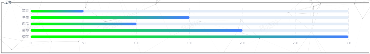
2.横向柱状图
<template>
  <div>
    <div ref="chart1" class="chart"></div>
  </div>
</template>
<script>
import * as echarts from "echarts";
export default {
  data() {
    return {
      chartOption: {
        grid: {
          left: "5%",
          right: "5%",
          bottom: "12%",
          top: "5%",
          containLabel: true
        },
        tooltip: {
          show: true,
          textStyle: {
            fontWeight: "bold",
            fontSize: 16
          }
        },
        xAxis: [
          {
            type: "value",
            axisTick: {
              show: false
            },
            min: 0,

            axisLine: {
              show: true,
              lineStyle: {
                color: "#707070",
                width: 0
              }
            },
            splitLine: {
              show: true,
              lineStyle: {
                color: "#e7e9ef",
                type: "dashed"
              }
            },
            nameTextStyle: {
              color: "red"
            },
            name: "",
            axisLabel: {
              inside: false,
              textStyle: {
                color: "#8f919e",
                fontSize: 14
              },
              interval: 0
            }
          }
        ],
        yAxis: [
          {
            type: "category",
            inverse: true,
            axisLabel: {
              show: true,
              color: "#8f919e",
              fontSize: 15
            },
            splitLine: {
              show: false,
              lineStyle: {
                color: "#e7e9ef"
              }
            },
            axisLine: {
              show: true,
              lineStyle: {
                color: "#707070",
                width: 0
              }
            },
            axisTick: {
              show: false
            },
            data: []
          }
        ],
        series: [
          {
            type: "bar",
            stack: "1",
            barWidth: 12,
            barBorderRadius: 30,
            showBackground: true,
            backgroundStyle: {
              color: "rgba(228, 237, 248, 1)",
              borderRadius: 7
            },
            itemStyle: {
              normal: {
                barBorderRadius: 20,
                color: function() {
                  return {
                    type: "linear",
                    x: 1,
                    y: 0,
                    x2: 0,
                    y2: 0,
                    colorStops: [
                      {
                        offset: 0,
                        color: "#457fff" // 0% 处的颜色
                      },
                      {
                        offset: 0.9,
                        color: "#0f0" // 100% 处的颜色
                      }
                    ]
                  };
                }
              }
            },
            data: []
          }
        ]
      }
    };
  },
  async mounted() {
    const chart = echarts.init(this.$refs.chart1);
    chart.setOption(this.chartOption);
    await this.fetchData();
  },
  methods: {
    async fetchData() {
      //获取接口数据
      let yData=["苹果", "草莓", "西瓜", "葡萄", "榴莲"]
      let series1 = [50, 150, 100, 200, 300];
      //将数据渲染到echarts图
      const chart = echarts.init(this.$refs.chart1);
      chart.setOption({
        yAxis: {
          data: yData
        },
        series: [{ data: series1 }]
      });
    }
  }
}
</script>
<style scoped lang="scss">
.chart {
  width: 100%;
  height: 300px;
}
</style>
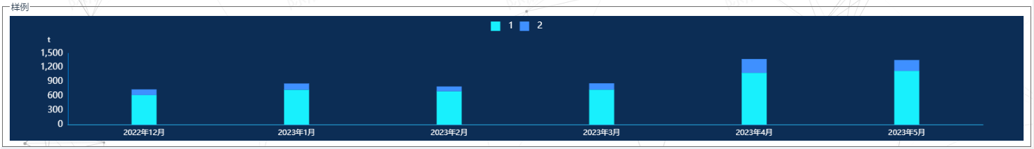
3.堆叠柱状图
<template>
  <div>
    <div ref="chart1" class="chart"></div>
  </div>
</template>
<script>
import * as echarts from "echarts";
export default {
  data() {
    return {
      chartOption: {
        tooltip: {
          trigger: "axis",
          axisPointer: {
            // 坐标轴指示器,坐标轴触发有效
            type: "shadow" // 默认为直线,可选为:'line' | 'shadow'
          },
          formatter: function(params) {
            // 颜色默认是:params[i].color。
            // 如果是渐变颜色需要改写成:params[i].color.colorStops[0].color
            var relVal = params[0].name;
            for (var i = 0, l = params.length; i < l; i++) {
              relVal +=
                '<br/><span style="display:inline-block;margin-right:5px;border-radius:10px;width:9px;height:9px;background-color:' +
                params[i].color +
                '"></span>';
              relVal += params[i].seriesName + " : " + params[i].value + "t";
            }
            return relVal;
          }
        },
        backgroundColor: "#0c2d55",
        color: ["#18f0fd", "#3f90ff"],
        legend: {
          show: true,
          top: "2%",
          icon: "rect",
          itemWidth: 15, // 图例标记的图形宽度。
          itemHeight: 15, //  图例标记的图形高度。
          textStyle: {
            color: "#fff",
            fontSize: 14,
            padding: [0, 8, 0, 8]
          }
        },
        grid: {
          left: "3%",
          right: "4%",
          bottom: "3%",
          containLabel: true
        },
        xAxis: [
          {
            type: "category",
            axisLine: {
              //坐标轴轴线相关设置。数学上的x轴
              show: true,
              lineStyle: {
                color: "rgb(41,188,245)"
              }
            },
            axisLabel: {
              //坐标轴刻度标签的相关设置
              textStyle: {
                color: "#FFFFFF",
                fontSize: 12
              }
            },
            splitLine: {
              show: false,
              lineStyle: {
                color: "#233653"
              }
            },
            axisTick: {
              show: false
            },
            data: []
          }
        ],
        yAxis: [
          {
            name: "t",
            nameTextStyle: {
              color: "#fff",
              fontSize: 12,
              padding: [0, 60, 0, 0]
            },
            // minInterval: 1,
            type: "value",
            splitLine: {
              show: true,
              lineStyle: {
                color: "#1160a0",
                type: "dashed"
              }
            },
            axisLine: {
              show: true,
              lineStyle: {
                color: "#008de7"
              }
            },
            axisLabel: {
              show: true,
              textStyle: {
                color: "#fff",
                fontSize: 14
              }
            },
            axisTick: {
              show: false
            },
            splitLine: false
          }
        ],
        series: [
          {
            name: "1",
            type: "bar",
            stack: "搜索引擎",
            barWidth: 40,
            label: {
              show: false
            },
            data: []
          },
          {
            name: "2",
            type: "bar",
            label: {
              show: false
            },
            stack: "搜索引擎",
            data: []
          }
        ]
      }
    };
  },
  async mounted() {
    const chart = echarts.init(this.$refs.chart1);
    chart.setOption(this.chartOption);
    await this.fetchData();
  },
  methods: {
    async fetchData() {
      //获取接口数据
      let xData = ["2022年12月","2023年1月","2023年2月","2023年3月","2023年4月","2023年5月"];
      let series1 = [620, 732, 701, 734, 1090, 1130, 1120];
      let series2 = [120, 132, 101, 134, 290, 230, 220];
      //将数据渲染到echarts图
      const chart = echarts.init(this.$refs.chart1);
      chart.setOption({
        xAxis: {
          data: xData
        },
        series: [{ data: series1 }, { data: series2 }]
      });
    }
  }
};
</script>
<style scoped lang="scss">
.chart {
  width: 100%;
  height: 300px;
}
</style>
转载请注明原文链接:https://www.cnblogs.com/chenJieLing/

 浙公网安备 33010602011771号