css布局
一、介绍css常用于布局属性:
1、float 浮动
可使元素脱离文本流并设置浮动方向
2、display:inline-block
可使元素成为内联块元素
3、position:absolute
可使元素脱离文本流,离自身最近的定位祖先元素为基准进行偏移
4、display:flex
可使元素成为弹性伸缩盒子
二、css通过这些属性,可以实现多种布局:
1、左右布局

<div class="box">
 <div class="item left">left item</div>
 <div class="item right">right item</div>
</div>
1)float布局
.box{background:#000;}
.item{height:100px;}
.left{width:100px;float:left;background:#eee;}
.right{margin-left:100px;background:#f00;}
或者可以
.box{background:#000;}
.item{height:100px;}
.left{width:100px;float:left;background:#eee;}
.right{width:100px;float:right;background:#f00;}
可通过float和margin的搭配,实现不同的左右布局效果。
但此时子元素都脱离文本流,父元素会发生高度塌陷。因此需要清除浮动。
可以通过overflow或者clear进行清除。clearfix也使常用小技巧
.clearfix:after{content:'';display:block;clear:both;}
2) inline-block
.box{background:#000;font-size:0;}
.item{display:inline-block;height:100px;font-size:18px;}
.left{width:100px;background:#eee;}
.right{width:150px;background:#f00;}
把元素设置为inline-block,可实现左右布局,且可给元素设置宽高。但元素之间会出现间距。可通过font-size:0进行清除。
3)position
.box{position:relative;background:#000;display:flex;}
.item{height:100px;}
.left{position:absolute;top:0;left:0;width:100px;background:#eee;}
.right{position:absolute;top:0;right:0;width:150px;background:#f00;}
子元素可通过父元素进行绝对定位
4) flex
.box{background:#000;display:flex;}
.item{height:100px;}
.left{width:100px;background:#eee;}
.right{flex:1;background:#f00;}
很好用,唯一的缺点就是有兼容性问题
2、左中右布局
<div class="box">
 <div class="item left">left item</div>
 <div class="item middle">middle item</div>
 <div class="item right">right item</div>
</div>
1)float
.box{background:#000;}
.item{height:100px;}
.left{width:100px;float:left;background:#eee;}
.middle{width:100px;float:left;background:#00f;}
.right{margin-left:200px;background:#f00;}
可通过float和margin的搭配,实现不同的左中右布局效果
2)inline-block,参照左右布局即可实现
3)position,参考左右布局即可实现
4)flex,参考左右布局即可实现
3、水平居中
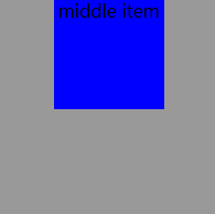
<div class="box">
 <div class="item middle">middle item</div>
</div>
1)inline-block
.box{background:#999;width:200px;height:200px;text-align:center;}
.middle{background:#00f;width:100px;height:100px;display:inline-block;}
text-align可以改变内联元素的位置
2)position
.box{position:relative;background:#999;width:200px;height:200px;}
.middle{position:absolute;top:0;left:50%;margin-left:-50px;background:#00f;width:100px;height:100px;}
3) flex
.box{background:#999;width:200px;height:200px;display:flex;justify-content:center;}
.middle{background:#00f;width:100px;height:100px;}
4、垂直居中
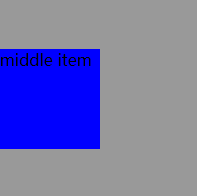
<div class="box">
 <div class="item middle">middle item</div>
</div>
1)inline-block
.box{background:#999;width:200px;height:200px;line-height:200px;}
.middle{background:#00f;width:100px;height:100px;display:inline-block;vertical-align:middle;line-height:100px;}
可利用父元素的line-height,搭配vertical-align:middle,把内联元素垂直居中。
2) position
.box{position:relative;background:#999;width:200px;height:200px;}
.middle{position:absolute;top:50%;left:0;margin-top:-50px;background:#00f;width:100px;height:100px;}
3) flex
.box{background:#999;width:200px;height:200px;display:flex;align-items:center;}
.middle{background:#00f;width:100px;height:100px;}

 浙公网安备 33010602011771号