flex学习之flex-wrap
flex-wrap决定了flex container是单行还是多行
· nowrap(默认):单行
· wrap:多行
· wrap-reverse:多行(对比wrap,cross start与cross end相反
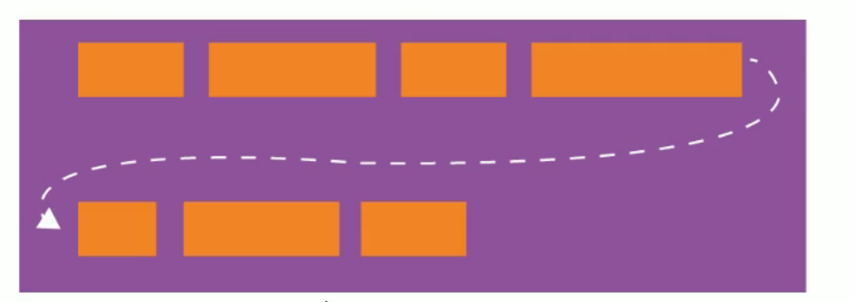
flex-flow是flex-direction||flex-wrap的缩写
· 可以省略,顺序任意
<!DOCTYPE html>
<html lang="en">
<head>
    <meta charset="UTF-8">
    <title>Title</title>
    <style>
        .box{
            width: 500px;
            height: 500px;
            background: orange;
            margin: 0 auto;
            display: flex;
            /*flex-direction: column-reverse;*/
            /*justify-content: space-around;*/
            /*在交叉轴上进行排列的方式*/
            /*align-items: normal;*/

            /*flex-wrap: wrap-reverse;*/

            flex-flow: row-reverse wrap;
            justify-content: space-evenly;
        }
        .item{
            width: 100px;
            height: 100px;
            text-align: center;
            line-height: 100px;
        }
        .item1{
            background: #42b983;
            color: white;
        }
        .item2{
            background: green;
            color: white;
        }
        .item3{
            background: blue;
            color: white;
        }
    </style>
</head>
<body>
        <div class="box">
            <div class="item item1">item1</div>
            <div class="item item2">item2</div>
            <div class="item item3">item3</div>
            <div class="item item3">item4</div>
            <div class="item item3">item5</div>
            <div class="item item3">item6</div>
            <div class="item item3">item7</div>
            <div class="item item3">item8</div>
            <div class="item item3">item9</div>
        </div>
</body>
</html>
本文来自博客园,作者:竹石2020,转载请注明原文链接:https://www.cnblogs.com/ch2020/p/14872217.html

 浙公网安备 33010602011771号