
使用css属性position: sticky实现表格前5列和首行固定
position: sticky 是 CSS 中一种实用的定位方式,使元素在滚动时根据阈值在 相对定位 和 固定定位 之间切换。
混合定位:元素默认表现如 position: relative,当滚动到指定阈值(如 top: 10px)时切换为 position: fixed,滚动出父容器后恢复。
依赖阈值:必须设置至少一个方向属性(top、bottom、left、right)来触发固定行为。
使用 position: sticky 属性实现表格首行固定
<style>
  div {
    overflow: auto;
    width: 800px;
    height: 500px;
  }
  table {
    table-layout: fixed;
    border-collapse: separate;
    border-spacing: 0;
    width: 1000px;
    height: 600px;
  }

  table th,
  table td {
    border: 1px silver solid;
    width: 100px;
    height: 200px;
    line-height: 200px;
  }

  table th {
    position: sticky;
    background: #fff;
    z-index: 2;
    top: 0;
  }
</style>
<div>
  <table>
    <thead>
      <tr>
        <th>col1</th>
        <th>col2</th>
        <th>col3</th>
        <th>col4</th>
        <th>col5</th>
        <th>col6</th>
        <th>col7</th>
        <th>col8</th>
        <th>col9</th>
        <th>col10</th>
      </tr>
    </thead>
    <tbody>
      <tr>
        <td>1</td>
        <td>2</td>
        <td>3</td>
        <td>4</td>
        <td>5</td>
        <td>6</td>
        <td>7</td>
        <td>8</td>
        <td>9</td>
        <td>10</td>
      </tr>
      <tr>
        <td>1</td>
        <td>2</td>
        <td>3</td>
        <td>4</td>
        <td>5</td>
        <td>6</td>
        <td>7</td>
        <td>8</td>
        <td>9</td>
        <td>10</td>
      </tr>
    </tbody>
  </table>
</div>
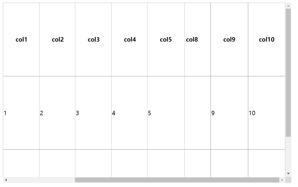
使用position: sticky 属性实现表格前5列固定
<style>
  div {
    overflow: auto;
    width: 800px;
    height: 500px;
  }
  table {
    table-layout: fixed;
    border-collapse: separate;
    border-spacing: 0;
    width: 1000px;
    height: 600px;
  }

  table th,
  table td {
    border: 1px silver solid;
    width: 100px;
    height: 200px;
    line-height: 200px;
  }

  th:nth-child(-n + 5),
  td:nth-child(-n + 5) {
    position: sticky;
    background: #fff;
    z-index: 2;
  }

  th:nth-child(1),
  td:nth-child(1) {
    left: 0;
  }
  th:nth-child(2),
  td:nth-child(2) {
    left: 100px;
  }
  th:nth-child(3),
  td:nth-child(3) {
    left: 200px;
  }
  th:nth-child(4),
  td:nth-child(4) {
    left: 300px;
  }
  th:nth-child(5),
  td:nth-child(5) {
    left: 400px;
  }
</style>
<div>
  <table>
    <thead>
      <tr>
        <th>col1</th>
        <th>col2</th>
        <th>col3</th>
        <th>col4</th>
        <th>col5</th>
        <th>col6</th>
        <th>col7</th>
        <th>col8</th>
        <th>col9</th>
        <th>col10</th>
      </tr>
    </thead>
    <tbody>
      <tr>
        <td>1</td>
        <td>2</td>
        <td>3</td>
        <td>4</td>
        <td>5</td>
        <td>6</td>
        <td>7</td>
        <td>8</td>
        <td>9</td>
        <td>10</td>
      </tr>
      <tr>
        <td>1</td>
        <td>2</td>
        <td>3</td>
        <td>4</td>
        <td>5</td>
        <td>6</td>
        <td>7</td>
        <td>8</td>
        <td>9</td>
        <td>10</td>
      </tr>
    </tbody>
  </table>
</div>
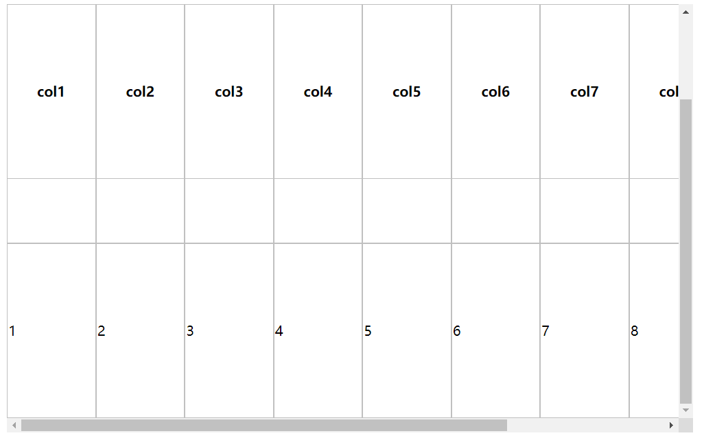
使用 position: sticky 属性实现表格前5列和首行固定
注意:首行的前5列的层级应比其他单元格层级高,避免内容覆盖
<style>
  div {
    overflow: auto;
    width: 800px;
    height: 500px;
  }

  table {
    table-layout: fixed;
    border-collapse: separate;
    border-spacing: 0;
    width: 1000px;
    height: 600px;
  }

  table th,
  table td {
    border: 1px silver solid;
    box-sizing: border-box;
    width: 100px;
    height: 200px;
    line-height: 200px;
  }

  table th,
  table td:nth-child(-n + 5) {
    position: sticky;
    background: #fff;
    z-index: 2;
  }
  table th:nth-child(n + 5) {
    top: 0;
  }

  table th:nth-child(1) {
    top: 0;
    left: 0;
    z-index: 3;
  }
  table th:nth-child(2) {
    top: 0;
    left: 100px;
    z-index: 3;
  }
  table th:nth-child(3) {
    top: 0;
    left: 200px;
    z-index: 3;
  }
  table th:nth-child(4) {
    top: 0;
    left: 300px;
    z-index: 3;
  }
  table th:nth-child(5) {
    top: 0;
    left: 400px;
    z-index: 3;
  }

  td:nth-child(1) {
    left: 0;
  }
  td:nth-child(2) {
    left: 100px;
  }
  td:nth-child(3) {
    left: 200px;
  }
  td:nth-child(4) {
    left: 300px;
  }
  td:nth-child(5) {
    left: 400px;
  }
</style>
<div>
  <table>
    <thead>
      <tr>
        <th>col1</th>
        <th>col2</th>
        <th>col3</th>
        <th>col4</th>
        <th>col5</th>
        <th>col6</th>
        <th>col7</th>
        <th>col8</th>
        <th>col9</th>
        <th>col10</th>
      </tr>
    </thead>
    <tbody>
      <tr>
        <td>1</td>
        <td>2</td>
        <td>3</td>
        <td>4</td>
        <td>5</td>
        <td>6</td>
        <td>7</td>
        <td>8</td>
        <td>9</td>
        <td>10</td>
      </tr>
      <tr>
        <td>1</td>
        <td>2</td>
        <td>3</td>
        <td>4</td>
        <td>5</td>
        <td>6</td>
        <td>7</td>
        <td>8</td>
        <td>9</td>
        <td>10</td>
      </tr>
    </tbody>
  </table>
</div>


 浙公网安备 33010602011771号