SVG学习小案例
最近要做一个页面:在图片上特定区域根据数值显示不同的颜色。
涉及到图片和绘图,细数下可能的解决方案:canvas、svg。由于区域并不规则且需要根据区域交互,考虑svg的方案,使用echarts画图,并找到了例子:Examples - Apache ECharts
找几个案例复习下svg的用法,以下案例来自 SVG Tutorial - Learn how to code images in HTML with SVG (svg-tutorial.com)
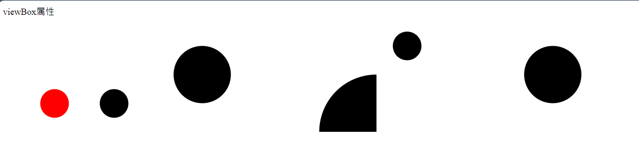
viewBox属性
<!-- viewBox属性用于定义图像元素的坐标系统。viewBox中的前两个值定义了图像的左上角坐标,后两个值定义了图像元素视角的大小。 -->
<dl>
  <dt>viewBox属性</dt>
  <dd>
    <svg width="100" height="100" viewBox="0 0 100 100">
      <circle cx="50" cy="50" r="25" fill="red" />
    </svg>

    <svg width="100" height="100" viewBox="0 0 200 200">
      <circle cx="100" cy="100" r="50" />
    </svg>

    <svg width="200" height="200" viewBox="0 0 200 200">
      <circle cx="100" cy="100" r="50" />
    </svg>

    <svg width="200" height="200" viewBox="0 0 100 100">
      <circle cx="100" cy="100" r="50" />
    </svg>

    <svg width="200" height="200" viewBox="0 0 400 400">
      <circle cx="100" cy="100" r="50" />
    </svg>

    <svg width="200" height="200" viewBox="-100 -100 200 200">
      <circle cx="0" cy="0" r="50" />
    </svg>
  </dd>
</dl>
基本形状实例
<dl>
  <dt>基本形状实例</dt>
  <dd>
    <svg width="200" height="200" viewBox="-100 -100 200 200">
      <path d="M -40,-40 L 40,-40" stroke="#333333" stroke-width="25" stroke-linecap="round" />
    </svg>

    <svg width="200" height="200" viewBox="-100 -100 200 200">
      <path d="M -40 -40 L 40 -40 M -40 0 L 40 0 M -40 40 L 40 40" stroke="#333333" stroke-width="25" stroke-linecap="round" />
    </svg>

    <svg width="200" height="200" viewBox="-100 -100 200 200">
      <path d="M -30 -20 L 0 10 L 30 -20" fill="none" stroke="black" stroke-width="70" stroke-linecap="round" />
    </svg>

    <svg width="200" height="200" viewBox="-100 -100 200 200">
      <path d="M -30 -20 L 0 10 L 30 -20" fill="none" stroke="black" stroke-width="10" stroke-linecap="round" />
    </svg>

    <svg width="200" height="200" viewBox="-100 -100 200 200">
      <path d="M -70 0 L 70 0 L 30 -50" fill="none" stroke="#D1495B" stroke-width="25" stroke-linecap="round" stroke-linejoin="round" />
    </svg>

    <svg width="200" height="200" viewBox="-100 -100 200 200">
      <path d="M -70 0 L 70 0 L 30 -50" fill="none" stroke="#D1495B" stroke-width="25" stroke-linecap="round" />
    </svg>

    <svg width="200" height="200" viewBox="-100 -100 200 200">
      <path d="M -70 0 L 70 0 L 30 -50 M 70 0 L 30 50" fill="none" stroke="#D1495B" stroke-width="25" stroke-linecap="round" stroke-linejoin="round" />
    </svg>

    <!-- A rx ry rotation large-arc-flag sweep-flag x y -->
    <!-- x y为圆弧的结束点坐标  rx ry为x y方向的半径 sweep-flag 顺时针/逆时针方向 large-arc-flag是否为最短路径 rotation 旋转角度 -->
    <svg width="200" height="200" viewBox="-100 -100 200 200">
      <path d="M -40 -40 A 70 70 0 0 0 40 40" fill="none" stroke="red" stroke-width="2" />
    </svg>
    <svg width="200" height="200" viewBox="-100 -100 200 200">
      <path d="M -40 -40 A 70 70 0 0 1 40 40" fill="none" stroke="red" stroke-width="2" />
    </svg>
    <svg width="200" height="200" viewBox="-100 -100 200 200">
      <path d="M -40 -40 A 70 70 0 1 1 40 40" fill="none" stroke="red" stroke-width="2" />
    </svg>
    <svg width="200" height="200" viewBox="-100 -100 200 200">
      <path d="M -40 -40 A 70 40 0 1 1 40 40" fill="none" stroke="red" stroke-width="2" />
    </svg>
    <svg width="200" height="200" viewBox="-100 -100 200 200">
      <path d="M -40 -40 A 70 40 30 1 1 40 40" fill="none" stroke="red" stroke-width="2" />
    </svg>
    <svg width="200" height="200" viewBox="-100 -100 200 200">
      <path d="M -40 -40 A 70 40 60 1 1 40 40" fill="none" stroke="red" stroke-width="2" />
    </svg>
  </dd>
</dl>

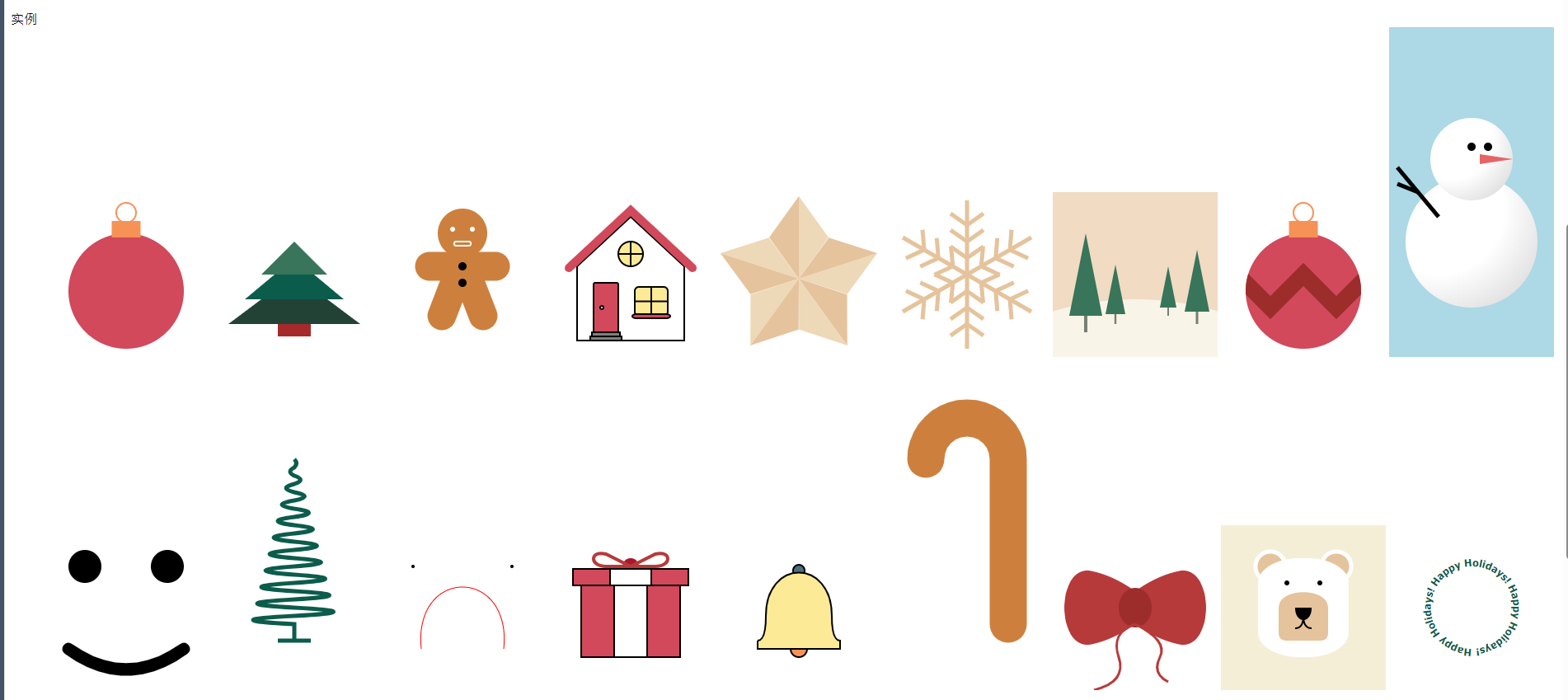
实例
<dl>
  <dt>实例</dt>
  <dd>
    <svg width="200" height="200">
      <circle cx="100" cy="120" r="70" fill="#D1495B" />
      <rect x="82.5" y="35" width="35" height="20" fill="#F79257" />
      <circle cx="100" cy="25" r="12" fill="none" stroke="#F79257" stroke-width="2" />
    </svg>

    <!-- 圣诞树 -->
    <svg width="200" height="200" viewBox="-100 -100 200 200">
      <polygon points="0,0 80,60 -80,60" fill="#234236" />
      <polygon points="0,-20 60,30 -60,30" fill="#0C5C4C" />
      <polygon points="0,-40 40,0 -40,0" fill="#38755B" />
      <rect x="-20" y="60" width="40" height="15" fill="brown" />
    </svg>

    <style>
      .head {
        fill: #cd803d;
      }

      .eye {
        fill: white;
      }

      .mouth {
        fill: none;
        stroke: white;
        stroke-width: 2px;
      }

      .limb {
        stroke: #cd803d;
        stroke-width: 35px;
        stroke-linecap: round;
      }
    </style>
    <!-- 小熊面包 -->
    <svg class="gingerbread" width="200" height="200" viewBox="-100 -100 200 200">
      <circle class="head" cx="0" cy="-50" r="30" />

      <circle class="eye" cx="-12" cy="-55" r="3" />
      <circle class="eye" cx="12" cy="-55" r="3" />
      <rect class="mouth" x="-10" y="-40" width="20" height="5" rx="2" />

      <line class="limb" x1="-40" y1="-10" x2="40" y2="-10" />
      <line class="limb" x1="-25" y1="50" x2="0" y2="-15" />
      <line class="limb" x1="25" y1="50" x2="0" y2="-15" />

      <circle class="button" cx="0" cy="-10" r="5" />
      <circle class="button" cx="0" cy="10" r="5" />
    </svg>

    <style>
      .house {
        stroke: black;
        stroke-width: 2px;
        fill: white;
      }

      .house .roof {
        fill: none;
        stroke: #d1495b;
        stroke-width: 10px;
        stroke-linecap: round;
      }

      .house .door {
        fill: #d1495b;
      }

      .house .stair {
        fill: gray;
      }

      .house .window {
        fill: #fdea96;
      }

      .house .window-sill {
        fill: #d1495b;
        stroke-linecap: round;
      }
    </style>
    <!-- 房子 -->
    <svg class="house" width="200" height="200" viewBox="-100 -100 200 200">
      <polygon class="wall" points="-65,80 -65,-10 0,-70 65,-10 65,80" />
      <polyline class="roof" points="-75,-8 0,-78 75,-8" />

      <rect class="door" x="-45" y="10" width="30" height="60" rx="2" />
      <circle class="door-knob" cx="-35" cy="40" r="2" />
      <rect class="stair" x="-47" y="70" width="34" height="5" />
      <rect class="stair" x="-49" y="75" width="38" height="5" />

      <rect class="window" x="5" y="15" width="40" height="35" rx="5" />
      <line x1="5" y1="32.5" x2="45" y2="32.5" />
      <line x1="25" y1="15" x2="25" y2="50" />
      <rect class="window-sill" x="2" y="48" width="46" height="5" rx="5" />

      <circle class="window" cx="0" cy="-25" r="15" />
      <line x1="-15" y1="-25" x2="15" y2="-25" />
      <line x1="0" y1="-40" x2="0" y2="-10" />
    </svg>

    <!-- 五角星 -->
    <svg width="200" height="200" viewBox="-100 -100 200 200">
      <g transform="translate(0 5)">
        <g>
          <polygon points="0,0 36,-50 0,-100" fill="#EDD8B7" />
          <polygon points="0,0 -36,-50 0,-100" fill="#E5C39C" />
        </g>
        <g transform="rotate(72)">
          <polygon points="0,0 36,-50 0,-100" fill="#EDD8B7" />
          <polygon points="0,0 -36,-50 0,-100" fill="#E5C39C" />
        </g>
        <g transform="rotate(-72)">
          <polygon points="0,0 36,-50 0,-100" fill="#EDD8B7" />
          <polygon points="0,0 -36,-50 0,-100" fill="#E5C39C" />
        </g>
        <g transform="rotate(144)">
          <polygon points="0,0 36,-50 0,-100" fill="#EDD8B7" />
          <polygon points="0,0 -36,-50 0,-100" fill="#E5C39C" />
        </g>
        <g transform="rotate(-144)">
          <polygon points="0,0 36,-50 0,-100" fill="#EDD8B7" />
          <polygon points="0,0 -36,-50 0,-100" fill="#E5C39C" />
        </g>
      </g>
    </svg>

    <!-- 雪花 -->
    <svg width="200" height="200" viewBox="-100 -100 200 200">
      <defs>
        <path id="branch" d="M 0 0 L 0 -90 M 0 -20 L 20 -34 M 0 -20 L -20 -34 M 0 -40 L 20 -54 M 0 -40 L -20 -54 M 0 -60 L 20 -74 M 0 -60 L -20 -74" stroke="#E5C39C" stroke-width="5" />
      </defs>

      <use href="#branch" />
      <use href="#branch" transform="rotate(60)" />
      <use href="#branch" transform="rotate(120)" />
      <use href="#branch" transform="rotate(180)" />
      <use href="#branch" transform="rotate(240)" />
      <use href="#branch" transform="rotate(300)" />
    </svg>

    <!-- 森林 -->
    <svg width="200" height="200" viewBox="-100 -100 200 200">
      <defs>
        <g id="tree">
          <polygon points="-10,0 10,0 0 -50" fill="#38755b" />
          <line x1="0" y1="0" x2="0" y2="10" stroke="#778074" stroke-width="2" />
        </g>
      </defs>

      <rect x="-100" y="-100" width="200" height="200" fill="#F1DBC3" />
      <circle cx="0" cy="380" r="350" fill="#F8F4E8" />

      <use href="#tree" x="-30" y="25" transform="scale(2)" />
      <use href="#tree" x="-20" y="40" transform="scale(1.2)" />
      <use href="#tree" x="40" y="40" />
      <use href="#tree" x="50" y="30" transform="scale(1.5)" />
    </svg>

    <svg width="200" height="200" viewBox="-100 -100 200 200">
      <defs>
        <clipPath id="ball">
          <circle cx="0" cy="20" r="70" />
        </clipPath>
      </defs>

      <circle cx="0" cy="20" r="70" fill="#D1495B" />

      <polyline clip-path="url(#ball)" points="-120 40 -80 0 -40 40 0 0 40 40 80 0 120 40" fill="none" stroke="#9C2D2A" stroke-width="20" />

      <circle cx="0" cy="-75" r="12" fill="none" stroke="#F79257" stroke-width="2" />
      <rect x="-17.5" y="-65" width="35" height="20" fill="#F79257" />
    </svg>

    <!-- 雪人 -->
    <svg width="200" height="400" viewBox="-100 -200 200 400" style="background-color: lightblue">
      <defs>
        <radialGradient id="snowball" cx="0.25" cy="0.25" r="1">
          <stop offset="0%" stop-color="white" />
          <stop offset="50%" stop-color="white" />
          <stop offset="100%" stop-color="#d6d6d6" />
        </radialGradient>
      </defs>

      <circle cx="0" cy="60" r="80" fill="url(#snowball)" />
      <circle cx="0" cy="-40" r="50" fill="url(#snowball)" />
      <polygon points="10,-46 50,-40 10,-34" fill="#e66465" />

      <circle cx="0" cy="-55" r="5" />
      <circle cx="20" cy="-55" r="5" />

      <line x1="-40" y1="30" x2="-90" y2="-30" stroke="black" stroke-width="5" />
      <line x1="-65" y1="0" x2="-90" y2="-10" stroke="black" stroke-width="5" />
    </svg>

    <!-- 笑脸 -->
    <svg width="200" height="200" viewBox="-100 -100 200 200">
      <circle cx="-50" cy="-50" r="20" />
      <circle cx="50" cy="-50" r="20" />
      <path d="M -70,50 Q 0,100 70,50" fill="none" stroke="black" stroke-width="15" stroke-linecap="round" />
    </svg>

    <!-- 1棵树 -->
    <svg width="200" height="400" viewBox="-100 -200 200 400">
      <path
        d="
          M 0 -80
          Q 5 -75 0 -70
          Q -10 -65 0 -60
          Q 15 -55 0 -50
          Q -20 -45 0 -40
          Q 25 -35 0 -30
          Q -30 -25 0 -20
          Q 35 -15 0 -10
          Q -40 -5 0 0
          Q 45 5 0 10
          Q -50 15 0 20
          Q 55 25 0 30
          Q -60 35 0 40
          Q 65 45 0 50
          Q -70 55 0 60
          Q 75 65 0 70
          Q -80 75 0 80
          Q 85 85 0 90
          Q -90 95 0 100
          Q 95 105 0 110
          Q -100 115 0 120
          L 0 140
          L 20 140
          L -20 140"
        fill="none"
        stroke="#0C5C4C"
        stroke-width="5"
      />
    </svg>

    <!-- 表情 -->
    <svg width="200" height="200" viewBox="-100 -100 200 200">
      <path
        d="M -50,50
           C -60,-50 60,-50 50,50"
        fill="none"
        stroke="red"
      />
      <circle cx="-60" cy="-50" r="2" />
      <circle cx="60" cy="-50" r="2" />
    </svg>

    <style>
      .box {
        fill: #d1495b;
        stroke: black;
        stroke-width: 2px;
      }
      .stripe {
        fill: white;
        stroke: black;
        stroke-width: 2px;
      }
      .ribbon {
        stroke: #b73a3b;
        stroke-width: 4px;
        fill: none;
      }
    </style>
    <!-- 盒子 -->
    <svg width="200" height="200" viewBox="-100 -100 200 200">
      <circle cx="0" cy="-50" r="10" fill="#a9172a" />
      <rect class="box" x="-60" y="-40" width="120" height="100" />
      <rect class="box" x="-70" y="-47" width="140" height="20" />
      <rect class="stripe" x="-20" y="-40" width="40" height="100" />
      <rect class="stripe" x="-25" y="-47" width="50" height="20" />

      <path
        class="ribbon"
        d="M 0 -50
          L 30 -50
          C 50 -50 50 -70 30 -65
          L 0 -50"
      />

      <path
        class="ribbon"
        d="M 0 -50
          L -30 -50
          C -50 -50 -50 -70 -30 -65
          L 0 -50"
      />
    </svg>

    <!-- 铃铛 -->
    <svg width="200" height="200" viewBox="-100 -100 200 200">
      <g stroke="black" stroke-width="2">
        <circle cx="0" cy="-45" r="7" fill="#4F6D7A" />
        <circle cx="0" cy="50" r="10" fill="#F79257" />
        <path
          d="
            M -50 40
            L -50 50
            L 50 50
            L 50 40
            Q 40 40 40 10
            C 40 -60 -40 -60 -40 10
            Q -40 40 -50 40"
          fill="#FDEA96"
        />
      </g>
    </svg>

    <style>
      .body {
        stroke-linecap: round;
        fill: none;
      }
    </style>
    <!-- 拐杖 -->
    <svg width="200" height="400" viewBox="-100 -200 200 400">
      <path
        class="body"
        d="
          M 50 120
          L 50 -80
          A 50 50 0 0 0 -50 -80"
        stroke="#cd803d"
        stroke-width="45"
      />
    </svg>

    <!-- 领结 -->
    <svg width="200" height="200" viewBox="-100 -100 200 200">
      <defs>
        <path
          id="ribbon"
          d="
            M 0 -20
            Q 28 -40 56 -45
            C 96 -48 96 48 56 45
            Q 28 40 0 20"
          fill="#B73A3B"
        />
      </defs>

      <use href="#ribbon" />
      <use href="#ribbon" transform="scale(-1)" />
      <ellipse cx="0" cy="0" rx="20" ry="24" fill="#9C2D2A" />

      <path
        d="
          M 0 20
          Q 40 40 30 60
          Q 20 80 40 90

          M 0 20
          Q -30 30 -20 60
          Q -10 90 -50 100"
        fill="none"
        stroke="#B73A3B"
        stroke-width="3"
      />
    </svg>

    <style>
      .bear {
        background-color: #f5eed7;
      }

      .bear .ear {
        fill: #e5c39c;
        stroke: white;
        stroke-width: 5;
      }

      .bear .face {
        fill: white;
      }

      .bear .mouth {
        fill: none;
        stroke: black;
        stroke-width: 2;
      }
    </style>
    <!-- 小熊 -->
    <svg class="bear" width="200" height="200" viewBox="-100 -100 200 200">
      <circle class="ear" cx="-40" cy="-50" r="18"></circle>
      <circle class="ear" cx="40" cy="-50" r="18"></circle>

      <rect class="face" x="-55" y="-60" width="110" height="120" rx="50" ry="30" />
      <circle cx="20" cy="-30" r="3" />
      <circle cx="-20" cy="-30" r="3" />

      <path
        d="
          M -30 0
          C -30 -25 30 -25 30 0
          L 30 30
          Q 30 40 20 40
          L -20 40
          Q -30 40 -30 30"
        fill="#E5C39C"
      />
      <path
        d="
          M -10 0
          L 10 0
          C 10 20 -10 20 -10 0"
      />
      <path
        class="mouth"
        d="
          M 0 10
          Q 0 25 10 25

          M 0 10
          Q 0 25 -10 25"
      />
    </svg>

    <!-- 字体环绕图形 -->
    <svg width="200" height="200" viewBox="-100 -100 200 200">
      <defs>
        <path id="text-arc" d="M 0 50 A 50 50 0 1 1 1 50" />
      </defs>

      <text fill="#0c5c4c" font-family="Tahoma" font-size="0.77em" font-weight="bold">
        <textPath href="#text-arc">Happy Holidays! Happy Holidays! Happy Holidays!</textPath>
      </text>
    </svg>
  </dd>
</dl>
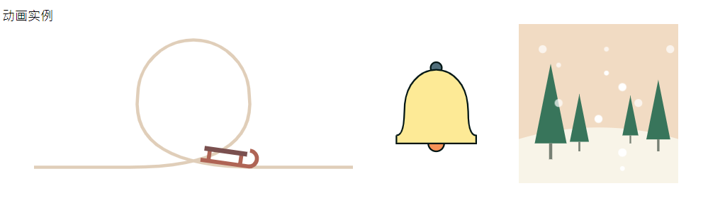
动画实例
<dl>
  <dt>动画实例</dt>
  <dd>
    <style>
      .sleigh {
        offset-path: path("M -200 80 L -90 80 Q 60 80 60 -10 A 50 50 0 0 0 -60 -10 Q -60 80 90 80 L 200 80");
        animation: roller-coaster 6000ms infinite linear;
      }

      @keyframes roller-coaster {
        0% {
          offset-distance: 0%;
        }
        100% {
          offset-distance: 100%;
        }
      }
    </style>
    <!-- 雪橇沿着轨道行进 -->
    <svg width="400" height="200" viewBox="-200 -100 400 200" fill="none">
      <path stroke="#E0CEB9" stroke-width="4" d="M -200 80 L -80 80 Q 80 80 70 -10 A 70 70 0 0 0 -70 -10 Q -80 80 80 80 L 200 80" />

      <g class="sleigh">
        <path
          d="
            M -30 -2 L 30 -2 A 10 10 0 0 0 30 -22
            M -20 -2 L -20 -17
            M 20 -2 L 20 -17"
          stroke="#AF6455"
          stroke-width="5"
        />
        <path d="M -27 -17 L 27 -17" stroke="#7A504F" stroke-width="6" />
      </g>
    </svg>

    <style>
      .bell:hover {
        transform-origin: center 30%;
      }

      .bell:hover,
      .bell:hover .bell-tongue {
        animation-duration: 0.5s;
        animation-delay: -0.25s;
        animation-iteration-count: infinite;
        animation-direction: alternate;
        animation-timing-function: ease-in-out;
        animation-name: ring;
      }

      @keyframes ring {
        from {
          transform: rotate(-20deg);
        }
        to {
          transform: rotate(20deg);
        }
      }
    </style>
    <!-- 鼠标放在铃铛上,铃铛开始摇摆 -->
    <svg class="bell" width="200" height="200" viewBox="-100 -100 200 200">
      <g stroke="#001514" stroke-width="2">
        <circle cx="0" cy="-45" r="7" fill="#4F6D7A" />
        <circle class="bell-tongue" cx="0" cy="50" r="10" fill="#F79257" />
        <path
          d="
            M -50 40
            L -50 50
            L 50 50
            L 50 40
            Q 40 40 40 10
            C 40 -60 -40 -60 -40 10
            Q -40 40 -50 40"
          fill="#FDEA96"
        />
      </g>
    </svg>

    <style>
      .flake {
        animation-duration: inherit;
        animation-name: snowing;
        animation-iteration-count: infinite;
        animation-timing-function: linear;
      }

      @keyframes snowing {
        from {
          transform: translate(0, -100px);
        }
        to {
          transform: translate(0, 100px);
        }
      }

      .flake.opaque {
        opacity: 0.7;
      }

      .flake.slow {
        animation-duration: 5s;
      }

      .flake.fast {
        animation-duration: 3s;
      }
    </style>
    <!-- 森林雪花下落效果 -->
    <svg width="200" height="200" viewBox="-100 -100 200 200">
      <defs>
        <g id="tree">
          <polygon points="-10,0 10,0 0 -50" fill="#38755b" />
          <line x2="0" y2="10" stroke="#778074" stroke-width="2" />
        </g>
        <circle id="big" cx="0" cy="0" r="5" fill="white" />
        <circle id="small" cx="0" cy="0" r="3" fill="white" />
      </defs>

      <rect x="-100" y="-100" width="200" height="200" fill="#F1DBC3" />
      <circle cx="0" cy="380" r="350" fill="#F8F4E8" />

      <use href="#tree" x="-30" y="25" transform="scale(2)" />
      <use href="#tree" x="-20" y="40" transform="scale(1.2)" />
      <use href="#tree" x="40" y="40" />
      <use href="#tree" x="50" y="30" transform="scale(1.5)" />

      <use href="#big" x="0" y="0" class="flake fast" />
      <use href="#big" x="-50" y="-20" class="flake fast opaque" />
      <use href="#big" x="30" y="-40" class="flake fast" />
      <use href="#big" x="50" y="-20" class="flake fast opaque" />
      <use href="#big" x="30" y="50" class="flake slow" />
      <use href="#big" x="-70" y="-80" class="flake slow opaque" />
      <use href="#big" x="30" y="50" class="flake slow" />
      <use href="#big" x="90" y="-80" class="flake slow opaque" />
      <use href="#small" x="10" y="-50" class="flake slow" />
      <use href="#small" x="-50" y="-60" class="flake slow opaque" />
      <use href="#small" x="30" y="70" class="flake slow" />
      <use href="#small" x="10" y="-80" class="flake slow opaque" />
    </svg>
  </dd>
</dl>
SVG应用-交互
<dl>
  <dt>SVG应用-交互</dt>
  <dd>
    <style>
      .close {
        display: inline-block;
        width: 50px;
        height: 50px;
        border-radius: 50%;
        background-color: gray;

        background-image: url("data:image/svg+xml,<svg xmlns='http://www.w3.org/2000/svg' width='50' height='50' viewBox='0 0 100 100'><path d='M 30 30 L 70 70 M 30 70 L 70 30' stroke='white' stroke-width='10' /></svg>");
      }
    </style>
    <!-- SVG图形应用到html中 -->
    <a href="/" class="close"></a>

    <style>
      .background {
        display: inline-block;
        width: 200px;
        height: 200px;
        background-color: #38755b;
        background-image: url("data:image/svg+xml,%3Csvg xmlns='http://www.w3.org/2000/svg' width='50' height='50' viewBox='0 0 120 120'%3E%3Cpolyline fill='none' stroke='%230c5c4c' stroke-width='42.4' points='-30 0 60 90 150 0' /%3E%3C/svg%3E");
      }
    </style>
    <!-- SVG应用到html中 -->
    <div class="background"></div>

    <!-- 显示时间的钟表 -->
    <svg width="200" height="200" viewBox="-100 -100 200 200">
      <rect x="-100" y="-100" width="200" height="200" fill="#CD803D" />

      <circle r="55" stroke="#FCCE7B" stroke-width="10" fill="white" />

      <!-- 钟表刻度 stroke-dasharray -->
      <circle r="45" stroke="#B6705F" stroke-width="6" stroke-dasharray="6 17.56194490192345" stroke-dashoffset="3" fill="none" />

      <g stroke="#5f4c6c" stroke-linecap="round">
        <line id="hours" y2="-20" stroke-width="8" />
        <line id="minutes" y2="-35" stroke-width="6" />
      </g>
    </svg>
    <script>
      window.addEventListener("DOMContentLoaded", () => {
        const hoursElement = document.getElementById("hours");
        const minutesElement = document.getElementById("minutes");
        const hour = new Date().getHours() % 12;
        const minute = new Date().getMinutes();
        hoursElement.setAttribute("transform", `rotate(${(360 / 12) * hour})`);
        minutesElement.setAttribute("transform", `rotate(${(360 / 60) * minute})`);
      });
    </script>

    <style>
      .lights {
        fill: none;
        stroke: #5f4c6c;
        stroke-width: 2;
      }

      .lights #button {
        cursor: pointer;
      }
    </style>
    <!-- 交互-开灯 关灯效果 -->
    <svg class="lights" width="200" height="200" viewBox="-100 -100 200 300">
      <defs>
        <g id="bulb">
          <path d="M 0,0 Q 20 25 0 40 Q -20 25 0 0" />
          <rect x="-6" y="-1" width="12" height="10" rx="3" fill="#5F4C6C" />
        </g>
      </defs>

      <path d="M -140 -60 Q -70 -50 0 -60 Q 110 -70 110 10" />
      <line x1="-70" y1="-15" x2="-70" y2="-55" />
      <line x1="30" y1="-25" x2="30" y2="-60" />
      <use class="b" href="#bulb" x="-120" y="-45" transform="rotate(5)" />
      <use class="b" href="#bulb" x="-70" y="-15" />
      <use class="b" href="#bulb" x="-20" y="-57" transform="rotate(-5)" />
      <use class="b" href="#bulb" x="30" y="-25" />

      <rect x="90" y="10" width="40" height="40" fill="lightgray" />
      <circle id="button" cx="110" cy="30" r="15" fill="red" />
    </svg>
    <script>
      window.addEventListener("DOMContentLoaded", () => {
        const button = document.getElementById("button");
        let lightsOn = false;
        button.addEventListener("click", () => {
          const bulbs = document.querySelectorAll(".b");
          bulbs[0].setAttribute("fill", lightsOn ? "white" : "#FFC05B");
          bulbs[1].setAttribute("fill", lightsOn ? "white" : "#F86285");
          bulbs[2].setAttribute("fill", lightsOn ? "white" : "#03A8A8");
          bulbs[3].setAttribute("fill", lightsOn ? "white" : "#748CEF");

          lightsOn = !lightsOn;
          button.setAttribute("fill", lightsOn ? "green" : "red");
        });
      });
    </script>

    <div style="display: inline-block; width: 200px; height: 200px" id="diagram_con"></div>
    <script>
      function Diagram() {
        const dataPoints = [3, 4, 7, 5, 3, 6];
        const sineWave = Array.from({ length: 115 })
          .map((item, index) => `${index - 55},${Math.sin(index / 20) * 20 + 10}`)
          .join(" ");
        console.log(sineWave, typeof sineWave);

        const getRect = (dataPoint, index) => {
          return `<rect key=${index} x=${index * 20 - 55} y=${50 - dataPoint * 10} width="15" height=${dataPoint * 10} fill="#CD803D" />`;
        };

        return `<svg width="200" height="200" viewBox="-100 -100 200 200">
                  ${dataPoints.map(getRect).join("")}
                  <polyline points="${sineWave}" fill="none" stroke="black" stroke-width="5" />
                </svg>`;
      }
      document.querySelector("#diagram_con").innerHTML = Diagram();
    </script>

    <style>
      .flake {
        animation-duration: inherit;
        animation-name: snowing;
        animation-iteration-count: infinite;
        animation-timing-function: linear;
      }

      @keyframes snowing {
        from {
          transform: translate(0, -100px);
        }
        to {
          transform: translate(0, 100px);
        }
      }

      .flake.opaque {
        opacity: 0.7;
      }

      .flake.slow {
        animation-duration: 5s;
      }

      .flake.fast {
        animation-duration: 3s;
      }
    </style>
    <svg width="200" height="200" viewBox="-100 -100 200 200">
      <clipPath id="snow-globe">
        <circle cx="0" cy="0" r="80" />
      </clipPath>

      <g clip-path="url(#snow-globe)">
        <rect x="-100" y="-100" width="200" height="200" fill="#F1DBC3" />
        <circle cx="0" cy="380" r="350" fill="#F8F4E8" />

        <g>
          <defs>
            <g id="tree">
              <polygon points="-10,0 10,0 0 -50" fill="#38755b" />
              <line x2="0" y2="10" stroke="#778074" stroke-width="2" />
            </g>
          </defs>

          <use href="#tree" x="-20" y="25" transform="scale(1.8)" />
          <use href="#tree" x="-10" y="40" transform="scale(1)" />
          <use href="#tree" x="30" y="40" transform="scale(0.8)" />
          <use href="#tree" x="40" y="30" transform="scale(1.2)" />
        </g>

        <g class="snowing">
          <defs>
            <circle id="big" cx="0" cy="0" r="5" fill="white" />
            <circle id="small" cx="0" cy="0" r="3" fill="white" />
          </defs>

          <use href="#big" x="0" y="0" class="flake fast" />
          <use href="#big" x="-50" y="-20" class="flake fast opaque" />
          <use href="#big" x="30" y="-40" class="flake fast" />
          <use href="#big" x="50" y="-20" class="flake fast opaque" />
          <use href="#big" x="30" y="50" class="flake slow" />
          <use href="#big" x="-70" y="-80" class="flake slow opaque" />
          <use href="#big" x="30" y="50" class="flake slow" />
          <use href="#big" x="90" y="-80" class="flake slow opaque" />
          <use href="#small" x="10" y="-50" class="flake slow" />
          <use href="#small" x="-50" y="-60" class="flake slow opaque" />
          <use href="#small" x="30" y="70" class="flake slow" />
          <use href="#small" x="10" y="-80" class="flake slow opaque" />
        </g>
      </g>

      <circle cx="0" cy="0" r="80" fill="none" stroke="gray" stroke-width="2" />
    </svg>
  </dd>
</dl>


 浙公网安备 33010602011771号