python3可视化之matplotlib库
Matplotlib 库是一个用于数据可视化和绘制静态图表的 Python 库。
它提供了大量的函数和类,可以帮助用户轻松地创建各种类型的图表,包括直方图、箱形图、散点图、饼图、条形图和密度图等。
画布及图表元素
import numpy as np
import matplotlib.pyplot as plt
# 解决中文乱码问题
plt.rcParams["font.sans-serif"] = ["SimHei", "Microsoft YaHei"] # 中文字体
plt.rcParams["axes.unicode_minus"] = False # 解决负号显示为方块的问题
# 数据
x = np.arange(0, 2 * np.pi, 0.1)
y1 = np.sin(x)
y2 = np.cos(x)
# 创建画布
fig = plt.figure(figsize=[6, 3], dpi=100) # dpi:一英寸有多少像素
fig.set_size_inches(10, 4) # 英寸
fig.set_facecolor("lightgreen") # 背景色
fig.set_linewidth(5) # 边框宽度
fig.set_edgecolor("silver") # 边框颜色
fig.suptitle("整个图形的总标题") # 设置标题
fig.subplots_adjust(wspace=0.3)
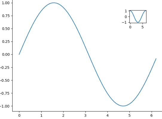
ax1 = fig.add_subplot(121) # 添加子图,第1位表示共几行,第2位表示共几列,第3位表示
ax1.plot(x, y1)
ax1.set_title("图1 标题") # 子图标题
ax1.set_xlabel("图1--x轴") # x轴标签
ax1.set_ylabel("图1--y轴") # y轴标签
ax1.set_ylim(-1.2, 1.2) # 坐标轴范围可根据值自动生成,可以手动设置
ax2 = fig.add_subplot(122)
ax2.plot(x, y1)
ax2.plot(x, y2)
ax2.set_title("图2 标题")
ax2.set_xlabel("图2--x轴")
ax2.set_ylabel("图2--y轴")
ax2.legend(labels=["sin", "cos"]) # 图例
# 显示
# fig.show()
# 保存图像到磁盘
fig.savefig("../../charts/mat.png")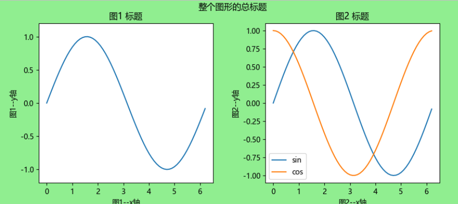
样式
import numpy as np
import matplotlib.pyplot as plt
from matplotlib.ticker import MultipleLocator

x = np.arange(0, 2 * np.pi, 0.1)
y1 = np.sin(x)
y2 = np.cos(x)

# 全局样式表
plt.style.use("seaborn-v0_8")

# 整体绘图样式
plt.rcParams["font.sans-serif"] = ["SimHei", "Microsoft YaHei"]  # 中文字体
plt.rcParams["axes.unicode_minus"] = False  # 解决负号显示为方块的问题
plt.rc("axes", facecolor="#E8E6E3", edgecolor="black", grid=True)  # 坐标轴配置
plt.rc("grid", linestyle="dashed", linewidth=1, color="silver", alpha=0.5)  # 网格配置
plt.rc("ytick", color="g", direction="in")  # y轴刻度配置


fig, ax = plt.subplots(5, 1, constrained_layout=True)  # constrained_layout=True自适应宽高样式

# 两个不同范围的双坐标轴
ax[0].plot(x, y1)
ax[0].twinx().plot(x, y2 * 2)

# 反转轴
ax[1].plot(x, y2)
ax[1].invert_xaxis()

# 主要和次要刻度
ax[2].xaxis.set_major_locator(MultipleLocator(0.5))  # 设置X轴的主要刻度间隔20
ax[2].xaxis.set_minor_locator(MultipleLocator(0.1))  # 设置X轴的次要刻度间隔2
# 隐藏刻度
ax[2].yaxis.set_major_locator(plt.NullLocator())
# 突出某些刻度值
obj = ax[2].get_xticklabels()[3]
obj.set_size(15)
obj.set_color("red")
# 刻度标签旋转一定角度
ax[2].tick_params(axis="x", rotation=30)
ax[2].plot(x, y2)

# 图例
ax[3].plot(x, y1, label="sin")
ax[3].plot(x, y2, label="cos")
ax[3].legend(frameon=False, loc="upper center", ncol=2)  # frameon=False:无边框,ncol=2:图例分2列

# 文本及样式
with plt.style.context("classic"):  # 局部样式表
    ax[4].set_title("标题", fontdict={"fontsize": 15, "color": "r"})  # 标题
    ax[4].set_xlabel("x轴", fontdict={"fontsize": 10, "color": "g"})  # 设置X轴标签的字体和颜色
    ax[4].set_ylabel("y轴", fontdict={"fontsize": 10, "color": "b"})  # 设置Y轴标签的字体和颜色
    ax[4].text(5, 0, "f(x) = sin(x)", fontdict={"fontsize": 12, "color": "k"})  # 按照坐标位置添加一段文本
    ax[4].plot(x, y1, label="sin")

fig.savefig("../../charts/mat-plot.png")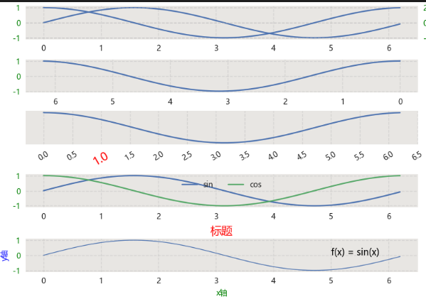
子图布局
import numpy as np
import matplotlib.pyplot as plt
x = np.arange(0, 2 * np.pi, 0.1)
y1 = np.sin(x)
y2 = np.cos(x)
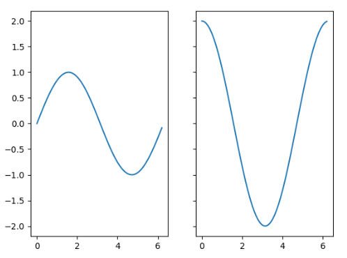
fig = plt.figure(figsize=(20, 10))
plt.subplot(1, 2, 1)
plt.plot(x, y1)
fig.add_subplot(1, 2, 2)
plt.plot(x, y2)
fig.savefig("../../charts/mat-subplot.png")
# 设置子图1行2列
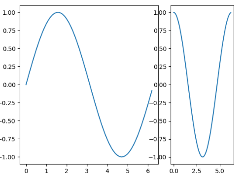
fig, ax = plt.subplots(1, 2)
ax[0].plot(x, y1)
ax[1].plot(x, y2)
fig.savefig("../../charts/mat-subplot2.png")
# 使子图刻度保持一致,便于比较
fig, ax = plt.subplots(1, 2, sharey="all") # 设置sharey='all',使Y轴刻度保持一致
ax[0].plot(x, y1)
ax[1].plot(x, y2 * 2)
fig.savefig("../../charts/mat-subplot-share.png")
# 复杂子图布局
fig = plt.figure()
grid = plt.GridSpec(1, 3)
ax1 = fig.add_subplot(grid[0, :2])
ax2 = fig.add_subplot(grid[0, 2])
ax1.plot(x, y1)
ax2.plot(x, y2)
fig.savefig("../../charts/mat-subplot-gird.png")
# 嵌套子图
fig = plt.figure()
# 参数分别为:坐标x、坐标y、宽度、高度。左下角为零点的占画布宽度/高度的比例。
ax = fig.add_axes([0.1, 0.1, 0.9, 0.9])
ax.plot(x, y1)
ax1 = fig.add_axes([0.8, 0.8, 0.1, 0.1])
ax1.plot(x, y2)
fig.savefig("../../charts/mat-subplot-mul.png")简单子图

子图Y轴刻度保持一致
复杂子图布局
嵌套子图
基本图表
# Matplotlib 库是一个用于数据可视化和绘图的 Python 库。
# 它提供了大量的函数和类,可以帮助用户轻松地创建各种类型的图表,包括直方图、箱形图、散点图、饼图、条形图和密度图等。


import numpy as np
import matplotlib.pyplot as plt
from matplotlib.ticker import MultipleLocator

# 全局样式表
plt.style.use("seaborn-v0_8")

# 整体绘图样式
plt.rcParams["font.sans-serif"] = ["SimHei", "Microsoft YaHei"]  # 中文字体
plt.rcParams["axes.unicode_minus"] = False  # 解决负号显示为方块的问题


x0 = np.arange(2015, 2025)
y1 = np.random.randint(80, 100, 10)
y2 = np.random.randint(5, 10, 10)
y3 = np.random.randint(0, 5, 10)
x = np.char.ljust(x0.astype(str), 5, "年")
y4 = np.random.randint(60, 90, 100)

fig, ax = plt.subplots(5, 2, constrained_layout=True, figsize=(20, 25))  # constrained_layout=True自适应宽高样式

# 折线图:展示数据随时间或有序变量的变化趋势,适用于趋势分析
ax[0, 0].plot(x, y1)


# 散点图:显示两个变量间的关系,用于识别相关性或分布模式
ax[0, 1].scatter(y1, y2)


# 饼图:显示各类别占总体的比例
ax[1, 0].pie(y1, labels=x, autopct="%1.1f%%")


# 直方图:展示数值型数据的分布情况(频数或概率密度)
ax[1, 1].hist(y4, bins=10)


# 面积图:展示数据的趋势变化
ax[2, 0].fill_between(x, y1)

# 堆叠面积图:展示多个数据系列之间的变化趋势
ax[2, 1].stackplot(x, [y1, y2, y3], labels=["项1", "项2", "项3"])
ax[2, 1].legend(loc="upper left")


# 柱状图:比较不同类别的数值大小
ax[3, 0].bar(x, y1)  # 垂直
ax[3, 1].barh(x, y1)  # 水平


# 堆叠柱状图
ax[4, 0].bar(x, y1, label="项1")
ax[4, 0].bar(x, y2, label="项2", bottom=y1)
ax[4, 0].bar(x, y3, label="项3", bottom=y1 + y2)


# 多系列柱状图
rect1 = ax[4, 1].bar(x0, y1, label="项1", width=0.25)
rect2 = ax[4, 1].bar(x0 + 0.25, y2, label="项2", width=0.25)
rect3 = ax[4, 1].bar(x0 + 2 * 0.25, y3, label="项3", width=0.25)
ax[4, 1].bar_label(rect1, padding=3)  # 数值文本
ax[4, 1].bar_label(rect2, padding=3)
ax[4, 1].bar_label(rect3, padding=3)
ax[4, 1].set_xticks(x0 + 0.25)  # 设置刻度位置
ax[4, 1].set_xticklabels(x)  # 设置标签文本


fig.savefig("../../charts/matplot.png")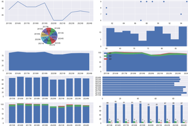
复杂图表
import numpy as np
import matplotlib.pyplot as plt
from matplotlib.ticker import MultipleLocator
# 全局样式表
plt.style.use("seaborn-v0_8")
# 整体绘图样式
plt.rcParams["font.sans-serif"] = ["SimHei", "Microsoft YaHei"] # 中文字体
plt.rcParams["axes.unicode_minus"] = False # 解决负号显示为方块的问题
fig, ax = plt.subplots(4, 1, constrained_layout=True, figsize=(20, 10)) # constrained_layout=True自适应宽高样式
# 误差条图:展示数据不确定性(如标准差、置信区间)
x = np.arange(10)
y = 2.5 * np.sin(x / 20 * np.pi)
yerr = np.linspace(0.05, 0.2, 10)
ax[0].errorbar(x, y, yerr=yerr, fmt="-o", capsize=5, capthick=2)
# 箱线图:展示数据分布的五数概括(最小值、四分位数、中位数、最大值)及离群点
data = [np.random.normal(0, std, 100) for std in range(1, 4)]
ax[1].boxplot(data, vert=True, patch_artist=True, labels=["Group 1", "Group 2", "Group 3"])
# 热力图:用颜色矩阵展示二维数据值,常用于相关性分析
data = np.random.rand(5, 5)
im = ax[2].imshow(data, cmap="hot", interpolation="nearest")
cax = fig.add_axes([0.95, 0.27, 0.02, 0.20]) # 创建专用colorbar区域 [left, bottom, width, height]
fig.colorbar(im, cax=cax)
# 等高线图:展示三维数据在二维平面的等值线,适用于科学计算
x = np.linspace(-5, 5, 100)
y = np.linspace(-5, 5, 100)
X, Y = np.meshgrid(x, y)
Z = np.sin(np.sqrt(X**2 + Y**2))
im1 = ax[3].contourf(X, Y, Z, 20)
cax = fig.add_axes([0.95, 0.02, 0.02, 0.20])
fig.colorbar(im1, cax=cax)
fig.savefig("../../charts/matplot1.png")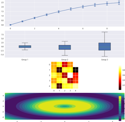
cmap参数-核心颜色映射类型
- 顺序型(Sequential):适用于从低到高的数值渐变:
- viridis(蓝 → 黄渐变)
- plasma(紫 → 橙渐变)
- inferno(黑 → 红渐变)
- magma(黑 → 红渐变)
- cividis(蓝 → 黄渐变)
- hot(黑 → 红 → 黄 → 白)
- Greens(绿色系渐变)
- 发散型(Diverging):适合表示带中心点的数据(如正负值):
- coolwarm(蓝 → 白 → 红)
- Spectral(彩虹色系)
- bwr(蓝 → 白 → 红)
- 定性型(Qualitative):用于分类数据或离散值:
- tab10(10 种区分色)
- Set1(鲜艳分类色)
- Accent(高对比度分类色)学习案例
import matplotlib.pyplot as plt
import numpy as np

N = 8
i = 0
# 指定一个画板
fig = plt.figure(figsize=(20, 5 * N))

x = np.arange(0, 3 * np.pi, 0.1)
y_sin = np.sin(x)
y_cos = np.cos(x)
i += 1
plt.subplot(N, 1, i)
plt.plot(x, y_sin)
plt.plot(x, y_cos)
plt.title("Sine & Cosine plot")


cat1 = ["a", "b", "c"]
cat2 = ["a1", "b1", "c1"]
val1 = [12, 16, 6]
val2 = [6, 15, 7]
i += 1
plt.subplot(N, 1, i)
plt.bar(x=cat1, height=val1, width=0.5, color="y")
plt.bar(x=cat2, height=val2, width=0.5, color="c")
plt.title("Bar chart")  # 图形标题
plt.xlabel("X axis")  # x轴名称
plt.ylabel("Y axis")  # y轴名称
plt.ylim((5, 20))  # y轴范围
plt.xticks(rotation=40)  # x轴刻度
plt.yticks([5, 10, 15, 20])  # y轴刻度
plt.legend(["a", "b"])  # 图例
for x, y in zip(cat1, val1):
    plt.text(x, y + 0.05, "%.0f" % y, ha="center", va="bottom", fontsize=12)
for x, y in zip(cat2, val2):
    plt.text(x, y + 0.05, "%.0f" % y, ha="center", va="bottom", fontsize=12)

i += 1
plt.subplot(N, 1, i)
plt.bar(x=cat1, height=val1, width=0.5, color="y", align="center")
plt.bar(x=cat1, height=val2, width=0.5, bottom=y, color="c", align="center")
plt.title("Bar chart stack")


arr = np.array([22, 87, 5, 43, 56, 73, 55, 54, 11, 20, 51, 5, 79, 31, 27])
i += 1
plt.subplot(N, 1, i)
plt.hist(arr, bins=[0, 20, 40, 60, 80, 100])
plt.title("histogram")

n = 256
x = np.linspace(-np.pi, np.pi, n, endpoint=True)
y = np.sin(2 * x)
i += 1
plt.subplot(N, 1, i)
plt.plot(x, y + 1, color="blue", alpha=1.00)
plt.fill_between(x, 1, y + 1, color="blue", alpha=0.25)
plt.plot(x, y - 1, color="blue", alpha=1.00)
plt.fill_between(x, -1, y - 1, (y - 1) > -1, color="blue", alpha=0.25)
plt.fill_between(x, -1, y - 1, (y - 1) < -1, color="red", alpha=0.25)
plt.title("curve_chart")

# 绘制图形
# plt.show()
plt.savefig("../../files/gen/plt.jpg")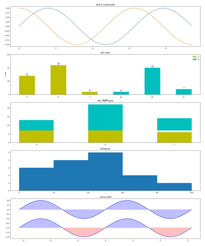

 浙公网安备 33010602011771号