

css3动画
因为今天不太舒服,所以就没有那么详细的写了,但是只是不分类,代码里面都也很详细的写了的。抱歉了。
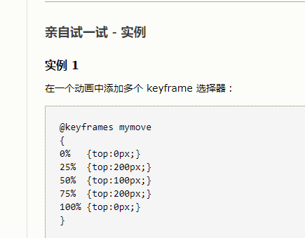
<!DOCTYPE html>
<html>
    <head>
        <meta charset="UTF-8">
        <title></title>
        <style type="text/css">
            *{
                padding: 0;
                margin: 0;
            }
            #wrap{
                position: relative;
                width: 300px;
                height: 300px;
                margin: 200px auto;
                border: 1px solid;
            }
            .test{
                position: absolute;
                width: 100px;
                height: 100px;
                border: 1px solid pink;
                left: 50%;
                top: 50%;
                /*transform有限制,不能重复用两个,这样子只会有一个生效,这样子的话,就annimation就有作用了*/
                /*transform: translate3d(-50%,-50%,0);*/
                margin-left: -50px;
                margin-top: -50px;
                border-radius:50% ;
                background: pink;
                text-align: center;
                font: 20px/100px "微软雅黑";
                /*不设置的时候,动画完就会回到原来的位置*/
                /*动画内的属性*/
                animation-name: name;
                animation-duration: 3s;
                animation-timing-function: linear;
                /*反转的是关键帧和animation-timing-function*/
                /*轮流反向 animation-direction: alternate-reverse;*/
                /*一直反转 animation-direction: reverse*/
                /*一共有四个值
                 normal:from - to 正常
                 reverse to-from
                 alternate-reverse:to-from-from-to  如此循环
                 alternate from - to- to -from  如此循环

                 * */
                animation-direction: normal;


                /*动画外的属性*/
                animation-delay: 2s;

                /*只作用于动画内的属性*/
                animation-iteration-count: 3;

                /*元素在动画外的状态*
                 * 就是说动画完后,元素应该处于什么位置之类的
                 * backwards:在 animation-delay 所指定的一段时间内,在动画显示之前,应用开始属性值(在第一个关键帧中定义)
                 * 。(意思就是说已经开始使开始的状态有效了,比如from的位置,已经有效,而不是还在原来位置)
                 * forwards:当动画完成后,保持最后一个属性值(在最后一个关键帧中定义)(意思是完成后,不会回来原来位置,而是保持最后的一个效果的状态)
                 * both:backwards+forwards(两者都应用)
                 */
                animation-fill-mode: forwards;
                /*设置是否要暂停,可以控制暂停,默认是running*/
                /*animation-play-state:paused;*/


            }
            @keyframes name{
                from{
                    transform: translateY(-100px);
                }
                to{
                    transform: translateY(100px);
                }
            }
        </style>
    </head>
    <body>
        <div id="wrap">
            <div class="test">
                rainbow
            </div>
        </div>
    </body>
</html>
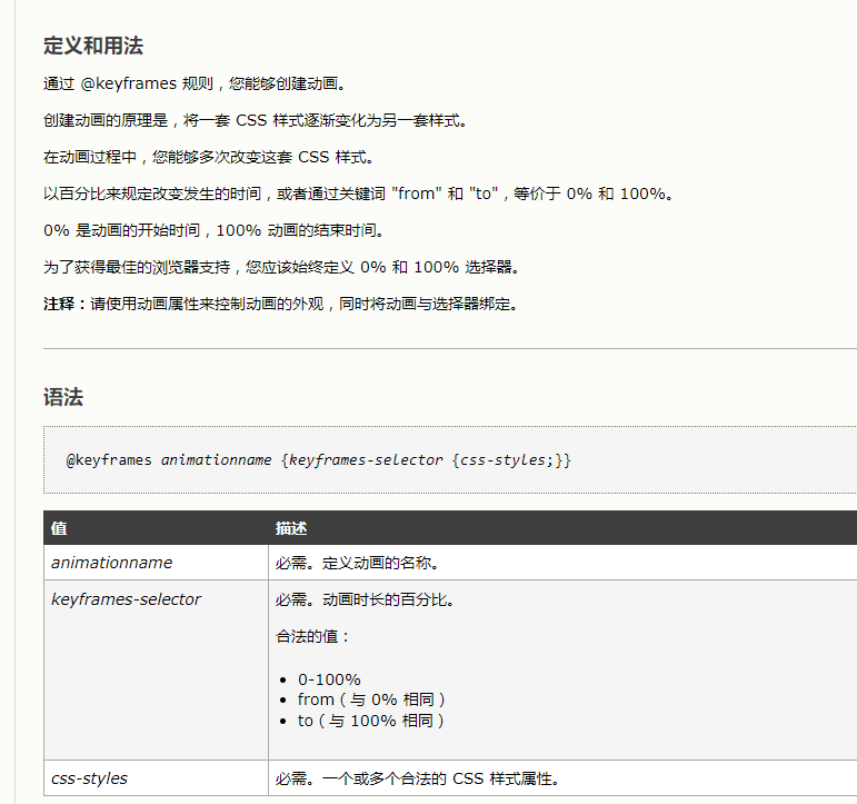
@keyframes 关键帧 规则

 浙公网安备 33010602011771号