No.10可视化大屏--vite+vue3 Echarts 图表引入之柱状图
一、modelSecond 部分 图表引入

1.1Echarts
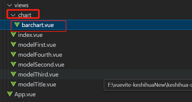
第一步:创建一个放图表的文件夹
第二步:创建一个柱状图barchart组件
第三步:安装,导入echarts
npm install echarts
npm install echarts --saveEcharts 官网:https://echarts.apache.org/zh/index.html
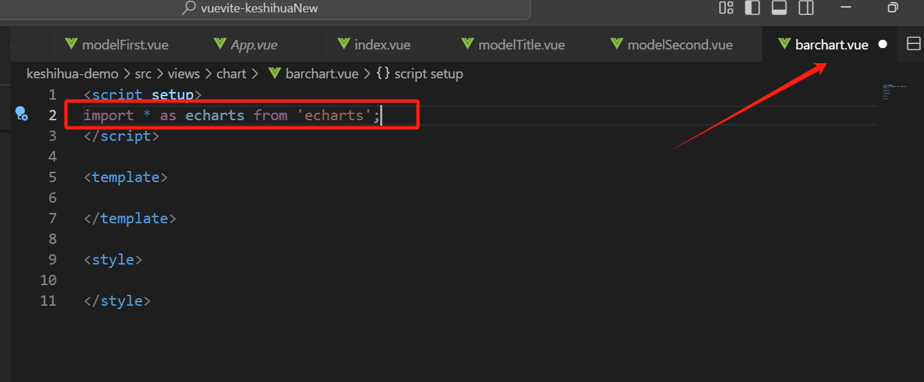
第四步:引入 ECharts
import * as echarts from 'echarts';
第五步: 绘图,
在barchart.vue中,写入代码,加粗的部分为从echarts官网复制过来修改的部分
<script setup>
import { ref,reactive,onMounted} from 'vue';
import * as echarts from 'echarts';

let chart = ref();
onMounted(()=>{
    chartInit()
})

// echarts是基于JS的,和vue里面的语法不太一样,不能完全粘贴过来
function chartInit(){
    // 基于准备好的dom,初始化echarts实例
    var myChart = echarts.init(chart.value);

    // 指定图表的配置项和数据
    var option = {
    title: {
        text: 'ECharts 入门示例'
    },
    tooltip: {},
    legend: {
        data: ['销量']
    },
    xAxis: {
        data: ['衬衫', '羊毛衫', '雪纺衫', '裤子', '高跟鞋', '袜子']
    },
    yAxis: {},
    series: [
        {
        name: '销量',
        type: 'bar',
        data: [5, 20, 36, 10, 10, 20]
        }
    ]
    };

    // 使用刚指定的配置项和数据显示图表。
    myChart.setOption(option);
}

</script>

<template>
    <!-- 绘图前我们需要为 ECharts 准备一个定义了高宽的 DOM 容器 -->
    <div ref="chart" style="width: 400px;height:600px;"></div>

</template>

<style>

</style>
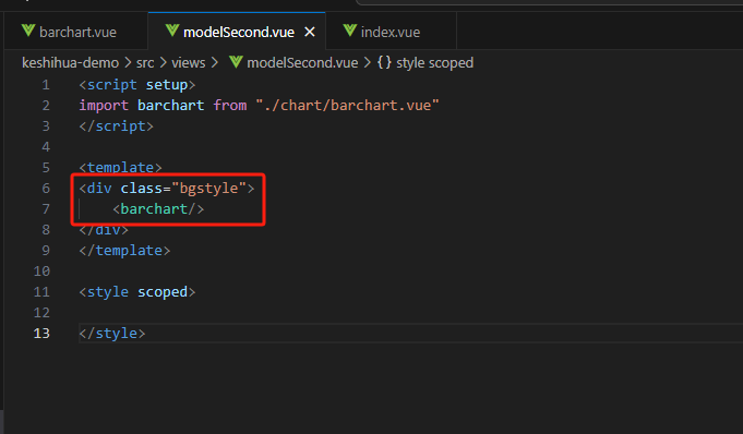
第六步:引入到modelSecond 组件中

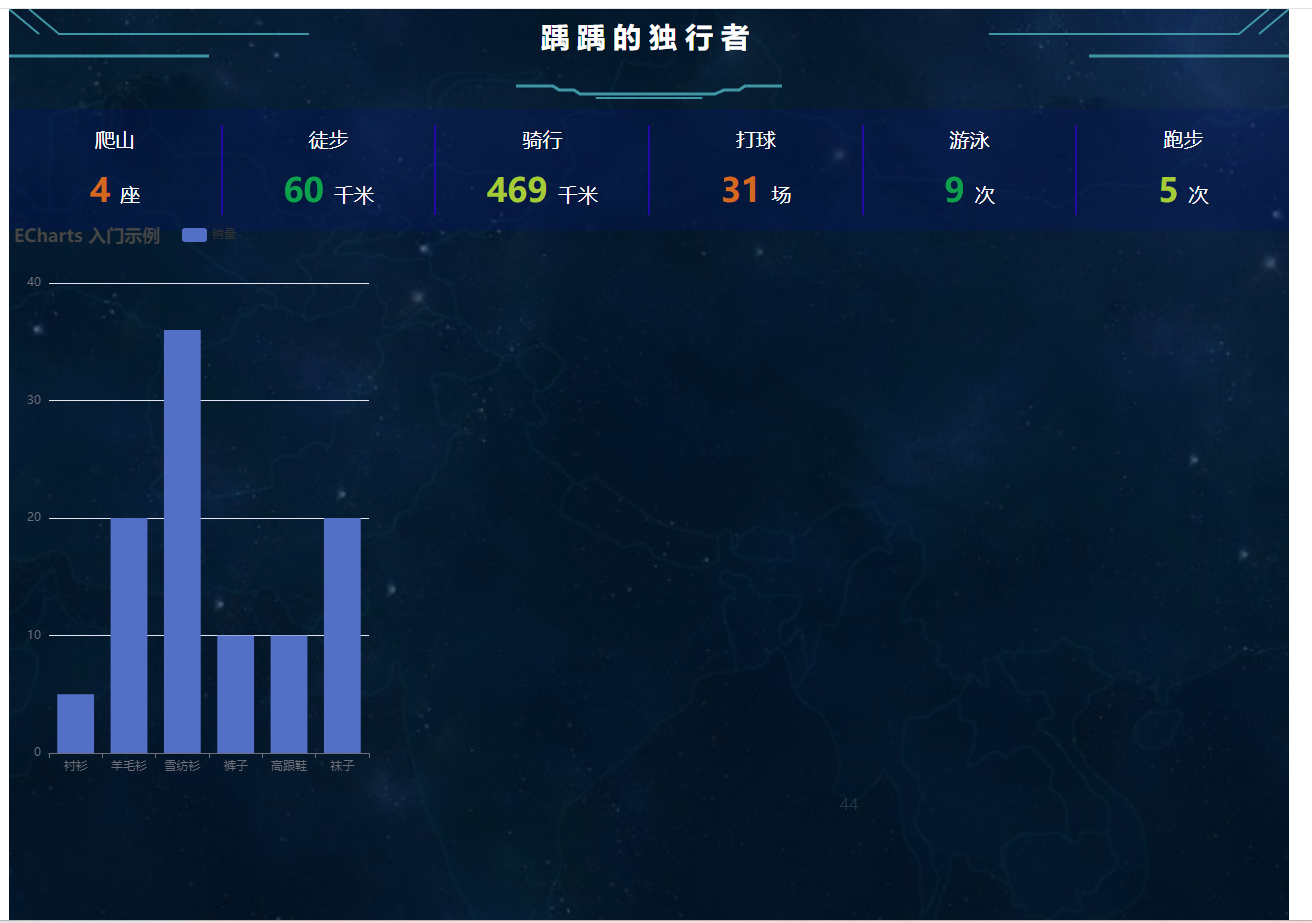
效果:
二、图表配置
在barchart.vue 中,完整代码:
<script setup>
import { ref,reactive,onMounted} from 'vue';
import * as echarts from 'echarts';
let chart = ref();
onMounted(()=>{
chartInit()
})
// echarts是基于JS的,和vue里面的语法不太一样,不能完全粘贴过来
function chartInit(){
// 基于准备好的dom,初始化echarts实例
var myChart = echarts.init(chart.value);
// 指定图表的配置项和数据
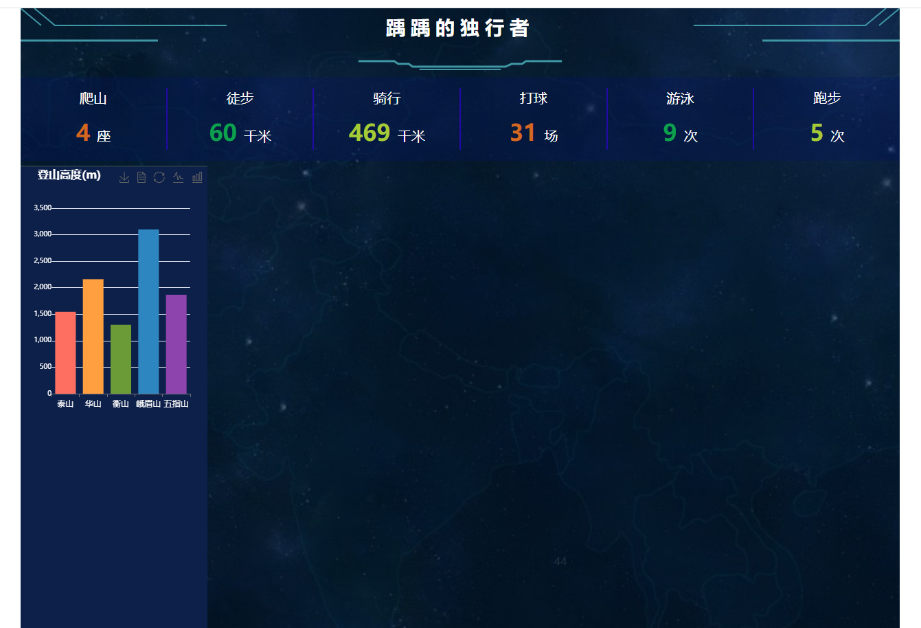
var option = {
title: {
text: '登山高度(m)',
textStyle:{
color : "#fff",
fontSize : 16
}
},
tooltip: {},
// legend: {
// data: ['销量']
// },
xAxis: {
type:'category', //指定轴的类型,数字轴还是名称轴
data: ['泰山', '华山', '衡山', '峨眉山', '五指山'],
axisLine:{
lineStytle:{
color:'#fff'
}
},
axisLabel: {
interval: 0, // 确保所有标签都显示
margin: 10, // 增加标签的左边距
color:'#FFFFFF'
}
},
yAxis: {
type:'value',//指定轴的类型,数字轴还是名称轴
axisLine:{
lineStytle:{
color:'#fff'
}
},
axisLabel: {
fontSize: 10, // 调整字体大小
margin: 0,// 增加间距
color:'#FFFFFF'
}
},
series: [
{
name: '销量',
type: 'bar',
data: [1545, 2160, 1300, 3099, 1867],
barWidth:30,//设置柱宽度
itemStyle:{
color:function(params){
var colorList = ['#FF6F61', '#FF9F40', '#6B9B37', '#2E86C1', '#8E44AD']
return colorList[params.dataIndex]
}
}
}
],
toolbox:{
show:true,
feature:{
saveAsImage:{},
dataView:{},
restore:{},
magicType:{
type:['line','bar']
}
}
}
};
// 使用刚指定的配置项和数据显示图表。
myChart.setOption(option);
}
</script>
<template>
<!-- 绘图前我们需要为 ECharts 准备一个定义了高宽的 DOM 容器 -->
<div ref="chart" class = "barchart" style="width: 100%;height:400px;"></div>
</template>
<style>
.barchart {
margin-left: 20px;
}
.bgstyle {
height: 100%;
background-color: #0D2049;
border-top: 2px solid;
}
</style>
在modelSecond 中,
效果:

 浙公网安备 33010602011771号