推荐一个新的编程用字体"Segoe UI"
微软在Vista里面预备的界面字体Segoe UI虽然备受争议,不过我们却不得不承认这是一款优秀的字体,我曾经数次懊恼于Tahoma那方方正正的点(字号大了更加明显 ),所以嘛就特别地喜欢这个Segoe:)。当然这和Tahoma一样仍然是一款不等宽字体,对于习惯使用等款字体编程的朋友暂时就享受不到了哦。
下面是Segoe UI在Visual Studio 2005里的两种配色效果:

// default color theme

// black and white high contrast theme
我使用的Segoe UI主题:
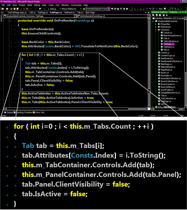
// 18pt Segoe UI in black and white higt contrast style is my favorite :)
字体下载:Segoe UI, enjoy it !
!
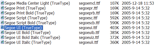
在Fonts目录里安装后如下图:
下面是Segoe UI在Visual Studio 2005里的两种配色效果:
// default color theme
// black and white high contrast theme
我使用的Segoe UI主题:
// 18pt Segoe UI in black and white higt contrast style is my favorite :)
字体下载:Segoe UI, enjoy it
在Fonts目录里安装后如下图:


 浙公网安备 33010602011771号