React Native学习笔记(三)—— 样式、布局与核心组件
一、样式与布局
1.1、创建ReactNative项目
React Native 有一个内置的命令行界面,你可以用它来生成一个新项目。您可以使用 Node.js 附带的 访问它,而无需全局安装任何内容。让我们创建一个名为“AwesomeProject”的新 React Native 项目:npx
npx react-native@latest init AwesomeProject

现在ReactNative的项目就创建完成了,我们就用VScode打开,运行项目以及编辑。
1.2、目录结构
 ├── /_test_                   # RN生成,测试目录
  ├── /android                 # RN生成,android代码目录,具体见下图
  ├── /ios                     # RN生成,代码目录,具体见下图
  ├── /node_modules            # 自动生成,安装依赖的目录,不会被提交
  ├── .babelrc                 # RN生成,Babel配置文件
  ├── .buckconfig              # RN生成,Buck是Mac OS X和Linux使用的构建工具,Buck的配置文件,buck是Facebook开源的高效构建系统
  ├── .flowconfig              # RN生成,Flow是一个静态的类型检查工具
  ├── .gitattributes           # RN生成,配置Git对一个特定的子目录或子文件集运用那些设置项
  ├── .gitignore               # RN生成,配置Git忽略提交的文件
  ├── .watchmanconfig          # RN生成,Watchman用于监控文件变化,辅助实现工程修改所见即所得
  ├── yarn.lock                # RN生成,Yarn是node包管理器,yarn.lock文件使程序在不同的机器上以同样的方式安装依赖
  ├── package.json             # RN生成,用于描述项目的基本信息以及需要的依赖信息
  ├── index.android.js         # RN生成,android入口文件
  ├── index.ios.js             # RN生成,ios入口文件
  ├── index.web.js             # 自定义,web入口文件
  ├── CHANGELOG.md             # 自定义,版本更新日志
  ├── README.md                # 自定义,项目运行说明
1.3、运行项目
第 1 步:启动metro
npx react-native start
第 2 步:启动应用程序
npx react-native run-android
第3步:项目启动完成

1.4、设置模拟器
1、设置模拟器悬浮在窗口最顶端段


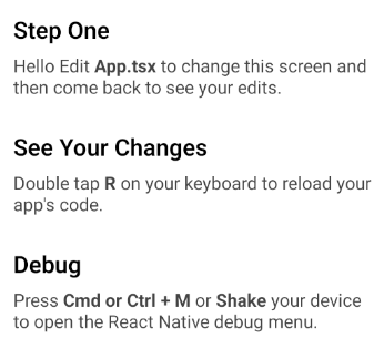
2、修改App.tsx文件
3、双击R键重新加载代码
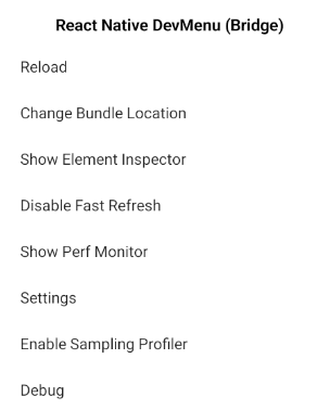
4、Ctrl+M或摇晃手机打开调试模式
1.5、样式单位
一、长度的单位
在开始任何布局之前,让我们来首先需要知道,在写React Native组件样式时,长度的不带单位的,它表示“与设备像素密度无关的逻辑像素点”。
这个怎么理解呢?
我们知道,屏幕上一个发光的最小点,对应着一个pixel(像素)点。
假设下面三个矩形,代表三个屏幕大小一样的设备,但是,它们拥有的分辨率(resolution)不同:

图1.相同尺寸的设备 不同的分辨率
图上的每一个小格子,其实就代表了一个像素(pixel)。可以看到,一个像素点的大小,在这个三个物理尺寸一样但拥有不同分辨率的设备上,是不一样的。
如果我们以像素为单位来设置一个界面元素的大小,比如说2px的高度,那么这2px的长度上面的设备中就会是下面这个样子:

图2.不同分辨率下的2px实际高度
它们真实显示出的长度是不一样的。
我们想要一种长度单位,在同样物理尺寸大小的屏幕上(不论分辨率谁高谁低,只要物理尺寸大小一样即可),1个单位的长度所代表的物理尺寸是一样的。这种单位就应该是独立于分辨率的,把它起一个名字叫做 density-independent pixels,简称dp。这其实就是Android系统中所使用的长度单位。
举例来说,2dp宽,2dp高的内容,在不同分辨率但屏幕尺寸一样的设备上所显示出的物理大小是一样的。(一个题外话:有些Android开发者建议所有可点击的按钮,宽高都不应该少于48dp。)

图3. 2dp * 2dp大小的内容 在同样尺寸的屏幕中所占据的物理大小一致
Android中字体大小使用另外一个单位,叫做scale independent pixels,简称sp。这个单位和dp很类似,不过它通常是用在对字体大小的设置中。通过它设置的字体,可以根据系统字体大小的变化而变化。
pixel与dp存在一个公式:px = dp * (dpi/160)。
dpi表示dot per inch,是每英寸上的像素点,它也有个自己的计算公式,具体这里就不展开了。只需要知道我们之所以要使用一个独立于设备分辨率的单位,主要是为了让应用在不同分辨率的设备中,看起来一致。
在RN中,同样也拥有一个类似于dp的长度单位。如果我们想知道自己的屏幕以这种长度的计量下是多少单位,可以通过引入react-native包中的Dimensions拿到,同时还可以查看本机的像素比例是多少。

import {
  Text,
  View,
  Dimensions,
  PixelRatio
} from 'react-native';
const { height, width } = Dimensions.get('window');
const pxRatio = PixelRatio.get();

<View style={styles.container}>
  <Text style={styles.welcome}>
    {`width: ${width}, height: ${height}`}
  </Text>
  <Text style={styles.welcome}>
    {`pixel radio: ${pxRatio}`}
  </Text>
</View>
显示如下:

图4. 当前手机的屏幕信息
它反映出,当前手机屏幕的宽度占据360个单位,高度占据640个单位。像素比例是3,实际上这就是一个 1080 * 1920 像素的手机。其中1080 = width * pixelRadio, 1920 = height * pixelRatio
1.5、样式
在 React Native 中,仍然是使用 JavaScript 来写样式,所有的核心组件都接受名为 style 的属性,这些样式名基本上都遵循 web 上的 CSS 属性名
1.5.1、RN 样式的声明方式
属性值为对象:<组件 style={{样式}} />
属性值为数组:<组件 style={[{样式1}, ..., {样式N}]} />
import { Text, StyleSheet, View } from 'react-native'
import React, { Component } from 'react'
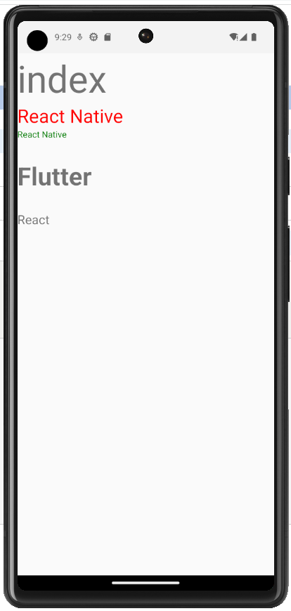
export default class Com1 extends Component {
render() {
return (
<View>
<Text style={{fontSize: 60}}>index</Text>
<Text style={[{color: 'red'}, {fontSize: 30}]}>React Native</Text>
<Text style={[{color: 'red'}, {color: 'green'}]}>React Native</Text>
<Text style={styles.mainTitle}>Flutter</Text>
<Text style={[styles.subTitle]}>React</Text>
</View>
);
}
}
const styles = StyleSheet.create({
mainTitle: {
fontSize: 40, // number 类型
fontWeight: 'bold', // string 类型
marginVertical: 30, // number 类型
},
subTitle: {
fontSize: 20,
fontWeight: '400', // string 类型
},
});
1.5.2、RN 中的样式与 CSS 的不同
import { Text, StyleSheet, View } from 'react-native'
import React, { Component } from 'react'
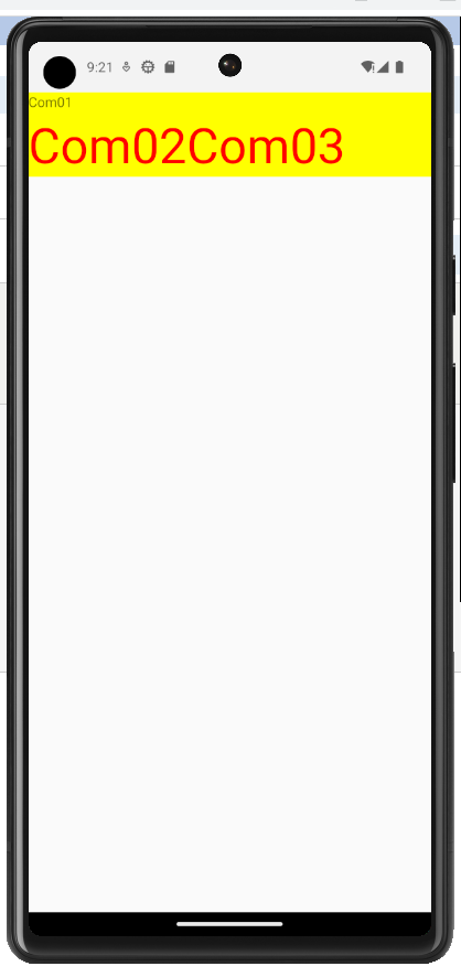
export default class Com01 extends Component {
render() {
return (
<View style={styles.font50}>
<Text>Com01</Text>
<View>
<Text style={styles.font50}>Com02
<Text>Com03</Text>
</Text>
</View>
</View>
)
}
}
const styles = StyleSheet.create({
font50:{
fontSize:50,
color:"#ff0000",
backgroundColor:"yellow"
}
})
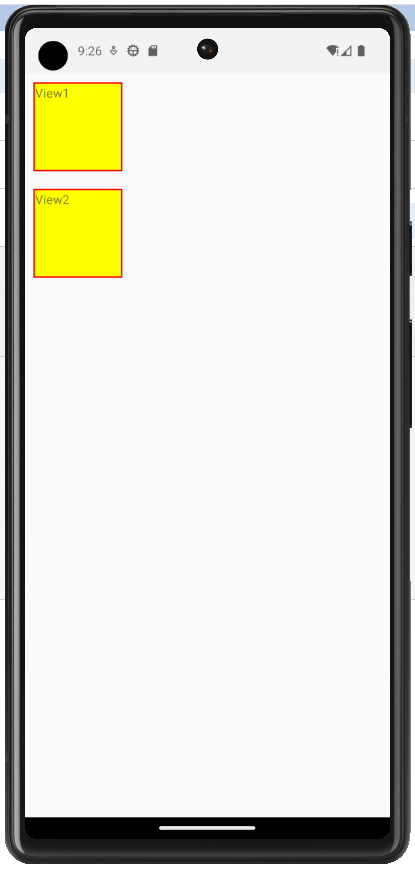
import { Text, StyleSheet, View } from 'react-native'
import React, { Component } from 'react'

export default class Com01 extends Component {
  render() {
    return (
      <View>
      <View style={styles.box}>
        <Text>View1</Text>
      </View>
      <View style={styles.box}>
        <Text>View2</Text>
      </View>
      </View>
    )
  }
}

const styles = StyleSheet.create({
    box:{
        fontSize:50,
        backgroundColor:"yellow",
        width:100,
        height:100,
        borderWidth:2,
        borderColor:"red",
        marginVertical:10,
        marginHorizontal:10
    }
})
1.6、使用 Flexbox 布局
1.6.1、flexbox概要
1.6.2、flex属性
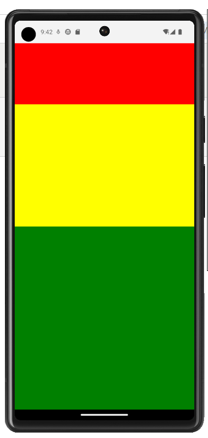
import { Text, StyleSheet, View , Dimensions} from 'react-native'
import React, { Component } from 'react'

export default class Com02 extends Component {
  render() {
    return (
      <View style={[styles.container]}>
        <View style={{flex:1,backgroundColor:"red"}}></View>
        <View style={{flex:2,backgroundColor:"yellow"}}></View>
        <View style={{flex:3,backgroundColor:"green"}}></View>
      </View>
    )
  }
}

const styles = StyleSheet.create({
    container:{
        display:"flex",
        height:Dimensions.get("window").height,
        width:Dimensions.get("window").width,
        backgroundColor:"yellow"
    }
})
1.6.3、flexDirection
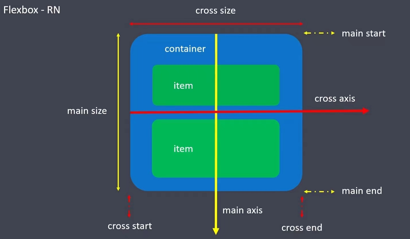
谈到布局我们从原生讲起,在iOS的世界里我们是有X轴、Y轴的,
那么在React Native的世界里对应的就是flexDirection属性,
flexDirection?: "row" | "column" | "row-reverse" | "column-reverse";
它是有row(行,我们可以和X轴对应,水平方向)、column(列,我们可以和Y轴对应,垂直方向),
flexDirection决定了子控件的排列方向,也就决定了主次轴,
如果是row那么X轴就是主轴,Y轴就是次轴(侧轴),如果是column那么Y轴就是主轴,X轴就是次轴(侧轴)。
我们的justifyContent和alignItems就是参照于主次轴的,justifyContent参照主轴,alignItems参照次轴。
换言之justifyContent和alignItems依赖于flexDirection,离开了flexDirection,两者也就没有了意义。
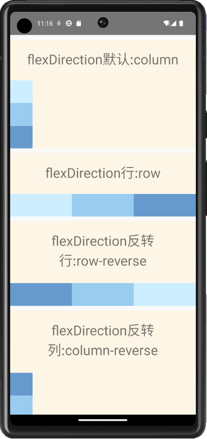
import { Text, StyleSheet, View,ScrollView } from 'react-native'
import React, { Component } from 'react'

export default class Com03 extends Component {
  render() {
    return (
      <ScrollView>
        <View style={[styles.card]}>
           <Text style={styles.title}>flexDirection默认:column</Text>
           <View style={[styles.container,{flexDirection:"column"}]}>
             <View style={[styles.box,{backgroundColor:"#cceeff"}]}></View>
             <View style={[styles.box,{backgroundColor:"#99ccee"}]}></View>
             <View style={[styles.box,{backgroundColor:"#6699cc"}]}></View>
           </View>
        </View>
        <View style={[styles.card]}>
           <Text style={styles.title}>flexDirection行:row</Text>
           <View style={[styles.container,{flexDirection:"row"}]}>
             <View style={[styles.box,{backgroundColor:"#cceeff"}]}></View>
             <View style={[styles.box,{backgroundColor:"#99ccee"}]}></View>
             <View style={[styles.box,{backgroundColor:"#6699cc"}]}></View>
           </View>
        </View>
        <View style={[styles.card]}>
           <Text style={styles.title}>flexDirection反转行:row-reverse</Text>
           <View style={[styles.container,{flexDirection:"row-reverse"}]}>
             <View style={[styles.box,{backgroundColor:"#cceeff"}]}></View>
             <View style={[styles.box,{backgroundColor:"#99ccee"}]}></View>
             <View style={[styles.box,{backgroundColor:"#6699cc"}]}></View>
           </View>
        </View>
        <View style={[styles.card]}>
           <Text style={styles.title}>flexDirection反转列:column-reverse</Text>
           <View style={[styles.container,{flexDirection:"column-reverse"}]}>
             <View style={[styles.box,{backgroundColor:"#cceeff"}]}></View>
             <View style={[styles.box,{backgroundColor:"#99ccee"}]}></View>
             <View style={[styles.box,{backgroundColor:"#6699cc"}]}></View>
           </View>
        </View>
      </ScrollView>
    )
  }
}

const styles = StyleSheet.create({
    container:{
        marginTop:10
    },
    card:{
        marginTop:10,
        backgroundColor:"oldlace",
        display:"flex"
    },
    box:{
        width:50,
        height:50,
        flex:1
    },
    title:{
        fontSize:30,
        textAlign:"center",
        paddingVertical:20
    }
})
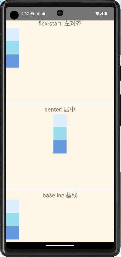
1.6.4、justifyContent
import { Text, StyleSheet, View, ScrollView } from 'react-native'
import React, { Component } from 'react'
export default class FlexBoxJustifyContent extends Component {
render() {
return (
<ScrollView>
<View style={styles.container}>
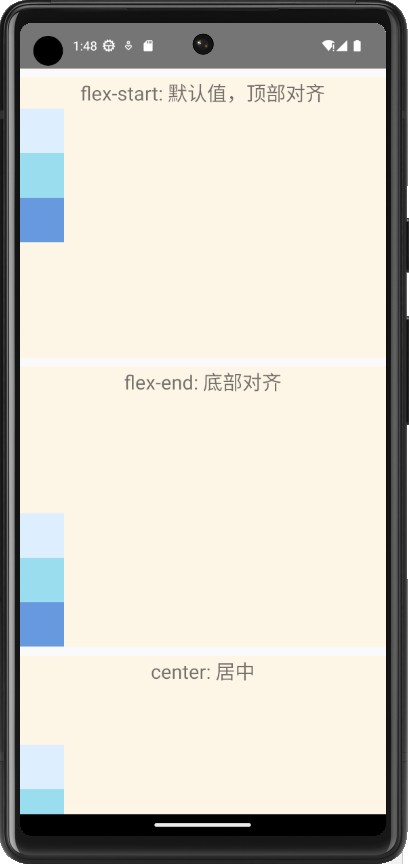
<Text style={styles.title}>flex-start: 默认值,顶部对齐</Text>
<View style={[styles.card,{minHeight:280,justifyContent:"flex-start"}]}>
<View style={[styles.box,{backgroundColor:"#ddeeff"}]}></View>
<View style={[styles.box,{backgroundColor:"#99ddee"}]}></View>
<View style={[styles.box,{backgroundColor:"#6699dd"}]}></View>
</View>
</View>
<View style={styles.container}>
<Text style={styles.title}>flex-end: 底部对齐</Text>
<View style={[styles.card,{minHeight:280,justifyContent:"flex-end"}]}>
<View style={[styles.box,{backgroundColor:"#ddeeff"}]}></View>
<View style={[styles.box,{backgroundColor:"#99ddee"}]}></View>
<View style={[styles.box,{backgroundColor:"#6699dd"}]}></View>
</View>
</View>
<View style={styles.container}>
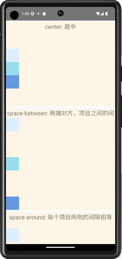
<Text style={styles.title}>center: 居中</Text>
<View style={[styles.card,{minHeight:280,justifyContent:"center"}]}>
<View style={[styles.box,{backgroundColor:"#ddeeff"}]}></View>
<View style={[styles.box,{backgroundColor:"#99ddee"}]}></View>
<View style={[styles.box,{backgroundColor:"#6699dd"}]}></View>
</View>
</View>
<View style={styles.container}>
<Text style={styles.title}>space-between: 两端对齐,项目之间的间隔都相等</Text>
<View style={[styles.card,{minHeight:280,justifyContent:"space-between"}]}>
<View style={[styles.box,{backgroundColor:"#ddeeff"}]}></View>
<View style={[styles.box,{backgroundColor:"#99ddee"}]}></View>
<View style={[styles.box,{backgroundColor:"#6699dd"}]}></View>
</View>
</View>
<View style={styles.container}>
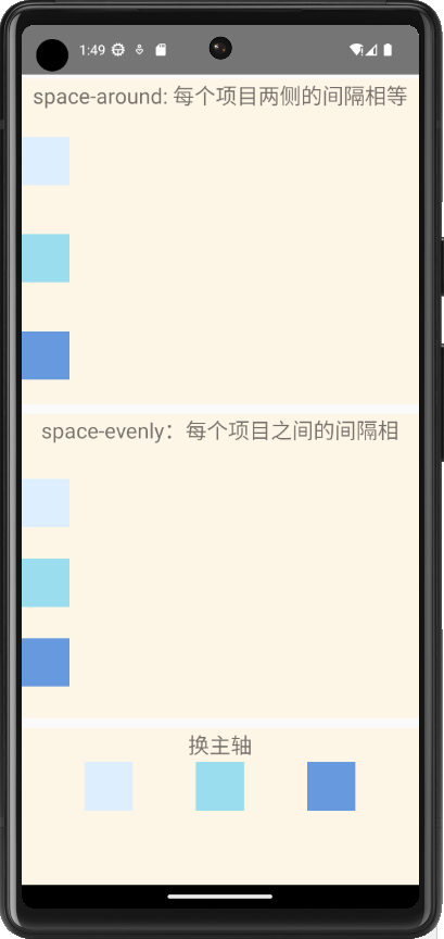
<Text style={styles.title}>space-around: 每个项目两侧的间隔相等</Text>
<View style={[styles.card,{minHeight:280,justifyContent:"space-around"}]}>
<View style={[styles.box,{backgroundColor:"#ddeeff"}]}></View>
<View style={[styles.box,{backgroundColor:"#99ddee"}]}></View>
<View style={[styles.box,{backgroundColor:"#6699dd"}]}></View>
</View>
</View>
<View style={styles.container}>
<Text style={styles.title}>space-evenly:每个项目之间的间隔相等,均匀排列每个项目</Text>
<View style={[styles.card,{minHeight:280,justifyContent:"space-evenly"}]}>
<View style={[styles.box,{backgroundColor:"#ddeeff"}]}></View>
<View style={[styles.box,{backgroundColor:"#99ddee"}]}></View>
<View style={[styles.box,{backgroundColor:"#6699dd"}]}></View>
</View>
</View>
<View style={styles.container}>
<Text style={styles.title}>换主轴</Text>
<View style={[styles.card,{minHeight:280,flexDirection:"row",justifyContent:"space-evenly"}]}>
<View style={[styles.box,{backgroundColor:"#ddeeff",height:50}]}></View>
<View style={[styles.box,{backgroundColor:"#99ddee",height:50}]}></View>
<View style={[styles.box,{backgroundColor:"#6699dd",height:50}]}></View>
</View>
</View>
</ScrollView>
)
}
}
const styles = StyleSheet.create({
container:{
backgroundColor:"oldlace",
marginTop:10
},
title:{
height:35,
textAlign:"center",
fontSize:22
},
card:{
display:"flex"
},
box:{
minHeight:50,
width:50
}
})
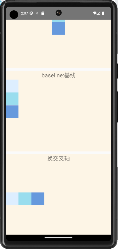
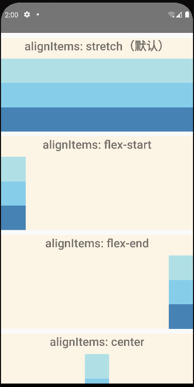
1.6.5、alignItems
type FlexAlignType = "flex-start" | "flex-end" | "center" | "stretch" | "baseline";
alignItems?: FlexAlignType;
import { Text, StyleSheet, View, ScrollView } from 'react-native'
import React, { Component } from 'react'
export default class FlexBoxJustifyContent extends Component {
render() {
return (
<ScrollView>
<View style={styles.container}>
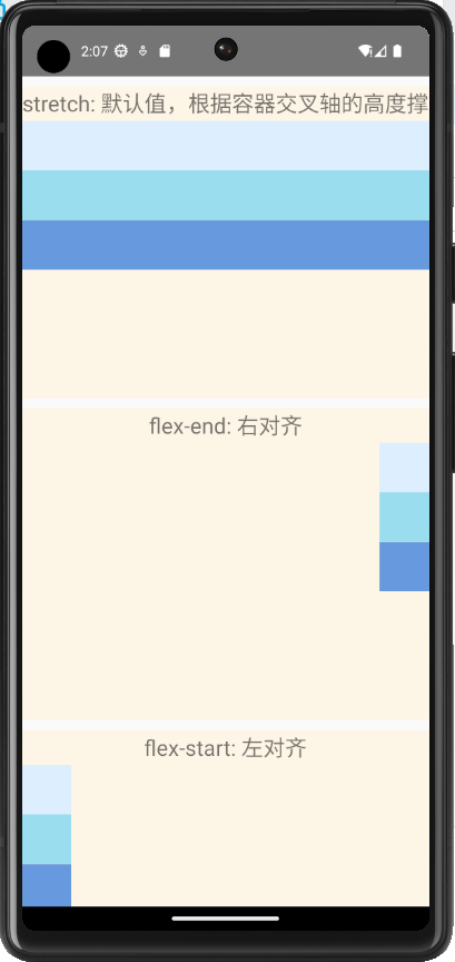
<Text style={styles.title}>stretch: 默认值,根据容器交叉轴的高度撑满容器子元素</Text>
<View style={[styles.card,{minHeight:280,alignItems:"stretch"}]}>
<View style={[styles.box,{backgroundColor:"#ddeeff"}]}></View>
<View style={[styles.box,{backgroundColor:"#99ddee"}]}></View>
<View style={[styles.box,{backgroundColor:"#6699dd"}]}></View>
</View>
</View>
<View style={styles.container}>
<Text style={styles.title}>flex-end: 右对齐</Text>
<View style={[styles.card,{minHeight:280,alignItems:"flex-end"}]}>
<View style={[styles.box,{backgroundColor:"#ddeeff",width:50}]}></View>
<View style={[styles.box,{backgroundColor:"#99ddee",width:50}]}></View>
<View style={[styles.box,{backgroundColor:"#6699dd",width:50}]}></View>
</View>
</View>
<View style={styles.container}>
<Text style={styles.title}>flex-start: 左对齐</Text>
<View style={[styles.card,{minHeight:280,alignItems:"flex-start"}]}>
<View style={[styles.box,{backgroundColor:"#ddeeff",width:50}]}></View>
<View style={[styles.box,{backgroundColor:"#99ddee",width:50}]}></View>
<View style={[styles.box,{backgroundColor:"#6699dd",width:50}]}></View>
</View>
</View>
<View style={styles.container}>
<Text style={styles.title}>center: 居中</Text>
<View style={[styles.card,{minHeight:280,alignItems:"center"}]}>
<View style={[styles.box,{backgroundColor:"#ddeeff",width:50}]}></View>
<View style={[styles.box,{backgroundColor:"#99ddee",width:50}]}></View>
<View style={[styles.box,{backgroundColor:"#6699dd",width:50}]}></View>
</View>
</View>
<View style={styles.container}>
<Text style={styles.title}>baseline:基线</Text>
<View style={[styles.card,{minHeight:280,alignItems:"baseline"}]}>
<View style={[styles.box,{backgroundColor:"#ddeeff",width:50}]}></View>
<View style={[styles.box,{backgroundColor:"#99ddee",width:50}]}></View>
<View style={[styles.box,{backgroundColor:"#6699dd",width:50}]}></View>
</View>
</View>
<View style={styles.container}>
<Text style={styles.title}>换交叉轴</Text>
<View style={[styles.card,{minHeight:280,flexDirection:"row",alignItems:"center"}]}>
<View style={[styles.box,{backgroundColor:"#ddeeff",height:50,width:50}]}></View>
<View style={[styles.box,{backgroundColor:"#99ddee",height:50,width:50}]}></View>
<View style={[styles.box,{backgroundColor:"#6699dd",height:50,width:50}]}></View>
</View>
</View>
</ScrollView>
)
}
}
const styles = StyleSheet.create({
container:{
backgroundColor:"oldlace",
marginTop:10
},
title:{
height:35,
textAlign:"center",
fontSize:22
},
card:{
display:"flex"
},
box:{
minHeight:50
}
})
1.6.6、alignSelf
import React from 'react';
import {View, Text, ScrollView, StyleSheet} from 'react-native';

const AlignItems = () => {
  return (
    <ScrollView>
      <View style={styles.card}>
        <Text style={styles.title}>alignItems: stretch(默认)</Text>
        <View style={[styles.container, {alignItems: 'stretch'}]}>
          <View style={[styles.box, {backgroundColor: 'powderblue'}]} />
          <View style={[styles.box, {backgroundColor: 'skyblue'}]} />
          <View style={[styles.box, {backgroundColor: 'steelblue'}]} />
        </View>
      </View>
      <View style={styles.card}>
        <Text style={styles.title}>alignItems: flex-start</Text>
        <View style={[styles.container, {alignItems: 'flex-start'}]}>
          <View style={[styles.box, {backgroundColor: 'powderblue'}]} />
          <View style={[styles.box, {backgroundColor: 'skyblue'}]} />
          <View style={[styles.box, {backgroundColor: 'steelblue'}]} />
        </View>
      </View>
      <View style={styles.card}>
        <Text style={styles.title}>alignItems: flex-end</Text>
        <View style={[styles.container, {alignItems: 'flex-end'}]}>
          <View style={[styles.box, {backgroundColor: 'powderblue'}]} />
          <View style={[styles.box, {backgroundColor: 'skyblue'}]} />
          <View style={[styles.box, {backgroundColor: 'steelblue'}]} />
        </View>
      </View>
      <View style={styles.card}>
        <Text style={styles.title}>alignItems: center</Text>
        <View style={[styles.container, {alignItems: 'center'}]}>
          <View style={[styles.box, {backgroundColor: 'powderblue'}]} />
          <View style={[styles.box, {backgroundColor: 'skyblue'}]} />
          <View style={[styles.box, {backgroundColor: 'steelblue'}]} />
        </View>
      </View>
      <View style={styles.card}>
        <Text style={styles.title}>alignItems: baseline</Text>
        <View style={[styles.container, {alignItems: 'baseline'}]}>
          <View style={[styles.box, {backgroundColor: 'powderblue'}]} />
          <View style={[styles.box, {backgroundColor: 'skyblue'}]} />
          <View style={[styles.box, {backgroundColor: 'steelblue'}]} />
        </View>
      </View>
      <View style={styles.card}>
        <Text style={styles.title}>alignItems: baseline vs</Text>
        <Text style={styles.title}>alignSelf: center</Text>
        <View style={[styles.container, {alignItems: 'baseline'}]}>
          <View style={[styles.box, {backgroundColor: 'powderblue'}]} />
          <View
            style={[
              styles.box,
              {backgroundColor: 'skyblue', alignSelf: 'center'},
            ]}
          />
          <View style={[styles.box, {backgroundColor: 'steelblue'}]} />
        </View>
      </View>
    </ScrollView>
  );
};

const styles = StyleSheet.create({
  title: {
    textAlign: 'center',
    fontSize: 24,
    fontWeight: '600',
  },
  card: {
    marginTop: 10,
    backgroundColor: 'oldlace',
  },
  container: {
    marginTop: 10,
  },
  box: {
    minWidth: 50,
    height: 50,
  },
});

export default AlignItems;
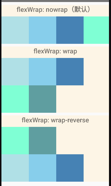
1.6.7、flexWrap
import React from 'react';
import {View, Text, StyleSheet} from 'react-native';

const FlexWrap = () => {
  return (
    <View>
      <View style={styles.card}>
        <Text style={styles.title}>flexWrap: nowrap(默认)</Text>
        <View style={[styles.container, {flexWrap: 'nowrap'}]}>
          <View style={[styles.box, {backgroundColor: 'powderblue'}]} />
          <View style={[styles.box, {backgroundColor: 'skyblue'}]} />
          <View style={[styles.box, {backgroundColor: 'steelblue'}]} />
          <View style={[styles.box, {backgroundColor: 'aquamarine'}]} />
          <View style={[styles.box, {backgroundColor: 'cadetblue'}]} />
        </View>
      </View>
      <View style={styles.card}>
        <Text style={styles.title}>flexWrap: wrap</Text>
        <View style={[styles.container, {flexWrap: 'wrap'}]}>
          <View style={[styles.box, {backgroundColor: 'powderblue'}]} />
          <View style={[styles.box, {backgroundColor: 'skyblue'}]} />
          <View style={[styles.box, {backgroundColor: 'steelblue'}]} />
          <View style={[styles.box, {backgroundColor: 'aquamarine'}]} />
          <View style={[styles.box, {backgroundColor: 'cadetblue'}]} />
        </View>
      </View>
      <View style={styles.card}>
        <Text style={styles.title}>flexWrap: wrap-reverse</Text>
        <View style={[styles.container, {flexWrap: 'wrap-reverse'}]}>
          <View style={[styles.box, {backgroundColor: 'powderblue'}]} />
          <View style={[styles.box, {backgroundColor: 'skyblue'}]} />
          <View style={[styles.box, {backgroundColor: 'steelblue'}]} />
          <View style={[styles.box, {backgroundColor: 'aquamarine'}]} />
          <View style={[styles.box, {backgroundColor: 'cadetblue'}]} />
        </View>
      </View>
    </View>
  );
};

const styles = StyleSheet.create({
  title: {
    textAlign: 'center',
    fontSize: 24,
    fontWeight: '600',
  },
  card: {
    marginTop: 10,
    backgroundColor: 'oldlace',
  },
  container: {
    marginTop: 10,
    flexDirection: 'row',
  },
  box: {
    width: 100,
    height: 100,
  },
});

export default FlexWrap;
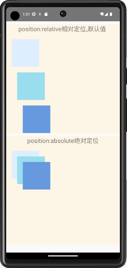
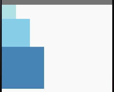
1.6.8、相对定位与绝对定位
import { Text, StyleSheet, View, ScrollView } from 'react-native'
import React, { Component } from 'react'

export default class Position extends Component {
  render() {
    return (
      <ScrollView>
        <View style={styles.container}>
            <Text style={styles.title}>position:relative相对定位,默认值 </Text>
            <View style={[styles.card,{height:360,position:"relative"}]}>
                <View style={[styles.box,{backgroundColor:"#ddeeff",left:20,top:20}]}></View>
                <View style={[styles.box,{backgroundColor:"#99ddee",left:40,top:40}]}></View>
                <View style={[styles.box,{backgroundColor:"#6699dd",left:60,top:60}]}></View>
            </View>
        </View>
        <View style={styles.container}>
            <Text style={styles.title}>position:absolute绝对定位</Text>
            <View style={[styles.card,{height:360,width:"100%"}]}>
                <View style={[styles.box,{backgroundColor:"#ddeeff",position:"absolute",left:20,top:20}]}></View>
                <View style={[styles.box,{backgroundColor:"#99ddee",position:"absolute",left:40,top:40}]}></View>
                <View style={[styles.box,{backgroundColor:"#6699dd",position:"absolute",left:60,top:60}]}></View>
            </View>
        </View>
      </ScrollView>
    )
  }
}

const styles = StyleSheet.create({
    container:{
        backgroundColor:"oldlace",
        marginTop:10
    },
    title:{
        height:35,
        textAlign:"center",
        fontSize:22
    },
    card:{
    },
    box:{
        height:100,
        width:100
    }
})
1.6.9、宽度与高度
import {View} from 'react-native';
import React from 'react';

export default function Basics() {
  return (
    <View>
      <View style={{width: 50, height: 50, backgroundColor: 'powderblue'}} />
      <View style={{width: 100, height: 100, backgroundColor: 'skyblue'}} />
      <View style={{width: 150, height: 150, backgroundColor: 'steelblue'}} />
    </View>
  );
}
import {View} from 'react-native';
import React from 'react';

export default function FlexDimensions() {
  return (
    <View style={{height: '100%'}}>
      <View style={{flex: 1, backgroundColor: 'powderblue'}} />
      <View style={{flex: 2, backgroundColor: 'skyblue'}} />
      <View style={{flex: 3, backgroundColor: 'steelblue'}} />
    </View>
  );
}
import {View} from 'react-native';
import React from 'react';

export default function FlexDimensions() {
  return (
    <View style={{height: '100%'}}>
      <View style={{height: '15%', backgroundColor: 'powderblue'}} />
      <View style={{height: '35%', backgroundColor: 'skyblue'}} />
      <View style={{height: '55%', backgroundColor: 'steelblue'}} />
    </View>
  );
}
import {View, Dimensions, StyleSheet} from 'react-native';
import React from 'react';

export default function DimensionsDemo() {
  return (
    <View style={{flexDirection: 'row'}}>
      {/* 注意看父容器是没有指定宽高的 */}
      <View style={[styles.box, {backgroundColor: 'powderblue'}]} />
      <View style={[styles.box, {backgroundColor: 'skyblue'}]} />
      <View style={[styles.box, {backgroundColor: 'steelblue'}]} />
    </View>
  );
}

const styles = StyleSheet.create({
  box: {
    width: Dimensions.get('window').width / 3, // 三等分设备宽度
    height: 90,
  },
});
二、组件
2.1、React Native 核心组件

2.2、组件简介
2.2.1、简介
RN中的核心组件,是对原生组件的封装
- 原生组件:Android或ios内的组件
- 核心组件:RN中常用的,来自react-native的组件


在 Android 开发中是使用 Kotlin 或 Java 来编写视图;在 iOS 开发中是使用 Swift 或 Objective-C 来编写视图。在 React Native 中,则使用 React 组件通过 JavaScript 来调用这些视图。在运行时,React Native 为这些组件创建相应的 Android 和 iOS 视图。由于 React Native 组件就是对原生视图的封装,因此使用 React Native 编写的应用外观、感觉和性能与其他任何原生应用一样。我们将这些平台支持的组件称为原生组件。
官网的核心主键,React Native 具有许多核心组件,从表单控件到活动指示器,应有尽有。你可以在API 章节找到它们。您将主要使用以下核心组件:

这是参考的核心组件有:


官网的案例:
/* eslint-disable prettier/prettier */
import React, { Component } from 'react';
import { Text, StyleSheet, View , Image, ScrollView, TextInput} from 'react-native';

export default class CoreComponent  extends Component {
  render() {
    return (
        <ScrollView>
        <Text>Some text</Text>
        <View>
          <Text>Some more text</Text>
          <Image
            source={{
              uri: 'https://reactnative.dev/docs/assets/p_cat2.png',
            }}
            // eslint-disable-next-line react-native/no-inline-styles
            style={{ width: 200, height: 200 }}
          />
        </View>
        <TextInput
          // eslint-disable-next-line react-native/no-inline-styles
          style={{
            height: 40,
            borderColor: 'gray',
            borderWidth: 1,
          }}
          defaultValue="You can type in me"
        />
      </ScrollView>
    );
  }
}

// eslint-disable-next-line @typescript-eslint/no-unused-vars
const styles = StyleSheet.create({});
效果:

2.2.2、Alert和Button
Button是一个简单的跨平台的按钮组件。下面是一个最简示例:
AlertAndButton.tsx
上面这段代码会在 iOS 上渲染一个蓝色的标签状按钮,在 Android 上则会渲染一个蓝色圆角矩形带白字的按钮。点击这个按钮会调用"onPress"函数,具体作用就是显示一个 alert 弹出框。你还可以指定"color"属性来修改按钮的颜色。
<Button title='alert' onPress={() => {
    Alert.alert('Alert Title',
        'My Alert Msg',
        [
            {
                text: 'Ask me later',
                onPress: () => ToastAndroid.show('wait', ToastAndroid.SHORT)
            },
            {
                text: 'Cancel',
                onPress: () => ToastAndroid.show('Cancel', ToastAndroid.SHORT),
                style: 'cancel'
            },
            {
                text: 'OK',
                onPress: () => ToastAndroid.show('OK', ToastAndroid.SHORT)
            },
        ],
        {
            cancelable: true,
            onDismiss: () => {
                ToastAndroid.show('点击了外面', ToastAndroid.SHORT)
            }
        });
}}/>
运行效果:点击按钮弹出提示框


再试试下面这个使用Button的例子吧。你可以点击"Tap to Play"来预览真实效果
buttonBasics.tsx
import React, { Component } from 'react';
import { Alert, Button, StyleSheet, View } from 'react-native';

export default class ButtonBasics extends Component {
  _onPressButton() {
    Alert.alert('You tapped the button!')
  }

  render() {
    return (
      <View style={styles.container}>
        <View style={styles.buttonContainer}>
          <Button
            onPress={this._onPressButton}
            title="Press Me"
          />
        </View>
        <View style={styles.buttonContainer}>
          <Button
            onPress={this._onPressButton}
            title="Press Me"
            color="#841584"
          />
        </View>
        <View style={styles.alternativeLayoutButtonContainer}>
          <Button
            onPress={this._onPressButton}
            title="This looks great!"
          />
          <Button
            onPress={this._onPressButton}
            title="OK!"
            color="#841584"
          />
        </View>
      </View>
    );
  }
}

const styles = StyleSheet.create({
  container: {
   flex: 1,
   justifyContent: 'center',
  },
  buttonContainer: {
    margin: 20
  },
  alternativeLayoutButtonContainer: {
    margin: 20,
    flexDirection: 'row',
    justifyContent: 'space-between'
  }
})
运行效果:

2.2.3、Switch和StatuBas
1、引入
import { View, Switch, StyleSheet } from "react-native";
2、使用
<Switch
trackColor={{ false: "#767577", true: "#81b0ff" }}
thumbColor={isEnabled ? "#f5dd4b" : "#f4f3f4"}
ios_backgroundColor="#3e3e3e"
onValueChange={toggleSwitch}
value={isEnabled}
/>
3、参数
trackColor={false: color, true: color} 开启/关闭状态时的背景颜色。
ios_backgroundColor='x' 在iOS上,自定义背景颜色。当开关值为false或开关被禁用时(开关是半透明的),可以看到这个背景颜色。
onValueChange 当值改变的时候调用此回调函数,参数为新的值。
testID 用来在端到端测试中定位此视图。
thumbColor='x' 开关上圆形按钮的背景颜色。在 iOS 上设置此颜色会丢失按钮的投影。
tintColor='x' 关闭状态时的边框颜色(iOS)或背景颜色(Android)。
value=布尔值变量 表示此开关是否打开。默认为 false(关闭状态)。
/* eslint-disable prettier/prettier */
import React, { Component } from 'react';
import { StatusBar, StyleSheet, Switch, View } from 'react-native';

export default class SwitchAndStatuBar extends Component<any,any> {
    constructor(props:any){
        super(props);
        this.state = {
            hideStatusBar:false,
        };
    }
  render() {
    return (
      <View style={[styles.container]}>
        <StatusBar
            hidden={this.state.hideStatusBar} //是否显示顶部
            backgroundColor="blue" //仅在Android应用下有效
            barStyle={'dark-content'}
         //用于设置状态栏文字的颜色,其值是枚举类型enum(‘default’, ‘light-content’, ‘dark-content’):
         //default:黑色文字(默认)
         //light-content:白色文字
         //dark-content: 暗色文字
        />
      //开关组件
        <Switch
        trackColor={{false:'red',true:'green'}}
        thumbColor={this.state.hideStatusBar ? 'red' : 'white'}
        value={this.state.hideStatusBar}
      //选中事件
        onValueChange={()=>{this.setState({hideStatusBar:!this.state.hideStatusBar});}}
        />
      </View>
    );
  }
}


const styles = StyleSheet.create({
    container:{
        flex:1,
        justifyContent:'center',
        alignItems:'center',
    },
});
运行效果:

2.2.4、ActivityIndicator
ActivityIndicator的效果类似我们平时看到了loading,在android中ActivityIndicator是progressBar 的Indeterminate(false)模式,说白了就是一个半圆转啊转。
具体属性:
1、ViewPropTypes props… :包含View控件的所有属性,具体咱们看View的属性解释。
2、animating:是否显示,默认true(显示)
3、color: 指示器的颜色, ios默认为gray(#999999),android 默认使用progressBar的系统样式,取决于你设置的style。
4、size: 表示大小,可以设置的值有:
‘small’: 宽高各20
‘large’: 宽高各36
5、hidesWhenStopped:此属性只在ios生效,当停止动画的时候,是否隐藏。默认为true。
ActivityIndicatorDemo.tsx
import React, {Component} from 'react';
    import {
        StyleSheet,
        View,
        Text,
        ActivityIndicator,
    } from 'react-native';
    export default class ActivityIndicatorDemo extends Component {

    render() {
        return (
            <View style={{flex:1}}>
                <View style={{flexDirection:'row'}}>
                    <Text>全部默认:</Text>
                    <ActivityIndicator />
                </View>
                <View style={{flexDirection:'row'}}>
                    <Text>添加背景色:</Text>
                    <ActivityIndicator style={{backgroundColor:'blue'}}/>
                </View>
                <View style={{flexDirection:'row'}}>
                    <Text>animating=false (隐藏):</Text>
                    <ActivityIndicator animating={false}/>
                </View>
                <View style={{flexDirection:'row'}}>
                    <Text>设置color:</Text>
                    <ActivityIndicator color='red'/>
                </View>
                <View style={{flexDirection:'row'}}>
                    <Text>size small:</Text>
                    <ActivityIndicator size="small"/>
                    <Text>size large:</Text>
                    <ActivityIndicator size="large"/>
                </View>
                <View style={{flexDirection:'row'}}>
                    <Text>view props属性设置:</Text>
                    <ActivityIndicator style={{height:100,width:80,backgroundColor:'black'}} />

                </View>
            </View>
        );
    }
    }
运行效果:

2.2.5、Image图片加载
1、source图片路径
ImageDemo.tsx
/* eslint-disable prettier/prettier */
import React, {Component} from 'react';
import {View, Image, StyleSheet, Dimensions} from 'react-native';

export default class ImageDemo extends Component {
  render() {
    return (
      <View style={[styles.container]}>
        <Image style={[styles.items]} source={require('./images/logo.jpg')} />
        <Image
          style={styles.tinyLogo}
          source={{uri: 'https://reactnative.dev/img/tiny_logo.png'}}
        />
        <Image
          style={styles.logo}
          source={{
            uri: 'data:image/png;base64,iVBORw0KGgoAAAANSUhEUgAAADMAAAAzCAYAAAA6oTAqAAAAEXRFWHRTb2Z0d2FyZQBwbmdjcnVzaEB1SfMAAABQSURBVGje7dSxCQBACARB+2/ab8BEeQNhFi6WSYzYLYudDQYGBgYGBgYGBgYGBgYGBgZmcvDqYGBgmhivGQYGBgYGBgYGBgYGBgYGBgbmQw+P/eMrC5UTVAAAAABJRU5ErkJggg==',
          }}
        />
      </View>
    );
  }
}

const styles = StyleSheet.create({
  container: {
    flex: 1,
    justifyContent: 'center',
    alignItems: 'center',
  },
  items:{
    height:200,
    width:Dimensions.get('window').width,
  },
  tinyLogo: {
    width: 50,
    height: 50,
  },
  logo: {
    width: 66,
    height: 58,
  },
});
运行效果:

使用Image组件时,如果默认不对resizeMode进行设置,那么
图片会按照宽高比例中较小的一方显示,长的一方将被裁切掉两端
Image的resizeMode属性:
resizeMode enum(‘cover’,‘contain’,‘stretch’,‘repeat’,‘center’)
如果我们需要将原图完全显示出来可以设置
resizeMode =’contain’:
图片将按比例缩放按宽和高较长的显示,短的方向两边留出空白
resizeMode =’stretch’:
图片将完全显示出来并拉伸变形铺满整个屏幕
但如果你的尺寸比例不合适,可能会出现下列尴尬画面
repeat:图片重复并铺满屏幕(不支持android)
center:图片不拉伸不缩放且居中
最后提醒一下大家,ImageBackground组件中的resizeMode是无效的
2.2.6、TextInput
TextInputDemo.tsx
/* eslint-disable prettier/prettier */
import React, {Component} from 'react';
import {
  StyleSheet,
  View,
  TextInput,
  Dimensions,
  Button,
  Alert,
} from 'react-native';

export default class TextInputDemo extends Component<any, any> {
  constructor(props: any) {
    super(props);
    this.state = {
      username: '',
      password: '',
    };
  }
  doLogin = () => {
    Alert.alert(this.state.username);
  };
  render() {
    return (
      <View style={[styles.containers]}>
        <TextInput
          value={this.state.username}
          style={[styles.input]}
          placeholder="请输入用户名"
          onChangeText={_val => {
            this.setState({username: _val});
          }}
        />
        <TextInput
          style={[styles.input]}
          placeholder="请输入密码"
          value={this.state.password}
          //保护密码
          secureTextEntry={true}
          onChangeText={_val => {
            this.setState({password: _val});
          }}
        />

        <TextInput
          style={[styles.input]}
          placeholder="请输入手机号"
          //数字键盘
          keyboardType="number-pad"
        />

        <TextInput
          style={[styles.input]}
          placeholder="文本域"
          multiline={true}
          numberOfLines={5}
          textAlignVertical="top"
        />
        <View>
          <Button title="登录" onPress={this.doLogin} />
        </View>
      </View>
    );
  }
}

const styles = StyleSheet.create({
  containers: {
    flex: 1,
    justifyContent: 'center',
  },
  input: {
    width: Dimensions.get('window').width - 20,
    margin: 10,
    borderWidth: 1,
    borderColor: 'red',
    paddingHorizontal: 5,
  },
});
运行效果:

Touchable组件
- TouchableHighlight:触碰后,高亮显示
- TouchableOpacity:触碰后,透明度降低(模糊显示)
- TouchaleWithoutFeedback:触碰后,无影响
TouchaleDemo.tsx
/* eslint-disable prettier/prettier */
import React, { Component } from 'react';
import { Text, StyleSheet, View, TouchableHighlight, Alert, TouchableOpacity, TouchableWithoutFeedback } from 'react-native';

export default class TouchaleDemo extends Component {
  render() {
    return (
      <View style={[styles.container]}>
        <TouchableHighlight onPress={()=>{
           Alert.alert('触碰高亮显示');
        }} >
        <View>
              <Text style={[styles.item]}> 触碰高亮 </Text>
        </View>
        </TouchableHighlight>

        <TouchableOpacity onPress={()=>{
           Alert.alert('触碰透明的变化');
        }}>
        <View>
              <Text style={[styles.item]}> 触碰透明的变化 </Text>
        </View>
        </TouchableOpacity>

        <TouchableWithoutFeedback onPress={()=>{
           Alert.alert('触碰无效');
        }}>
        <View>
              <Text style={[styles.item]}> 触碰无效 </Text>
        </View>
        </TouchableWithoutFeedback>
      </View>
    );
  }
}


const styles = StyleSheet.create({
    container:{
        flex:1,
        justifyContent:'center',
        alignItems:'center',
    },
    item:{
        marginBottom:20,
        padding:10,
        borderWidth:1,
        borderColor:'red',
    },
});
运行效果:

ScrollView和SafeAreaView
ScrollView是一个通用的可滚动的容器,你可以在其中放入多个组件和视图,而且这些组件并不需要是同类型的。ScrollView不仅可以垂直滚动(默认),还能水平滚动(通过horizontal属性来设置)。
ScrollView常用属性:
horizontal(布尔值):当此属性为true的时候,所有的的子视图会在水平方向上排成一行,而不是默认的在垂直方向上排成一列。默认值为false。
showsHorizontalScrollIndicator(布尔值):当此属性为true的时候,显示一个水平方向的滚动条。
showsVerticalScrollIndicator(布尔值):与showsHorizontalScrollIndicator相对,当此属性为true的时候,显示一个垂直方向的滚动条。
OnMomentumScrollEnd(function) :当一帧滚动完毕的时候调用,e.nativeEvent.contentOffset,可以用来获取偏移量。
onScrollBeginDrag(function) :当开始手动拖拽的时候调用。
onScrollEndDrag(function) :当结束手动拖拽的时候调用。
onScroll(function) :在滚动的过程中,每帧最多调用一次此回调函数。调用的频率可以用scrollEventThrottle属性来控制。
运行效果:有滚动效果

SectionList
用于呈现分区列表的高性能界面,支持最方便的功能:
- 完全跨平台。
- 可配置的可见度回传。
- 列表标题支持。
- 列表页脚支持。
- 项目分隔符支持。
- 节标题支持。
- 节分隔符支持。
- 异构数据和项目呈现支持。
- 拉动以刷新。
- 滚动加载。
如果您不需要部分支持并且想要更简单的界面,请使用<FlatList>
官网案例:
SectionListDemo.tsx
/* eslint-disable prettier/prettier */
import React, {Component} from 'react';
import { StyleSheet,
    Text,
    View,
    SafeAreaView,
    SectionList,
    StatusBar} from 'react-native';

export default class SectionListDemo extends Component {
     DATA = [
        {
          title: 'Main dishes',
          data: ['Pizza', 'Burger', 'Risotto'],
        },
        {
          title: 'Sides',
          data: ['French Fries', 'Onion Rings', 'Fried Shrimps'],
        },
        {
          title: 'Drinks',
          data: ['Water', 'Coke', 'Beer'],
        },
        {
          title: 'Desserts',
          data: ['Cheese Cake', 'Ice Cream'],
        },
      ];
  render() {
    return (
        <SafeAreaView style={styles.container}>
        <SectionList
          sections={this.DATA}
          keyExtractor={(item, index) => item + index}
          renderItem={({item}) => (
            <View style={styles.item}>
              <Text style={styles.title}>{item}</Text>
            </View>
          )}
          renderSectionHeader={({section: {title}}) => (
            <Text style={styles.header}>{title}</Text>
          )}
        />
      </SafeAreaView>
    );
  }
}


const styles = StyleSheet.create({
    container: {
        flex: 1,
        paddingTop: StatusBar.currentHeight,
        marginHorizontal: 16,
      },
      item: {
        backgroundColor: '#f9c2ff',
        padding: 20,
        marginVertical: 8,
      },
      header: {
        fontSize: 32,
        backgroundColor: '#fff',
      },
      title: {
        fontSize: 24,
      },
});
运行效果:

Animated
Animated库旨在使动画变得流畅,强大并易于构建和维护。Animated侧重于输入和输出之间的声明性关系,以及两者之间的可配置变换,此外还提供了简单的 start/stop方法来控制基于时间的动画执行。
创建动画最基本的工作流程是先创建一个 Animated.Value ,将它连接到动画组件的一个或多个样式属性,然后使用Animated.timing()通过动画效果展示数据的变化:
Animated库旨在使动画变得流畅,强大并易于构建和维护。Animated侧重于输入和输出之间的声明性关系,以及两者之间的可配置变换,此外还提供了简单的 start/stop方法来控制基于时间的动画执行。
创建动画最基本的工作流程是先创建一个 Animated.Value ,将它连接到动画组件的一个或多个样式属性,然后使用Animated.timing()通过动画效果展示数据的变化:
AnimatedDemo.tsx
/* eslint-disable prettier/prettier */
import React, {Component} from 'react';
import {Text, StyleSheet, View,Animated,Button} from 'react-native';

export default class AnimatedDemo extends Component {
   // fadeAnim will be used as the value for opacity. Initial Value: 0
   state = {
    fadeAnim: new Animated.Value(0),
  };

  fadeIn = () => {
    // Will change fadeAnim value to 1 in 5 seconds
    Animated.timing(this.state.fadeAnim, {
      //目标值
      toValue: 1,
      //动画执行的时间
      duration: 5000,
      //启动原生方式,渲染动画(执行效率更高)
      useNativeDriver: true,
    }).start();
  };

  fadeOut = () => {
    // Will change fadeAnim value to 0 in 5 seconds
    Animated.timing(this.state.fadeAnim, {
      toValue: 0,
      duration: 5000,
      useNativeDriver: true,
    }).start();
  };
  render() {
    return (
      <View style={styles.container}>
        <Animated.View
          style={[
            styles.fadingContainer,
            {
              opacity: this.state.fadeAnim, // Bind opacity to animated value
            },
          ]}
        >
          <Text style={styles.fadingText}>Fading View!</Text>
        </Animated.View>
        <View style={styles.buttonRow}>
          {/* 淡入 */}
          <Button title="Fade In" onPress={this.fadeIn} />
          {/* 淡出 */}
          <Button title="Fade Out" onPress={this.fadeOut} />
        </View>
      </View>
    );
  }
}


const styles = StyleSheet.create({
  container: {
    flex: 1,
    alignItems: 'center',
    justifyContent: 'center',
  },
  fadingContainer: {
    paddingVertical: 8,
    paddingHorizontal: 16,
    backgroundColor: 'powderblue',
  },
  fadingText: {
    fontSize: 28,
    textAlign: 'center',
    margin: 10,
  },
  buttonRow: {
    flexDirection: 'row',
    marginVertical: 16,
  },
});
运行效果:点击FADEIN 有淡出效果,FADEOUT淡出效果
6、第三方组件
通过命令安装第三的组件
比如如图所示:

6.1、WebView
引入的命令:
yarn add react-native-webview
配置:
https://github.com/react-native-webview/react-native-webview/blob/master/docs/Getting-Started.md
示例:MyWeb.js
/* eslint-disable prettier/prettier */
import React, {Component} from 'react';
import {WebView} from 'react-native-webview';

export default class MyWeb extends Component {
  render() {
    return (
    //链接到百度的网址
      <WebView source={{uri: 'https://baidu.com'}} style={{marginTop: 20}} />
    );
  }
}
运行效果:

6.2、Picker(下拉框)
引入的命令:
yarn add @react-native-picker/picker
配置:
https://github.com/react-native-picker/picker
示例:PickerDemo.js
运行效果:

6.3、Swiper(轮播效果)
npm i --save react-native-swiper@nex
配置:
https://github.com/leecade/react-native-swiper
示例:SwiperDemo.js
/* eslint-disable prettier/prettier */
import React from 'react';
import {Text, View} from 'react-native';
import Swiper from 'react-native-swiper';

var styles = {
  wrapper: {},
  slide1: {
    flex: 1,
    justifyContent: 'center',
    alignItems: 'center',
    backgroundColor: '#9DD6EB',
  },
  slide2: {
    flex: 1,
    justifyContent: 'center',
    alignItems: 'center',
    backgroundColor: '#97CAE5',
  },
  slide3: {
    flex: 1,
    justifyContent: 'center',
    alignItems: 'center',
    backgroundColor: '#92BBD9',
  },
  text: {
    color: '#fff',
    fontSize: 30,
    fontWeight: 'bold',
  },
};

export default () => (
  <Swiper style={styles.wrapper} showsButtons loop={false}>
    <View testID="Hello" style={styles.slide1}>
      <Text style={styles.text}>Hello Swiper</Text>
    </View>
    <View testID="Beautiful" style={styles.slide2}>
      <Text style={styles.text}>Beautiful</Text>
    </View>
    <View testID="Simple" style={styles.slide3}>
      <Text style={styles.text}>And simple</Text>
    </View>
  </Swiper>
);
运行效果:

三、常见问题的解决办法
3.1、jsx文件eslint报错 Parsing error: Unexpected token < eslint
问题
最近在使用react native开发app的发现一个问题:
报错详情:
可以看到,这是jsx的正确写法,并没有语法错误,但是eslint还是报错,大致意思就是意外的符号<,可以大概推断是eslint没有正确解析jsx语法造成的,虽然程序可以正常运行,但是对于强迫症来说,确实受不了。
分析
原因:开发环境与ESLint当前的解析功能不兼容
解决方案:使用babel-eslint解析
解决
安装babel-eslint
npm install babel-eslint --save-dev
在.eslintrc.js中加入
parse: 'babel-eslint'
问题解决,报错清除。
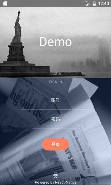
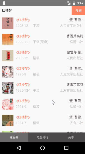
四、作业
1、完成如下页面布局


 浙公网安备 33010602011771号