【全】CSS动画大全之按钮【a】
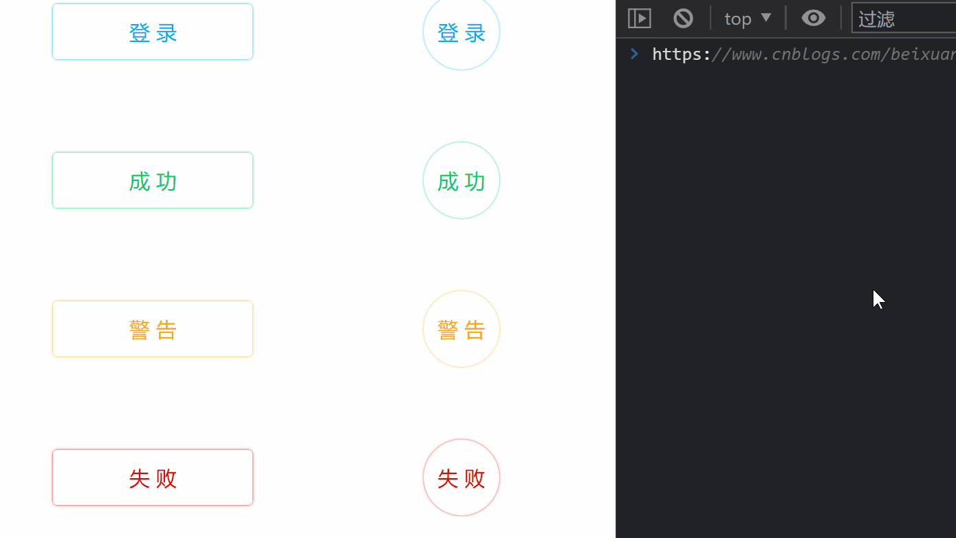 普通按钮悬浮效果
效果预览

代码
<!DOCTYPE html>
<html>
    <head>
        <meta charset="utf-8" />
        <meta name="author" content="https://www.cnblogs.com/beixuan">
        <meta name="version" content="1.0.0">
        <meta name="date" content="2021/12/01 18:00:26">
        <meta name="viewport" content="width=device-width, initial-scale=1">
        <title>CSS动画大全之按钮[a]</title>
    </head>
    <style type="text/css">

      /* 设置 body 内、外边距为 0 */
      body {
        margin: 0;
        padding: 0;
      }

      /* 页面容器 */
      .page-wrapper {
        width: 100vw;
        height: 100vh;
        /* grid 布局 */
        display: grid;
        /* 分左右两列,分别为 50% */
        grid-template-columns: 50% 50%;
        grid-template-rows: 100%;
        /* 设置水平垂直居中 */
        justify-items: center;
        align-items: center;
      }

      .page-wrapper > div {
        display: grid;
        grid-template-columns: 100%;
        grid-template-rows: 20%;
        justify-items: center;
        align-items: center;
        height: 100vh;
      }

      /* 按钮样式 */
      .btn {
        padding: 1rem;
        min-width: 12.5rem;
        text-align: center;
        font-size: 1.5rem;
        cursor: pointer;
        border-radius: 5px;
      }

      /* 成功按钮样式 */
      .btn-primary {
        box-shadow: 0 0 3px #00aaff;
        color: #00aaff;
        transition: all 0.3s ease-in;
      }

      /* 成功按钮悬浮样式 */
      .btn-primary:hover {
        box-shadow: 0 0 1px #00aaff;
        background-color: #00aaff;
        color: #fff;
      }

      /* 成功按钮样式 */
      .btn-success {
        box-shadow: 0 0 3px #00d064;
        color: #00d064;
        transition: all 0.3s ease-in;
      }

      /* 成功按钮悬浮样式 */
      .btn-success:hover {
        box-shadow: 0 0 1px #00d064;
        background-color: #00d064;
        color: #fff;
      }

      /* 警告按钮样式 */
      .btn-warning {
        box-shadow: 0 0 3px #ffaa00;
        color: #ffaa00;
        transition: all 0.3s ease-in;
      }

      /* 警告按钮悬浮样式 */
      .btn-warning:hover {
        box-shadow: 0 0 1px #ffaa00;
        background-color: #ffaa00;
        color: #fff;
      }

      /* 失败按钮样式 */
      .btn-danger {
        box-shadow: 0 0 3px #e30000;
        color: #e30000;
        transition: all 0.3s ease-in;
      }

      /* 失败按钮悬浮样式 */
      .btn-danger:hover {
        box-shadow: 0 0 1px #e30000;
        background-color: #ff072c;
        color: #fff;
      }

      /* 默认按钮样式 */
      .btn-default {
        box-shadow: 0 0 3px #000000;
        color: #000000;
        transition: all 0.3s ease-in;
      }

      /* 默认按钮悬浮样式 */
      .btn-default:hover {
        box-shadow: 0 0 1px #000000;
        background-color: #bababa;
        color: #fff;
      }

      /* 圆形按钮样式 */
      .circle {
        border-radius: 50%;
        min-width: 56px;
        min-height: 56px;
        line-height: 56px;
        cursor: auto;
      }

    </style>
    <body>
      <!-- 页面容器 -->
      <div class="page-wrapper">
        <div>
          <div class="btn btn-primary">登 录</div>
          <div class="btn btn-success">成 功</div>
          <div class="btn btn-warning">警 告</div>
          <div class="btn btn-danger">失 败</div>
          <div class="btn btn-default">默 认</div>
        </div>

        <div>
          <div class="btn btn-primary circle">登 录</div>
          <div class="btn btn-success circle">成 功</div>
          <div class="btn btn-warning circle">警 告</div>
          <div class="btn btn-danger circle">失 败</div>
          <div class="btn btn-default circle">默 认</div>
        </div>
      </div>
    </body>
</html>
本文要是对您有帮助,顶我一下哦!↓↓↓

 浙公网安备 33010602011771号