Flutter 陈航 12-控件 Text Image Button ListView CustomScrollView
目录
12 | 经典控件(一):文本、图片和按钮在Flutter中怎么用?
Button/Image/Text 是由 RawMaterialButton/RawImage/RichText 承载视觉,它们都继承自 RenderObjectWidget,而 RenderObjectWidget 的父类就是 Widget。
文本控件 Text
Text 支持两种类型的文本展示:单一样式的文本 Text,混合样式的富文本 Text.rich。
单一样式的文本
展示效果控制:
控制整体文本布局的参数:
- 对齐方式 textAlign
- 排版方向 textDirection
- 最大行数 maxLines
- 截断规则 overflow
- 缩放因子 textScaleFactor
控制文本展示样式的参数 style:
- 字体名称 fontFamily
- 字体大小 fontSize
- 文本颜色 color
- 文本阴影 shadows
- 指定行高 height:并不是一个绝对值,而是一个因子,具体的行高等于 fontSize * height
Text(
  'Text',
  textAlign: TextAlign.right,
  style: TextStyle(
    fontWeight: FontWeight.bold,
    fontSize: 20,
    color: Colors.green,
  ),
);
混合样式的富文本
在 Android 中使用 SpannableString 来实现,在 Flutter 中即 TextSpan。
TextStyle greenStyle = const TextStyle(fontSize: 20, color: Colors.green);
TextStyle redStyle = const TextStyle(fontWeight: FontWeight.bold, fontSize: 20, color: Colors.red);

Text richText = Text.rich(
  TextSpan(children: <TextSpan>[
    TextSpan(text: '红色样式', style: redStyle),
    const TextSpan(text: '默认样式'),
    TextSpan(text: '绿色样式', style: greenStyle),
  ]),
  textAlign: TextAlign.center,
);
图片控件 Image
常用属性
- 填充模式 fit
- 拉伸模式 centerSlice
- 重复模式 repeat
加载不同来源的图片
Image widget 有一个必选的 image 参数,它对应一个 ImageProvider。
- 项目资源图片:
Image(image: AssetImage("assets/images/flutter_icon.png"), width: 80)- 快捷构造函数:
Image.asset("assets/images/flutter_icon.png", width: 80)
- 快捷构造函数:
- 本地文件图片:
Image.file(new File("/storage/xxx/xxx/test.jpg"), width: 80) - 加载网络图片:
Image.network("http://xxx/test.gif", width: 80) - 加载内存图片:
Image.memory()
Image 原生支持 gif 格式
asset 资源
flutter:
  uses-material-design: true
  assets:
    - assets/images/flutter_icon.png
- 注意:此处 assets 前面有两个空格
- assets 目录和 lib 目录是在同一级
- 由于 yaml 文件对缩进严格,所以必须严格按照每一层两个空格的方式进行缩进
FadeInImage
FadeInImage 控件提供了图片占位的功能,并且支持在图片加载完成时淡入淡出的视觉效果。
FadeInImage.assetNetwork(
  placeholder: 'assets/images/flutter_icon.png',
  image: 'http://p1.qhmsg.com/dm/180_180_100/t0114c2c828368e8986.jpg',
  fit: BoxFit.cover,
  width: 200,
  height: 200,
);
ImageProvider
图片加载过程由 ImageProvider 触发,ImageProvider 定义了图片数据获取的接口 load(),从不同的数据源获取图片需要不同的实现。
- 首先,ImageProvider 根据
_ImageState中传递的图片配置生成对应的图片缓存 key - 然后,去 ImageCache 中查找是否有对应的图片缓存
- 如果有,则通知
_ImageState刷新 UI - 如果没有,则启动 ImageStream 开始异步加载
- 加载完毕后,更新缓存
- 最后,通知
_ImageState刷新 UI
- 如果有,则通知
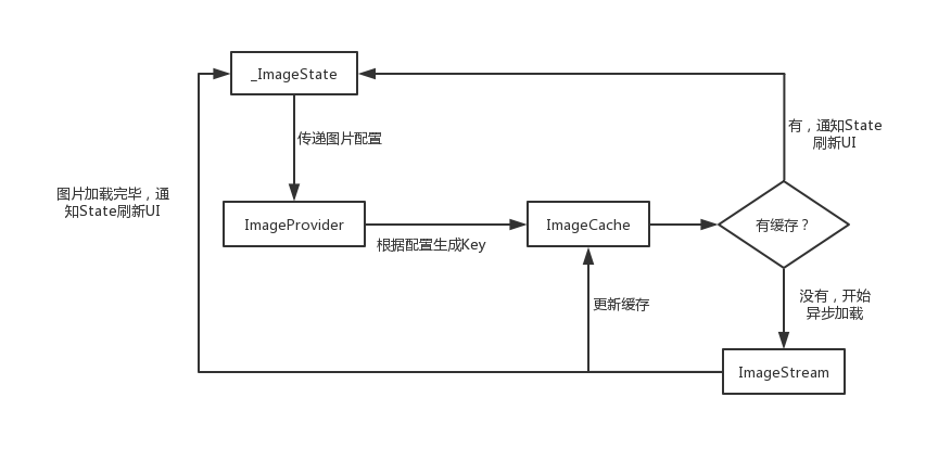
ImageCache 使用 LRU(Least Recently Used,最近最少使用)算法进行缓存更新策略,并且默认最多存储 1000 张图片,最大缓存限制为 100MB,当限定的空间已存满数据时,把最久没有被访问到的图片清除。
CachedNetworkImage
图片缓存只会缓存在内存中,如果想要支持缓存到文件系统,可以使用第三方的 CachedNetworkImage。
CachedNetworkImage 除了支持图片缓存外,还提供了比 FadeInImage 更为强大的加载过程占位与加载错误占位,可以支持比用图片占位更灵活的自定义控件占位。
CachedNetworkImage(
   imageUrl: "http://xxx/xxx/jpg",
   placeholder: (context, url) => CircularProgressIndicator(), // 占位的转圈
   errorWidget: (context, url, error) => Icon(Icons.error), // 错误图兜底
)
按钮
Material 组件库中提供了多种按钮组件,它们都是直接或间接对 RawMaterialButton 组件的包装定制,他们唯一的区别只是默认样式不同而已。
按钮的外观大都可以通过属性来自定义。
所有 Material 库中的按钮在按下时都会有水波纹动画。
两个属性
- onPressed:用于设置点击回调
- child:用于设置按钮的内容
几种类型的按钮
- FloatingActionButton:圆形按钮
- IconButton:图标按钮,不包括文字(有
icon无child),默认没有背景,点击后会出现背景 - ElevatedButton(代替 RaisedButton):漂浮按钮,默认带有圆角矩形背景和阴影,按下后阴影会变大
- TextButton(代替 FlatButton):文本按钮,默认背景透明且不带阴影,按下后会有背景色
- OutlinedButton(代替 OutlineButton):边框按钮,默认不带阴影且背景透明,点击后会出现背景
FloatingActionButton(onPressed: () => log('圆形按钮'),child: Text('圆形按钮'));
IconButton(onPressed: () => log('图标按钮'), icon: Icon(Icons.thumb_up));
ElevatedButton(onPressed: () => log('圆角矩形按钮'),child: Text('圆角矩形按钮'));
TextButton(onPressed: () => log('透明背景按钮'),child: Text('透明背景按钮'));
OutlinedButton(onPressed: () => log('边框按钮'),child: Text('边框按钮'));
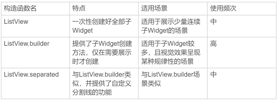
ListView
在处理用于展示一组连续、可滚动的视图元素的场景,Flutter 提供了比原生 Android、iOS 系统更加强大的列表组件 ListView 与 CustomScrollView。
一次性加载
ListView 提供了一个默认构造函数,通过设置 children 参数,可以将所有子 Widget 包含到 ListView 中。
这种方式仅适用于列表中含有少量元素的场景。
ListView(
  children: const <Widget>[
    ListTile(leading: Icon(Icons.map), title: Text('Map')),
    ListTile(leading: Icon(Icons.mail), title: Text('Mail')),
    ListTile(leading: Icon(Icons.message), title: Text('Message'))
  ],
);
scrollDirection
除了默认的垂直方向布局外,ListView 还可以通过设置 scrollDirection 参数支持水平方向布局。
ListView(
  scrollDirection: Axis.horizontal,
  itemExtent: 200,
  children: <Widget>[
    Container(color: Colors.black),
    Container(color: Colors.red),
    Container(color: Colors.blue),
    Container(color: Colors.green),
    Container(color: Colors.yellow),
    Container(color: Colors.orange)
  ],
);
按需加载
ListView 另一个构造函数 ListView.builder 适用于子 Widget 比较多的场景。
- itemBuilder,列表项的创建方法。当列表滚动到相应位置时,会调用该方法创建子 Widget
- itemCount,列表项的数量,如果为空,则表示 ListView 为无限列表
- itemExtent,列表项的高度,非必填参数,设置后能提升性能,为 null 时会动态计算高度
ListView.builder(
  itemCount: 30,
  itemExtent: 50,
  itemBuilder: (BuildContext context, int index) => ListTile(
    title: Text("title $index"),
    subtitle: Text("  subtitle $index"),
  ),
);
分割线
在 ListView 中,有两种方式支持分割线:
- 在 itemBuilder 中,根据 index 的值动态创建分割线,此时会将分割线视为列表项的一部分
- 使用 ListView 的构造方法
ListView.separated,此时会单独设置分割线
ListView.separated(
  itemCount: 30,
  separatorBuilder: (BuildContext context, int index) => index % 2 == 0
      ? const Divider(color: Colors.green) // index 为偶数,创建绿色分割线
      : const Divider(color: Colors.red), // index 为奇数,创建红色分割线
  itemBuilder: (BuildContext context, int index) => ListTile(
    title: Text("title $index"),
    subtitle: Text("  subtitle $index"),
  ),
);
总结
CustomScrollView
CustomScrollView 用来处理多个需要自定义滚动效果的 Widget。
在 CustomScrollView 中,这些彼此独立的、可滚动的 Widget 被统称为 Sliver。
ListView 的 Sliver 实现为 SliverList
AppBar 的 Sliver 实现为 SliverAppBar
这些 Sliver 不再维护各自的滚动状态,而是交由 CustomScrollView 统一管理,最终实现滑动效果的一致性。
CustomScrollView(
  slivers: <Widget>[
    SliverAppBar(
        title: const Text('SliverAppBar'),
        floating: true, // 悬浮样式
        flexibleSpace: Image.network(iconUrl, fit: BoxFit.cover), // 悬浮头图背景
        expandedHeight: 300), // 头图控件高度
    SliverList(
      delegate: SliverChildBuilderDelegate(
            (context, index) => ListTile(title: Text('SliverList Item $index')),
        childCount: 100,
      ),
    )
  ],
);
- SliverAppBar 的 flexibleSpace 可以让背景图显示在 AppBar 下方,高度和 SliverAppBar 一样
- SliverList 通过
SliverChildBuilderDelegate实现列表项元素的创建 - SliverAppBar 和 SliverList 一并交由 CustomScrollView 的
slivers统一管理
滚动监听与控制
- ScrollController 与 ListView 绑定,可以进行滚动信息的监听、相应的滚动控制
- NotificationListener 通过将 ListView 纳入子 Widget,可用于获取滚动事件
ScrollController
Flutter 中的 Widget 并不是渲染到屏幕的最终视觉元素(RenderObject 才是),所以我们无法像原生的 Android 或 iOS 系统那样,向持有的 Widget 对象获取或设置最终渲染相关的视觉信息,而必须通过对应的组件控制器才能实现。
ListView 的组件控制器则是 ScrollController,可以通过它来获取视图的滚动信息、更新视图的滚动位置。
ScrollController 的初始化、监听及销毁需要与 StatefulWidget 的状态保持同步。
class _HomePageState extends State<HomePage> {
  final ScrollController _controller = ScrollController();
  bool isToTop = false;

  void _onPressed() {
    debugPrint("_onPressed isToTop=$isToTop");
    // 当滚动视图到特定位置后,用户可以点击按钮返回列表顶部。添加一个滚动到顶部的动画
    _controller.animateTo(0, duration: const Duration(milliseconds: 200), curve: Curves.ease);
  }

  @override
  void initState() {
    _controller.addListener(() {
      // 注册滚动监听,根据当前视图的滚动位置,判断当前是否需要启用 isToTop
      if (_controller.offset > 600) {
        setState(() => isToTop = true); // 如果 ListView 已经向下滚动了 600,则启用
      } else if (_controller.offset < 300) {
        setState(() => isToTop = false); // 如果 ListView 向下滚动距离不足 300,则禁用
      }
    });
    super.initState();
  }

  @override
  Widget build(BuildContext context) => Scaffold(
      appBar: AppBar(title: Text(widget.title)),
      body: ListView.builder(
          controller: _controller, // 初始化传入控制器
          itemCount: 100,
          itemBuilder: (context, index) => ListTile(title: Text("Index : $index"))),
      floatingActionButton: FloatingActionButton(
        onPressed: isToTop ? _onPressed : null, // 根据 isToTop 判断是否需要注册滚动到顶部的方法
        child: Text(isToTop ? '启用' : '禁用'), // 根据 isToTop 显示内容
      ));

  @override
  void dispose() {
    _controller.dispose(); // 销毁控制器
    super.dispose();
  }
}
ScrollNotification
ScrollNotification 可以感知 ListView 的滚动事件。
ScrollNotification 通知的获取是通过 NotificationListener 来实现的。NotificationListener 是一个 Widget,为了监听滚动类型的事件,需要将 NotificationListener 添加为 ListView 的父容器,然后通过 onNotification 回调函数实现监听逻辑。
class _HomePageState extends State<HomePage> {
  @override
  Widget build(BuildContext context) => Scaffold(
      appBar: AppBar(title: Text(widget.title)),
      body: NotificationListener<ScrollNotification>(
        //添加 NotificationListener 作为父容器,注册 onNotification 通知回调
        onNotification: (scrollNotification) {
          var pixels = scrollNotification.metrics.pixels.toInt(); // The current scroll position
          var before = scrollNotification.metrics.atEdge; // 是否滑到边缘了
          if (scrollNotification is ScrollStartNotification) {
            log('Scroll Start, pixels=$pixels'); // 一个滚动开始
          } else if (scrollNotification is ScrollUpdateNotification) {
            log('Scroll Update, before=$before'); // 一串滚动位置更新(也可能是 0 个)
          } else if (scrollNotification is ScrollEndNotification) {
            log('Scroll End, pixels=$pixels'); // 一个滚动结束
          }
          return true;
        },
        child: ListView.builder(itemCount: 30, itemBuilder: (context, index) => ListTile(title: Text("$index"))),
      ),
      floatingActionButton: FloatingActionButton(onPressed: () => log("onPressed"), child: const Text('按钮')));
}
ScrollController 只能和具体的 ListView 关联后才可以监听到滚动信息,而 NotificationListener 则可以监听其子 Widget 中的任意 ListView,包括这些滚动位置信息、滚动事件信息。
2023-1-1
本文来自博客园,作者:白乾涛,转载请注明原文链接:https://www.cnblogs.com/baiqiantao/p/17019216.html

 浙公网安备 33010602011771号