
Python中作Q-Q图(quantile-quantile Plot)
Q-Q图主要可以用来回答这些问题:
- 两组数据是否来自同一分布
PS:当然也可以用KS检验,利用python中scipy.stats.ks_2samp函数可以获得差值KS statistic和P值从而实现判断。 - 两组数据的尺度范围是否一致
- 两组数据是否有类似的分布形状
前面两个问题可以用样本数据集在Q-Q图上的点与参考线的距离判断;而后者则是用点的拟合线的斜率判断。
用Q-Q图来分析分布的好处都有啥?(谁说对了就给他)
- 两组数据集的大小可以不同
- 可以回答上面的后两个问题,这是更深入的数据分布层面的信息。
那么,Q-Q图要怎么画呢?
将其中一组数据作为参考,另一组数据作为样本。样本数据每个值在样本数据集中的百分位数(percentile)作为其在Q-Q图上的横坐标值,而该值放到参考数据集中时的百分位数作为其在Q-Q图上的纵坐标。一般我们会在Q-Q图上做一条45度的参考线。如果两组数据来自同一分布,那么样本数据集的点应该都落在参考线附近;反之如果距离越远,这说明这两组数据很可能来自不同的分布。
python中利用scipy.stats.percentileofscore函数可以轻松计算上诉所需的百分位数;而利用numpy.polyfit函数和sklearn.linear_model.LinearRegression类可以用来拟合样本点的回归曲线
from scipy.stats import percentileofscore
from sklearn.linear_model import LinearRegression
import pandas as pd
import matplotlib.pyplot as plt

# df_samp, df_clu are two dataframes with input data set
ref = np.asarray(df_clu)
samp = np.asarray(df_samp)
ref_id = df_clu.columns
samp_id = df_samp.columns

# theoretical quantiles
samp_pct_x = np.asarray([percentileofscore(ref, x) for x in samp])
# sample quantiles
samp_pct_y = np.asarray([percentileofscore(samp, x) for x in samp])
# estimated linear regression model
p = np.polyfit(samp_pct_x, samp_pct_y, 1)
regr = LinearRegression()
model_x = samp_pct_x.reshape(len(samp_pct_x), 1)
model_y = samp_pct_y.reshape(len(samp_pct_y), 1)
regr.fit(model_x, model_y)
r2 = regr.score(model_x, model_y)
# get fit regression line
if p[1] > 0:
    p_function = "y= %s x + %s, r-square = %s" %(str(p[0]), str(p[1]), str(r2))
elif p[1] < 0:
    p_function = "y= %s x - %s, r-square = %s" %(str(p[0]), str(-p[1]), str(r2))
else:
    p_function = "y= %s x, r-square = %s" %(str(p[0]), str(r2))
print "The fitted linear regression model in Q-Q plot using data from enterprises %s and cluster %s is %s" %(str(samp_id), str(ref_id), p_function)

# plot q-q plot
x_ticks = np.arange(0, 100, 20)
y_ticks = np.arange(0, 100, 20)
plt.scatter(x=samp_pct_x, y=samp_pct_y, color='blue')
plt.xlim((0, 100))
plt.ylim((0, 100))
# add fit regression line
plt.plot(samp_pct_x, regr.predict(model_x), color='red', linewidth=2)
# add 45-degree reference line
plt.plot([0, 100], [0, 100], linewidth=2)
plt.text(10, 70, p_function)
plt.xticks(x_ticks, x_ticks)
plt.yticks(y_ticks, y_ticks)
plt.xlabel('cluster quantiles - id: %s' %str(ref_id))
plt.ylabel('sample quantiles - id: %s' %str(samp_id))
plt.title('%s VS %s Q-Q plot' %(str(ref_id), str(samp_id)))
plt.show()
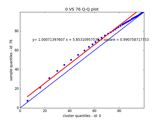
效果如上图所示,在本例中所用的样本数据在左下稀疏,在右上集中,且整体往上偏移,说明其分布应该与参考数据是不一样的(分布形状不同),用KS检验得到ks-statistic: 0.171464; p_value: 0.000000也验证了这一点;但是其斜率在约为1,且整体上偏的幅度不大,说明这两组数据的尺度是接近的。
PS: 这里的方法适用于不知道数据分布的情况。如果想检验数据是否符合某种已知的分布,例如正态分布请出门左转用scipy.stats.probplot函数。
参考:

 浙公网安备 33010602011771号