![]()
父组件引入组件方法
const date = ref('')
const periodOptions = ref([
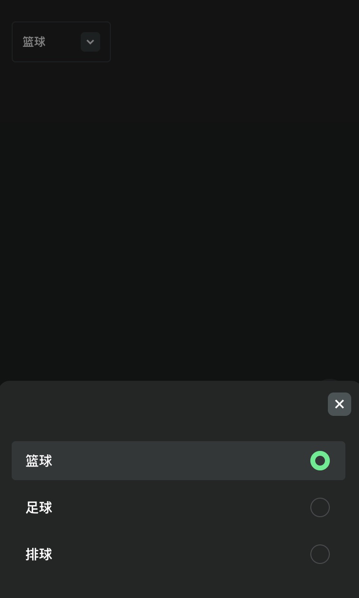
{ label: '篮球', value: 0 },
{ label: '足球', value: 1 },
{ label: '排球', value: 2 },
])
watch(date, (val) => {
date.value = val
emits('update:modelValue', val)
}, { immediate: true })
<AppSelect v-model="date" :options="periodOptions" title="" />
组件本身
<script setup lang="ts">
import { computed, defineEmits, defineProps, ref, toRefs } from 'vue'
import { useI18n } from 'vue-i18n'

// 为组件定义名称
defineOptions({
  name: 'AppSelect',
})

const props = defineProps({
  modelValue: {
    required: true,
  },

  options: {
    type: [Array, String],
    required: true,
  },

  // 是否显示触发按钮
  showTrigger: {
    type: Boolean,
    default: true,
  },

  // 是否支持搜索
  searchable: {
    type: Boolean,
    default: false,
  },

  // 弹框标题
  title: {
    type: String,
    default: '选择币种',
  },
  // 不影响原组件进行一些修改的兼容处理
  fromPage: {
    type: String,
    default: '',
  },
})

const emit = defineEmits(['update:modelValue'])

// 使用国际化函数
const { t } = useI18n()

interface OptionItem {
  label: string
  value: string
  cur?: string
}

const { modelValue, options, showTrigger, searchable, title } = toRefs(props)

// 控制显示选择器
const showSelect = ref(false)

// 搜索文本
const searchText = ref('')

// 选择选项处理函数
function selectOption(option: OptionItem) {
  emit('update:modelValue', option.value)
  showSelect.value = false
  searchText.value = ''
}

// 打开选择器时清空搜索
function openSelect() {
  showSelect.value = true
  searchText.value = ''
}

// 过滤选项
const filteredOptions = computed(() => {
  if (!searchText.value)
    return options.value
  return options.value.filter(option =>
    option.label.toLowerCase().includes(searchText.value.toLowerCase()),
  )
})

// 获取当前选择项的标签文本
const selectedLabel = computed(() => {
  const option = options.value.find((option: any) => option.value === modelValue.value)
  const data = filteredOptions.value.find((item: any) => {
    return item?.value?.[0] === modelValue.value?.[0] && item?.value?.[1] === modelValue.value?.[1]
  })
  return option ? option.label : (data?.label || '自定义')
})

// 公开组件方法
defineExpose({
  showSelect,
  selectOption,
  openSelect,
})
</script>

<template>
  <section class="app-select">
    <!-- 选择器触发按钮 -->
    <section v-if="showTrigger" class="select-trigger" @click="openSelect">
      <span>{{ selectedLabel }}</span>
      <section class="arrow-icon">
        <img src="/images/webp/affiliate-program/arrow-down.webp" alt="" class="w-[12px]">
      </section>
    </section>

    <!-- 选择器弹出层 -->
    <section v-if="showSelect" class="select-popup-container">
      <section class="popup-mask" @click.stop="showSelect = false" />
      <section class="select-popup animated">
        <section class="popup-content">
          <section class="popup-header">
            <section class="popup-title">
              {{ title }}
            </section>
            <section class="close-btn" @click="showSelect = false">
              <span class="close-icon">×</span>
            </section>
          </section>

          <!-- 搜索框 -->
          <section v-if="searchable" class="search-container">
            <input v-model="searchText" type="text" placeholder="搜索" class="search-input">
          </section>

          <section class="popup-inner">
            <section
              v-for="option in filteredOptions" :key="option.value" class="select-option"
              :class="{ active: option.value === modelValue }" @click="selectOption(option)"
            >
              <section class="option-content">
                <BaseCurrencyIcon
                  v-if="option.cur" style="width: 14px; height: 14px; margin-right: 8px;"
                  :cur="option.cur"
                />
                {{ option.label }}
              </section>
              <section class="circle-container">
                <section v-if="option.value === modelValue" class="select-indicator" />
              </section>
            </section>
          </section>
        </section>
      </section>
    </section>
  </section>
</template>

<style scoped lang="scss">
.app-select {
  position: relative;
  padding: 0;
  border-radius: 4px;
  border: 1px solid #3A4142;
  box-sizing: content-box;
}

.select-trigger {
  padding: 0 10px;
  height: 40px;
  border-radius: 4px;
  font-size: 12px;
  font-weight: 600;
  display: flex;
  align-items: center;
  justify-content: space-between;
  background-color: #232626;
  cursor: pointer;
  width: 100%;
  min-width: 100px;
  flex: 0 0 auto;
}

// 弹出动画
.popup-enter-active,
.popup-leave-active {
  transition: all 0.3s ease;
}

.popup-enter-from,
.popup-leave-to {
  transform: translateY(100%);
  opacity: 0;
}

// 弹出选择器容器
.select-popup-container {
  position: fixed;
  left: 0;
  top: 0;
  right: 0;
  bottom: 0;
  z-index: 100;

  .popup-mask {
    position: absolute;
    top: 0;
    left: 0;
    right: 0;
    bottom: 0;
    background-color: rgba(0, 0, 0, 0.5);
  }
}

// 弹出选择器样式
.select-popup {
  position: fixed;
  left: 0;
  bottom: 0;
  width: 100%;
  z-index: 101;

  &.animated {
    animation: slideUp 0.3s ease-out forwards;
  }

  @keyframes slideUp {
    from {
      transform: translateY(100%);
    }

    to {
      transform: translateY(0);
    }
  }

  .popup-content {
    background-color: #232626;
    border-radius: 12px 12px 0 0;
    position: relative;
  }

  .popup-header {
    margin-bottom: 14px;
    padding: 12px;
    display: flex;
    justify-content: space-between;
    align-items: center;
    position: relative;

    .popup-title {
      font-size: 16px;
      font-weight: bold;
      color: #fff;
    }
    .close-btn {
      width: 24px;
      height: 24px;
      line-height: 20px;
      text-align: center;
      border-radius: 6px;
      background: #4a5354;
      align-items: center;
      justify-content: center;
      display: block;

      .close-icon {
        font-size: 18px;
        font-weight: bold;
        color: #fff;
      }
    }
  }

  // 搜索框样式
  .search-container {
    padding: 0 16px 16px;
  }

  .search-input {
    width: 100%;
    height: 40px;
    background-color: #323738;
    border: none;
    border-radius: 6px;
    padding: 0 12px;
    color: #fff;
    font-size: 14px;

    &::placeholder {
      color: #7A8283;
    }
  }

  .popup-inner {
    max-height: 40vh;
    overflow-y: scroll;
    padding: 0 0 20px;
  }

  .select-option {
    height: 40px;
    margin: 0 14px 8px;
    padding: 0 14px;
    font-size: 14px;
    font-weight: bold;
    position: relative;
    border-radius: 4px;
    display: flex;
    align-items: center;
    justify-content: space-between;

    &.active {
      color: white;
      font-weight: 500;
      background-color: #323738;
    }

    .option-content {
      display: flex;
      align-items: center;
    }

    .circle-container {
      width: 24px;
      height: 24px;
      display: flex;
      align-items: center;
      justify-content: center;
      position: relative;

      &::before {
        content: '';
        position: absolute;
        width: 20px;
        height: 20px;
        border: 1px solid #e4eaf030;
        border-radius: 50%;
      }
    }

    .select-indicator {
      width: 20px;
      height: 20px;
      border-radius: 50%;
      background-color: #24ee89;
      position: absolute;

      &::before {
        content: '';
        position: absolute;
        width: 10px;
        height: 10px;
        background: #323738;
        left: 50%;
        top: 50%;
        transform: translate(-50%, -50%);
        border-radius: 50%;
      }
    }
  }
}

.arrow-icon {
  width: 20px;
  height: 20px;
  display: flex;
  align-items: center;
  justify-content: center;
  background: #3a4142;
  border-radius: 4px;
}
</style>


 浙公网安备 33010602011771号