


Matplotlib中柱状图bar使用
一、函数原型
matplotlib.pyplot.bar(left, height, alpha=1, width=0.8, color=, edgecolor=, label=, lw=3)
1. left:x轴的位置序列,一般采用range函数产生一个序列,但是有时候可以是字符串
2. height:y轴的数值序列,也就是柱形图的高度,一般就是我们需要展示的数据;
3. alpha:透明度,值越小越透明
4. width:为柱形图的宽度,一般这是为0.8即可;
5. color或facecolor:柱形图填充的颜色;
6. edgecolor:图形边缘颜色
7. label:解释每个图像代表的含义,这个参数是为legend()函数做铺垫的,表示该次bar的标签,其中legend()函数loc参数如下:
'best'         : 0, (only implemented for axes legends)(自适应方式)
'upper right'  : 1,
'upper left'   : 2,
'lower left'   : 3,
'lower right'  : 4,
'right'        : 5,
'center left'  : 6,
'center right' : 7,
'lower center' : 8,
'upper center' : 9,
'center'       : 10,
8. linewidth or linewidths or lw:边缘or线的宽
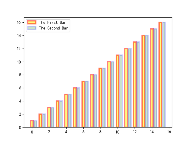
import pandas as pd
import numpy as np
import matplotlib as mpl
mpl.rcParams['font.sans-serif']=['SimHei']

import matplotlib.pyplot as plt
y = range(1,17)

plt.bar(np.arange(16), y, alpha=0.5, width=0.3, color='yellow', edgecolor='red', label='The First Bar', lw=3)
plt.bar(np.arange(16)+0.4, y, alpha=0.2, width=0.3, color='green', edgecolor='blue', label='The Second Bar', lw=3)
plt.legend(loc='upper left')
plt.show()
1)为坐标轴加上标签
plt.xlabel('This Is X Axis', fontsize=15)
plt.ylabel('This Is Y Axis', fontsize=15)
plt.title('This Is My Title', fontsize=15)
#fontsize可以控制字体大小
2)X轴可以是字符串
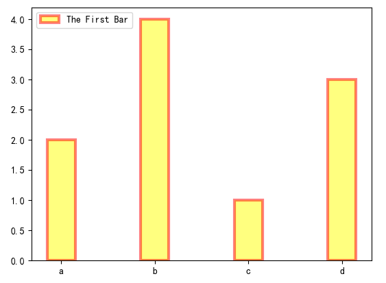
import matplotlib as mpl
mpl.rcParams['font.sans-serif']=['SimHei']

import matplotlib.pyplot as plt

x = ['c', 'a', 'd', 'b']
y = [1, 2, 3, 4]

plt.bar(x, y, alpha=0.5, width=0.3, color='yellow', edgecolor='red', label='The First Bar', lw=3)
plt.legend(loc='upper left')

plt.show()
python3已经自动将x轴的字符串进行了排序,x轴变成了[ 'a', 'b', 'c', 'd' ](放心:同时x轴对应的y轴值也跟随x的顺序变化),python2并未自动对x轴字符串进行排序:
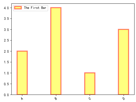
3) 如果想自己给x轴的bar加上标签,或者想让标签倾斜:plt.xticks()
import numpy as np
import matplotlib as mpl
mpl.rcParams['font.sans-serif']=['SimHei']

import matplotlib.pyplot as plt

x = []
y = []

x = ['c', 'a', 'd', 'b']
y = [1, 2, 3, 4]
#plt.figure(figsize=(40,40))
plt.bar(x, y, alpha=0.5, width=0.3, color='yellow', edgecolor='red', label='The First Bar', lw=3)
plt.legend(loc='upper left')
plt.xticks(np.arange(4), ('A','B', 'C', 'D'), rotation=30)#rotation控制倾斜角度

plt.show()
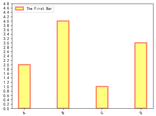
4) 如果想控制y轴数值间隔:plt.yticks(np.arange(0,5,0.2))
import numpy as np
import matplotlib as mpl
mpl.rcParams['font.sans-serif']=['SimHei']

import matplotlib.pyplot as plt

x = []
y = []

x = ['c', 'a', 'd', 'b']
y = [1, 2, 3, 4]
#plt.figure(figsize=(40,40))
plt.bar(x, y, alpha=0.5, width=0.3, color='yellow', edgecolor='red', label='The First Bar', lw=3)
plt.legend(loc='upper left')
plt.xticks(np.arange(4), ('A','B', 'C', 'D'), rotation=30)#rotation控制倾斜角度
plt.yticks(np.arange(0, 5, 0.2))
plt.show()
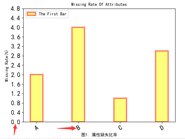
5)加上label和title
import numpy as np
import matplotlib as mpl
mpl.rcParams['font.sans-serif']=['SimHei']

import matplotlib.pyplot as plt

x = ['c', 'a', 'd', 'b']
y = [1, 2, 3, 4]
#plt.figure(figsize=(40,40))
plt.bar(x, y, alpha=0.5, width=0.3, color='yellow', edgecolor='red', label='The First Bar', lw=3)
plt.legend(loc='upper left')
plt.xticks(np.arange(4), ('A','B', 'C', 'D'), rotation=30)#rotation控制倾斜角度
plt.yticks(np.arange(0, 5, 0.4))

#fontsize控制了label和title字体大小
plt.ylabel('Missing Rate(%)', fontsize=10)
plt.title('Missing Rate Of Attributes', fontsize=10)
plt.xlabel('图1. 属性缺失比率', fontsize=10)

#但是如果想调整轴上数值字体大小呢?
plt.tick_params(axis='both', labelsize=15)

plt.show()
6)如果遇到title越出画布的,可以使用plt.figure(figsize=(50,80))适当调整figsize的大小,plt.savefig('NA.png')可以保存图片。
7)可以将图形框的四条边去掉,或者坐标轴线宽进行加粗
import numpy as np
import matplotlib as mpl
mpl.rcParams['font.sans-serif']=['SimHei']

import matplotlib.pyplot as plt

x = ['c', 'a', 'd', 'b']
y = [1, 2, 3, 4]

plt.figure(figsize=(40,40), dpi=80)

#底部和左边加粗,顶部和右边消失
ax = plt.subplot(1,1,1)
ax.spines['bottom'].set_linewidth(10)
ax.spines['left'].set_linewidth(10)
ax.spines['top'].set_visible(False)
ax.spines['right'].set_visible(False)

plt.bar(x, y, alpha=0.8, width=0.3, color='yellow', edgecolor='red', label='The First Bar', lw=6)
plt.legend(loc='upper left', fontsize=35)

plt.xticks(np.arange(4), ('A','B', 'C', 'D'), rotation=30)#rotation控制倾斜角度
plt.yticks(np.arange(0, 5, 0.4))

#fontsize控制了label和title字体大小
plt.ylabel('Missing Rate(%)', fontsize=40)
plt.title('Missing Rate Of Attributes', fontsize=40)
plt.xlabel('图1. 属性缺失比率', fontsize=40)

#但是如果想调整轴上数值字体大小呢?
plt.tick_params(axis='both', labelsize=35)

plt.savefig('NA.png', dpi=80)
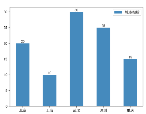
8)给柱状图顶部添加文字(plt.text)
"""
    默认的是竖值条形图
"""
import numpy as np
import matplotlib.pyplot as plt

# 将全局的字体设置为黑体
plt.rcParams['font.family'] = 'SimHei'

# 数据
N = 5
y = [20, 10, 30, 25, 15]
x = np.arange(N)
# 添加地名坐标
str1 = ("北京", "上海", "武汉", "深圳", "重庆")

# 绘图 x x轴, height 高度, 默认:color="blue", width=0.8
p1 = plt.bar(x, height=y, width=0.5, label="城市指标", tick_label=str1)

# 添加数据标签,也就是给柱子顶部添加标签
for a, b in zip(x, y):
    plt.text(a, b + 0.05, '%.0f' % b, ha='center', va='bottom', fontsize=10)

# 添加图例
plt.legend()

# 展示图形
plt.show()


 浙公网安备 33010602011771号