
搭建Wpf框架(8) —— 3D展示墙
AIStudio框架汇总及介绍
源码是从3DWall改造的,忘了哪下载的了,没办法贴上原链接了。
1.将UseControl改造成Control控件,这样可以在用的地方改模板即可。(内容控件的DataTemplate)
2.将Wall显示控件改成类似与ItemSource的绑定
3.实现了横向排列和竖向排列。
4.3D部分没有改,就用的原先的。
5.Popupwindow当然也改成了可自定义内容的控件。
最后使用的时候简化如下:
<UserControl.Resources>
<!--模型1-->
<DataTemplate DataType="{x:Type model:WallItemData}">
<Grid>
<Image x:Name="PART_Image" Source="{Binding Source}" Stretch="UniformToFill"/>
</Grid>
</DataTemplate>
</UserControl.Resources>
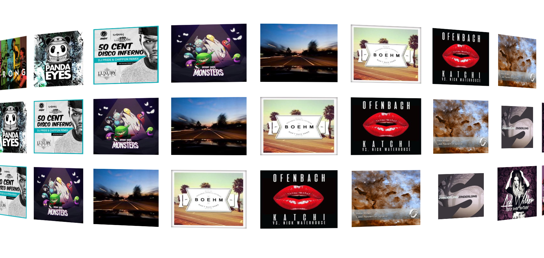
<wall:WallControl ItemsSource="{Binding Datas}" x:Name="_mainwall" />
其中:WallItemData为用户自定义的类,Datas为WallItemData集合。效果图如下:
源码地址:https://gitee.com/akwkevin/aistudio.-util.-layout
另外,当然要集成到我们的系统当中去啦。
将DataTemplate替换成
<DataTemplate DataType="{x:Type model:_3DItemData}">
<Border BorderBrush="{DynamicResource MahApps.Brushes.Accent}" BorderThickness="1">
<Grid Width="200" Height="200">
<Grid.RowDefinitions>
<RowDefinition Height="Auto"/>
<RowDefinition Height="*"/>
</Grid.RowDefinitions>
<Border Background="{DynamicResource MahApps.Brushes.Accent}">
<TextBlock VerticalAlignment="Center" Text="{Binding Label}" Foreground="{DynamicResource MahApps.Brushes.Text}" Margin="2,2" IsHitTestVisible="False" />
</Border>
<ContentControl Grid.Row="1" Content="{Binding Content}"/>
</Grid>
</Border>
</DataTemplate>
使用 <utilwall:WallControl x:Name="_mainwall" Grid.Row="1" FillAll="False" Orientation="Vertical" ItemsSource="{Binding User3DData.Data}" >
效果图如下:
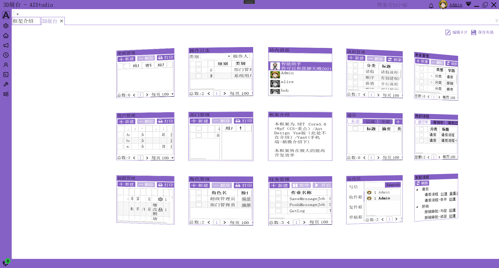
效果一般般吧,还是3D照片墙好看,或者波形图也可以,一些统计的页面。
最后源码地址:艾竹/AIStudio.Wpf.AClient (gitee.com)

 浙公网安备 33010602011771号