

Vue3-单文件组件
语法定义
自动名称推导
Vue 会根据 .vue 文件名自动推导组件名,适用于:
• 开发时控制台警告信息。
• Vue DevTools 组件树展示。
• 组件自引用(如 FooBar.vue 中可直接
基础结构
<template>
  <div class="example">{{ msg }}</div>
</template>

<script>
export default {
  data() {
    return {
      msg: 'Hello world!'
    }
  }
}
</script>

<style>
.example {
  color: red;
}
</style>

<custom1>
  This could be e.g. documentation for the component.
</custom1>
语法块总览
<template>
每个 .vue 文件最多只能有一个顶层 <template>。
内部结构会被编译为渲染函数。
支持标准 HTML、Pug 等模板语言(需配置)。

<script>
定义组件逻辑,通常导出组件配置对象。
每个文件最多只能有一个 <script> 块,除非使用 <script setup>。

<script setup>
组合式 API 的简化写法。
顶层变量自动暴露给模板。
每个文件最多只能有一个 <script setup>。

<style>
可以有多个 <style> 块。
支持 scoped 或 module 作用域隔离。
支持预处理器(如 SCSS、Less、Stylus)。
预处理器支持
代码块可以使用 lang 这个 attribute 来声明预处理器语言,最常见的用例就是在 script中使用 TypeScript:
<script lang="ts">
  // use TypeScript
</script>
lang 在任意块上都能使用,比如我们可以在style标签中使用 Sass 或是 template中使用 Pug:
<template lang="pug">
p {{ msg }}
</template>

<style lang="scss">
  $primary-color: #333;
  body {
    color: $primary-color;
  }
</style>
src 导入
如果喜欢将 *.vue 组件分散到多个文件中,可以为一个语块使用 src 这个 attribute 来导入一个外部文件:
<template src="./template.html"></template>
<style src="./style.css"></style>
<script src="./script.js"></script>
请注意 src 导入和 JS 模块导入遵循相同的路径解析规则,这意味着:
相对路径需要以 ./ 开头
也可以从 npm 依赖中导入资源
<!-- 从所安装的 "todomvc-app-css" npm 包中导入一个文件 -->
<style src="todomvc-app-css/index.css" />

<!-- src 导入对自定义语块也同样适用 -->
<unit-test src="./unit-test.js">
</unit-test>
script setup
里面的代码会被编译成组件 setup() 函数的内容。这意味着与普通的 script 只在组件被首次引入的时候执行一次不同,script setup中的代码会在每次组件实例被创建的时候执行。
<template>
  <h2>{{ title }}</h2>

  <p>父组件传入的 msg: {{ msg }}</p>
  <p>父组件传入的 modelValue: {{ modelValue }}</p>

  <button @click="emitEvent">发送事件</button>
  <button @click="updateModel">更新 v-model</button>

  <hr>

  <MyButton @click="logSlots">
    <template #default>自定义插槽内容</template>
  </MyButton>

  <div v-focus>自定义指令应用</div>

  <slot name="customSlot"></slot>
</template>

<script setup lang="ts">
// -------------------- 基础与导入 --------------------
import { ref, computed, watch, defineProps, defineEmits, defineModel, defineExpose, defineOptions, useSlots, useAttrs } from 'vue'
import MyButton from './MyButton.vue'
import { fetchData } from './api'

// -------------------- defineOptions --------------------
defineOptions({
  name: 'FullDemoComponent'
})

// -------------------- defineProps --------------------
interface Props {
  msg: string
}
const props = defineProps<Props>()

// -------------------- defineEmits --------------------
const emit = defineEmits<{
  (e: 'customEvent', payload: string): void
}>()

// -------------------- defineModel --------------------
const modelValue = defineModel<string>()

// -------------------- 响应式 --------------------
const title = ref('这是一个完整的 <script setup> Demo')

// -------------------- 方法 --------------------
const emitEvent = () => {
  emit('customEvent', '你好,父组件!')
}

const updateModel = () => {
  modelValue.value = '子组件更新了 v-model'
}

// -------------------- defineExpose --------------------
const secret = ref('这是暴露给父组件的内容')
defineExpose({
  secret
})

// -------------------- 自定义指令 --------------------
const vFocus = {
  mounted(el: HTMLElement) {
    el.focus()
  }
}

// -------------------- 插槽相关 --------------------
const slots = useSlots()
const attrs = useAttrs()

const logSlots = () => {
  console.log('当前插槽信息:', slots)
  console.log('其他属性信息:', attrs)
}

// -------------------- 顶层 await --------------------
const asyncData = await fetchData()
console.log('异步数据:', asyncData)
</script>
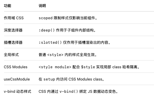
CSS
作用域 CSS、深度选择器、插槽样式、全局样式、CSS Modules、v-bind 动态样式
<script setup>
import { ref, useCssModule } from 'vue'

// 动态颜色,用于 v-bind 动态绑定
const theme = ref({
  color: 'blue'
})

// 访问 CSS Modules
const classes = useCssModule()
</script>

<template>
  <div class="box">
    <h2 class="title">作用域 & 样式功能综合演示</h2>

    <p class="desc">这段文字应用了作用域 CSS</p>

    <div class="deep">
      <ChildComp />
    </div>

    <div class="slot-box">
      <slot name="customSlot"></slot>
    </div>

    <p :class="classes.red">这是通过 CSS Modules 控制的文字</p>

    <p class="bind-text">这里的颜色通过 v-bind 绑定 theme.color</p>
  </div>
</template>

<style scoped>
/* 作用域 CSS */
.title {
  color: green;
}

.desc {
  font-style: italic;
}

/* 深度选择器,影响子组件内部结构 */
.deep :deep(.inner) {
  color: orange;
}

/* 插槽选择器,控制插槽内容样式 */
:slotted(span) {
  font-weight: bold;
  color: purple;
}

/* v-bind 动态绑定颜色 */
.bind-text {
  color: v-bind('theme.color');
}
</style>

<style module>
.red {
  color: red;
  font-size: 18px;
}
</style>

<style>
/* 全局样式 */
body {
  background-color: #f5f5f5;
}
</style>

<script>
// 子组件示例
export default {
  name: 'ChildComp',
  template: `<div class="inner">子组件的内容</div>`
}
</script>
如果这篇文章对你有用,可以关注本人微信公众号获取更多ヽ(^ω^)ノ ~


 浙公网安备 33010602011771号