
R画图——分屏
最近项目需求,用R画了一个九宫格的图,第一次画,将简化后的脚本呈现一下,不是有人说,既然做了,那就摆出来吧。
*中文行为说明:
args <- commandArgs(T)
调用命令行读取
file <- read.table(args[1])
以表格形式读取第一个文件
my_len = length(args)
计算总文件数
a <- t(file[1])
读取第一个文件第一列
#par(mfrow=c(3,3))
#绘制九宫格画布(3 x 3)
nm = args[1]
定义画布的标题
pdf (paste(nm, "all.pdf", sep = "."))
定义输出图片格式和文件名
split.screen(c(3,3))
绘制九宫格画布(3 x 3)
c <- matrix(0, ncol = 52)
定义一个新的数据c,由52个0组成的列
for (j in 1:7){
循环读取7个文件
file <- read.table(args[j])
读取各个文件
print (file)
打印文件检验读取是否正确
b <- t(file[2])
取文件第二列作为b
c = c + b
c为所有文件第二列的求和
print (args[j])
输出当前读取文件名
maxa = max(a)
获取a数组的最大值
maxb = max(b)
获取b数组的最大值
col_c=c("#66CDAA","#8E388E","#CDCD00","red","blue")
定义颜色
sp <- spline (a, b, n=60, method = "natural")
绘制平滑曲线,n为生成差值的数量
# split.screen(c(3,3))#, screen = j)
screen(j)
定位于第j个画布
par(mar=c(2,2,1,1))
定义画布边界
nm = strsplit(args[j], split = ".xls")[[1]]
获取标题信息
plot(a[2:51],b[2:51],type='l',col=col_c[1], lwd=1, xlab = " Distance ()", ylab = "Frequence Number", main = nm[1], cex.lab=0.5, cex.axis = 0.5, cex.main = 0.5, xaxt = "n", yaxt ="n", tcl = 0.2)
画图
axis(1, mgp = c(0, 0, 0), cex.axis = 0.5, xlab = "Stream Distance to TEs (1000bp windows)", tcl = 0.2)
调整X轴
axis(2, mgp = c(0, 0, 0), cex.axis = 0.5, tcl = 0.2)
调整Y轴
title(xlab = "Distance of (1000bp windows)", ylab = "Frequence Number", line = 0.5, cex.lab=0.5,)
调整标题
}
screen(8)
par(mar=c(2,2,1,1))
plot(a[2:51],c[2:51],type='l',col=col_c[1], lwd=1, xlab = "Distance to (1000bp windows)", ylab = "Frequence Number", main = "complete ", cex.lab=0.5, cex.axis = 0.5, cex.main = 0.5, xaxt = "n", yaxt ="n", tcl = 0.2)
画7组数据统计图
axis(1, mgp = c(0, 0, 0), cex.axis = 0.5, xlab = "Stream Distance to TEs (1000bp windows)", tcl = 0.2)
axis(2, mgp = c(0, 0, 0), cex.axis = 0.5, tcl = 0.2)
title(xlab = "Distance of CNE to genes (1000bp windows)", ylab = "Frequence Number", line = 0.5, cex.lab=0.5,)
dev.off()
完成
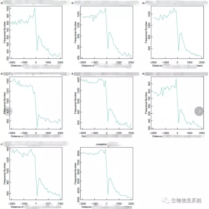
看起来很简单,对不对。其实未简化的脚本长一些,在每个小图中又绘制了多条曲线,第八幅图用来做图例和文本说明,第九幅图用来做另一类统计的曲线图(强迫症的缺陷)。

有兴趣的同学可以一起探讨(图片大小,刻度线调整,刻度值位置大小调整,标题调整,正则匹配,图注,注释,等等。我是个R小白。生物埋葬理科生,那就用各种语言把生物学生挖出来吧。)
共载于微信公众号

posted on 2019-10-15 11:33 Yuan-SW-F(abysw) 阅读(833) 评论(0) 收藏 举报

 浙公网安备 33010602011771号