
对NBA球员巴特勒进行大数据分析
(一)选题背景:NBA 作为世界上水平最高的篮球联赛,吸引了无数的球迷。每一场NBA 比赛都会产生大量的数据信息,如果能够有效地运用这些数据,便可以充分发挥出其潜在价值。
在每年赛季开始之前,大量的媒体专家都会对本赛季 NBA 常规赛的情况进行预测,这其中球队战绩和明星球员的个人数据是大家着重讨论的话题。及时而准确的完成对这些数据的预测一方面有利于各球队管理层在赛季进行前采用合适的决策,另一方面可以最大化商业公司的利益。本实验在赛季开始前完成对本赛季 NBA 球队战绩以及个人数据的分析。
(二)大数据分析方案:从网站中下载相关的数据集,对数据集进行整理,在python的环境中,给数据集中的文件打上标签,对数据进行预处理,利用keras,构建网络,训练模型,导入图片测试模型。
(三)数据分析的实现步骤:
1.导入相关库
[1]
import numpy as np
import pandas as pd
import matplotlib.pyplot as plt
import seaborn as sns;sns.set()
%matplotlib inline

from sklearn.ensemble import RandomForestClassifier
from sklearn.model_selection import KFold
2.读取数据集CSV
[2]
Butler = pd.read_csv('Butler_data.csv')
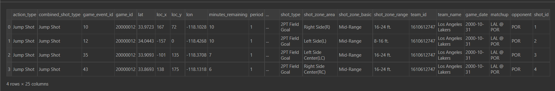
Butler.head(4)
action_typecombined_shot_typegame_event_idgame_idlatloc_xloc_ylonminutes_remainingperiod...shot_typeshot_zone_areashot_zone_basicshot_zone_rangeteam_idteam_namegame_datematchupopponentshot_id0Jump ShotJump Shot102000001233.972316772-118.1028101...2PT Field GoalRight Side(R)Mid-Range16-24 ft.1610612747Los Angeles Lakers2000-10-31LAL @ PORPOR11Jump ShotJump Shot122000001234.0443-1570-118.4268101...2PT Field GoalLeft Side(L)Mid-Range8-16 ft.1610612747Los Angeles Lakers2000-10-31LAL @ PORPOR22Jump ShotJump Shot352000001233.9093-101135-118.370871...2PT Field GoalLeft Side Center(LC)Mid-Range16-24 ft.1610612747Los Angeles Lakers2000-10-31LAL @ PORPOR33Jump ShotJump Shot432000001233.8693138175-118.131861...2PT Field GoalRight Side Center(RC)Mid-Range16-24 ft.1610612747Los Angeles Lakers2000-10-31LAL @ PORPOR4
3.数据集清洗和预处理
[3]
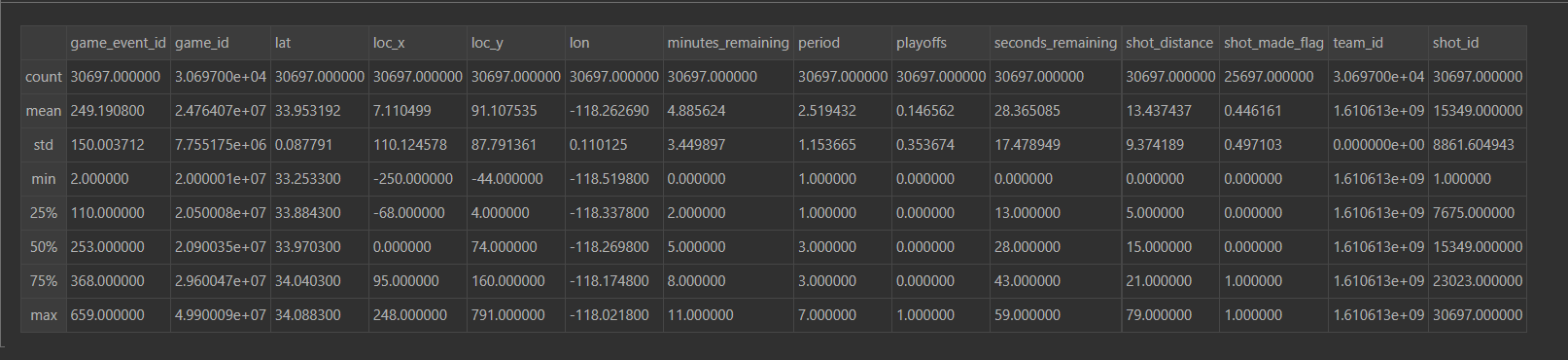
Butler.describ()
[4]
Butler.shape#处理前总共有30697个数据
(30697, 25)
[5]
Butler = Butler[pd.notnull(Butler['shot_made_flag'])]#通过以上数据集的列举对空值进行处理
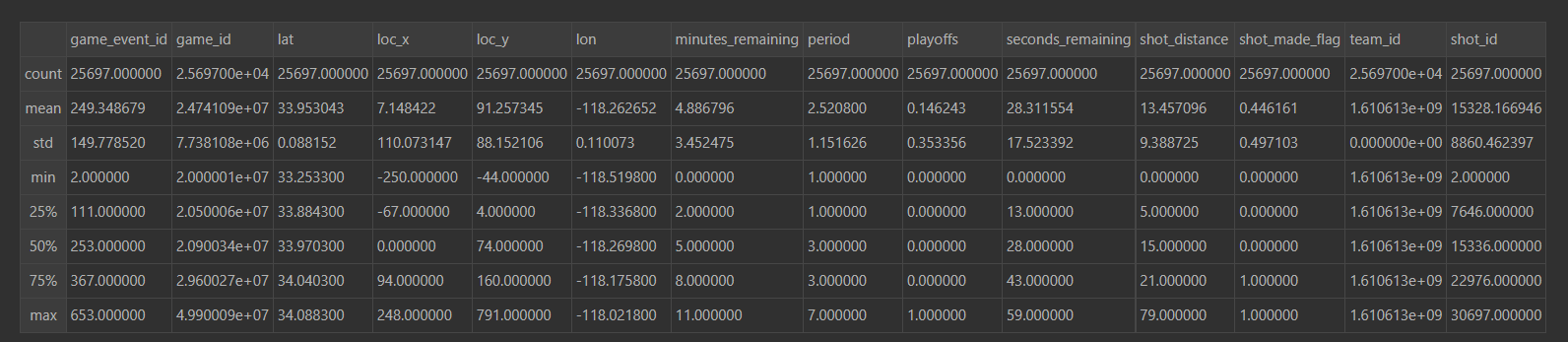
Butler.describe()
[6]
Butler.shape#处理后则使用25697个有用数据
(25697, 25)
[7]
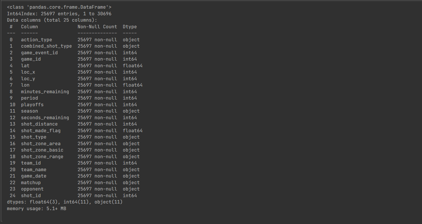
Butler.info()#该数据集共有0-24也就是25个特征
4.数据探索性分析
4.1单变量分析
[8]
plt.rcParams['font.sans-serif']=['SimHei']#防止中文标签报错
plt.rcParams['axes.unicode_minus']=False#防止负号报错
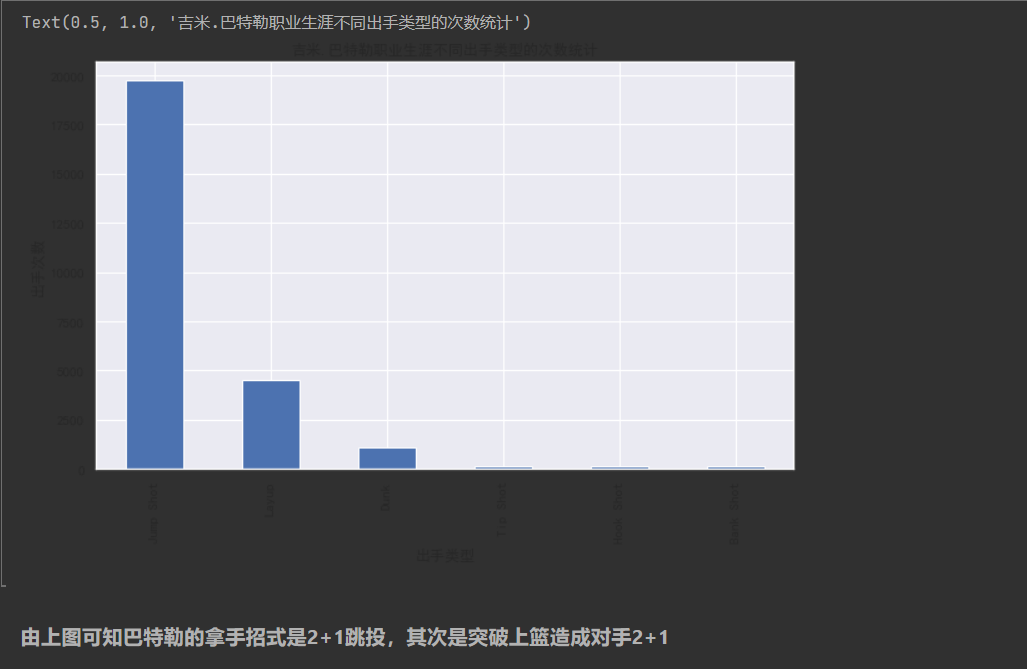
#查看巴特勒出手类型的分布
plt.figure(figsize = (10,6))
Butler['combined_shot_type'].value_counts().plot(kind = 'bar')
plt.xlabel('出手类型');plt.ylabel('出手次数');plt.title('吉米.巴特勒职业生涯不同出手类型的次数统计')
Text(0.5, 1.0, '吉米.巴特勒职业生涯不同出手类型的次数统计')
[9]
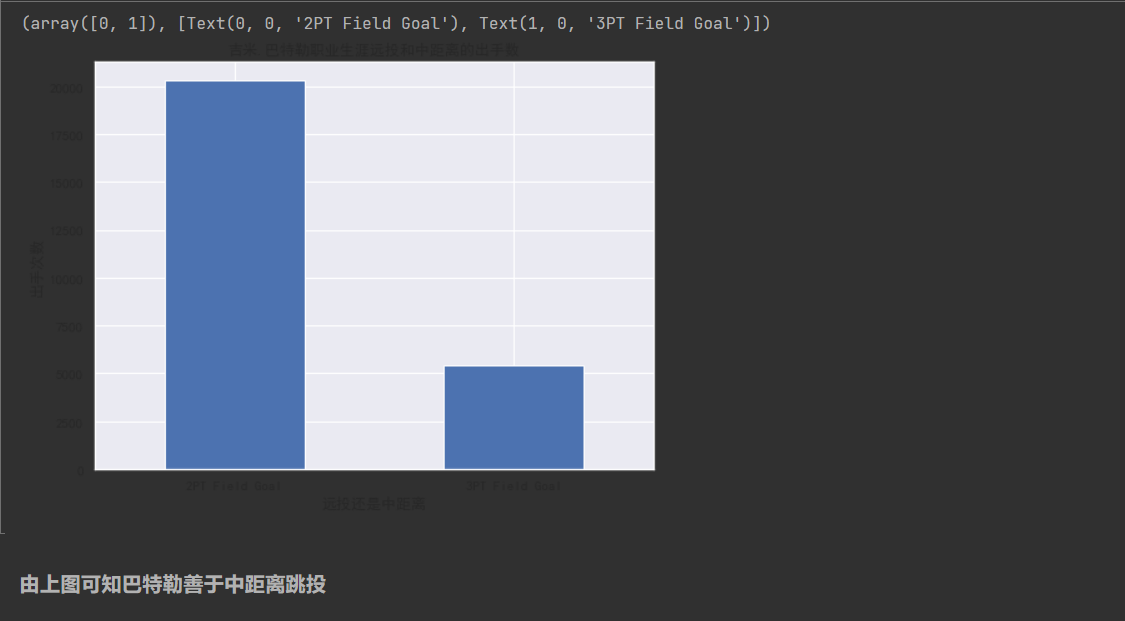
#查看巴特勒两分球,三分球的出手数
plt.figure(figsize = (8,6))
Butler['shot_type'].value_counts().plot(kind = 'bar')
plt.xlabel('远投还是中距离');plt.ylabel('出手次数');plt.title('吉米.巴特勒职业生涯远投和中距离的出手数')
plt.xticks(rotation = 0)
(array([0, 1]), [Text(0, 0, '2PT Field Goal'), Text(1, 0, '3PT Field Goal')])
[10]
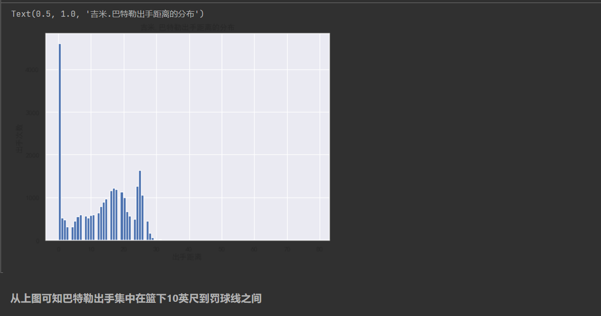
#查看巴特勒出手距离的分布
plt.figure(figsize = (8,6))
Butler['shot_distance'].hist(bins = 100)
plt.xlabel('出手距离');plt.ylabel('出手次数');plt.title('吉米.巴特勒出手距离的分布')
Text(0.5, 1.0, '吉米.巴特勒出手距离的分布')
[11]
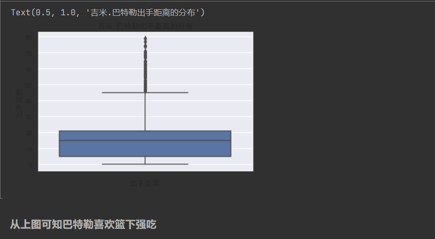
#绘制箱型图
plt.figure(figsize = (6,4))
sns.boxplot(data = Butler,y = 'shot_distance')
plt.xlabel('出手距离');plt.ylabel('出手次数');plt.title('吉米.巴特勒出手距离的分布')
Text(0.5, 1.0, '吉米.巴特勒出手距离的分布')
[12]
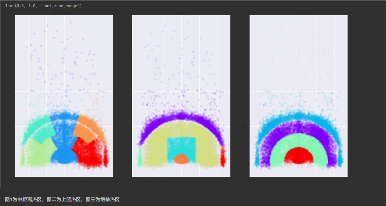
#可视化巴特勒的出手区域,按照不同的标准划分的出手区域
import matplotlib.cm as cm
plt.figure(figsize  = (20,10))

def scatter_plot_by_category(feat):
    alpha = 0.1
    gs = Butler.groupby(feat)
    cs = cm.rainbow(np.linspace(0,1,len(gs)))
    for g,c in zip(gs,cs):
        plt.scatter(g[1].loc_x,g[1].loc_y,color = c,alpha = alpha)

plt.subplot(1,3,1)
scatter_plot_by_category(Butler['shot_zone_area'])

plt.title('shot_zone_area')

plt.subplot(1,3,2)
scatter_plot_by_category(Butler['shot_zone_basic'])
plt.title('shot_zone_basic')

plt.subplot(1,3,3)
scatter_plot_by_category(Butler['shot_zone_range'])
plt.title('shot_zone_range')
Text(0.5, 1.0, 'shot_zone_range')
[13]
Butler['shot_distance'].describe()#各距离投射占比
count 25697.000000
mean 13.457096
std 9.388725
min 0.000000
25% 5.000000
50% 15.000000
75% 21.000000
max 79.000000
Name: shot_distance, dtype: float64
mean 13.457096
std 9.388725
min 0.000000
25% 5.000000
50% 15.000000
75% 21.000000
max 79.000000
Name: shot_distance, dtype: float64
[14]
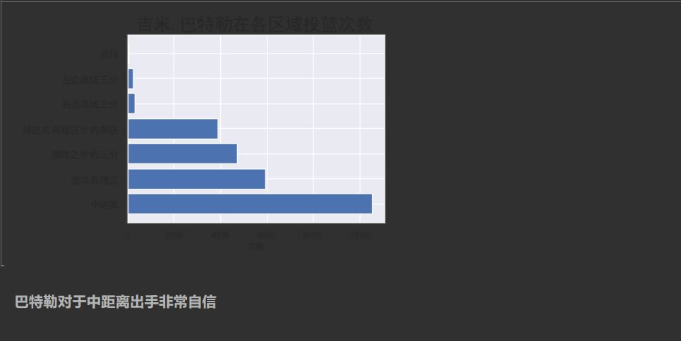
#巴特勒在各个位置投篮的次数
area = Butler['shot_zone_basic'].value_counts()
b = np.array([0,1,2,3,4,5,6])
plt.barh(b,area,align ='center')
plt.yticks(b,('中距离','进攻有理区','底线之外的三分','除进攻有理区外的禁区','右边底线三分','左边底线三分','后场'))
plt.xlabel('次数',fontsize=10)
plt.title('吉米.巴特勒在各区域投篮次数',fontsize=20)
plt.tight_layout()# 紧凑显示图片,居中显示
plt.show()
4.2双变量分析
[15]
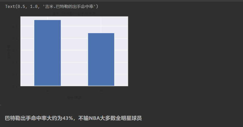
#查看巴特勒的出手命中率
plt.figure(figsize = (6,4))
Butler['shot_made_flag'].value_counts(normalize = True).plot(kind = 'bar')
plt.xlabel('命中情况');plt.ylabel('命中个数');plt.title('吉米.巴特勒的出手命中率')
Text(0.5, 1.0, '吉米.巴特勒的出手命中率')
[16]
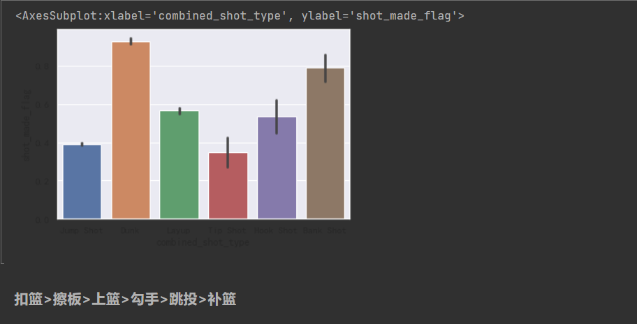
#观察不同出手类型与命中率之间的关系

sns.barplot(data = Butler,x = 'combined_shot_type',y = 'shot_made_flag')
<AxesSubplot:xlabel='combined_shot_type', ylabel='shot_made_flag'>
[17]
#观察两分球与三分球的命中率

sns.barplot(data = Butler,x = 'shot_type',y = 'shot_made_flag')
<AxesSubplot:xlabel='shot_type', ylabel='shot_made_flag'>
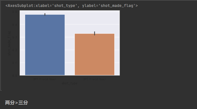
[18]
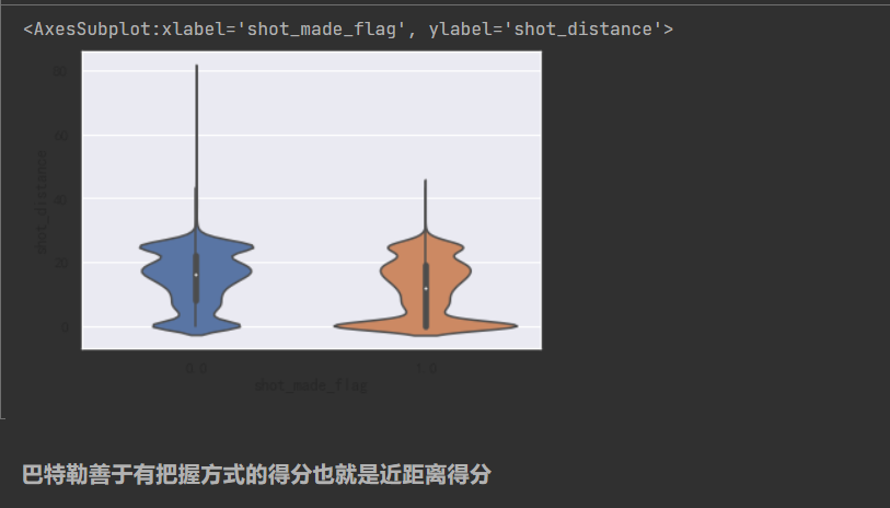
#观察出手距离与命中率之间的关系
sns.scatterplot(data = Butler, x = 'shot_distance',y = 'shot_made_flag' )
<AxesSubplot:xlabel='shot_distance', ylabel='shot_made_flag'>

[19]
sns.violinplot(data = Butler, y = 'shot_distance',x = 'shot_made_flag' )
<AxesSubplot:xlabel='shot_made_flag', ylabel='shot_distance'>
5.完整代码
  1 import numpy as np
  2 import pandas as pd
  3 import matplotlib.pyplot as plt
  4 import seaborn as sns;sns.set()
  5 %matplotlib inline
  6
  7 from sklearn.ensemble import RandomForestClassifier
  8 from sklearn.model_selection import KFold
  9
 94 # 查看前三行
 95
 96 year_df[2019].head(3)
 97
 98 for i in range(2014, 2020):
 99
100     year_df[i]
101
102     # 删除以下列
103
104     del_name = ['pid','tid','games_played','games_started','points']
105
106     year_df[i] = year_df[i].drop(del_name,axis=1)
107
108     # 连接first_name和last_name
109
110     year_df[i]['player_name'] = year_df[i]['first_name']+"-"+year_df[i]['last_name']
111
112     player_name = year_df[i].player_name
113
114     year_df[i] = year_df[i].drop(['first_name','last_name'],axis=1)
115
116    year_df[i] = year_df[i].drop('player_name',axis=1)
117
118     # 将player_name插入到第二列
119
120     year_df[i].insert(1,'player_name',player_name)
121
122     team_name = df.team_name
123
124     year_df[i] = year_df[i].drop('team_name',axis=1)
125
126     # 将team_name插入到第三列
127
128     year_df[i].insert(2,'team_name',team_name)
129
130 year_df[2019].columns
131
132 Index(['rank', 'player_name', 'team_name', 'score', 'minutes',
133
134        'field_goals_made', 'field_goals_att', 'field_goals_pct',
135
136        'three_points_made', 'three_points_att', 'three_points_pct',
137
138        'free_throws_made', 'free_throws_att', 'free_throws_pct',
139
140        'offensive_rebounds', 'defensive_rebounds', 'rebounds', 'assists',
141
142        'turnovers', 'assists_turnover_ratio', 'steals', 'blocks',
143
144        'personal_fouls'],
145
146      dtype='object')
147
148 # 查看前三行
149
150 year_df[2019].head(3)
151
152 # info方法可以显示每列名称,非空值数量,每列的数据类型,内存占用等信息。
153
154 # data.info()
155
156 for i in range(2014, 2019):
157
158     print("============"+str(i)+"年============")
159
160     print(year_df[i].isnull().sum(axis=0))
161
162     # 删除所有含有空值的行。就地修改。
163
164 # year_df[2019].dropna(axis=0, inplace=True)
165
166 # year_df[2019].isnull().sum()
167
168 year_df[2019].describe()
169
170 # 箱型图
171
172 plt.figure(figsize=(15, 8))
173
174 df = year_df[2019].iloc[:, 3:].copy()
175
176 col_name_fe = []
177
178 col_name_yi = dict()
179
180 i = 0
181
182 for item in df.columns.values:
183
184     temp = (item[0] + item[1] + item[-2]).upper()
185
186     col_name_fe.append(temp)
187
188     col_name_yi[temp.upper()] = item
189
190     i += 1
191
192 df.columns = col_name_fe
193
194 # whitegrid,darkgrid
195
196 sns.set_style("whitegrid")
197
198 sns.boxplot(data=df[list(df.columns)])
199
200 print(col_name_yi)
201
202 year_df[2019].duplicated().sum()
203
204 # data.drop_duplicates(inplace=True)
205
206  Butler = pd.read_csv('Butler_data.csv')
207
208 Butler.head(4)
209 Butler.describe()
210 Butler.shape#处理前总共有30697个数据
211 (30697, 25)
212 Butler = Butler[pd.notnull(Butler['shot_made_flag'])]#通过以上数据集的列举对空值进行处理
213 Butler.describe()
214 Butler.shape#处理后则使用25697个有用数据
215 (25697, 25)
216 Butler.info()#该数据集共有0-24也就是25个特征
217 plt.rcParams['font.sans-serif']=['SimHei']#防止中文标签报错
218 plt.rcParams['axes.unicode_minus']=False#防止负号报错
219 #查看巴特勒出手类型的分布
220 plt.figure(figsize = (10,6))
221 Butler['combined_shot_type'].value_counts().plot(kind = 'bar')
222 plt.xlabel('出手类型');plt.ylabel('出手次数');plt.title('吉米.巴特勒职业生涯不同出手类型的次数统计')
223 #查看巴特勒两分球,三分球的出手数
224 plt.figure(figsize = (8,6))
225 Butler['shot_type'].value_counts().plot(kind = 'bar')
226 plt.xlabel('远投还是中距离');plt.ylabel('出手次数');plt.title('吉米.巴特勒职业生涯远投和中距离的出手数')
227 plt.xticks(rotation = 0)
228 #查看巴特勒出手距离的分布
229 plt.figure(figsize = (8,6))
230 Butler['shot_distance'].hist(bins = 100)
231 plt.xlabel('出手距离');plt.ylabel('出手次数');plt.title('吉米.巴特勒出手距离的分布')
232 #绘制箱型图
233 plt.figure(figsize = (6,4))
234 sns.boxplot(data = Butler,y = 'shot_distance')
235 plt.xlabel('出手距离');plt.ylabel('出手次数');plt.title('吉米.巴特勒出手距离的分布')
236 #可视化巴特勒的出手区域,按照不同的标准划分的出手区域
237 import matplotlib.cm as cm
238 plt.figure(figsize  = (20,10))
239
240 def scatter_plot_by_category(feat):
241     alpha = 0.1
242     gs = Butler.groupby(feat)
243     cs = cm.rainbow(np.linspace(0,1,len(gs)))
244     for g,c in zip(gs,cs):
245         plt.scatter(g[1].loc_x,g[1].loc_y,color = c,alpha = alpha)
246
247 plt.subplot(1,3,1)
248 scatter_plot_by_category(Butler['shot_zone_area'])
249
250 plt.title('shot_zone_area')
251
252 plt.subplot(1,3,2)
253 scatter_plot_by_category(Butler['shot_zone_basic'])
254 plt.title('shot_zone_basic')
255
256 plt.subplot(1,3,3)
257 scatter_plot_by_category(Butler['shot_zone_range'])
258 plt.title('shot_zone_range')
259 Butler['shot_distance'].describe()#各距离投射占比
260 #巴特勒在各个位置投篮的次数
261 area = Butler['shot_zone_basic'].value_counts()
262 b = np.array([0,1,2,3,4,5,6])
263 plt.barh(b,area,align ='center')
264 plt.yticks(b,('中距离','进攻有理区','底线之外的三分','除进攻有理区外的禁区','右边底线三分','左边底线三分','后场'))
265 plt.xlabel('次数',fontsize=10)
266 plt.title('吉米.巴特勒在各区域投篮次数',fontsize=20)
267 plt.tight_layout()# 紧凑显示图片,居中显示
268 plt.show()
269 #查看巴特勒的出手命中率
270 plt.figure(figsize = (6,4))
271 Butler['shot_made_flag'].value_counts(normalize = True).plot(kind = 'bar')
272 plt.xlabel('命中情况');plt.ylabel('命中个数');plt.title('吉米.巴特勒的出手命中率')
273 #观察不同出手类型与命中率之间的关系
274
275 sns.barplot(data = Butler,x = 'combined_shot_type',y = 'shot_made_flag')
276 #观察两分球与三分球的命中率
277
278 sns.barplot(data = Butler,x = 'shot_type',y = 'shot_made_flag')
279 #观察出手距离与命中率之间的关系
280 sns.scatterplot(data = Butler, x = 'shot_distance',y = 'shot_made_flag' )
281 sns.violinplot(data = Butler, y = 'shot_distance',x = 'shot_made_flag' )

 浙公网安备 33010602011771号