K线图绘制
 K线图绘制,采用pyecharts或者matplotlib。注意数据格式
K线图绘制
一、时间
strftime将datetime类型转化为字符串, strptime将字符串转化为datetime类型。
1、strf转字符串
Python time strftime() 函数用于格式化时间,返回以可读字符串表示的当地时间,格式由参数 format 决定。
Python time strftime() 函数用于格式化时间,返回以可读字符串表示的当地时间,格式由参数 format 决定。
time.strftime(format[, t])

from datetime import datetime
now = datetime.now() # 当前时间

year = now.strftime("%Y")
print("year:", year)
month = now.strftime("%m")
print("month:", month)
day = now.strftime("%d")
print("day:", day)
time = now.strftime("%H:%M:%S")
print("time:", time)
date_time = now.strftime("%Y-%m-%d, %H:%M:%S")
print("date and time:",date_time)

'''
year: 2022
month: 06
day: 16
time: 16:06:40
date and time: 2022-06-16, 16:06:40
'''
2、strp拆分字符串
Python time strptime() 函数根据指定的格式把一个时间字符串解析为时间元组。
Python time strftime() 函数用于格式化时间,返回以可读字符串表示的当地时间,格式由参数 format 决定。
from datetime import datetime
 cday = datetime.strptime('2017-8-1 18:20:20', '%Y-%m-%d %H:%M:%S')
print(cday)

#2017-08-01 18:20:20
3、时间加减
from datetime import datetime, timedelta
now = datetime.now()
now
#datetime.datetime(2017, 5, 18, 16, 57, 3, 540997)
now + timedelta(hours=10)
#datetime.datetime(2017, 5, 19, 2, 57, 3, 540997)
now - timedelta(days=1)
#datetime.datetime(2017, 5, 17, 16, 57, 3, 540997)
now + timedelta(days=2, hours=12)
#datetime.datetime(2017, 5, 21, 4, 57, 3, 540997)
4、获取日k线
在获取股票日k线时,需要具体的年月日,年月日加减,具体内容如下
now = datetime.date.today()  # 今天
oneday = datetime.timedelta(days=1)  #一天
stday = str(now - 365 * oneday)
now = str(now)
二、matplotlib
1、数据
证券名称、日期、 、开盘价、最高价、最低价、收盘价、交易量
2、处理
2.1、导入数据
import numpy as np
import datetime as dt
import matplotlib.pyplot as mp
import matplotlib.dates as md
# 日期转换函数
def dmy2ymd(dmy):
dmy = str(dmy, encoding='utf-8')
#原数据日期 日-月-年 拆分、重组为 年-月日
time = dt.datetime.strptime(dmy, '%d-%m-%Y').date()
t = time.strftime('%Y-%m-%d')
return t
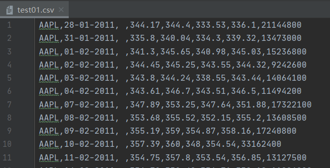
# 1.读取csv文件数据 读取指定列
dates, open_price, max_price, min_price, close_price, volumes = np.loadtxt(
r".\data\test01.csv",
delimiter=",",
usecols=(1, 3, 4, 5, 6, 7),
unpack=True,
dtype="M8[D], f8, f8, f8, f8, f8",
converters={1: dmy2ymd})
2.2、绘图、创建窗口
#设置绘图窗口
mp.figure(" K Line", facecolor="lightgray")
mp.title("K Line", fontsize=16)
mp.xlabel("Data", fontsize=14)
mp.ylabel("Price", fontsize=14)

#x坐标(时间轴)轴修改
ax = mp.gca()
#设置主刻度定位器为周定位器(每周一显示主刻度文本)
ax.xaxis.set_major_locator(md.WeekdayLocator(byweekday=md.MO))
ax.xaxis.set_major_formatter(md.DateFormatter('%Y-%m-%d'))
ax.xaxis.set_minor_locator(md.DayLocator())

mp.tick_params(labelsize=8)
mp.grid(linestyle=":")

#判断收盘价与开盘价 确定蜡烛颜色
colors_bool = close_price >= open_price
colors = np.zeros(colors_bool.size, dtype="U5")
colors[:] = "blue"
colors[colors_bool] = "white"

#确定蜡烛边框颜色
edge_colors = np.zeros(colors_bool.size, dtype="U1")
edge_colors[:] = "b"
edge_colors[colors_bool] = "r"

#绘制开盘价折线图片
dates = dates.astype(md.datetime.datetime)
mp.plot(dates, open_price, color="b", linestyle="--",
        linewidth=2, label="open", alpha=0.3)

#绘制蜡烛
mp.bar(dates, (close_price - open_price), 0.8, bottom=open_price, color=colors,
       edgecolor=edge_colors, zorder=3)

#绘制蜡烛直线(最高价与最低价)
mp.vlines(dates, min_price, max_price, color=edge_colors)

mp.legend()
mp.gcf().autofmt_xdate()
mp.show()
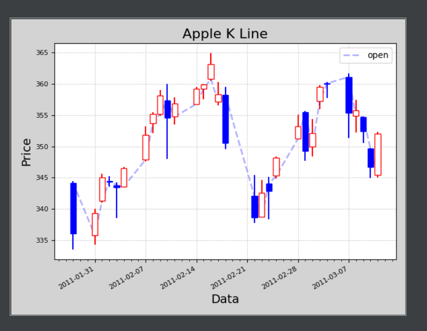
2.3、效果
生成静态图片
三、Pyecharts
1、用法
1.1、数据
x_data = ["2017-10-24", "2017-10-25", "2017-10-26", "2017-10-27"]
y_data = [[20, 30, 10, 35], [40, 35, 30, 55], [33, 38, 33, 40], [40, 40, 32, 42]]
1.2、处理
(
    Candlestick(init_opts=opts.InitOpts(width="1200px", height="600px"))
    .add_xaxis(xaxis_data=x_data)
    .add_yaxis(series_name="", y_axis=y_data)
    .set_series_opts()
    .set_global_opts(
        yaxis_opts=opts.AxisOpts(
            splitline_opts=opts.SplitLineOpts(
                is_show=True, linestyle_opts=opts.LineStyleOpts(width=1)
            )
        )
    )
    .render("简单K线图.html")
)
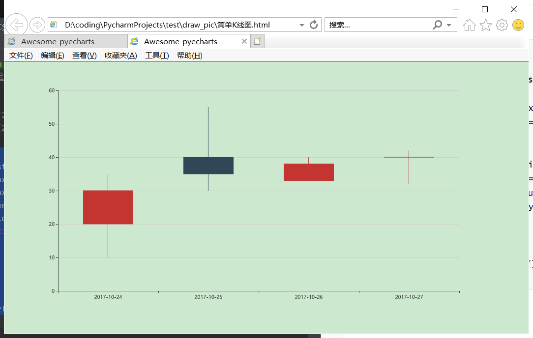
1.3、效果
生成为html文件,在网页中打开、是动态的,可以查看具体数据
2、实例
2.1、代码
#导入包
from pyecharts import options as opts
from pyecharts.charts import Kline
#共31条数据
data = [
    [2320.26, 2320.26, 2287.3, 2362.94],
    [2300, 2291.3, 2288.26, 2308.38],
    [2295.35, 2346.5, 2295.35, 2345.92],
    [2347.22, 2358.98, 2337.35, 2363.8],
    [2360.75, 2382.48, 2347.89, 2383.76],
    [2383.43, 2385.42, 2371.23, 2391.82],
    [2377.41, 2419.02, 2369.57, 2421.15],
    [2425.92, 2428.15, 2417.58, 2440.38],
    [2411, 2433.13, 2403.3, 2437.42],
    [2432.68, 2334.48, 2427.7, 2441.73],
    [2430.69, 2418.53, 2394.22, 2433.89],
    [2416.62, 2432.4, 2414.4, 2443.03],
    [2441.91, 2421.56, 2418.43, 2444.8],
    [2420.26, 2382.91, 2373.53, 2427.07],
    [2383.49, 2397.18, 2370.61, 2397.94],
    [2378.82, 2325.95, 2309.17, 2378.82],
    [2322.94, 2314.16, 2308.76, 2330.88],
    [2320.62, 2325.82, 2315.01, 2338.78],
    [2313.74, 2293.34, 2289.89, 2340.71],
    [2297.77, 2313.22, 2292.03, 2324.63],
    [2322.32, 2365.59, 2308.92, 2366.16],
    [2364.54, 2359.51, 2330.86, 2369.65],
    [2332.08, 2273.4, 2259.25, 2333.54],
    [2274.81, 2326.31, 2270.1, 2328.14],
    [2333.61, 2347.18, 2321.6, 2351.44],
    [2340.44, 2324.29, 2304.27, 2352.02],
    [2326.42, 2318.61, 2314.59, 2333.67],
    [2314.68, 2310.59, 2296.58, 2320.96],
    [2309.16, 2286.6, 2264.83, 2333.29],
    [2282.17, 2263.97, 2253.25, 2286.33],
    [2255.77, 2270.28, 2253.31, 2276.22],
]
#横坐标日期列表、纵坐标
c = (
    Kline()
        .add_xaxis(["2022/5/{}".format(i + 1) for i in range(31)])
        .add_yaxis("kline", data)
        .set_global_opts(
        xaxis_opts=opts.AxisOpts(is_scale=True),
        yaxis_opts=opts.AxisOpts(
            is_scale=True,
            splitarea_opts=opts.SplitAreaOpts(
                is_show=True, areastyle_opts=opts.AreaStyleOpts(opacity=1)
            ),
        ),
        datazoom_opts=[opts.DataZoomOpts(pos_bottom="-2%")],
        title_opts=opts.TitleOpts(title="Kline-DataZoom-slider-Position"),
    )
        .render("大量数据.html")
)
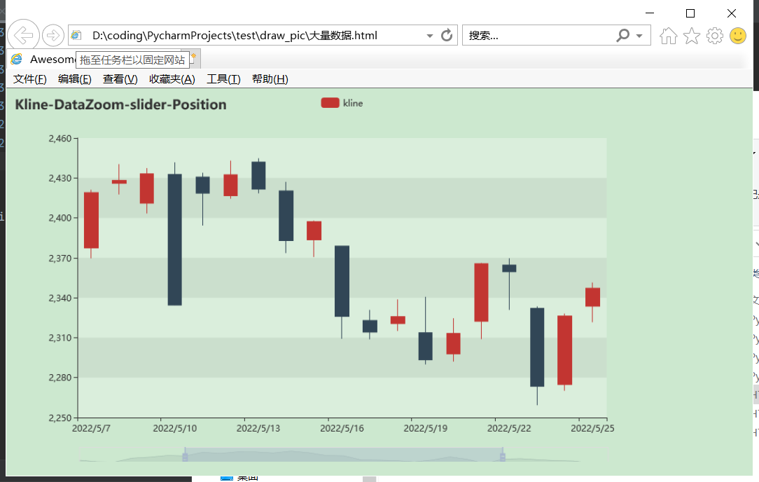
2.2、效果
参考来源
[时间库](Python time strftime() 方法 | 菜鸟教程 (runoob.com))
[pyecharts绘制k线图](pyecharts-3-绘制K线图 - 云+社区 - 腾讯云 (tencent.com))

 浙公网安备 33010602011771号