
ReactNative: 使用分组列表组件SectionList组件
一、简介
SectionList,分组列表,ReactNative中继提供的ListView和FlatList列表组件后的又一个很重要的分组列表组件。它的用法其实跟前面的FlatList差不多,但是SectionList组件性能更高,同时SectionList组件要比ListView组件使用简单的多。SectionList组件的功能非常强大,如下所示。现在我们来仔细研究一下这个组件的API。
- 完全跨平台。
- 可配置的可见性回调。
- 列表标题支持。
- 列出页脚支持。
- 项目分隔符支持。
- 节标题支持。
- 部分分隔符支持。
- 异构数据和项目渲染支持。
- 拉动以刷新。
- 滚动加载。
二、API
SectionList组件同样地对属性是必须直接提供的,有些是可选的。如下所示:
//分组基类SectionBase对象结构, 泛型为SectionItemT
type SectionBase<SectionItemT> = {

  //数据源数组,必需属性
  data: Array<SectionItemT>,

  //每一组数据源的标识符 ,必需属性
  key: string,

  //每一组的每一个item组件,可选属性
  renderItem?: ?(info: {item: SectionItemT, index: number}) => ?React.Element<any>,

  //分割线,可选属性
  ItemSeparatorComponent?: ?ReactClass<any>,

   //标识符,可选属性
   keyExtractor?: (item: SectionItemT) => string,
};

//必要的属性
//sections,是一个泛型数组,类型为SectionT,存储的是SectionBase对象
type RequiredProps<SectionT: SectionBase<any>> = {
    sections: Array<SectionT>,
};

//可选的属性
type OptionalProps<SectionT: SectionBase<any>> = {

  //每个部分中每个项目的默认渲染器。 可以逐段覆盖。
  renderItem: (info: {item: Item, index: number}) => ?React.Element<any>,

  //在每个部分的相邻项目之间渲染。每一个item的分割线
  ItemSeparatorComponent?: ?ReactClass<any>,

  //在列表的最开始呈现。表头
  ListHeaderComponent?: ?ReactClass<any>,

  //呈现在列表的最后。表尾
  ListFooterComponent?: ?ReactClass<any>,

  //在每个部分之间渲染。组分割线
  SectionSeparatorComponent?: ?ReactClass<any>,

  //一个标记属性,用于告诉列表重新渲染(因为它实现了`PureComponent`)。
  //如果您的`renderItem`,Header,Footer等函数中的任何一个都依赖于`data`道具之外的任何东西,请将其粘贴在这里并一视同仁。
  extraData?: any,

  //页面初次渲染的个数,可以不用等所有页面渲染出来再显示UI
  initialNumToRender: number,

  //用于提取指定索引处给定项目的唯一键。 键用于缓存,并用作反应键以跟踪项的重新排序。 默认的提取器检查item.key,然后像react一样退回到使用索引。
  keyExtractor: (item: Item, index: number) => string,

  //滚动位置在渲染内容的onEndReachedThreshold范围内时调用一次。
  onEndReached?: ?(info: {distanceFromEnd: number}) => void,

  //列表的底边必须从内容的末尾到末尾(以列表的可见长度为单位)多远,才能触发onEndReached回调。
  //因此,当内容的结尾在列表的可见长度的一半以内时,值为0.5将触发“ onEndReached”。
  onEndReachedThreshold?: ?number,

  //如果提供,将为“拉动刷新”功能添加标准的RefreshControl。
  onRefresh?: ?() => void,

  //当行的可视性发生变化时调用,如`viewabilityConfig`属性所定义。
  onViewableItemsChanged?: ?(info: {
    viewableItems: Array<ViewToken>,
    changed: Array<ViewToken>,
  }) => void,

  //等待刷新之前的新数据时,将其设置为true。
  refreshing?: ?boolean,

  //呈现在每个部分的顶部。 尚不支持粘性标头。组头
  renderSectionHeader?: ?(info: {section: SectionT}) => ?React.Element<any>,

  //使节标题停留在屏幕顶部,直到下一个将其关闭。 仅在iOS上默认启用,因为这是该平台的平台标准。
  stickySectionHeadersEnabled?: boolean,
};
三、使用
看完API,可以发现接收的数据数组sections存储的都是SectionBase,而每一个SectionBase内部都必需包含data数组和key唯一标识,剩余的元素是可选的。其实挺简单的,现在来实现一下部分功能,示例如下:
MySectionListView.js
import React, { Component } from 'react';
import {
StyleSheet,
View,
Image,
Text,
Dimensions,
SectionList
} from 'react-native';
const {width} = Dimensions.get('window');
const itemPadding = 20;
const itemWidth = (width-4*itemPadding)/3;
console.log('width:'+width);
const fetch_data = [
{
"type":"A",
"flowers":[
{
icon:require('../image/flower1.png'),
title:'玫瑰'
},
{
icon:require('../image/flower1.png'),
title:'玫瑰'
},
{
icon:require('../image/flower1.png'),
title:'玫瑰'
}
]
},
{
"type":"B",
"flowers":[
{
icon:require('../image/flower2.png'),
title:'草芽'
},
{
icon:require('../image/flower2.png'),
title:'草芽'
},
{
icon:require('../image/flower2.png'),
title:'草芽'
}
]
},
{
"type":"C",
"flowers":[
{
icon:require('../image/flower3.png'),
title:'向日葵'
},
{
icon:require('../image/flower3.png'),
title:'向日葵'
},
{
icon:require('../image/flower3.png'),
title:'向日葵'
}
]
},
{
"type":"D",
"flowers":[
{
icon:require('../image/flower4.png'),
title:'月季'
},
{
icon:require('../image/flower4.png'),
title:'月季'
},
{
icon:require('../image/flower4.png'),
title:'月季'
}
]
}
];
export default class MySectionListView extends Component{
//渲染item info: {item: Item, index: number}
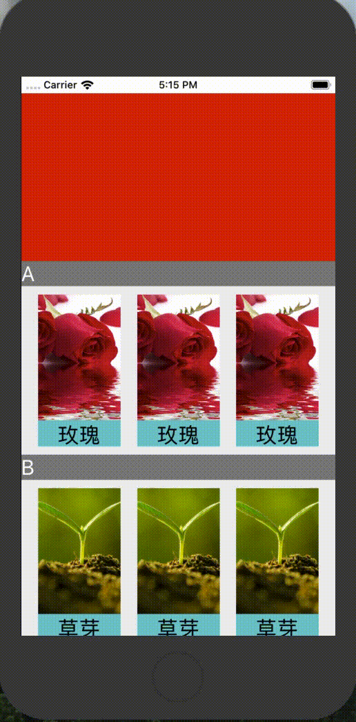
_renderItem(info){
return (
<View style={styles.item}>
<Image style={styles.image} source={info.item.icon}/>
<Text style={styles.text}>{info.item.title}</Text>
</View>
)
}
//渲染组头 info: {section: SectionT}
_renderSectionHeader(info){
return (
<View style={styles.sectionHeader}>
<Text key={info.section.key}
style={{color:'white',fontSize: 25,justifyContent: 'center'}}>
{info.section.type}
</Text>
</View>
)
}
//渲染表头
_listHeaderComponent(){
return (
<View style={{width:width,height:200,backgroundColor:'red'}}/>
)
}
//渲染表尾
_listFooterComponent(){
return (
<View style={{width:width,height:200,backgroundColor:'green'}}/>
)
}
render() {
//sections数据源
let sections = [];
for (let i = 0; i < fetch_data.length; i++) {
//创建SectionBase对象,初始化key唯一标识,和data数组
let data = [];
const type = fetch_data[i].type;
const flowers = fetch_data[i].flowers;
for(let j=0; j<flowers.length; j++){
data.push(flowers[j]);
}
sections.push({key: i, data: data, type:type});
}
return (
<View style={styles.flex}>
<SectionList
sections={sections}
renderItem={this._renderItem}
keyExtractor={(item, index) => ("index:" + index + item)}
contentContainerStyle={styles.section}
renderSectionHeader={this._renderSectionHeader}
ListHeaderComponent={this._listHeaderComponent}
ListFooterComponent={this._listFooterComponent}
/>
</View>
);
}
}
const styles = StyleSheet.create({
flex: {
flex: 1,
},
center: {
alignItems: 'center',
justifyContent: 'center'
},
section: {
flexDirection: 'row',
flexWrap: 'wrap',
backgroundColor:'#EEE'
},
item: {
width: itemWidth,
marginTop: 10,
marginBottom: 10,
marginLeft: itemPadding,
justifyContent: 'center',
backgroundColor: '#21c6cd'
},
image: {
width: itemWidth,
height: 150
},
text: {
marginTop: 5,
width: itemWidth,
fontSize: 25,
textAlign: 'center'
},
sectionHeader: {
height: 30,
width: width,
backgroundColor: 'gray'
}
});
程序猿神奇的手,每时每刻,这双手都在改变着世界的交互方式!

 浙公网安备 33010602011771号