
ReactNative: 使用像素密度类PixelRatio进行适配
一、简介
现在设备显示屏的清晰度越来越高,尤其是iOS移动设备上的高清适配,Retina显示屏。在开发中,为了保证图片在不同的设备上显示的效果保持一致,往往需要准备多套图片,比如iOS开发中的@1x,@2x,@3x图,这是一件比较繁琐的事。在RN中,针对这个情况提供了一种新的解决方案,由于RN中的pt单位是统一的,所以通过像素密度来获取图片在不同设备上需要的真正大小。PixelRatio类提供的都是静态的方法,直接类名调用即可。PixelRatio类提供了一些默认的像素密度如下:
像素密度             适用设备
PixelRatio.get() === 1      mdpi Android devices (160 dpi)
PixelRatio.get() === 1.5    hdpi Android devices (240 dpi)
PixelRatio.get() === 2      iPhone 4, 4S, 5, 5c, 5s, 6, xhdpi Android devices (320 dpi)
PixelRatio.get() === 3      iPhone 6 plus、xxhdpi Android devices (480 dpi)
PixelRatio.get() === 3.5    Nexus 6
二、API
//获取像素密度
static get(): number {
  return Dimensions.get('window').scale;
}

//获取字体比例,目前仅支持安卓,iOS默认还是使用像素密度
static getFontScale(): number {
  return Dimensions.get('window').fontScale || PixelRatio.get();
}

//获取一个布局元素的真实像素大小,返回值是一个四舍五入的整型
static getPixelSizeForLayoutSize(layoutSize: number): number {
  return Math.round(layoutSize * PixelRatio.get());
}

//将布局尺寸舍入到与整数像素数相对应的最接近的布局尺寸
//例如:on a device with a PixelRatioof 3,PixelRatio.roundToNearestPixel(8.4) = 8.33,exactly (8.33 * 3) = 25 pixels
static roundToNearestPixel(layoutSize: number): number {
  var ratio = PixelRatio.get();
  return Math.round(layoutSize * ratio) / ratio;
}

//仅支持web,开始检测
static startDetecting() {}
三、使用
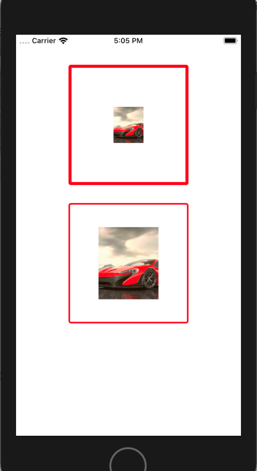
/**
 * Sample React Native App
 * https://github.com/facebook/react-native
 * @flow
 */

import React, { Component } from 'react';

import {
    AppRegistry,
    StyleSheet,
    View,
    PixelRatio,
    Image
} from 'react-native';


export default class ReactNativeDemo extends Component {

    render() {
        return (
            <View style={styles.flex}>
                <View style={styles.view1}>
                    <Image style={styles.image1} source={{uri:'car1.png'}}/>
                </View>
                <View style={styles.view2}>
                    <Image style={styles.image2} source={{uri:'car1.png'}}/>
                </View>
            </View>
        );
    }
}

const styles = StyleSheet.create({
    flex: {
        flex: 1,
        alignItems: 'center'
    },
    view1: {
        marginTop: 50,
        width:200,
        height:200,
        borderColor:'red',
        borderWidth: 5,                   ///未适配的线宽
        borderRadius: 4,
        alignItems: 'center',
        justifyContent: 'center'
    },
    view2: {
        marginTop: 30,
        width:200,
        height:200,
        borderColor:'red',
        borderWidth: 5/PixelRatio.get(),  ///适配后的线宽
        borderRadius: 4,
        alignItems: 'center',
        justifyContent: 'center'
    },
    image1: {
        width: 50,                       ///未适配的图宽(假设图片的原始宽度)
        height: 60                       ///未适配的图高(假设图片的原始高度)
    },
    image2: {
        width: PixelRatio.getPixelSizeForLayoutSize(50),      ///适配后的图宽
        height: PixelRatio.getPixelSizeForLayoutSize(60)      ///适配后的图高
    }
});

AppRegistry.registerComponent('ReactNativeDemo', () => ReactNativeDemo);
可以发现:采用当前设备的像素密度适配后,边框线宽和图片的尺寸都变的精细了。
程序猿神奇的手,每时每刻,这双手都在改变着世界的交互方式!

 浙公网安备 33010602011771号