机器学习—回归2-3(多项式回归)
使用多项式回归根据年龄预测医疗费用
主要步骤流程:
- 1. 导入包
- 2. 导入数据集
- 3. 数据预处理
- 3.1 检测缺失值
- 3.2 筛选数据
- 3.3 得到因变量
- 3.4 创建自变量
- 3.5 检验新的自变量和charges的相关性
- 3.6 拆分训练集和测试集
- 4. 构建多项式回归模型
- 4.1 构建模型
- 4.2 得到线性表达式
- 4.3 预测测试集
- 4.4 得到模型的MSE
- 5. 构建简单线性回归模型(用于对比)
- 5.1 构建简单线性回归模型(用于对比)
- 5.2 预测测试集
- 5.3 得到模型的MSE
- 6. 对比2种模型可视化效果
In [2]:
# 导入包
import numpy as np
import pandas as pd
import matplotlib.pyplot as plt
2. 导入数据集
In [3]:
# 导入数据集
data = pd.read_csv('insurance.csv')
data.head()
Out[3]:
3. 数据预处理
3.1 检测缺失值
In [4]:
# 检测缺失值
null_df = data.isnull().sum()
null_df
Out[4]:
3.2 筛选数据
In [5]:
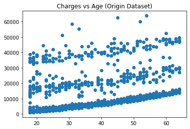
# 画出age和charges的散点图
plt.figure()
plt.scatter(data['age'], data['charges'])
plt.title('Charges vs Age (Origin Dataset)')
plt.show()
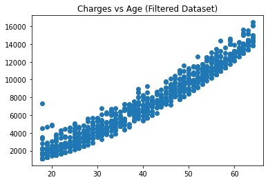
In [6]:
# 筛选数据
new_data_1 = data.query('age<=40 & charges<=10000') # 40岁以下 且 10000元以下
new_data_2 = data.query('age>40 & age<=50 & charges<=12500') # 40岁至50岁之间 且 12500元以下
new_data_3 = data.query('age>50 & charges<=17000') # 50岁以上 且 17000元以下
new_data = pd.concat([new_data_1, new_data_2, new_data_3], axis=0)
In [7]:
# 画出age和charges的散点图
plt.figure()
plt.scatter(new_data['age'], new_data['charges'])
plt.title('Charges vs Age (Filtered Dataset)')
plt.show()
In [8]:
# 检查age和charges的相关性
print('age和charges的相关性是:\n', np.corrcoef(new_data['age'], new_data['charges']))
3.3 得到因变量
In [9]:
# 得到因变量
y = new_data['charges'].values
3.4 创建自变量
In [10]:
# 创建自变量
from sklearn.preprocessing import PolynomialFeatures
poly_reg = PolynomialFeatures(degree = 4, include_bias=False)
x_poly = poly_reg.fit_transform(new_data.iloc[:, 0:1].values)
x_poly
Out[10]:
In [11]:
# 打印age数据
new_data.iloc[:, 0:1]
Out[11]:
3.5 检验新的自变量和charges的相关性
In [12]:
# 检验新的自变量和charges的相关性
corr_df = pd.DataFrame(x_poly, columns=['one','two','three','four'])
corr_df['charges'] = y
print('age的n次幂和charges的相关性是:\n', corr_df.corr(method='pearson'))
3.6 拆分训练集和测试集
In [13]:
# 拆分训练集和测试集
from sklearn.model_selection import train_test_split
x_train, x_test, y_train, y_test = train_test_split(x_poly, y, test_size = 0.2, random_state = 1)
4. 构建多项式回归模型
4.1 构建模型
In [14]:
# 构建多项式回归模型
from sklearn.linear_model import LinearRegression
regressor_pr = LinearRegression(normalize = True, fit_intercept = True)
regressor_pr.fit(x_train, y_train)
Out[14]:
4.2 得到线性表达式
In [15]:
# 得到线性表达式
print('Charges = %.2f * Age + %.2f * Age^2 + %.2f * Age^3 + %.2f * Age^4 + %.2f'
      %(regressor_pr.coef_[0], regressor_pr.coef_[1], regressor_pr.coef_[2], regressor_pr.coef_[3], regressor_pr.intercept_))
# Charges = -300.10 * Age + 19.35 * Age^2 + -0.31 * Age^3 + 0.00 * Age^4 + 2687.10
4.3 预测测试集
In [16]:
# 预测测试集
y_pred_pr = regressor_pr.predict(x_test)
4.4 得到模型的MSE
In [17]:
# 得到模型的MSE
from sklearn.metrics import mean_squared_error
mse_score = mean_squared_error(y_test, y_pred_pr)
print('多项式回归模型的MSE是:%.2f' %(mse_score)) # 654,495.38
5. 构建简单线性回归模型(用于对比)
5.1 构建简单线性回归模型(用于对比)
In [18]:
# 构建简单线性回归模型(用于对比)
regressor_slr = LinearRegression(normalize = True, fit_intercept = True)
regressor_slr.fit(x_train[:,0:1], y_train)
Out[18]:
5.2 预测测试集
In [19]:
# 预测测试集
y_pred_slr = regressor_slr.predict(x_test[:,0:1])
5.3 得到模型的MSE
In [20]:
# 得到模型的MSE
mse_score = mean_squared_error(y_test, y_pred_slr)
print('简单线性回归模型的MSE是:%.2f' %(mse_score))
6. 对比2种模型可视化效果
In [21]:
# 可视化测试集预测结果
plt.scatter(x_test[:,0], y_test, color = 'green', alpha=0.5)
plt.plot(x_test[:,0], y_pred_slr, color = 'blue')
plt.plot(x_test[:,0], y_pred_pr, color = 'red')
plt.title('Charges vs Age (Test set)')
plt.xlabel('Age')
plt.ylabel('Charges')
plt.show()
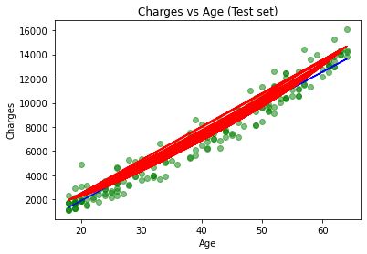
结论: 1)上图绿色点是样本点,红色点是多项式回归的拟合结果,蓝色点是简单线性回归的拟合结果。2种模型拟合效果都较好;
2)根据MSE,多项式回归模型性能略胜一筹;

 浙公网安备 33010602011771号