金融数据分析(一)
导论
本部分内容是关于金融数据分析的学习内容,该内容属于笔记部分,为毕业论文作铺垫
金融数据分析概述
该内容是通过系统性处理金融数据如交易记录,市场行情,用户行为等,进行决策支持
具体应用可以在风险控制,识别欺诈交易,预测市场趋势等
流程框架
数据准备 整合多源数据(交易库、用户画像库)、清洗异常值、构建数据仓库表关联逻辑
分析建模 选择指标(如客户流失率、坏账率)→ 构建统计模型(回归/分类)→ 验证假设
价值转化 可视化报告(自动生成图表)+ 决策建议(如风控策略优化)+ 持续迭代模型
常见的统计分布
离散分布
- 伯努利分布
单次二元事件(如成功概率)的分布
- 可以应用在贷款审批结果预测等方面
- 二项分布
描述一个随机事件在固定时间发生的次数
- 概率密度函数为\(P(X=k) = \left( \begin{array}{c} n \\ k \end{array} \right) p^{k} (1-p)^{n-k}\)
- 可以应用在分析股票价格在固定时间内变动的次数,或者用于分析市场波动的次数,分析交易量在固定时间内发生的次数等
- 泊松分布
表示低频事件发生的概率分布
- 概率密度函数为\(P(X=k) = \frac{\lambda^{k} e^{-\lambda}}{k!}\)
- 可以使用泊松分布来预测股票交易量
连续分布
-
正态分布
是常见的连续概率分布
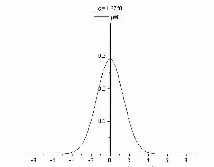
- 我们会假设数据满足正态分布,例如证券的收益率和价差等
-
对数正态分布
数据取对数后满足正态分布
统计推断关键分布
- t分布
假设我们有一个正态分布 \(N\left(\mu,\sigma^{2}\right)\),\(X_{1}\), \(X_{2}\), \(\cdots\), \(X_{n}\) 是独立的来自 \(N\left(\mu,\sigma^{2}\right)\) 的抽样随机变量。于是,\(X_{1}\), \(X_{2}\), \(\cdots\), \(X_{n}\) 的样本均值 \((\bar{X})\) 与样本方差 \(\left(S^{2}\right)\) 分别为:\(\bar{X}=\frac{\sum_{i=1}^{n}X_{i}}{n},S^{2}=\frac{1}{n-1}\sum_{i=1}^{n}\left(X_{i}-\bar{X}\right)^{2}\)。\((n-1)S^{2}/\sigma^{2}\) 服从的是自由度为 \(n-1\) 的 \(\chi^{2}\) 分布。现在我们考虑 \(\frac{\bar{X}-\mu}{S/\sqrt{n}}\)。经过简单的代数处理,我们有 \(\frac{\bar{X}-\mu}{S/\sqrt{n}}=\frac{(\bar{X}-\mu)/(\sigma/\sqrt{n})}{\sqrt{S^{2}/\sigma^{2}}}\)。可以看到,分子 \((\bar{X}-\mu)/(\sigma/\sqrt{n})\) 服从标准正态分布,而 \(\sqrt{S^{2}/\sigma^{2}}\) 是 \(\sqrt{\chi_{n-1}^{2}/(n-1)}\)。我们定义 \(\frac{\bar{X}-\mu}{S/\sqrt{n}}\) 服从的分布为自由度是 \(n-1\) 的 \(t\)-分布。
定义:如果我们有两个独立的随机变量 \(U\), \(V\)。\(U\sim N(0,1)\),\(V\sim\chi_{p}^{2}\)。即 \(U\) 服从标准正态分布,\(V\) 服从自由度为 \(p\) 的卡方分布。那么 \(U/\sqrt{V/p}\) 服从的分布是一个自由度为 \(p\) 的 \(t\)-分布。
- 卡方分布
\(\chi^{2}\)分布定义:设随机变量\(X_{1},\cdots,X_{n}\)相互独立,都服从\(N(0,1)\),则称\(\chi^{2}=\sum_{i=1}^{n}X_{i}^{2}\)服从自由度为\(n\)的\(\chi^{2}\)分布,记为\(\chi^{2}\sim\chi^{2}(n)\),自由度指式右端包含的独立变量的个数。\(\chi^{2}(n)\)分布的概率密度为:\(f_{n}(x)=\begin{cases} \dfrac{1}{2\Gamma(n/2)}\left(\dfrac{x}{2}\right)^{\frac{n}{2}-1}e^{-\frac{x}{2}}, & x>0, \\ 0, & x\leq 0. \end{cases}\)其中\(\Gamma(\alpha)=\int_{0}^{+\infty}x^{\alpha-1}e^{-x}dx\)。
- F分布
由卡方分布衍生设
• \(U\sim\chi^{2}(d_{1})\):自由度为\(d_{1}\)的卡方分布;
• \(V\sim\chi^{2}(d_{2})\):自由度为\(d_{2}\)的卡方分布;
• 且\(U\)与\(V\)相互独立。
那么随机变量
\(F=\dfrac{U/d_{1}}{V/d_{2}}\)
服从自由度为\((d_{1},d_{2})\)的F分布,记为\(F\sim F(d_{1},d_{2})\)
收益率及其分布特征
常用收益率计算公式
\(R_{t}=\frac{P_{t}-P_{t-1}}{P_{t-1}} \times 100\%\)
\(r_{t}=\ln\left(\frac{P_{t}}{P_{t-1}}\right)\)
其中\(P_{t}\)是时间t的资产价格
分布特征
- 尖峰厚尾性
许多金融研究文献已经证实了金融收益率数据具有比正态分布肥厚的尾部,也就是极端收益率发生的可能性要比正态分布所预测的大,因而,如果用正态分布来拟合收益率数据的概率分布,则可能会严重低估极端收益率发生的风险,所以,研究收益率序列的尾部特征更显重要。
传统的基于正态分布的统计方法,具有指数衰减的尾部:
\(P\{X>x\}\sim\frac{\phi(x)}{x}=\frac{e^{-x^{2}/2}}{x\sqrt{2\pi}}\)
由极值理论的研究表明,极端数据具有 Pareto 分布的性质,其尾部特征:
\(P\{X>x\}=x^{-\alpha},\ \alpha>0,\ x>1\)
该分布的尾部是幂衰减的,尾部较正态分布厚。
一般的,如果随机变量 X 满足
\(P\{X>x\}=x^{-\alpha}L(x),\quad \text{L(x)为慢变函数}\)
则称 X 有厚尾分布 F x( ),α 称为尾指数(tail index)。尾指数是用来衡量尾部厚
薄程度的参数,正态分布的尾指数为 0,其尾指数函数衰减。尾指数大于 0,则
分布尾部呈幂函数衰减,即呈现厚尾分布,并且尾指数越大,其尾部越厚。尾指
数就是广义 Pateto 分布的形状参数。
- 自相关性
实证研究表明,收益率的非线性函数,如绝对值或平方值的自相关函数是有长时间记忆(长程相关)的.这种时间关联特征在收益率时间序列上的表现就是波动聚集,即大波动一般相伴大波动,小波动常常跟随小波动
金融数据的可视化——基于新冠疫情器件中美股市波动的对比分析demo代码
import pandas_datareader as pdr
import pandas as pd
from datetime import datetime
import time

def get_stock_data_multi_source():
    """使用多个数据源获取股票数据"""
    data = {}
    start = datetime(2019, 1, 1)
    end = datetime(2023, 12, 31)

    # 定义股票代码和对应的多个数据源
    tickers_sources = {
        'S&P 500': ['^GSPC', 'SPY'],  # 指数和对应ETF
        'Dow Jones': ['^DJI', 'DIA'],
        'NASDAQ': ['^IXIC', 'QQQ'],
        '上证指数': ['000001.SS', 'ASHR'],  # A股和相关ETF
        '深证成指': ['399001.SZ', 'ASHR'],
        '创业板指': ['399006.SZ', 'KWEB']
    }

    # 可用的数据源列表
    sources = ['yahoo', 'stooq', 'tiingo']

    print("开始使用多数据源策略获取数据...")

    for name, symbols in tickers_sources.items():
        success = False

        # 尝试不同的股票代码
        for symbol in symbols:
            if success:
                break

            # 尝试不同的数据源
            for source in sources:
                try:
                    print(f"尝试获取 {name} ({symbol}) 从 {source}...")

                    if source == 'yahoo':
                        stock_data = pdr.get_data_yahoo(symbol, start, end)
                    elif source == 'stooq':
                        stock_data = pdr.get_data_stooq(symbol, start, end)
                    elif source == 'tiingo':
                        # 需要API密钥
                        stock_data = pdr.get_data_tiingo(symbol, start, end, api_key='YOUR_API_KEY')

                    if not stock_data.empty:
                        data[name] = stock_data['Close']
                        print(f"✓ {name} 数据获取成功 (来源: {source}, 代码: {symbol})")
                        success = True
                        break

                except Exception as e:
                    print(f"× {name} ({symbol}) 从 {source} 获取失败: {e}")
                    continue

            # 添加延迟避免频繁请求
            time.sleep(1)

        if not success:
            print(f"× {name} 所有尝试均失败")

    return pd.DataFrame(data)

# 执行数据获取
df = get_stock_data_multi_source()
import pandas as pd
import numpy as np
import matplotlib.pyplot as plt
import seaborn as sns
from datetime import datetime, timedelta
import warnings
warnings.filterwarnings('ignore')

# 设置中文字体和绘图样式
plt.rcParams['font.sans-serif'] = ['SimHei', 'DejaVu Sans']
plt.rcParams['axes.unicode_minus'] = False
plt.style.use('default')  # 修改为default样式,避免seaborn版本问题

def data_preprocessing_and_quality_check(df):
    """
    数据预处理和质量检查 - 修复版本兼容性问题
    """
    print("=" * 60)
    print("数据预处理和质量检查")
    print("=" * 60)

    # 基本信息
    print(f"数据形状: {df.shape}")
    print(f"数据列: {list(df.columns)}")
    print(f"时间范围: {df.index.min()} 到 {df.index.max()}")

    # 缺失值检查
    print(f"\n缺失值统计:")
    missing_data = df.isnull().sum()
    print(missing_data)

    # 数据清洗 - 使用新版本pandas的方法
    print("\n进行数据清洗...")

    # 处理缺失值 - 修复版本兼容性
    df_cleaned = df.ffill().bfill()

    # 去除异常值(使用3倍标准差规则)
    returns = df_cleaned.pct_change().dropna()

    # 检查极端值
    print("\n极端值检查:")
    for col in returns.columns:
        extreme_threshold = 3 * returns[col].std()
        extreme_count = len(returns[returns[col].abs() > extreme_threshold])
        print(f"{col}: {extreme_count} 个极端值")

    return df_cleaned, returns
#在金融日收益率的场景下,由于均值(μ)比标准差(σ)小得多(通常小一个数量级以上),在计算中将其省略,不会对最终的异常值判断结果产生实质性影响
# 执行数据预处理
df_processed, daily_returns = data_preprocessing_and_quality_check(df)
def define_covid_periods():
    """
    定义疫情相关的关键时间节点
    """
    covid_timeline = {
        'pre_covid': ('2019-01-01', '2020-01-19'),      # 疫情前
        'covid_outbreak': ('2020-01-20', '2020-03-31'),  # 疫情爆发期
        'covid_peak': ('2020-04-01', '2020-06-30'),      # 疫情高峰期
        'recovery_phase': ('2020-07-01', '2021-06-30'),  # 恢复期
        'post_covid': ('2021-07-01', '2023-12-31')       # 疫情后期
    }

    return covid_timeline

def period_analysis_fixed(df, returns, covid_timeline):
    """
    修复后的分期间分析股市表现
    """
    print("\n" + "=" * 60)
    print("分期间股市表现分析(修复版)")
    print("=" * 60)

    print(f"数据日期范围: {returns.index.min()} 到 {returns.index.max()}")
    print(f"数据总交易日数: {len(returns)}")

    period_stats = {}

    for period_name, (start_date, end_date) in covid_timeline.items():
        print(f"\n正在分析 {period_name.upper()} ({start_date} 到 {end_date})")

        # 转换日期格式
        start_dt = pd.to_datetime(start_date)
        end_dt = pd.to_datetime(end_date)

        # 确保日期在数据范围内
        actual_start = max(start_dt, returns.index.min())
        actual_end = min(end_dt, returns.index.max())

        # 获取期间数据
        mask = (returns.index >= actual_start) & (returns.index <= actual_end)
        period_data = returns[mask]

        print(f"实际分析期间: {actual_start.strftime('%Y-%m-%d')} 到 {actual_end.strftime('%Y-%m-%d')}")
        print(f"该期间交易日数: {len(period_data)}")

        if len(period_data) > 0:
            # 计算各项统计指标
            stats = {
                '交易日数': [len(period_data)] * len(period_data.columns),
                '平均日收益率(%)': period_data.mean() * 100,
                '日收益率标准差(%)': period_data.std() * 100,
                '年化收益率(%)': period_data.mean() * 252 * 100,
                '年化波动率(%)': period_data.std() * np.sqrt(252) * 100,
                '最大单日涨幅(%)': period_data.max() * 100,
                '最大单日跌幅(%)': period_data.min() * 100,
                '正收益交易日比例(%)': (period_data > 0).mean() * 100
            }

            # 创建DataFrame
            period_df = pd.DataFrame(stats, index=period_data.columns)
            period_stats[period_name] = period_df

            print("-" * 50)
            print(period_df.round(2))

        else:
            print(f"警告: {period_name} 期间没有数据")

    return period_stats

# 重新执行分期分析
print("重新执行分期间分析...")
covid_timeline = define_covid_periods()
print(covid_timeline)
period_statistics_fixed = period_analysis_fixed(df_processed, daily_returns, covid_timeline)
def comprehensive_visualization(df, returns, covid_timeline):
    """
    Comprehensive Visualization Analysis - Fixed version compatibility
    """

    # Added font cache clearing (to solve Jupyter kernel caching issues)

    fig = plt.figure(figsize=(20, 16))

    # Define key pandemic timeline points
    covid_dates = [
        ('2020-01-20', 'Outbreak'),
        ('2020-03-11', 'WHO Pandemic'),
        ('2020-03-23', 'Market Crash'),
        ('2020-04-08', 'Wuhan Open'),
        ('2021-01-20', 'Biden Inaug'),
        ('2021-12-31', 'Normalization')
    ]

    # 1. Price Trend Comparison
    ax1 = plt.subplot(3, 3, 1)
    colors = ['#FF6B6B', '#4ECDC4', '#45B7D1', '#96CEB4', '#FFEAA7', '#DDA0DD']

    for i, col in enumerate(df.columns):
        line_style = '-' if any(keyword in col for keyword in ['Index', 'Composite', 'ETF']) else '--'
        ax1.plot(df.index, df[col], label=col, linewidth=2,
                color=colors[i % len(colors)], linestyle=line_style)

    # Add key pandemic timeline markers
    for date_str, label in covid_dates:
        try:
            date_obj = pd.to_datetime(date_str)
            if date_obj >= df.index.min() and date_obj <= df.index.max():
                ax1.axvline(x=date_obj, color='red', linestyle=':', alpha=0.7)
        except:
            continue

    ax1.set_title('Price Trend Comparison', fontsize=14, fontweight='bold')
    ax1.set_ylabel('Price Index')
    ax1.legend(bbox_to_anchor=(1.05, 1), loc='upper left')
    ax1.grid(True, alpha=0.3)

    # 2. Normalized Trend (Baseline = Pandemic Start)
    ax2 = plt.subplot(3, 3, 2)
    covid_start_date = pd.to_datetime('2020-01-20')

    # Safely get baseline values
    try:
        base_idx = df.index.get_indexer([covid_start_date], method='nearest')[0]
        base_values = df.iloc[base_idx]
    except:
        # Use first available date if not found
        base_values = df.iloc[0]

    normalized_data = (df / base_values) * 100

    for i, col in enumerate(normalized_data.columns):
        line_style = '-' if any(keyword in col for keyword in ['Index', 'Composite', 'ETF']) else '--'
        ax2.plot(normalized_data.index, normalized_data[col],
                label=col, linewidth=2, color=colors[i % len(colors)], linestyle=line_style)

    ax2.axhline(y=100, color='black', linestyle='-', alpha=0.5, label='Baseline')
    if covid_start_date >= df.index.min() and covid_start_date <= df.index.max():
        ax2.axvline(x=covid_start_date, color='red', linestyle='--', alpha=0.7)

    ax2.set_title('Normalized Trend (Baseline=100)', fontsize=14, fontweight='bold')
    ax2.set_ylabel('Normalized Index')
    ax2.legend(bbox_to_anchor=(1.05, 1), loc='upper left')
    ax2.grid(True, alpha=0.3)

    # 3. Returns Distribution Comparison
    ax3 = plt.subplot(3, 3, 3)

    # Smart grouping: US vs CN Markets
    us_keywords = ['S&P', 'Dow', 'NASDAQ', 'SPY', 'DIA', 'QQQ']
    cn_keywords = ['Index', 'Composite', 'ETF', 'ASHR', 'FXI', 'KWEB']

    us_cols = [col for col in returns.columns if any(keyword in col for keyword in us_keywords)]
    cn_cols = [col for col in returns.columns if any(keyword in col for keyword in cn_keywords)]

    # Fallback if auto-grouping fails
    if not us_cols and not cn_cols:
        us_cols = returns.columns[:len(returns.columns)//2].tolist()
        cn_cols = returns.columns[len(returns.columns)//2:].tolist()

    if us_cols:
        us_avg = returns[us_cols].mean(axis=1)
        ax3.hist(us_avg * 100, bins=50, alpha=0.7, label='US Markets',
                color='#FF6B6B', density=True, histtype='stepfilled')

    if cn_cols:
        cn_avg = returns[cn_cols].mean(axis=1)
        ax3.hist(cn_avg * 100, bins=50, alpha=0.7, label='CN Markets',
                color='#4ECDC4', density=True, histtype='stepfilled')

    ax3.set_title('Daily Returns Distribution', fontsize=14, fontweight='bold')
    ax3.set_xlabel('Daily Return (%)')
    ax3.set_ylabel('Probability Density')
    ax3.legend()
    ax3.grid(True, alpha=0.3)

    # 4. Rolling Volatility Analysis
    ax4 = plt.subplot(3, 3, 4)
    window = 30

    if us_cols:
        us_avg = returns[us_cols].mean(axis=1)
        us_volatility = us_avg.rolling(window=window).std() * np.sqrt(252) * 100
        ax4.plot(us_volatility.index, us_volatility, label='US Volatility',
                color='#FF6B6B', linewidth=2)

    if cn_cols:
        cn_avg = returns[cn_cols].mean(axis=1)
        cn_volatility = cn_avg.rolling(window=window).std() * np.sqrt(252) * 100
        ax4.plot(cn_volatility.index, cn_volatility, label='CN Volatility',
                color='#4ECDC4', linewidth=2)

    for date_str, label in covid_dates:
        try:
            date_obj = pd.to_datetime(date_str)
            if date_obj >= returns.index.min() and date_obj <= returns.index.max():
                ax4.axvline(x=date_obj, color='red', linestyle=':', alpha=0.5)
        except:
            continue

    ax4.set_title('30-Day Rolling Volatility', fontsize=14, fontweight='bold')
    ax4.set_ylabel('Annualized Volatility (%)')
    ax4.legend()
    ax4.grid(True, alpha=0.3)

    # 5. Correlation Heatmap
    ax5 = plt.subplot(3, 3, 5)
    correlation_matrix = returns.corr()

    # Improved heatmap visualization
    im = ax5.imshow(correlation_matrix, cmap='RdYlBu_r', aspect='auto', vmin=-1, vmax=1)

    # Set tick labels
    ax5.set_xticks(range(len(correlation_matrix.columns)))
    ax5.set_yticks(range(len(correlation_matrix.columns)))
    ax5.set_xticklabels(correlation_matrix.columns, rotation=45, ha='right')
    ax5.set_yticklabels(correlation_matrix.columns)

    # Add correlation values
    for i in range(len(correlation_matrix.columns)):
        for j in range(len(correlation_matrix.columns)):
            text = ax5.text(j, i, f'{correlation_matrix.iloc[i, j]:.2f}',
                           ha="center", va="center", color="black", fontsize=8)

    ax5.set_title('Market Correlation Heatmap', fontsize=14, fontweight='bold')

    # 6. Cumulative Returns Comparison
    ax6 = plt.subplot(3, 3, 6)
    cumulative_returns = (1 + returns).cumprod()

    for i, col in enumerate(cumulative_returns.columns):
        line_style = '-' if any(keyword in col for keyword in ['Index', 'Composite', 'ETF']) else '--'
        ax6.plot(cumulative_returns.index, cumulative_returns[col],
                label=col, linewidth=2, color=colors[i % len(colors)], linestyle=line_style)

    ax6.axhline(y=1, color='black', linestyle='-', alpha=0.5)
    ax6.set_title('Cumulative Returns', fontsize=14, fontweight='bold')
    ax6.set_ylabel('Cumulative Return')
    ax6.legend(bbox_to_anchor=(1.05, 1), loc='upper left')
    ax6.grid(True, alpha=0.3)

    # 7. Drawdown Analysis
    ax7 = plt.subplot(3, 3, 7)

    def calculate_drawdown(prices):
        peak = prices.expanding().max()
        drawdown = (prices - peak) / peak
        return drawdown

    for i, col in enumerate(df.columns):
        drawdown = calculate_drawdown(df[col])
        ax7.plot(drawdown.index, drawdown * 100, label=col,
                linewidth=2, color=colors[i % len(colors)])

    # Fill last drawdown area
    if len(df.columns) > 0:
        last_drawdown = calculate_drawdown(df.iloc[:, -1])
        ax7.fill_between(last_drawdown.index, last_drawdown * 100, 0, alpha=0.3)

    ax7.set_title('Maximum Drawdown', fontsize=14, fontweight='bold')
    ax7.set_ylabel('Drawdown (%)')
    ax7.legend(bbox_to_anchor=(1.05, 1), loc='upper left')
    ax7.grid(True, alpha=0.3)

    # 8. Monthly Returns Boxplot
    ax8 = plt.subplot(3, 3, 8)

    # Calculate monthly returns
    monthly_returns = returns.resample('M').apply(lambda x: (1 + x).prod() - 1)

    # Prepare boxplot data
    box_data = []
    box_labels = []

    for col in monthly_returns.columns:
        if len(monthly_returns[col].dropna()) > 0:
            box_data.append(monthly_returns[col].dropna() * 100)
            # Shorten labels
            short_label = col[:10] + '...' if len(col) > 10 else col
            box_labels.append(short_label)

    if box_data:
        bp = ax8.boxplot(box_data, labels=box_labels, patch_artist=True)

        # Set box colors
        for patch, color in zip(bp['boxes'], colors):
            patch.set_facecolor(color)
            patch.set_alpha(0.7)

    ax8.set_title('Monthly Returns Distribution', fontsize=14, fontweight='bold')
    ax8.set_ylabel('Monthly Return (%)')
    ax8.tick_params(axis='x', rotation=45)
    ax8.grid(True, alpha=0.3)

    # 9. Rolling Sharpe Ratio
    ax9 = plt.subplot(3, 3, 9)

    if us_cols and cn_cols:
        # Calculate rolling Sharpe Ratio
        risk_free_rate = 0.02 / 252  # Annual risk-free rate 2%

        us_avg = returns[us_cols].mean(axis=1)
        cn_avg = returns[cn_cols].mean(axis=1)

        us_sharpe = (us_avg.rolling(window=252).mean() - risk_free_rate) / us_avg.rolling(window=252).std()
        cn_sharpe = (cn_avg.rolling(window=252).mean() - risk_free_rate) / cn_avg.rolling(window=252).std()

        ax9.plot(us_sharpe.index, us_sharpe, label='US Sharpe',
                color='#FF6B6B', linewidth=2)
        ax9.plot(cn_sharpe.index, cn_sharpe, label='CN Sharpe',
                color='#4ECDC4', linewidth=2)

    ax9.axhline(y=0, color='black', linestyle='-', alpha=0.5)
    ax9.set_title('Rolling Sharpe Ratio', fontsize=14, fontweight='bold')
    ax9.set_ylabel('Sharpe Ratio')
    ax9.legend()
    ax9.grid(True, alpha=0.3)

    plt.tight_layout()
    plt.show()

# Execute comprehensive visualization
comprehensive_visualization(df_processed, daily_returns, covid_timeline)
def comprehensive_risk_analysis(df, returns, covid_timeline):
    """
    综合风险分析 - 修复版本兼容性
    """
    print("\n" + "=" * 80)
    print("综合风险指标分析")
    print("=" * 80)

    risk_metrics = {}

    # 智能分组
    us_keywords = ['S&P', 'Dow', 'NASDAQ', 'SPY', 'DIA', 'QQQ']
    cn_keywords = ['指数', '成指', 'ETF', 'ASHR', 'FXI', 'KWEB']

    us_cols = [col for col in returns.columns if any(keyword in col for keyword in us_keywords)]
    cn_cols = [col for col in returns.columns if any(keyword in col for keyword in cn_keywords)]

    # 如果自动分组失败,手动分组
    if not us_cols and not cn_cols:
        us_cols = returns.columns[:len(returns.columns)//2].tolist()
        cn_cols = returns.columns[len(returns.columns)//2:].tolist()
    print(us_cols)
    print(cn_cols)
    markets = {}
    if us_cols:
        markets['美股相关'] = returns[us_cols].mean(axis=1)
    if cn_cols:
        markets['A股/中概相关'] = returns[cn_cols].mean(axis=1)

    # 如果还是没有数据,使用全部数据
    if not markets:
        markets['整体市场'] = returns.mean(axis=1)

    for market_name, market_returns in markets.items():
        print(f"\n{market_name}风险指标:")
        print("-" * 40)
#         print(market_returns)
        print(markets.items())
        # 基本统计量
        annual_return = market_returns.mean() * 252 * 100
        annual_volatility = market_returns.std() * np.sqrt(252) * 100

        # 风险调整收益
        risk_free_rate = 2.0
        sharpe_ratio = (annual_return - risk_free_rate) / annual_volatility if annual_volatility > 0 else 0

        # 最大回撤
        cumulative = (1 + market_returns).cumprod()
        rolling_max = cumulative.expanding().max()
        drawdown = (cumulative - rolling_max) / rolling_max
        max_drawdown = drawdown.min() * 100

        # VaR计算(95%和99%置信度)
        var_95 = np.percentile(market_returns * 100, 5)
        var_99 = np.percentile(market_returns * 100, 1)

        # 条件风险价值(CVaR)
        cvar_95 = market_returns[market_returns <= np.percentile(market_returns, 5)].mean() * 100
        cvar_99 = market_returns[market_returns <= np.percentile(market_returns, 1)].mean() * 100

        # 偏度和峰度
        skewness = market_returns.skew()
        kurtosis = market_returns.kurtosis()

        # 下行风险
        downside_returns = market_returns[market_returns < 0]
        downside_volatility = downside_returns.std() * np.sqrt(252) * 100 if len(downside_returns) > 0 else 0

        # Sortino比率
        sortino_ratio = (annual_return - risk_free_rate) / downside_volatility if downside_volatility > 0 else 0

        # 卡尔玛比率
        calmar_ratio = annual_return / abs(max_drawdown) if max_drawdown != 0 else 0

        # 输出结果
        risk_results = {
            '年化收益率(%)': annual_return,
            '年化波动率(%)': annual_volatility,
            '夏普比率': sharpe_ratio,
            '最大回撤(%)': max_drawdown,
            '95% VaR(%)': var_95,
            '99% VaR(%)': var_99,
            '95% CVaR(%)': cvar_95,
            '99% CVaR(%)': cvar_99,
            '偏度': skewness,
            '峰度': kurtosis,
            '下行波动率(%)': downside_volatility,
            'Sortino比率': sortino_ratio,
            '卡尔玛比率': calmar_ratio
        }

        risk_metrics[market_name] = risk_results

        for metric, value in risk_results.items():
            print(f"{metric:15s}: {value:8.2f}")

    # 创建风险指标对比表
    risk_df = pd.DataFrame(risk_metrics)

    print(f"\n风险指标对比表:")
    print("=" * 50)
    print(risk_df.round(2))

    return risk_metrics, risk_df

# 执行风险分析
risk_analysis_results, risk_comparison_df = comprehensive_risk_analysis(df_processed, daily_returns, covid_timeline)
年化收益率(%) (Annualized Return):
含义:将投资组合在统计期间的总收益率转化为年度收益率。
解释:美股相关年化收益率为-12.19%,A股/中概相关为0.72%。说明在统计期间,美股相关组合整体年化收益为负,而A股/中概组合略有正收益。
年化波动率(%) (Annualized Volatility):
含义:收益率的标准差按年化计算,反映投资组合的风险水平,数值越大风险越高。
解释:美股相关波动率为21.89%,A股/中概相关为25.10%。A股/中概相关的波动率更高,说明其风险更大。
夏普比率 (Sharpe Ratio):
含义:每承担一单位总风险(波动率)所获得的超额收益(通常以无风险利率为基准)。计算公式为(年化收益率-无风险利率)/年化波动率。
解释:两者均为负值(美股相关-0.65,A股/中概相关-0.05)。负的夏普比率说明收益率低于无风险利率(或者为负时更是如此),风险调整后表现不佳。相对而言,A股/中概的负值更小,表现稍好。
最大回撤(%) (Maximum Drawdown):
含义:统计期间内,从最高点到最低点的最大损失幅度。
解释:美股相关最大回撤为-55.11%,A股/中概相关为-54.48%。两者都经历过超过50%的损失,风险极大。
95% VaR(%) (95% Value at Risk):
含义:在95%的置信水平下,投资组合可能遭受的最大损失(负值表示损失)。
解释:美股相关为-1.82%,A股/中概相关为-2.43%。意味着在95%的情况下,美股相关单日损失不超过1.82%,而A股/中概相关单日损失不超过2.43%。A股/中概相关的潜在单日损失更大。
99% VaR(%) (99% Value at Risk):
含义:在99%的置信水平下,投资组合可能遭受的最大损失。
解释:美股相关为-3.06%,A股/中概相关为-4.17%。在极端情况下(1%的尾部风险),A股/中概相关的损失更大。
95% CVaR(%) (95% Conditional Value at Risk):
含义:在95%置信水平下,超过VaR的损失的期望值(平均尾部损失)。
解释:美股相关为-2.87%,A股/中概相关为-3.55%。当发生95% VaR以上的损失时,美股相关平均损失为2.87%,而A股/中概相关平均损失为3.55%。
99% CVaR(%) (99% Conditional Value at Risk):
含义:在99%置信水平下,超过VaR的损失的期望值。
解释:美股相关为-5.12%,A股/中概相关为-5.71%。在极端情况下(1%的尾部),A股/中概相关的平均损失略高。
偏度 (Skewness):
含义:收益率分布的不对称性。正偏表示收益率分布右偏(有较大的正收益机会),负偏表示左偏(有较大的负收益风险)。
解释:美股相关偏度为1.15(正偏),说明其收益分布有较长的右尾(有较大的正收益机会);A股/中概相关为0.11(轻微正偏),几乎对称。
峰度 (Kurtosis):
含义:收益率分布的峰态,衡量极端收益出现的概率(高峰态意味着更多的极端收益)。
解释:美股相关峰度高达14.72(正态分布的峰度是3),说明其收益率分布有尖峰厚尾(出现极端收益的概率大);A股/中概相关为6.06,虽然也高于正态分布,但极端性弱于美股相关。
下行波动率(%) (Downside Volatility):
含义:只计算低于某个目标(通常用无风险利率或0)的收益率的波动率,反映下行风险。
解释:美股相关下行波动率为14.20%,A股/中概相关为17.36%。A股/中概相关的下行风险更大。
Sortino比率 (Sortino Ratio):
含义:类似于夏普比率,但只考虑下行风险。计算公式为(年化收益率-无风险利率)/下行波动率。
解释:美股相关为-1.00,A股/中概相关为-0.07。由于年化收益率为负,该比率也是负值,但A股/中概相关表现略好(绝对值更小)。
卡尔玛比率 (Calmar Ratio):
含义:年化收益率与最大回撤的比率,反映每单位最大回撤风险带来的收益。
解释:美股相关为-0.22,A股/中概相关为0.01。A股/中概相关在此指标上为正,说明其相对于最大回撤的补偿为正,而美股相关则没有补偿(负值)。

 浙公网安备 33010602011771号