matplotlib--heatmap
热图表示三维数据
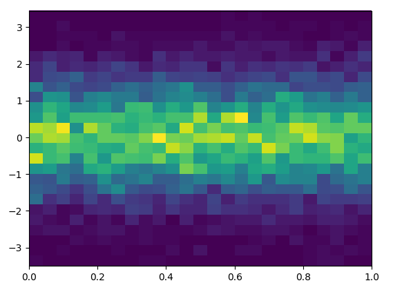
1.
plt.figure()

Y = np.random.normal(loc=0.0, scale=1.0, size=10000)
X = np.random.random(size=10000)
_ = plt.hist2d(X, Y, bins=25)
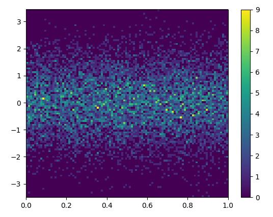
2.改变bin的数量
plt.figure()
_ = plt.hist2d(X, Y, bins=100)

# add a colorbar legend
plt.colorbar()
The Safest Way to Get what you Want is to Try and Deserve What you Want.

 浙公网安备 33010602011771号