
div垂直居中的4种方式方式
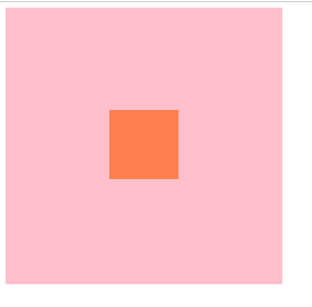
一、使用单元格居中
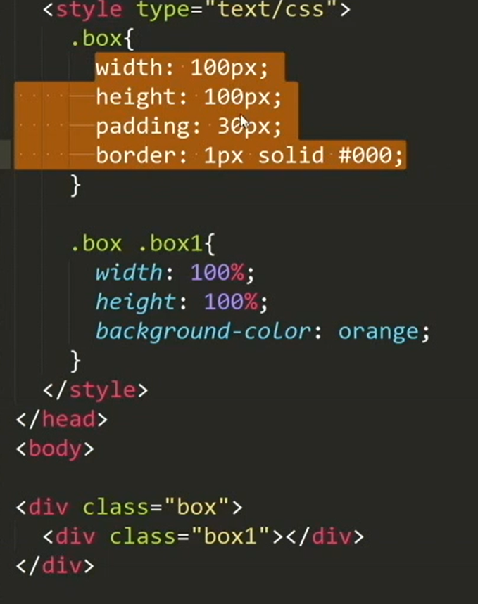
<!DOCTYPE html>
<html>
<head>
    <title>测试</title>
</head>
<style type="text/css">
    /* 使用单元格居中 */
    .out {
        width: 400px;
        height: 400px;
        background: pink;
        display: table-cell;
        text-align: center;
        vertical-align: middle;
    }
    .content {
        width: 100px;
        height: 100px;
        display: inline-block;
        background: coral;
    }

</style>
<body>
    <div class="out">
        <div class="content">

        </div>
    </div>
</body>
</html>
二、弹性盒子 flex
<!DOCTYPE html>
<html>
<head>
    <title>测试</title>
</head>
<style type="text/css">
    /* 使用弹性盒子 */
    .out {
        width: 400px;
        height: 400px;
        background: rgb(109, 106, 107);
        display: flex;
    }
    .content {
        width: 100px;
        height: 100px;
        display: inline-block;
        background: coral;
        margin: auto;
    }

</style>

<body>
    <div class="out">
        <div class="content">

        </div>
    </div>
</body>

</html>

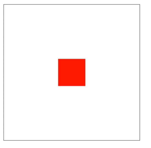
三、使用transform移动定位
<!DOCTYPE html>
<html>

<head>
    <title>测试</title>
</head>
<style type="text/css">
    /* 使用弹性盒子 */
    .out {
        width: 400px;
        height: 400px;
        background: powderblue;
        position: relative;
    }
    .content {
        width: 100px;
        height: 100px;
        background: coral;
        position: absolute;
        top: 50%;
        left: 50%;
        transform: translate(-50%, -50%);
    }

</style>

<body>
    <div class="out">
        <div class="content">

        </div>
    </div>
</body>

</html>

四、margin-left、margin-top
<!DOCTYPE html>
<html>

<head>
    <title>测试</title>
</head>
<style type="text/css">
    /* 使用弹性盒子 */
    .out {
        width: 400px;
        height: 400px;
        background: powderblue;
        position: relative;
    }
    .content {
        width: 100px;
        height: 100px;
        background: coral;
        position: absolute;
        margin-top: 50%;
         margin-left: 50%;
    }

</style>

<body>
    <div class="out">
        <div class="content">

        </div>
    </div>
</body>

</html>

 浙公网安备 33010602011771号