css基础
css基础
一、css介绍与用法
1.css: Cascading Style Sheet 层叠样式表
2.用法:
嵌入式: 写在head标签内 <style type="text/css"> </style>
外链式:rel 是关系 关系="样式表,样式单" <link rel="stylesheet" href="my.css"> <!-- --
行内式: <div style="color:red;">行内式</div>
二、css的常用属性
-
- Font-size 字号
- Font-family 字体
- Color 文字颜色
- Width 宽度
- Height 高度
- Background 背景色
- Text-align 文本水平对齐方式 left center right
- Line-height 行高
- Text-indent 首航缩进
- Font-weight 加粗
- Font-style 倾斜
- Text-decoration 文字修饰线 none underline line-through overline
三、css的选择器
1.标签选择器 : 标签名{}
2.id选择器 : #id名{}
3.类选择器: .类名{}
4.层级选择器: ul li{}
5.组选择器: div,p,span{}
6.伪类选择器: a: hover{}
四、盒子模型
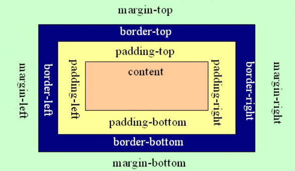
1.盒子模型的基础内容
边框线:
border:粗细 颜色 线条种类;Solid – 实线 dashed – 虚线 dotted – 点线
内边距:
padding: 一个值:上下左右 两个:上下 左右 三个:上 左右 下
外边距:
margin ***加border和padding会撑大盒子:1.手动减宽度高度;2.css3.0 启动盒子内减模式 box-sizing:border-box
2.display和overflow属性
overflow:解决内容查出父级如何显示的问题
hidden 溢出隐藏
auto 溢出滚动,超出了才滚动
scroll 溢出滚动无论是否超出都滚动


<!DOCTYPE html>
<html lang="en">
<head>
    <meta charset="UTF-8">
    <meta name="viewport" content="width=device-width, initial-scale=1.0">
    <meta http-equiv="X-UA-Compatible" content="ie=edge">
    <title>Document</title>
    <style>
        div{
            width: 200px;
            height: 200px;
            background: #ccc;
            /*
                visible:默认值
                hidden:溢出隐藏
                auto:溢出滚动, 自动检索是否超出
                scroll:溢出滚动, 一直显示滚动条
            */
            /* overflow: visible; */
            /* overflow: hidden; */
            /* overflow: auto; */
            overflow: scroll;
        }
    </style>
</head>
<body>
    <div>床前明月光,疑是地上霜。举头望明月,低头思故乡。床前明月光,疑是地上霜。举头望明月,低头思故乡。床前明月光,疑是地上霜。举头望明月,低头思故乡。床前明月光,疑是地上霜。举头望明月,低头思故乡。床前明月光,疑是地上霜。举头望明月,低头思故乡。</div>
</body>
</html>
display:转换元素类型:换行 – 块标签 不换行 – 行内
块:换行,宽高生效,如果不写宽度占父级100% block
行内:不换行,宽高不生效,尺寸和内容一样大 inline
行内块:不换行,宽高生效 inline-block
<!DOCTYPE html>
<html lang="en">
<head>
    <meta charset="UTF-8">
    <meta name="viewport" content="width=device-width, initial-scale=1.0">
    <meta http-equiv="X-UA-Compatible" content="ie=edge">
    <title>Document</title>
    <style>
            div{
                width: 200px;
                height: 200px;
                background: #ccc;
                /* display: inline-block; */
                display: none;
                /* 站位隐藏 */
                /* visibility: hidden; */
            }
            span{
                width: 200px;
                height: 200px;
                background: blueviolet;
                display: block;
            }
            /*
                不换行的标签 -- 行内 宽高不生效
                换行的标签 -- 块: 书写宽高, 不写宽度 跟父级一样大
                行内块: 宽度高度生效 在一行显示
                拓展: 浏览器在执行 行内 和行内快 标签 当文字处理, 在文字之间敲空格或者回车,会识别一个空格的距离
            */
        </style>
</head>
<body>
    <div>div</div>
    <div>div</div>
    <span>span</span>
    <span>span</span>
</body>
</html>

 浙公网安备 33010602011771号