CSS 小技巧
CSS 小技巧
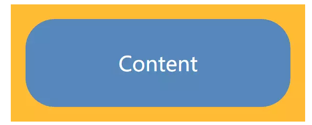
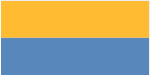
一、边框内圆角
我们在设计例如按钮等控件的时候,会遇到这样的设计:只有内侧有圆角,而边框或者描边的四个角还是保持直角的形状,用以下代码可以轻松的实现。
#wrapper {
    width: 200px;
    height: 80px;
    padding: 10px;
    background: rgb(255, 187, 51);

    #content {
        display: flex;
        justify-content: center;
        align-items: center;
        height: 100%;
        background: rgb(85, 136, 187);
        color: #fff;
        font-size: 14px;
        border-radius: 20px;
    }
}
这种解决方案需要使用到两个 dom 元素,那么如果只使用一个 dom 元素,应该怎么实现?
这里需要用到 CSS 的两个属性: box-shadow 和 outline 属性,具体属性参见MDN。
box-shadow属性有以下5个特性
1.<inset>
2.<offset-x> <offset-y>
3.<blur-radius>
4.<spread-radius>
5.<color>
这里我们将使用第四个属性 spread-radius 来填充效果当中的空白。同时利用 outline 的特性:描边不跟随边框绘制的特点来实现(因为不清楚这是不是一个bug,所以在将来的版本中可能会改变),具体代码如下。
box-shadow: 0 0 0 10px rgb(255, 187, 51);
outline: 10px solid rgb(255, 187, 51);
这种实现方式,对于边框的宽度和圆角的大小有一定的限制效果。仅当边框宽度 w 与圆角半径 r 存在 w ≥ (√2-1)r 关系时才可实现.
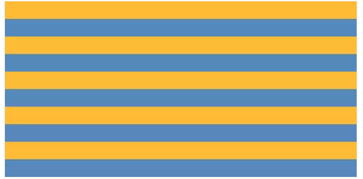
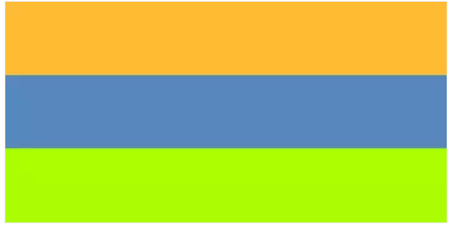
二、条纹背景
如何使用CSS来实现条纹?
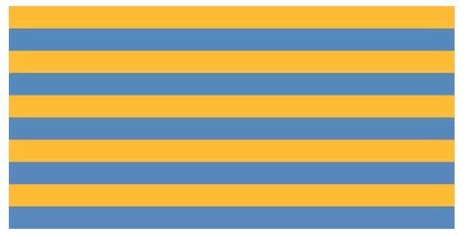
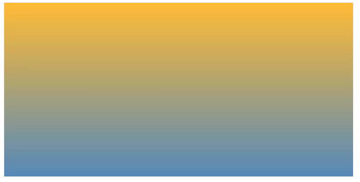
使用 linear-gradient 属性实现
#stripe {
  width: 400px;
  height: 200px;
  background: linear-gradient(rgb(255, 187, 51), rgb(85, 136, 187));
}
尝试修改 linear-gradient 属性,当linear-gradient属性
background: linear-gradient(rgb(255, 187, 51) 50%, rgb(85, 136, 187) 50%);
因为条纹是由 background-image 属性生成的,因此当然也可以使用 background-size 属性来改变它的大小
background-size: 100% 40px;
如果某个色标的位置值比整个列表中在它之前的色标的位置值都要小,则该色标的位置值会被设置为它前面所有色标位置值的最大值。
background: linear-gradient(rgb(255, 187, 51) 60%, rgb(85, 136, 187) 0);
然后我们尝试创建一个三色条纹以及垂直条纹
background: linear-gradient(
    rgb(255, 187, 51) 33.3%,
    rgb(85, 136, 187) 0,
    rgb(85, 136, 187) 66.6%,
    rgb(170, 255, 0) 0
);
垂直条纹
background: linear-gradient(to right, rgb(255, 187, 51) 60%, rgb(85, 136, 187) 0);
默认值为 to bottom ,可以设置 to right; to left 等
斜条纹
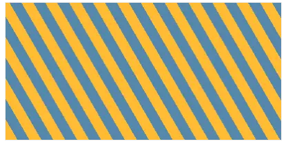
background: linear-gradient(45deg,
    rgb(255, 187, 51) 25%,
    rgb(85, 136, 187) 0,
    rgb(85, 136, 187) 50%,
    rgb(255, 187, 51) 0%,
    rgb(255, 187, 51) 75%,
    rgb(85, 136, 187) 0
);
background-size: 30px 30px;
为了达到斜条纹等宽的视觉效果,需要运用到勾股定理来计算宽度。
background-size: 42px 42px;
介绍 linear-gradient 的升级版 : repeating-linear-gradient
可以试着使用 linear-gradient 和 repeating-linear-gradient 实现同样的60°斜条纹进行对比
background: linear-gradient(60deg,
    rgb(255, 187, 51),
    rgb(255, 187, 51) 25%,
    rgb(85, 136, 187) 0,
    rgb(85, 136, 187) 50%,
    rgb(255, 187, 51) 0,
    rgb(255, 187, 51) 75%,
    rgb(85, 136, 187) 0,
    rgb(85, 136, 187) 100%
);
background-size: 18px 31px;
background: repeating-linear-gradient(60deg,
  rgb(255, 187, 51),
  rgb(255, 187, 51) 15px,
  rgb(85, 136, 187) 0,
  rgb(85, 136, 187) 30px
);
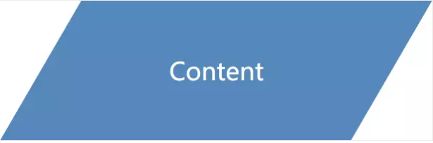
三、平行四边形和梯形
使用 transform 属性可以很轻松的创建一个平行四边形
#content {
    display: flex;
    justify-content: center;
    align-items: center;
    width: 200px;
    height: 80px;
    background: rgb(85, 136, 187);
    color: #fff;
    font-size: 14px;
    transform: skewX(-30deg);

    span {
        transform: skewX(30deg);
    }
}
缺点:需要两个元素、修改的话需要修改两个地方。
如何使用一个元素就实现这样的效果。
解决办法:将平行四边形的背景设置在伪元素上,对伪元素进行变形。
#content {
    position: relative;
    display: flex;
    justify-content: center;
    align-items: center;
    width: 120px;
    height: 60px;
    font-size: 18px;
    font-weight: 600;
    color: #fff;

    &::after {
        content: '';
        position: absolute;
        top: 0;
        left: 0;
        right: 0;
        bottom: 0;
        transform: skewX(-30deg);
        background: rgb(85, 136, 187);
        z-index: -1;
    }
}
梯形的概念比平行四边形更加宽泛,只需要两条边平行即可。梯形常用于标签页,之前常用伪元素方法来实现一个梯形。

.trapezoid {
    position: relative;
    left: 200px;
    width: 400px;
    height: 180px;
    background: rgb(85, 136, 170);
    display: flex;
    justify-content: center;
    align-items: center;
    font-size: 48px;
    color: rgb(255, 255, 255);

    &::before,
    &::after {
        content: '';
        position: absolute;
    }

    &::before {
        position: absolute;
        top: 0;
        left: -100px;
        width: 0;
        height: 0;
        border-top: 180px solid transparent;
        border-bottom: 0 solid transparent;
        border-right: 100px solid rgb(255, 187, 51);
    }

    &::after {
        position: absolute;
        top: 0;
        right: -240px;
        width: 0;
        height: 0;
        border-top: 180px solid transparent;
        border-bottom: 0 solid transparent;
        border-left: 240px solid rgb(255, 187, 51);
    }
}
缺点:
1.把两个伪元素都使用了;
2.需要修改形状时,需要修改的方过多;
3.不能给梯形加边框、阴影;
4.不能设置成圆角梯形;
通过构造平行四边形的思想,对矩形进行变形。但是这次不采用 2d 平面的变形,而是 3d 平面变形,通过视觉差来构造一个梯形。
这里需要用到 transform 属性3d变换特性:
1.perspective
2.rotate3d (rotateX rotateY rotateZ)
3.transform-origin
4.scale3d (scaleX scaleY scaleZ)
实现一个最简单的梯形所需要的代码只有以下一行:
transform: perspective(200px) rotateX(30deg);
与 2d 变换不同,3d 内部变形是不可逆的,因此与构造平行四边形相似,我们也可以将图形的变形放在伪元素上。
.trapezoid {
    position: relative;
    left: 200px;
    width: 400px;
    height: 180px;
    display: flex;
    justify-content: center;
    align-items: center;
    font-size: 48px;
    color: rgb(255, 255, 255);

    &::before {
        content: '';
        position: absolute;
        top: 0;
        left: 0;
        right: 0;
        bottom: 0;
        background: rgb(85, 136, 170);
        transform: perspective(200px) rotateX(30deg);
        z-index: -1;
    }
}
优化
1、修改 transform-origin 属性,控制转动轴
transform-origin: bottom;
2、通过 scale3d 属性而非 padding 属性来修正视觉大小,同时兼顾了优雅降级
transform: perspective(200px) rotateX(30deg) scaleY(2.25);
3、添加圆角、阴影、背景渐变
background: linear-gradient(to right, rgb(85, 136, 170), rgb(255, 187, 51));
border-top-right-radius: 60px;
border-top-left-radius: 60px;
box-shadow: 10px 10px 10px 1px rgba(85, 136, 170, .2);
4、改变 transform-origin 得到不同斜边的梯形
transform: perspective(200px) rotateX(10deg);
transform-origin: left;
缺点
斜边的角度依赖于元素的宽度。因此,当元素的内容长度不等时,想要得到斜度一致的梯形就不容易了。
3d 变换具体实现原理参见 matrix3d
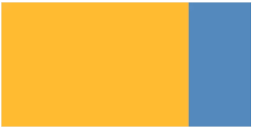
四、阴影
投影首先会想到 box-shadow 这个属性,根据以上的介绍,我们可以轻松的做出一个元素的阴影
#shadow {
    width: 200px;
    height: 100px;
    background: rgb(255, 187, 51);
    box-shadow: 240px 120px 0 0 red;
}
那么如何针对一张图片实现其对应的阴影?在页面的例如头像显示会遇到这种效果
这里将会使用到CSS3里面的 filter 属性
#logo {
    position: relative;
    width: 200px;
    height: 200px;
    background: url('../img/logo.svg') no-repeat;

    &::after {
        content: '';
        position: absolute;
        top: 40px;
        left: 0;
        width: 100%;
        height: 100%;
        background: url('../img/logo.svg') no-repeat;
        background-size: 100% 100%;
        filter: blur(10px)
    }
}

 浙公网安备 33010602011771号