matplotlib 进阶之Artist tutorial(如何操作Atrist和定制)
matplotlib教程学习笔记
基本
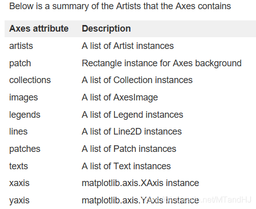
有俩种Artist:primitives(图形元素)和containers(容器)。primitives是我们需要加入图片的元素,比如线条,矩形,文字等,而容器是放置这些元素的地方,比如Axis,Axes和Figure。标准的用法,应该是先建立一个Figure对象,再创建数个Axes对象,然后再添加图形元素。
plt.figure()
import matplotlib.pyplot as plt

fig = plt.figure()
ax = fig.add_subplot(2, 1, 1) #俩行一列, ax为第一个Plot
Axes是最多使用的,大部分图形元素都会添加于其中,我们可以利用add_axes()来随时随地添加Axes。
fig.add_axes()
fig2 = plt.figure()
ax2 = fig2.add_axes([0.15, 0.1, 0.6, 0.5]) #[left right width height]
继续画图:
ax.lines
t = np.arange(0, 1, 0.01)
s = np.sin(2*np.pi*t)
line, = ax.plot(t, s, color="blue", lw=2)
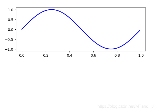
在这个例子中,ax是Axes实例,通过fig.add_subplot创建(subplot是Axes的一个子类),当你运行ax.plot的时候,它创建了一个Line2D实例,并将此元素添加到Axes.lines.list中,从下面我们可以看到,这个线,与返回得到的线line是一样的:
print(line, ax.lines[0]) # Line2D(_line0) Line2D(_line0)
既然Line2D实例被添加到了ax.lines列表中,那么我们也可以通过对列表进行操作来移除该实例:
del ax.lines[0]
ax.lines.remove(line)
set_xlabel
Axes也可以来修饰坐标轴,比如添加坐标轴的名称:
xtext = ax.set_xlabel("my xdata")
ytext = ax.set_ylabel("my ydata")
当我们使用set_xlabel的时候,它将数据传入XAxis的Text实例(每个Axes都有一个XAxis和YAxis实例)。
一个完整的例子
import matplotlib.pyplot as plt
import numpy as np
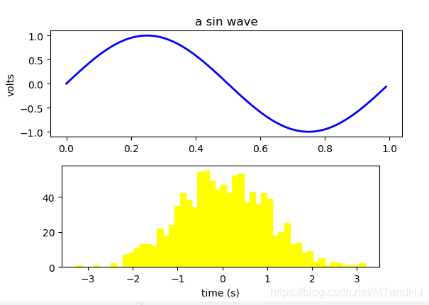
fig = plt.figure()
fig.subplots_adjust(top=0.8)
ax1 = fig.add_subplot(211) #2row 1col 第一个plot
ax1.set_ylabel("volts")
ax1.set_title("a sin wave")
t = np.arange(0, 1, 0.01)
s = np.sin(2*np.pi*t)
line, = ax1.plot(t, s, color="blue", lw=2)
np.random.seed(10086)
ax2 = fig.add_axes([0.15, 0.1, 0.7, 0.3])
n, bins, patches = ax2.hist(np.random.randn(1000), 50,
facecolor="yellow", edgecolor="yellow")
ax2.set_xlabel('time (s)')
plt.show()
定制你的对象
obj.set(alpha=0.5, zorder=2), obj.set_alpha(0.5)
我们可以通过obj.set(alpha=0.5, zorder=2)等以此设置多个属性,也可以通过obj.set_alpha(0.5)设定alpha一个属性。
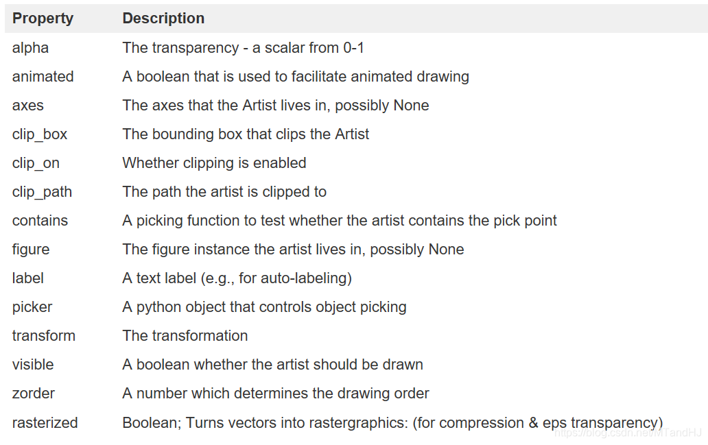
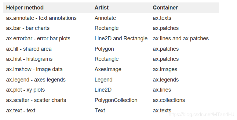
Artist实例有一系列属性,通过对属性的调整可以达到个性化的目的,下面是一个表:
相关信息被存放在figure.patch和ax.patch中,我们可以通过matplotlib.artist.getp()来查阅
matplotlib.artist.getp(), plt.getp()
通过下列语句都能获得line的alpha属性:
import matplotlib
plt.getp(line, "alpha")
plt.matplotlib.artist.getp(line, "alpha")
通过下列语句获得全部属性:
print(matplotlib.artist.getp(fig.patch)) #直接fig也可以啊,为什么一定要fig.patch?
agg_filter = None
alpha = None
animated = False
antialiased = False
bbox = Bbox(x0=0.0, y0=0.0, x1=1.0, y1=1.0)
capstyle = butt
children = []
clip_box = None
clip_on = True
clip_path = None
contains = None
data_transform = BboxTransformTo(     TransformedBbox(         Bbox...
edgecolor = (1.0, 1.0, 1.0, 1.0)
extents = Bbox(x0=0.0, y0=0.0, x1=640.0, y1=480.0)
facecolor = (1.0, 1.0, 1.0, 1.0)
figure = Figure(640x480)
fill = True
gid = None
hatch = None
height = 1
in_layout = True
joinstyle = miter
label =
linestyle = solid
linewidth = 0.0
patch_transform = CompositeGenericTransform(     BboxTransformTo(   ...
path = Path(array([[0., 0.],        [1., 0.],        [1.,...
path_effects = []
picker = None
rasterized = None
sketch_params = None
snap = None
transform = CompositeGenericTransform(     CompositeGenericTra...
transformed_clip_path_and_affine = (None, None)
url = None
verts = [[  0.   0.]  [640.   0.]  [640. 480.]  [  0. 480....
visible = True
width = 1
window_extent = Bbox(x0=0.0, y0=0.0, x1=640.0, y1=480.0)
x = 0
xy = (0, 0)
y = 0
zorder = 1
None
也可以通过查阅某个对象的属性:
print(matplotlib.artist.getp(line))
直接用
print(plt.getp(line))
也是可以的,虽然好像有一丢丢的不一样。
容器
正如我们之前提到的,Artist包括图形元素和容器。容器和图形元素有类似的属性,也有一些特别的 ,不如可以通过xscale属性来控制x轴为线性的还是'log'的。这一节,我们将回顾有关不同容器对象的一些方法。
Figure container
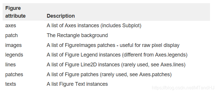
最底层(top level)的容器便是figure对象,它包含一切在figure中的元素。其背景为Rectangle,被存放在Figure.patch中。当你通过add_subplot()或者add_axes()创建实例的时候,这些元素会被自动添加到,Figure.axes中。
fig = plt.figure()
ax1 = fig.add_subplot(211)
ax2 = fig.add_axes([0.1, 0.2, 0.7, 0.3])

ax1
#<matplotlib.axes._subplots.AxesSubplot at 0x1e734b47f28>

ax2
#<matplotlib.axes._axes.Axes at 0x1e734de6908>

print(fig.axes)
#[<matplotlib.axes._subplots.AxesSubplot object at 0x000001E734B47F28>,
#<matplotlib.axes._axes.Axes object at 0x000001E734DE6908>]
我们可以通过fig.gca或者fig.sca来获得当前的axes,也可以通过delaxes()方法来移除。
print(fig.gca()) # Axes(0.1, 0.2; 0.7x0.3)
plt.delaxes(ax2)
print(fig.gca()) # AxesSubplot(0.125,0.536818;0.775x0.343182)
图片有用自己的text, lines, patches, images, 你可以直接往里面添加图片元素。
图片坐标(0, 0)代表左下角, (1,1)代表右上角?
import matplotlib.lines as lines

fig = plt.figure()

l1 = lines.Line2D([0, 1], [0, 1], transform=fig.transFigure, figure=fig)
l2 = lines.Line2D([0, 1], [1, 0], transform=fig.transFigure, figure=fig)
fig.lines.extend([l1, l2]) #extend是列表的方法

plt.show()

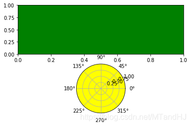
Axes container
Axes是matplotlib的重中之重,它包含了却大多数的Artist。和Figure一样,它包含patch——Rectangle:笛卡尔坐标和Circle:极坐标。
fig = plt.figure()

ax = fig.add_subplot(211)
rect = ax.patch  # a Rectangle instance
rect.set_facecolor('green')
ax2 = fig.add_subplot(212, projection='polar')
cir = ax2.patch
cir.set_facecolor('yellow')
plt.show()
当你使用plotting method的时候,比如plot(),传入arrays,这个方法会创建了一个matplotlib.lines.Line2D()实例,并利用参数加以更新,然后将lines加入Axes.lines容器,并将他返回给你。
x, y = np.random.rand(2, 100)
line = ax.plot(x, y, "-", color="blue", linewidth=2)
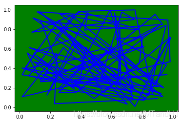
print(ax.lines)
# [<matplotlib.lines.Line2D object at 0x000002A965ED88D0>]
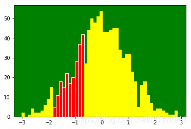
bar(),hist()也有相似的功能,会添加patches到Axes.patches列表中。
下面的n表示每个柱patch的高度,bins是指所在的位置,而rectangles是Rectangle实例列表。
n, bins, rectangles = ax.hist(np.random.randn(1000), 50, facecolor="yellow")
for item in rectangles[10:20]:
    item.set_facecolor("red")
    item.set_edgecolor((1.0, 1.0, 1.0, 1.0))

plt.show()
一般情况下,请不要将之间向Axes.lines和Axes.patches中添加实例,除非你非常确定要这么做。因为,在添加实例前,Axes会做一些额外的事情:它会设置一些属性,检查Artist中的数据,并自动改变Axes的布局。我们可以通过add_line(),add_patch()来添加元素。
本来这里应该有一个完整的实例的,但是obj.get_axes()函数被移除了,所以没办法了,贴一下方法:
Axis container
matplotlib.axis.Axis实例处理轴和网格线,以及上面的标记。
fig, ax = plt.subplots()
axis = ax.xaxis
print(axis.get_ticklocs())
print(axis.get_ticklabels())
print(axis.get_ticklines())
print(axis.get_ticklines(minor=True))
#[0.  0.2 0.4 0.6 0.8 1. ]
#<a list of 6 Text major ticklabel objects>
#<a list of 12 Line2D ticklines objects>
#<a list of 0 Line2D ticklines objects>
一个关于Axis的完整的例子(+常用的函数)
# Here is a summary of some of the useful accessor methods of the ``Axis``
# (these have corresponding setters where useful, such as
# set_major_formatter)
#
# ======================  =========================================================
# Accessor method         Description
# ======================  =========================================================
# get_scale               The scale of the axis, e.g., 'log' or 'linear'
# get_view_interval       The interval instance of the axis view limits
# get_data_interval       The interval instance of the axis data limits
# get_gridlines           A list of grid lines for the Axis
# get_label               The axis label - a Text instance
# get_ticklabels          A list of Text instances - keyword minor=True|False
# get_ticklines           A list of Line2D instances - keyword minor=True|False
# get_ticklocs            A list of Tick locations - keyword minor=True|False
# get_major_locator       The matplotlib.ticker.Locator instance for major ticks
# get_major_formatter     The matplotlib.ticker.Formatter instance for major ticks
# get_minor_locator       The matplotlib.ticker.Locator instance for minor ticks
# get_minor_formatter     The matplotlib.ticker.Formatter instance for minor ticks
# get_major_ticks         A list of Tick instances for major ticks
# get_minor_ticks         A list of Tick instances for minor ticks
# grid                    Turn the grid on or off for the major or minor ticks
# ======================  =========================================================
#
# Here is an example, not recommended for its beauty, which customizes
# the axes and tick properties

# plt.figure creates a matplotlib.figure.Figure instance
fig = plt.figure()
rect = fig.patch  # a rectangle instance
rect.set_facecolor('lightgoldenrodyellow')

ax1 = fig.add_axes([0.1, 0.3, 0.4, 0.4])
rect = ax1.patch
rect.set_facecolor('lightslategray')

for label in ax1.xaxis.get_ticklabels():
    # label is a Text instance
    label.set_color('red')
    label.set_rotation(45)
    label.set_fontsize(16)

for line in ax1.yaxis.get_ticklines():
    # line is a Line2D instance
    line.set_color('green')
    line.set_markersize(25)
    line.set_markeredgewidth(3)

plt.show()

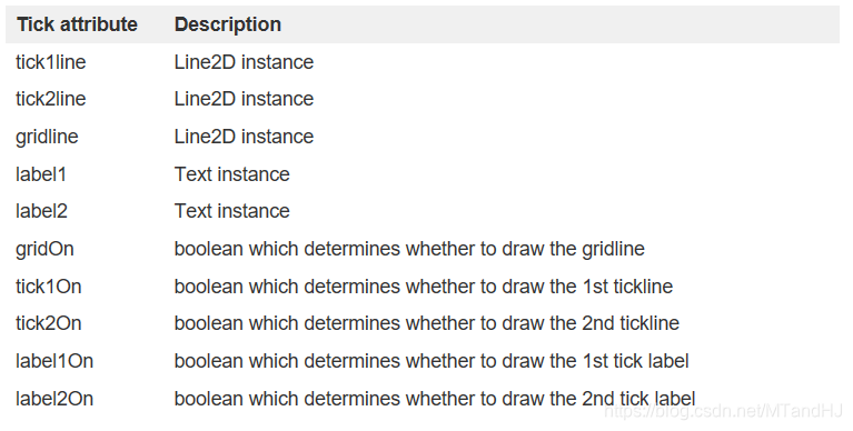
Tick containers
Tick是最后的容器,包含了轴和网格线实例。
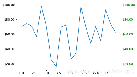
一个关于Tick的例子
# sphinx_gallery_thumbnail_number = 10
import numpy as np
import matplotlib.pyplot as plt


import matplotlib.ticker as ticker

# Fixing random state for reproducibility
np.random.seed(19680801)

fig, ax = plt.subplots()
ax.plot(100*np.random.rand(20))

formatter = ticker.FormatStrFormatter('$%1.2f')
ax.yaxis.set_major_formatter(formatter)

for tick in ax.yaxis.get_major_ticks():
    tick.label1On = True
    tick.label2On = True
    tick.label2.set_color('green')

plt.show()
函数链接
add_axes()-添加axes
set_xlabel()-添加xlabel
matplotlib.artist.getp()-获取属性类似的plt.getp()
Rectangle-figure的背景
add_subplot()-添加subplot
fig.gca()-获取当前的axes
plt.delaxes(ax)-移除ax
ax.add_line()-添加line
ax.add_patches()-添加patches

 浙公网安备 33010602011771号