
背景——background-image(不止图片,还有渐变)
上节说道background-image能做的background都能做
综述
| 值 | 说明 |
|---|---|
| url('URL') | 图像的URL |
| none | 无图像背景会显示。这是默认 |
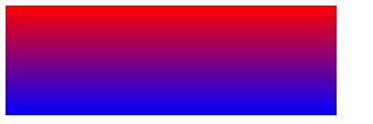
| linear-gradient() | 创建一个线性渐变的 "图像",(默认从上到下) |
| radial-gradient() | 用径向渐变创建 "图像"。 (center to edges) |
| repeating-linear-gradient() | 创建重复的线性渐变 "图像"。 |
| repeating-radial-gradient() | 创建重复的径向渐变 "图像" |
| inherit | 指定背景图像应该从父元素继承 |
linear-gradient() 线性渐变
| 值 | 描述 |
|---|---|
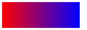
| direction | 用角度值指定渐变的方向(或角度)。可以是角度0deg是从下到上,90deg是从左到右;可以是方向: to right top 从左下到右上 |
| color-stop1, color-stop2,... | 用于指定渐变的起止颜色。可以设置多种颜色,他都会一一渐变,至少两个颜色 。都可以非均匀渐变 |
background-image: linear-gradient(direction?, color-stop1, color-stop2, ...?);
栗子:
background-image: linear-gradient(red ,blue)  background-image: linear-gradient(90deg, red ,blue)  background-image: linear-gradient(to right top ,red, blue);

radial-gradient() 椭圆渐变
background-image: radial-gradient(shape size at position, start-color, ..., last-color);
| 属性 | 描述 |
|---|---|
| shape | ellipse (默认)/circle |
| size | 定义渐变的大小 |
| position | 定义渐变的位置 |
| start-color, ..., last-color | 用于指定渐变的起止颜色。每个颜色后面还能跟百分比(相对当前元素宽高)定义颜色区域,做非均匀渐变 |
非均匀渐变
background: radial-gradient(circle at 0% 0%, yellow 5%, red 20%, blue 30% )
size:到哪一个地方渐变完所有颜色
farthest-corner(默认) : 指定径向渐变的半径长度为从圆心到离圆心最远的角closest-side:指定径向渐变的半径长度为从圆心到离圆心最近的边closest-corner: 指定径向渐变的半径长度为从圆心到离圆心最近的角farthest-side:指定径向渐变的半径长度为从圆心到离圆心最远的边
举例子:
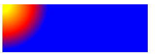
background: radial-gradient(circle farthest-corner at left center, red, blue )的效果如左图,真正面目如右图
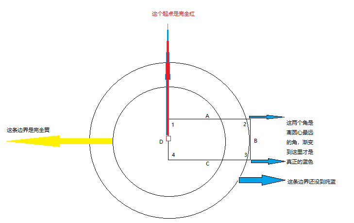
size默认是farthest-corner,那离position最远的角就是2,3两个,所以要到这两个角这里才能完全变成blue
position:
- 垂直上
center(默认)topbottom - 水平上
center(默认)rightleft - 自定义位置
width% height%: 该点为圆心
repeating-radial-gradient() 重复 和 repeating-linear-gradient() 异曲同工
语法
background-image: repeating-radial-gradient(shape size at position, start-color, ..., last-color);
重复要依赖每种颜色后面的百分比,这个百分比和不重复的不一样,对于不重复的,超出最后一个颜色的百分比,那就没有了,就只剩下最后那个颜色铺满剩余空间。
但repeating会通过重复里面的渐变再往外重复多层,直到铺满
background: repeating-radial-gradient(circle, yellow, red 50%, blue 100%) 和
background: radial-gradient(circle, yellow, red, blue)  效果就是一样的,因为100%表示铺满了,也不会重复了
每个百分比表示从起点到当前颜色边界的距离(百分比相对当前元素width而言)

这里面红点是为了清晰,方便看,因为红色是圆心,他要是设置个百分比,那就是自己离开圆心,那中间空出来的就会被最外层那个颜色占领,所以一般起始颜色都是不设置百分比的,就作为圆心;
同时终点颜色的百分比也不为100%,不然repeating没意义了
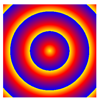
最后看一下效果图
background: repeating-radial-gradient(circle, yellow, red 10%, blue 30%)
因为黄——>红——>蓝,一整套下来占总宽的30%(注意不是10% + 30% = 40%啊,这是绝对定位,有覆盖的),那100 / 30 = 3.33,图中也刚好展示了完整的黄红蓝3次,还有一点没显示完的角,刚好3.333

 浙公网安备 33010602011771号