
会呼吸的图片,文字闪烁发光。也可用于博客美化

最近浏览一些培训学校的网站,想找一些视频或者资料充充电。偶尔看到了,这张效果图。PS:看下面的效果展示
因为本人前端比较小白,所以就运用了大家都会的F12解决了一下问题(手动滑稽)!
最后查了一下,是用到了Css3 @keyframes规则造成的简单的动画效果。所以就扒了下来,自己记录一下,方便自己以后拿来主义嘛~
一. HTML页面


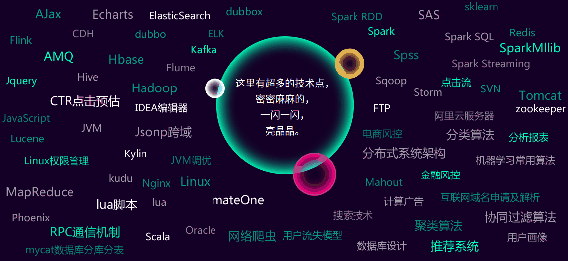
 1 <body>
 2 <div class="box4">
 3     <div class="box_In">
 4         <div class="b" id="box5">
 5             <div class="small_hd wow slideInDown">
 6                 <p>二、不断添加的新/热技术点</p>
 7             </div>
 8             <div class="con">
 9                 <div class="b_con">
10                     <p>这里有超多的技术点,<br />密密麻麻的,<br />一闪一  闪,<br />亮晶晶。</p>
11                 </div>
12                 <img class="b2" src="image/box4_b2.png"/>
13                 <img class="b3" src="image/box4_b3.png"/>
14                 <img class="b4" src="image/box4_b4.png"/>
15                 <img class="b5" src="image/box4_b5.png"/>
16             </div>
17         </div>
18     </div>
19 </div>
20 </body>
二. CSS代码
 1 body{background: #140026;}
 2 .box_In{width: 1200px;margin: 0 auto;position: relative;}
 3
 4 /*box4*/
 5 .box4 .small_hd{background: url(../images/box4_s1.jpg) no-repeat center; width: 945px;height: 35px;margin: 0 auto;line-height: 26px;}
 6 .box4 .small_hd p{font-size: 24px;color: #fff;text-align: center;letter-spacing:5px;}
 7
 8 .box4 .b{padding-bottom: 80px;}
 9 .box4 .b .small_hd{background: url(../images/box4_s2.jpg) no-repeat center; width: 967px;}
10 .box4 .b .con{width: 1157px;height: 539px;position: relative;margin: 50px auto 0;overflow: hidden;}
11 .box4 .b .b_con{background: url(../image/box4_b1.png) no-repeat center;width: 322px;height: 323px;margin:80px auto 0;}
12 .box4 .b .b_con p{font-size: 20px;color: #fff;text-align: center;padding-top: 80px;line-height: 32px;}
13 .box4 .b .con img{position: absolute;top: 0;left: 0;}
14 .box4 .b .con .b2{animation:bing2 5s  infinite;-webkit-animation:bing2 5.5s  infinite;-moz-animation:bing2 5.5s infinite;-o-animation:bing2 5.5s  infinite;}
15 .box4 .b .con .b3{animation:bing2 3s  infinite;-webkit-animation:bing2 3s  infinite;-moz-animation:bing2 3s infinite;-o-animation:bing2 3s infinite;}
16 .box4 .b .con .b4{animation:bing1 4s  infinite;-webkit-animation:bing1 4s  infinite;-moz-animation:bing1 4s infinite;-o-animation:bing1 4s  infinite;}
17 .box4 .b .con .b5{animation:bing3 2s  infinite;-webkit-animation:bing3 2.5s  infinite;-moz-animation:bing3 2.5s infinite;-o-animation:bing3 2.5s  infinite;}
18
19 @keyframes bing2
20 { 0%{opacity: .1;}   50%{opacity: 1;}  100%{opacity: .1;}}
21 @-moz-keyframes bing2
22 { 0%{opacity: .1;}   50%{opacity: 1;}  100%{opacity: .1;}}
23 @-webkit-keyframes bing2
24 { 0%{opacity: .1;}   50%{opacity: 1;}  100%{opacity: .1;}}
25 @-o-keyframes bing2
26 { 0%{opacity: .1;}   50%{opacity: 1;}  100%{opacity: .1;}}
27
28 @keyframes bing3
29 { 0%{opacity: .5;}   50%{opacity: 1;}  100%{opacity: .5;}}
30 @-moz-keyframes bing1
31 { 0%{opacity: .5;}   50%{opacity: 1;}  100%{opacity: .5;}}
32 @-webkit-keyframes bing1
33 { 0%{opacity: .5;}   50%{opacity: 1;}  100%{opacity: .5;}}
34 @-o-keyframes bing1
35 { 0%{opacity: .5;}   50%{opacity: 1;}  100%{opacity: .5;}}
三. 用到image
1.

2.

3.

4.

5.

四. 效果展示
好啦!这就是做出这个效果图所要用的全部东西啦。刚开始以为是很高大上的东东。以为是啥新技术呢,没想到。。。
不过,没事啦!默默告诉自己,不要怕,你是个后端开发工程师。没见过,但不要怂,就当学习新知识啦!哈哈哈~~~
有需要的小伙伴请直接享用吧!不用客气~
「一键投喂 牛奶/蛋糕/布丁/软糖/冰阔乐!」
 Mr·Capricorn

 浙公网安备 33010602011771号